Curated Coffee & Tea Subscription Landing Page
Steep is a curated subscription landing page built for coffee and tea brands that want to turn passive subscribers into engaged, higher-tier members. The modular card grid layout, animated search header, and single-step upgrade modal work together to make upselling feel natural and rewarding rather than pushy.
by Rocket studio
Quick summary
Steep is a single-page subscription landing page template designed for premium coffee and loose-leaf tea brands. It combines an animated search header, a staggered modular card grid, and a pinned upgrade call-to-action into one cohesive flow. The result feels like an editorial product experience rather than a standard e-commerce checkout page.
Who this template is for
This template is built for subscription brands and direct-to-consumer (D2C) operators who already have a subscriber base and want a high-touch page to encourage upgrades and gift add-ons. It suits brands with a design-forward identity and a range of subscription tiers to communicate.
- Coffee or tea subscription brands offering multiple membership tiers
- D2C operators targeting design-conscious, ritually motivated buyers
- Gift-focused brands who want to reduce decision fatigue during checkout
What problem this template solves
Most subscription upgrade pages feel like a billing screen. They list tiers in a plain table and leave the subscriber to imagine the difference. Steep solves this by turning the upgrade flow into an experience that mirrors the product's own sense of discovery.
- Subscribers lack emotional context to justify paying more for a higher tier
- Gift add-ons get buried in navigation and rarely convert
- Standard grids feel catalogued rather than curated, reducing perceived brand value
What you get with this template
You get a fully structured single-page layout that guides an existing subscriber from casual browsing to confident upgrading. Every section works together to create momentum toward that one primary action.
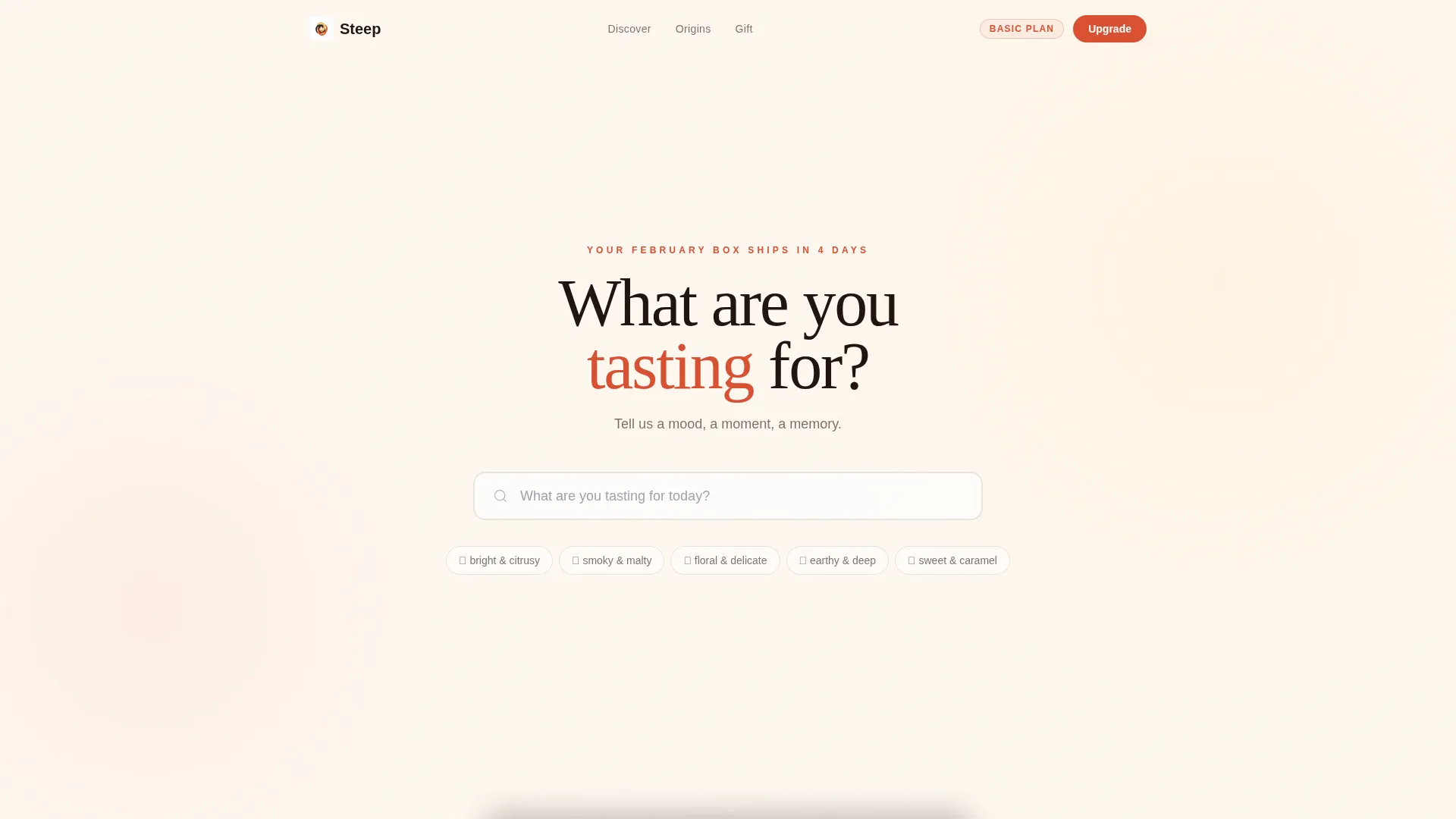
- An oversized animated search header with instant card results and a yuzu-yellow glowing underline
- A staggered modular card grid with hover-revealed details, brewing tips, and a scratch-to-reveal mystery card
- A pinned "Upgrade My Box" call-to-action button and a single-step tier comparison modal
Feature list
This template ships with several purpose-built components, each grounded in the brief's stated behavior and visual logic.
Animated Search Header
The header centers a single oversized search box on a warm ivory background. Ghost text reads "What are you tasting for today?" and typing triggers animated card results instantly. A yuzu-yellow underline glows as the visitor types, making the interaction feel alive and intentional rather than mechanical.
Staggered Modular Card Grid
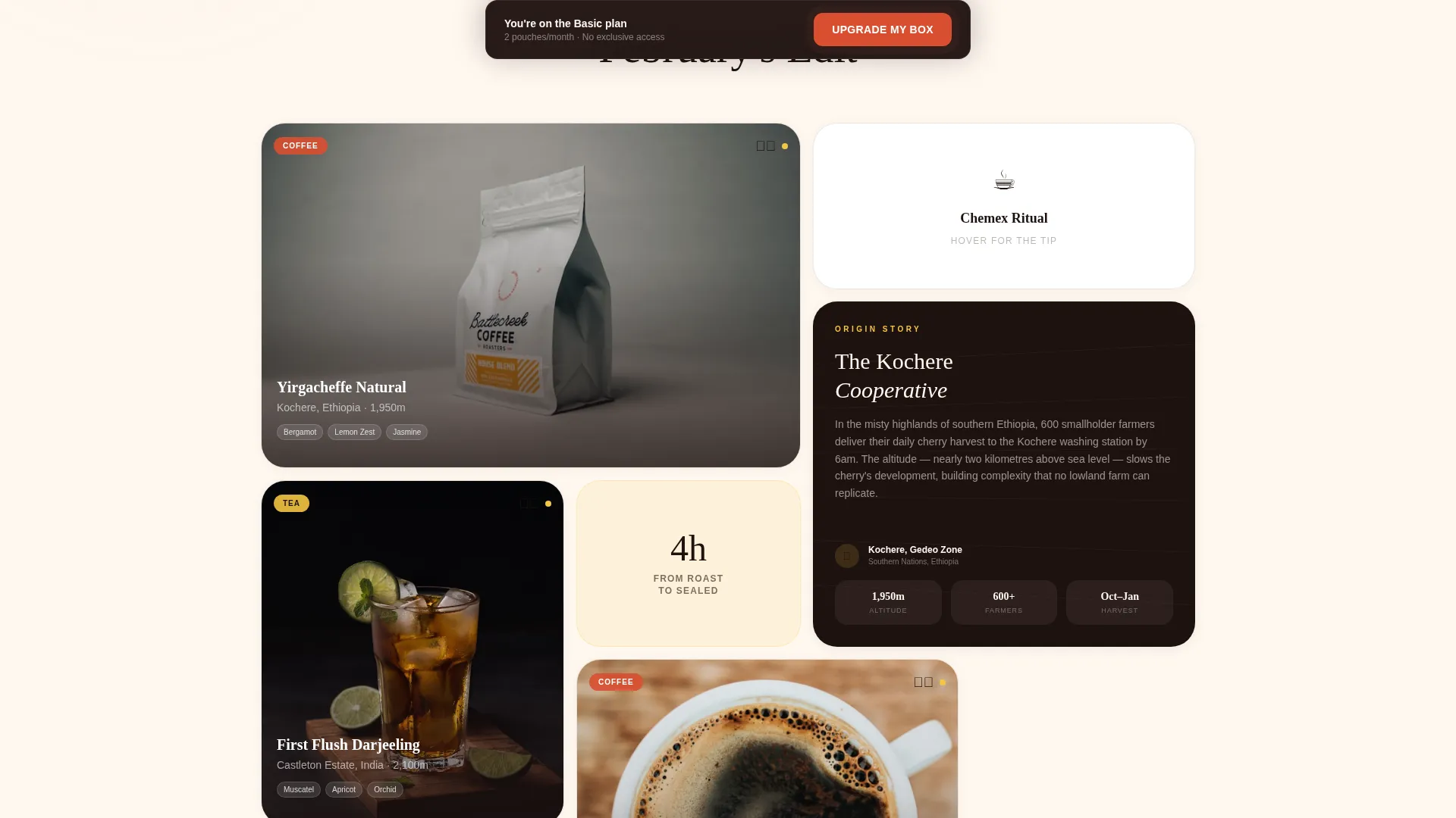
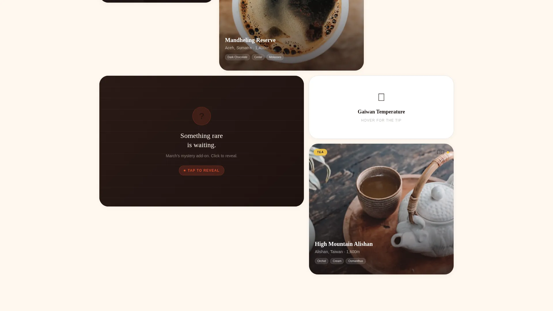
Cards appear one at a time on a staggered fade as the visitor scrolls. Each card holds a different proportion, breaking expected grid rhythm to feel curated. Hovering over any card surfaces a hidden detail such as farm altitude, a blender's handwritten note, or a short pour video.
Mystery Scratch-to-Reveal Card
One card in the grid is a scratch-to-reveal component that teases next month's mystery add-on. It rewards curiosity and gives returning visitors a reason to re-engage with the page between shipment cycles.
Pinned Upgrade Call-to-Action
The "Upgrade My Box" button in blood orange stays pinned to the bottom of the viewport. It begins a gentle pulse animation after the visitor scrolls past the third card, drawing attention without interrupting the browsing flow.
Single-Step Upgrade Modal
The upgrade flow lives inside one modal. Visitors choose between the Discoverer, Connoisseur, and Collector tiers using a visual comparison of pouch count and exclusive access perks. A real-time price display shows the cost difference as a daily figure, making the decision feel low-stakes.
Gift Add-On Path
A secondary "Add a Surprise" button sits beneath the mystery card. It opens a streamlined gift box configuration with the most popular option pre-selected, reducing the number of choices a subscriber has to make before committing.
Page sections overview
| Section | Purpose |
|---|---|
| Search Header | Entry interaction and product discovery |
| Card Grid | Browse products, tips, and surprises |
| Mystery Reveal Card | Tease and re-engage returning subscribers |
| Pinned Upgrade call to action | Persistent prompt to upgrade subscription tier |
| Upgrade Modal | Single-step tier selection and price comparison |
| Gift Add-On Button | Low-friction path to add a one-time gift box |
Design & branding system
The visual identity follows a Luxe Minimal theme built around a warm, restrained palette with one deliberate accent that catches the eye. Typography uses deep espresso across all body and heading text, keeping contrast high without resorting to stark black.
- Warm ivory (#FFF8F0) background, yuzu yellow (#F4C542) hover states, blood orange (#D94F30) primary buttons and badges, and deep espresso (#1E1210) typography
- Cards use varied proportions and asymmetric sizing to feel editorially composed rather than templated
- The palette is described as a Meyer lemon slice on a matte-black ceramic cup: restrained everywhere except one detail that makes you look twice
Mobile & speed optimization
The page is designed to maintain its editorial feel on smaller screens. The modular card grid reflows naturally, and the pinned call-to-action remains accessible without covering critical content.
- The staggered fade animation and card proportions adapt for touch-based browsing
- The pinned upgrade button stays visible at the viewport bottom across screen sizes
- The single-step modal keeps the upgrade decision contained and legible on compact displays
How this template helps you convert
Every design decision in Steep points toward one outcome: getting an existing subscriber to act, whether that is upgrading their tier or adding a gift to their next shipment.
- The animated search interaction creates immediate investment from the first second on the page, making subscribers feel understood before they read a single line of copy.
- The pinned blood-orange button with a gentle pulse builds quiet urgency without a countdown timer or aggressive pop-up, keeping the brand tone intact while driving action.
- The daily cost framing inside the upgrade modal ("+ $0.83/day") reframes the price increase as a tiny daily indulgence rather than a larger monthly commitment, lowering resistance at the moment of decision.
Other information about this template
Steep sits at the intersection of the Retail & E-Commerce category and the Subscription Box & D2C subcategory. The template was designed for brands where the product experience and the buying experience should feel equally considered.
- The template is suited to single-origin coffee brands, specialty loose-leaf tea subscriptions, and premium food and beverage direct-to-consumer operators
- The Luxe Minimal theme and Citrus Burst color system make it straightforward to adapt the palette to adjacent brand identities without restructuring the layout
- The modular card grid supports a mix of content types, including product pouches, editorial brewing tips, and interactive surprise components, all within one cohesive page
- This template is built for a landing page format: one continuous scroll, one primary goal, and no competing navigation to dilute focus
Theme
Soft Gradient
Creative direction
Seasonal/Moment
Color system
Ink & Paper
Style
Bento Grid
Direction
Quiz/Assessment
Page Sections
Animated Search Header with Live Results
Staggered Modular Card Grid
Scratch-to-reveal Mystery Card
Pinned Pulsing Upgrade Button
Single-step Tier Upgrade Modal
Pre-selected Gift Add-on Path
Related questions
Who is this template designed for?
Can I adapt the card grid to show different product types?
Does the upgrade modal support more or fewer than three tiers?
How does the gift add-on flow reduce decision fatigue?
Is this a single-page template or a multi-page website?



