Editorial Landing Page for Hospitality Sustainability Consultants
Steward is an editorial landing page template built for hospitality sustainability consultants. It combines longform case study storytelling with a refined magazine aesthetic to build the kind of authority that earns high-value clients. The layout guides boutique hotel owners, resort group operators, and hospitality brand directors toward a single, considered action: requesting a property audit.
by Rocket studio
Quick summary
Steward is a single-page editorial template designed for a hospitality sustainability consultancy. It uses a magazine-style narrative structure, dramatic visual shifts, and a carefully staged lead generation form to turn a consultant's credibility into client inquiries. The tone is unhurried, the design is considered, and every section earns the next scroll.
Who this template is for
This template is built for sustainability consultants working inside the hospitality industry. It speaks directly to practitioners whose work involves measurable, on-site transformation rather than advisory reports alone.
- Boutique hotel owners and independent property operators facing rising utility costs
- Resort group chief operating officers pursuing formal sustainability certifications before investor rounds
- Hospitality brand directors who need to demonstrate genuine environmental progress, not surface-level claims
What problem this template solves
Most consultancy landing pages lead with credentials and end with a contact form. That structure asks visitors to trust before they understand. Steward inverts this by leading with evidence first and making the ask only after demonstrating expertise through narrative.
- Generic service pages fail to communicate the depth and specificity of a sustainability practice
- Hospitality decision-makers are skeptical of greenwashing and dismiss vague environmental claims quickly
- A standard call-to-action button asks for commitment before the visitor feels ready to give it
What you get with this template
Steward delivers a complete, editorial-quality landing page structured around three core case study narratives and a carefully staged lead generation form. Each component of the layout is purpose-built for a consultancy that earns trust through demonstrated results.
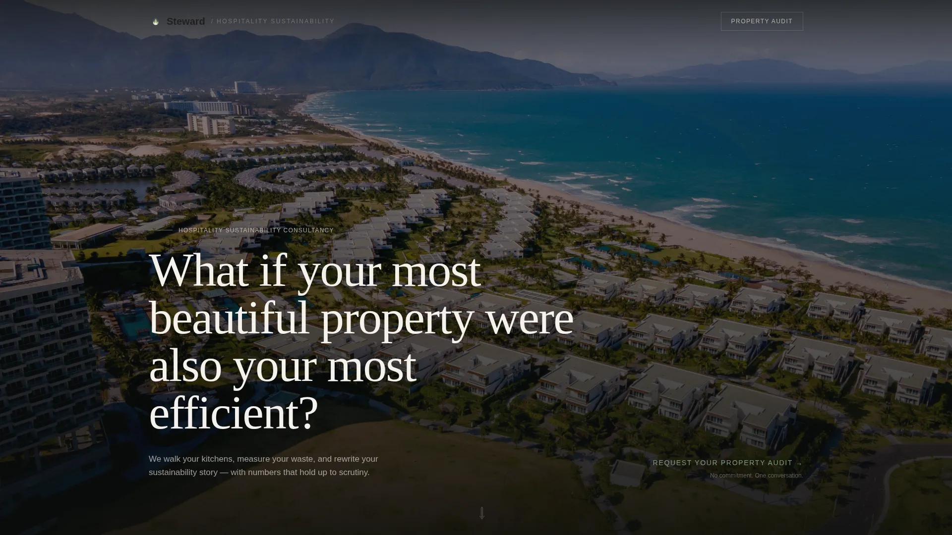
- A dark full-bleed header with a serif headline and a pulsing ambient glow effect on the property photograph
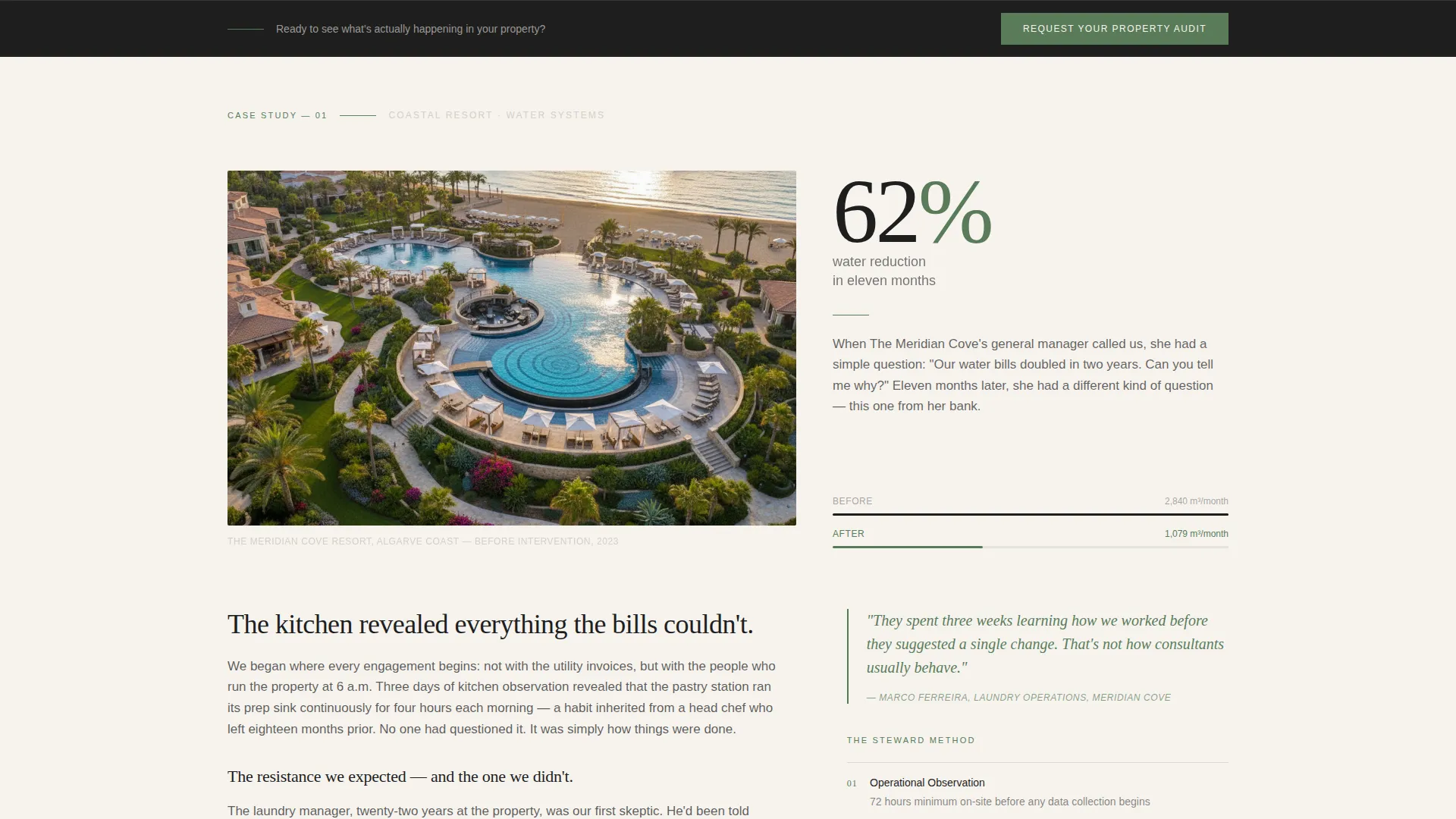
- Three self-contained case study scroll sections, each structured as a longform editorial spread with property image, bold data stat, methodology, and measurable outcome
- A lead generation form that asks for property name, room count, and one open-ended question about the visitor's biggest sustainability challenge
Feature list
This template includes the following built-in design and layout features drawn directly from its editorial brief.
Dark Full-Bleed Header with Ambient Glow
The header opens with an aerial twilight photograph of a coastal resort. Warm amber window glow pulses subtly against a deep charcoal sky. A large tracked-out serif headline fades in at magazine-cover scale, creating immediate visual authority before a word of body copy appears.
Case Study Narrative Scroll Sections
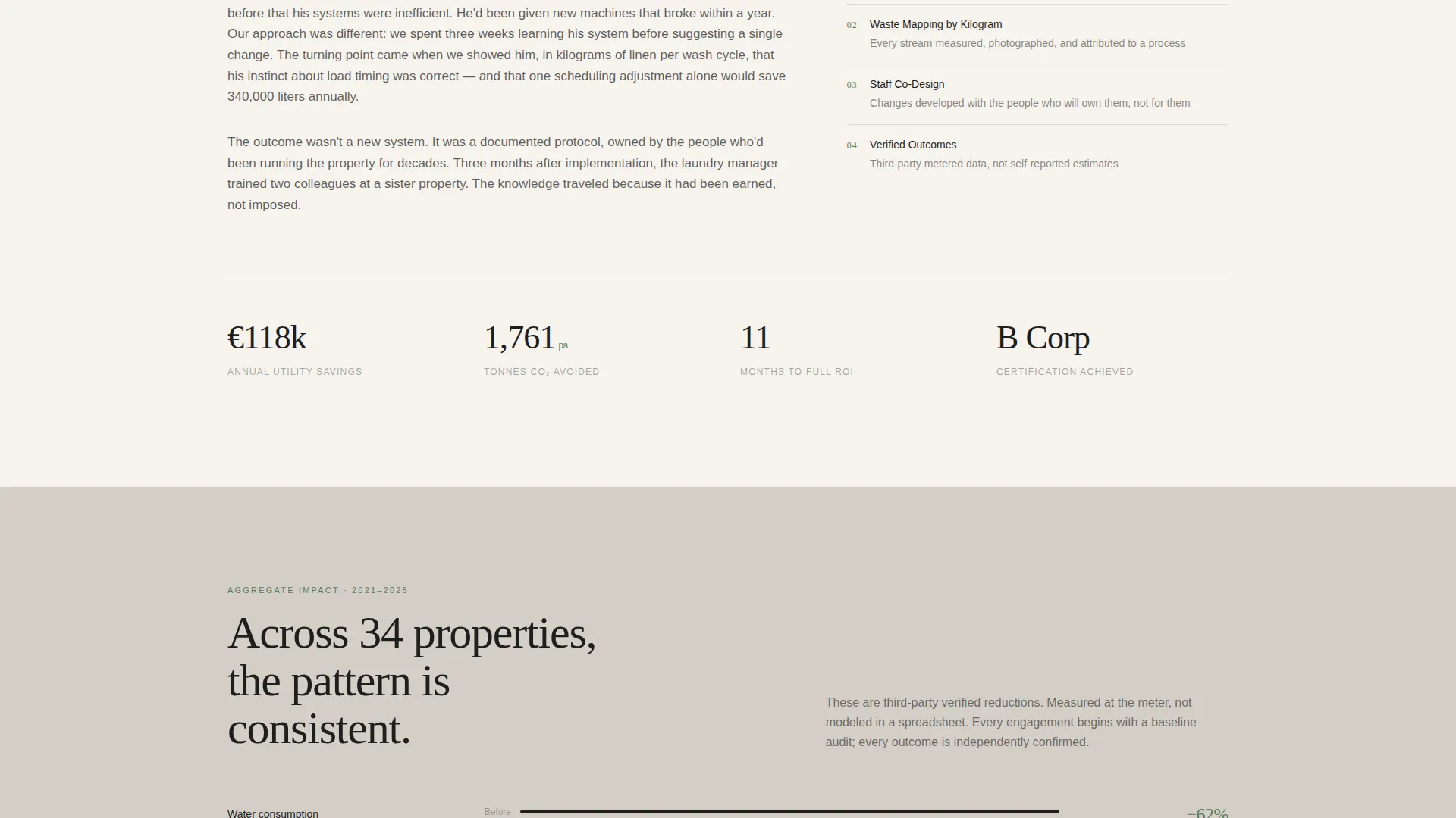
Each of the three case study sections is a self-contained editorial spread. It opens with a striking property image and a bold data statement, then unfolds through methodology, obstacles encountered, the turning point, and the final measurable result. The structure reads like longform journalism, not a features list.
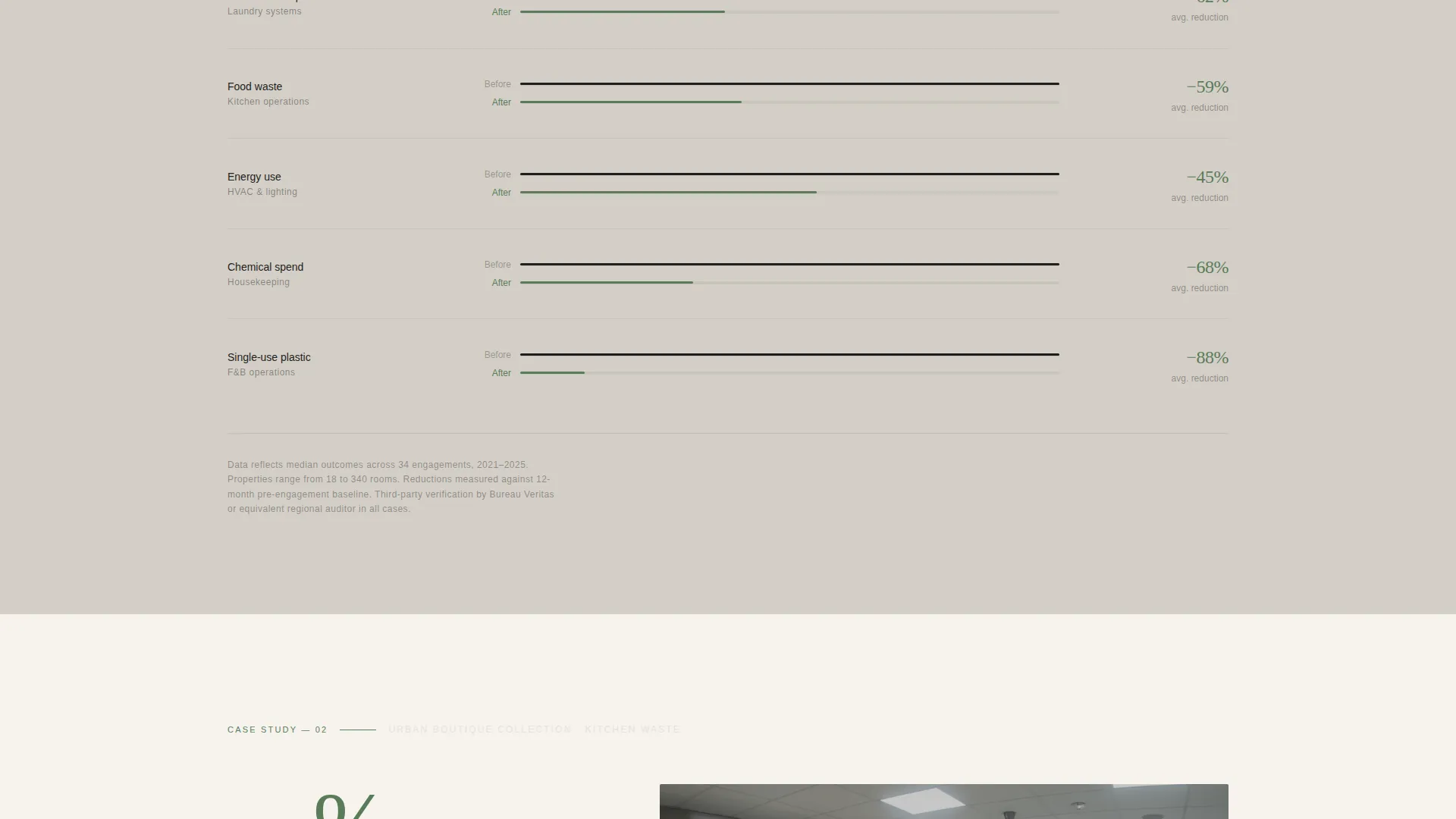
Full-Width Data Visualization Breaks
Between case study sections, full-width mist gray data panels act as editorial palette cleansers. These panels surface key metrics and statistics in a way that punctuates the narrative rhythm without interrupting the reading experience.
Staged Lead Generation call to action
The call to action appears twice, each time at a different commitment level. After the second case study it surfaces as a quiet text link. After the third it becomes a fixed bottom bar. This staged approach matches the visitor's growing confidence with a progressively firmer invitation.
Open-Question Audit Form
The lead capture form includes three fields: property name, number of rooms, and a single open text field asking what the visitor's biggest sustainability frustration is right now. That final field signals that the consultancy listens before it prescribes, which meaningfully increases form completion intent.
Editorial Typography and Color System
Large serif headlines, tracked-out display type, and alternating warm white and deep charcoal section backgrounds give the page a tactile, heavyweight-print quality. The single living-green accent color appears only in pull quotes, data highlights, and hover states, keeping the palette disciplined and intentional.
Page sections overview
| Section | Purpose |
|---|---|
| Full-Bleed Header | Sets editorial authority with a cinematic aerial photograph and a fading serif headline |
| Headline Introduction | Frames the consultancy's philosophy before the first case study |
| Case Study One | Opens with property image and bold water-reduction stat, then unfolds methodology and outcome |
| Data Visualization Break | Full-width mist gray panel surfacing key performance metrics between narratives |
| Case Study Two | Second editorial spread with resistance narrative, turning point, and measurable result |
| Quiet call to action Link | First lead generation prompt, appearing as an understated text link after case study two |
| Case Study Three | Third editorial spread completing the narrative arc with final proof of outcomes |
| Fixed Bottom Bar | Persistent audit request prompt that appears after the third case study |
| Audit Request Form | Three-field lead form including the open sustainability frustration question |
Design & branding system
The template uses a Cloud Canvas color palette built to feel like heavyweight uncoated paper stock. Every color choice is deliberate, and the single accent is used sparingly enough to carry meaning when it appears.
- Soft warm white (#F6F3EE), mist gray (#D4CFC7), deep editorial charcoal (#1E1E1E), and living green (#5A7C5A) form the complete palette
- Backgrounds alternate between warm white and charcoal to create dramatic section-level contrast without relying on decorative elements
- Large serif display typography is tracked out at magazine-cover scale, and mist gray holds sidebar data, captions, and supporting figures
Mobile & speed optimization
The editorial layout is built with responsive behavior in mind so the magazine-quality experience holds across screen sizes. The design structure supports clean rendering on smaller viewports without sacrificing its visual integrity.
- Full-bleed photographic sections and data visualization breaks are structured to reflow gracefully on mobile screen widths
- Typography sizing, spacing, and the fixed bottom bar call to action are designed to remain legible and functional on touch devices
- Section rhythm and scroll pacing are maintained across viewport sizes so the narrative still reads as intended on phones and tablets
How this template helps you convert
The conversion strategy in Steward is built on earned trust, not urgency. The page does not push the visitor toward a decision. It draws them toward one by demonstrating credibility at every scroll step.
- Longform case study narratives give decision-makers the evidence they need before they feel comfortable reaching out, reducing hesitation at the form stage.
- The staged call to action structure respects the visitor's reading pace and introduces the audit request only after two or three proof points have been established, which increases the relevance of the ask.
- The open-question form field invites the visitor to self-identify their primary challenge, which lowers the barrier to submission by making the form feel like the start of a conversation rather than a sales handoff.
Other information about this template
Steward is specifically matched to the hospitality sustainability consulting niche where the sales cycle is long and trust is the primary conversion driver. A few additional details about the template's context and use are worth noting.
- The template style is classified as Editorial Magazine and the creative direction is Case Study Narrative, making it well suited for practices that lead with documented results
- The header concept is Dark Full-Bleed with Glow, which produces a cinematic first impression appropriate for premium property clients
- The lead generation direction makes this template most effective for consultancies that offer an audit, assessment, or discovery engagement as their front-door offer
- The intersection of Professional Services, Hospitality Consulting, and sustainability storytelling makes this template relatively specialized; it is not a general-purpose agency or consulting template
Theme
Editorial Magazine
Creative direction
Case Study Narrative
Color system
Cloud Canvas
Style
Editorial/Magazine
Direction
Lead Generation
Page Sections
Dark Full-bleed Header with Ambient Glow
Case Study Narrative Scroll Sections
Full-width Data Visualization Breaks
Staged Lead Generation Call to Action
Open-question Audit Request Form
Editorial Typography and Color System
Related questions
Can I replace the case study content with my own client projects?
Who is this landing page template designed for?
What does the lead generation form collect?
Does the fixed bottom bar appear throughout the entire page?
Is this template suitable for a consultancy with a broad service offering?



