Vacation Rental Management Landing Page Template
Steward is a full-width, immersive landing page template built for boutique vacation rental management companies. It combines editorial photography, draggable before-and-after property reveals, and a transparent pricing table to guide second-home owners from curiosity to conversion. The warm stone palette and refined serif typography make every section feel considered, unhurried, and unmistakably premium.
by Rocket studio
Quick summary
Steward is a single-page landing template designed for vacation rental management companies. It opens with a golden-hour editorial hero, moves through draggable before-and-after property case studies, and closes with an inline assessment form and a three-tier pricing table. The page earns trust visually before asking for anything.
Who this template is for
This template is built for boutique property management companies that want to attract second-home owners as clients. It speaks directly to owners who purchased a lake house or coastal cottage expecting passive income but found the reality far more demanding.
- Vacation rental management companies pitching their services to property owners
- Boutique hospitality operators with a portfolio of styled, high-performing properties
- Property management professionals ready to move beyond generic listing sites and present a curated brand
What problem this template solves
Most property management landing pages look like spreadsheets with a logo on top. They list services without showing proof, quote percentages without showing results, and ask for a meeting before earning any trust. Owners scrolling these pages feel no different about their situation than when they arrived.
- Owners cannot visualize what professional management actually looks like for their specific property
- Generic pages fail to address the real pain: midnight guest messages, remote cleaner coordination, and empty peak-season calendars
- Visitors have no way to self-qualify before booking a call, which wastes time on both sides
What you get with this template
You get a fully structured, conversion-focused landing page that takes a visitor from emotional recognition to a filled-out inquiry form. Every section is purpose-built and sequenced to escalate from visual proof to financial proof.
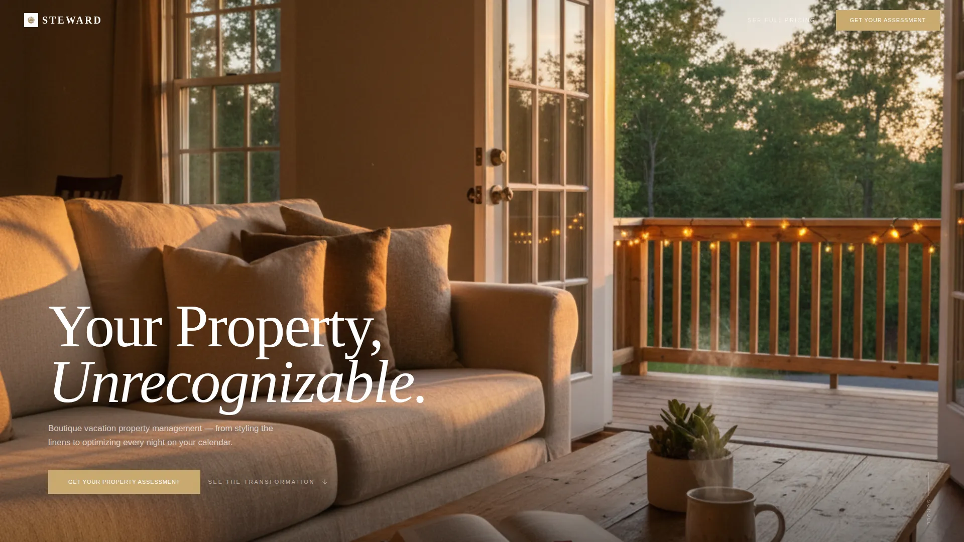
- A full-bleed editorial hero with a fade-in headline and no stock-photo polish
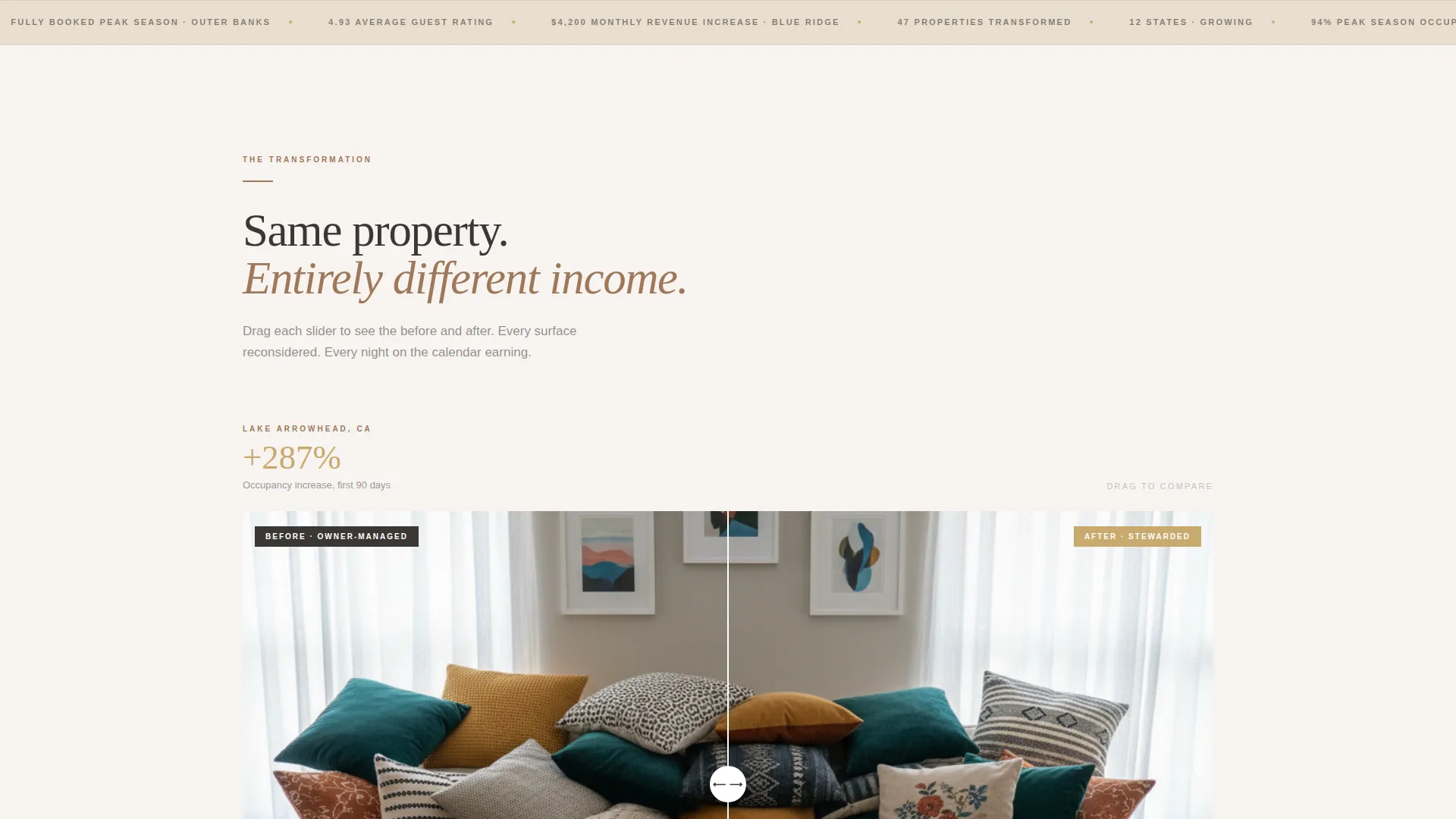
- Three draggable before-and-after property reveal sections with single-stat brass callouts
- An inline property assessment form, a sticky navigation bar, and a transparent three-tier management pricing table
Feature list
This template brings together a specific set of visual and structural components, each chosen to serve one goal: turning a skeptical property owner into a confident inquiry.
Editorial Hero Section
The header is a full-bleed photograph shot at golden hour from inside a vacation rental. The camera sits low from a linen sofa, looking through open French doors onto a string-lit porch. The headline "Your Property, Unrecognizable." fades in after a beat in a refined serif typeface, setting the emotional tone before a single word of copy is read.
Draggable Before-and-After Reveals
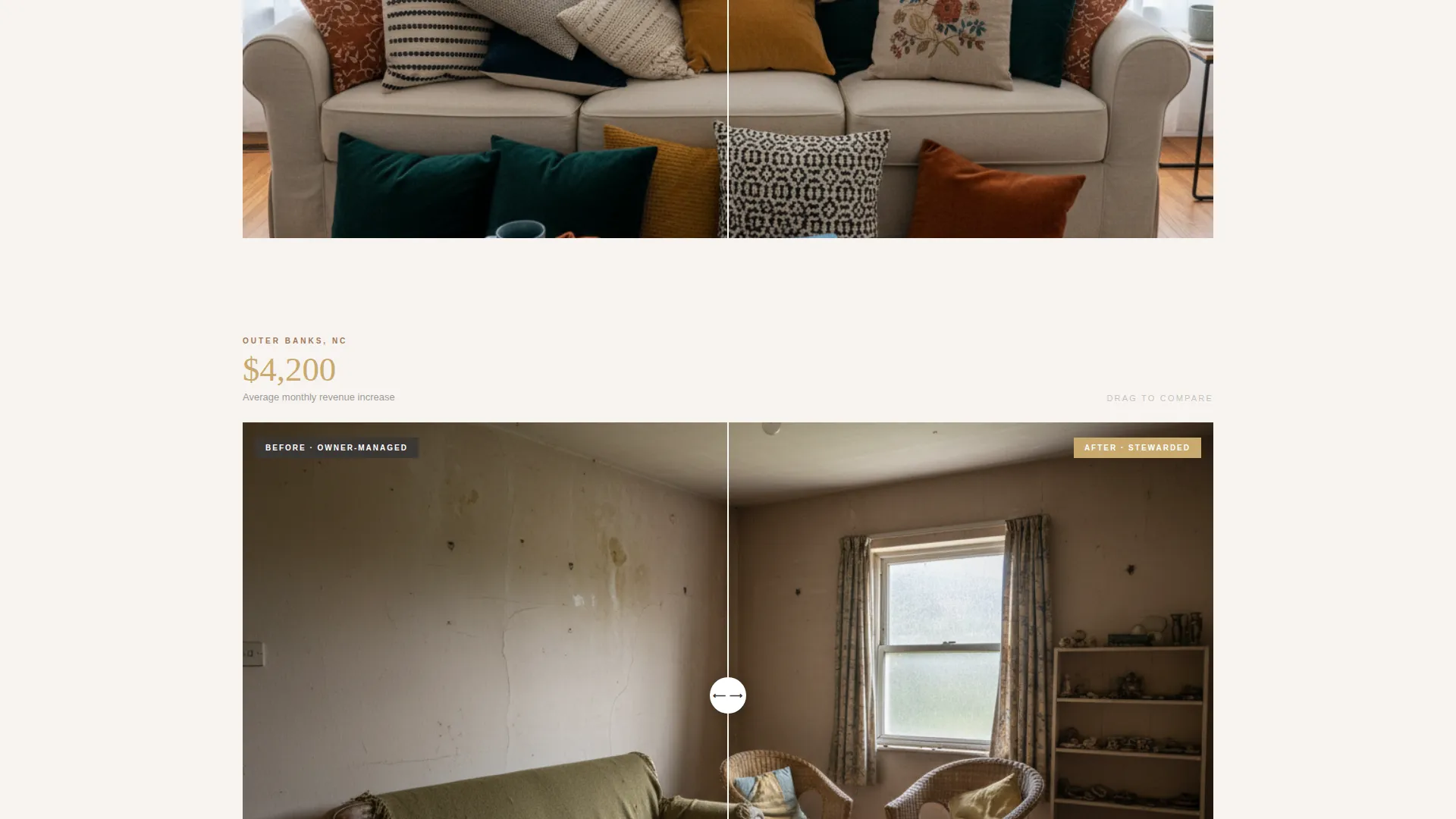
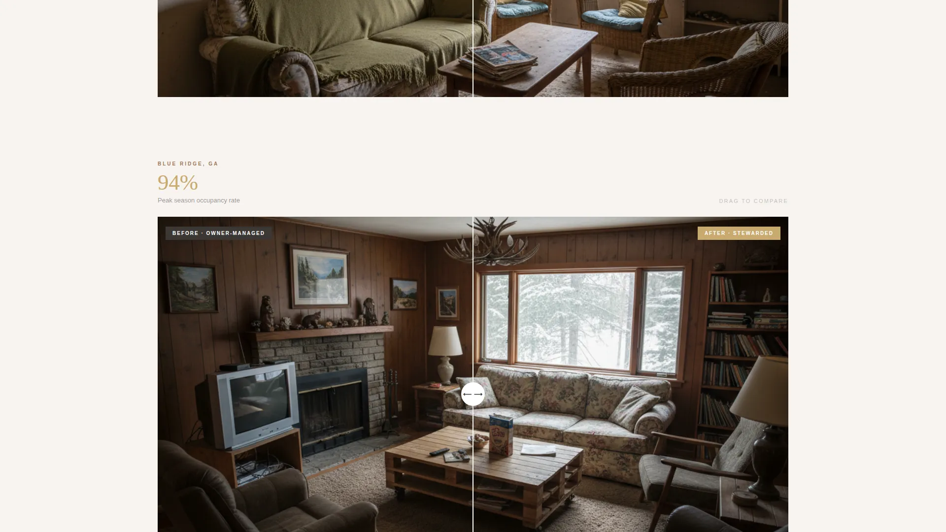
Three viewport-splitting property case studies each feature a draggable slider. The left side shows the owner-managed state: flat lighting, mismatched pillows, a generic welcome binder. The right side shows the stewarded result: styled, photographed, and fully booked. Visitors interact with the proof rather than just reading about it.
Single-Stat Brass Callouts
Between each before-and-after reveal, the page surfaces a single standout result in brushed brass typography against a clean background. Statements like "287% occupancy increase, Lake Arrowhead" communicate scale without cluttering the layout. These callouts act as visual punctuation between sections.
Inline Property Assessment Form
The primary call to action form appears right after the third before-and-after reveal, precisely when visitors are comparing their own property to what they have just seen. The form collects property location by region dropdown, number of bedrooms, current average monthly revenue with a "not sure" option, and an email address.
Transparent Three-Tier Pricing Table
A dedicated pricing section displays three management packages: Essentials, Signature, and Atelier. Each tier lists its monthly percentage and included services clearly, so visitors can self-select a fit before submitting the assessment form. The section is anchored to a "See Full Pricing" link in the sticky navigation.
Sticky Navigation with Dual calls to action
The navigation bar stays fixed at the top of the page during scrolling. It carries both the primary call to action, "Get Your Property Assessment," and the secondary anchor link, "See Full Pricing," giving visitors a consistent path forward at every scroll depth.
Page sections overview
| Section | Purpose |
|---|---|
| Editorial Hero | Opens with a golden-hour full-bleed photograph and a fade-in serif headline |
| Before/After Reveal One | Shows the first property transformation with a draggable slider |
| Stat Callout One | Surfaces a single brass-type occupancy result between reveals |
| Before/After Reveal Two | Demonstrates a second styled property transformation |
| Stat Callout Two | Highlights a financial result in brass typography |
| Before/After Reveal Three | Completes the visual proof sequence with a third property case study |
| Assessment Form | Inline form capturing location, bedrooms, revenue estimate, and email |
| Pricing Table | Three-tier package comparison with monthly percentages and services |
| Sticky Navigation | Persistent bar with dual calls to action anchored throughout the page scroll |
Design & branding system
The visual identity follows an Atelier Studio direction built on a warm stone color system. Every color and typographic choice is designed to feel tactile and unhurried rather than corporate or transactional.
- Color palette: sun-bleached limestone (#E8DFD0) for backgrounds, kiln-fired clay (#A0785A) for dividers and iconography, charcoal grout (#3B3735) for body text, and brushed brass (#C9A96E) reserved for buttons, toggles, hover states, and stat callouts
- Typography: a refined serif for headlines and display text, pairing editorial authority with the warmth of the stone palette
- Layout rhythm: backgrounds alternate between limestone and soft white, sections breathe with full-width photography punctuated by restrained single-stat moments
Mobile & speed optimization
The layout is structured so that the full narrative arc, from hero to pricing table, remains intact and readable on smaller screens. No section relies solely on wide-viewport behavior to communicate its point.
- The draggable before-and-after sliders are touch-compatible, allowing mobile visitors to interact with the property reveals by swiping
- The sticky navigation and its dual calls to action remain accessible throughout the mobile scroll experience
- The inline assessment form uses a dropdown region selector and simple fields that work naturally on touch devices
How this template helps you convert
The page is structured as a deliberate escalation from emotional resonance to rational confidence. Visitors are not asked to trust a claim; they are shown evidence repeatedly before they see a single form field.
- The editorial hero creates an immediate emotional response, making owners picture their own property transformed before they have read a word of the value proposition.
- Each before-and-after reveal followed by a brass stat callout layers visual proof with financial proof, so by the third reveal the visitor is already mentally comparing their own occupancy numbers.
- The inline assessment form appears at peak persuasion, and the transparent pricing table allows visitors to self-qualify their fit, removing friction from both the inquiry and the eventual sales conversation.
Other information about this template
This template is a strong fit for the vacation rental management niche within the broader real estate and property management category. It is purpose-built for a direct sales conversion goal, where the page must do the qualifying work that a human sales team would otherwise handle.
- The page type is a single-page landing experience, not a multi-page website, so all content flows in one continuous scroll
- The asymmetric grid layout and luxe minimal design direction keep the page feeling editorial rather than promotional
- The template suits operators whose service territory spans multiple regions, since the assessment form collects location data by region rather than requiring a specific address
- The warm stone color system and Atelier Studio theme position the management company as a design-led operator, which helps differentiate against commodity management platforms
Theme
Luxe Minimal
Creative direction
Calculator/Tool First
Color system
Cloud Canvas
Style
Asymmetric Grid (60/40)
Direction
Click-Through
Page Sections
Editorial Full-bleed Hero
Draggable Before-and-after Sliders
Brass Typography Stat Callouts
Inline Property Assessment Form
Transparent Three-tier Pricing Table
Sticky Dual-cta Navigation
Related questions
Can I update the before-and-after photos with my own property images?
How does the pricing table section work?
Is the assessment form connected to any booking or reservation system?
Can I change the color palette to match my existing brand?
Is this template suitable if I manage properties in multiple regions?



