Recruiting Agency | Free Website Template | Rocket
Steward is a split-screen landing page template built for nonprofit recruiting agencies. It pairs warm editorial design with a case study narrative structure, guiding executive directors and board chairs from recognition to action. The Slate and Sky color system, serif typography, and a slide-out lead generation form combine to create a page that feels personal, trustworthy, and ready to convert serious hiring inquiries.
by Rocket studio
Quick summary
Steward is a 50/50 split-screen landing page template for nonprofit staffing agencies. It uses a case study narrative structure to build trust through real hiring stories, escalating from a program hire to a full leadership transition. The goldenrod call-to-action anchors every section, and a slide-out form panel captures qualified leads without interrupting the reader's flow.
Who this template is for
This template is built for mission-driven recruiting agencies that place professionals inside nonprofit organizations. It speaks directly to the people doing the hiring, not the job seekers.
- Executive directors and board chairs who are mid-search and under pressure
- HR managers at family service organizations who have been let down by generic recruiters
- Nonprofit staffing agencies that want their landing page to feel like a trusted referral, not a sales pitch
What problem this template solves
Most recruiting agency pages look the same. They list services, show logos, and ask for a call. That approach fails with nonprofit leaders who need to feel understood before they share anything.
- Nonprofit hiring contacts need to see that an agency knows the difference between a program coordinator and a development officer
- Generic layouts break trust with mission-driven clients who have been burned before
- There is no clear narrative path that earns a lead form submission through story and proof
What you get with this template
This template delivers a full single-page layout structured to move a skeptical nonprofit leader from first impression to form submission. Every section is purposeful and sequenced.
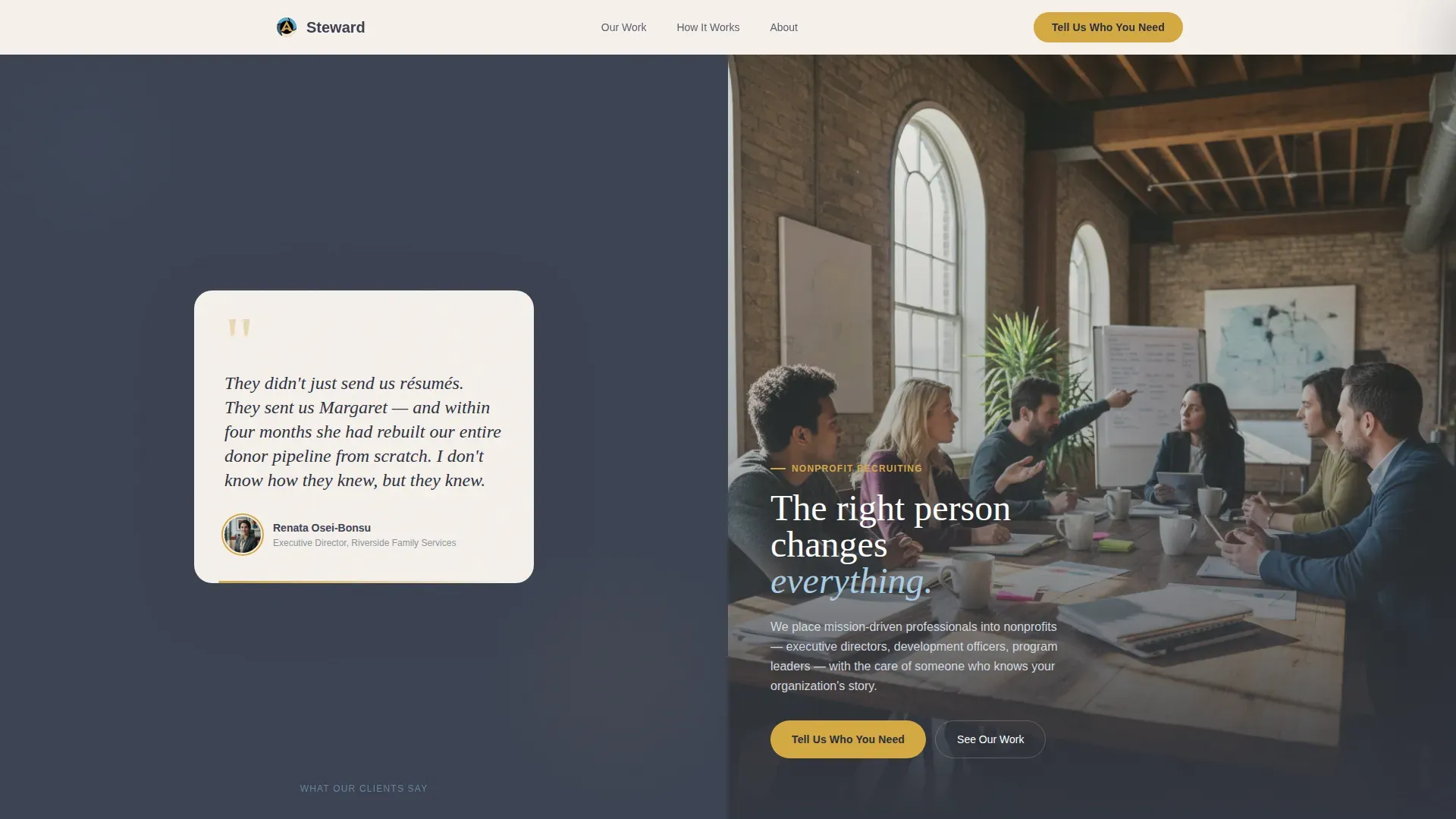
- A hero split with a testimonial card on the left and a warm team photograph on the right
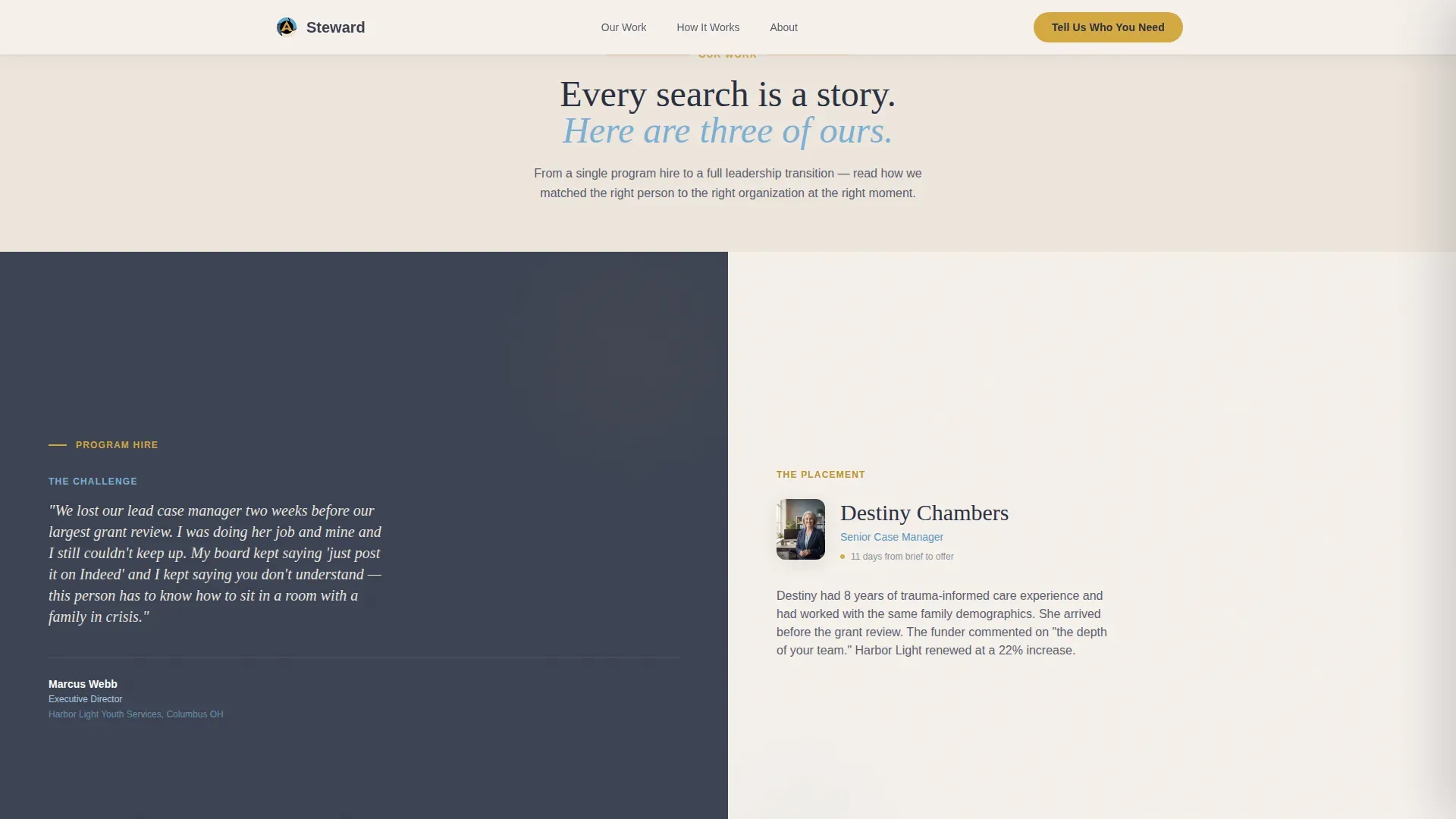
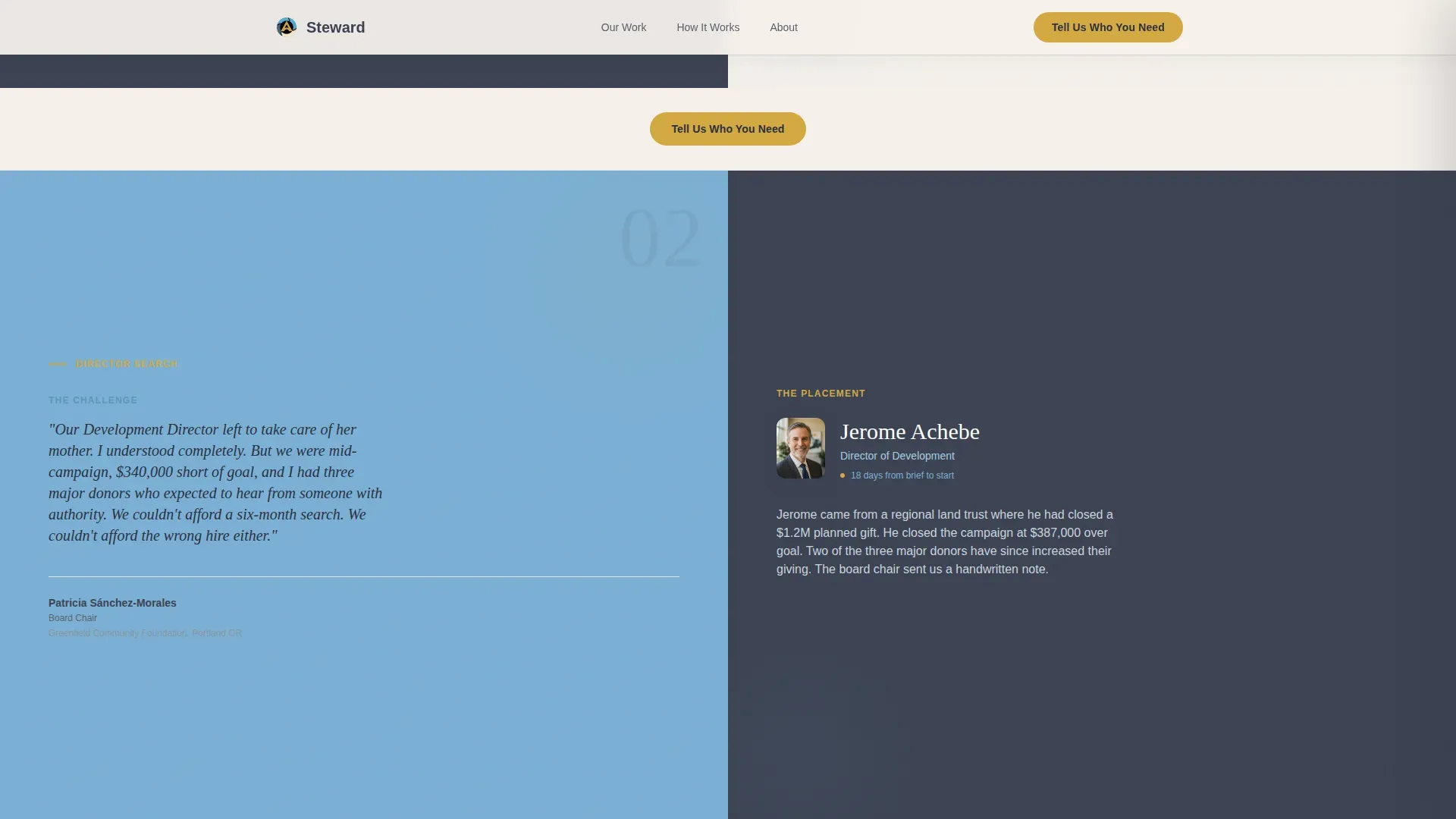
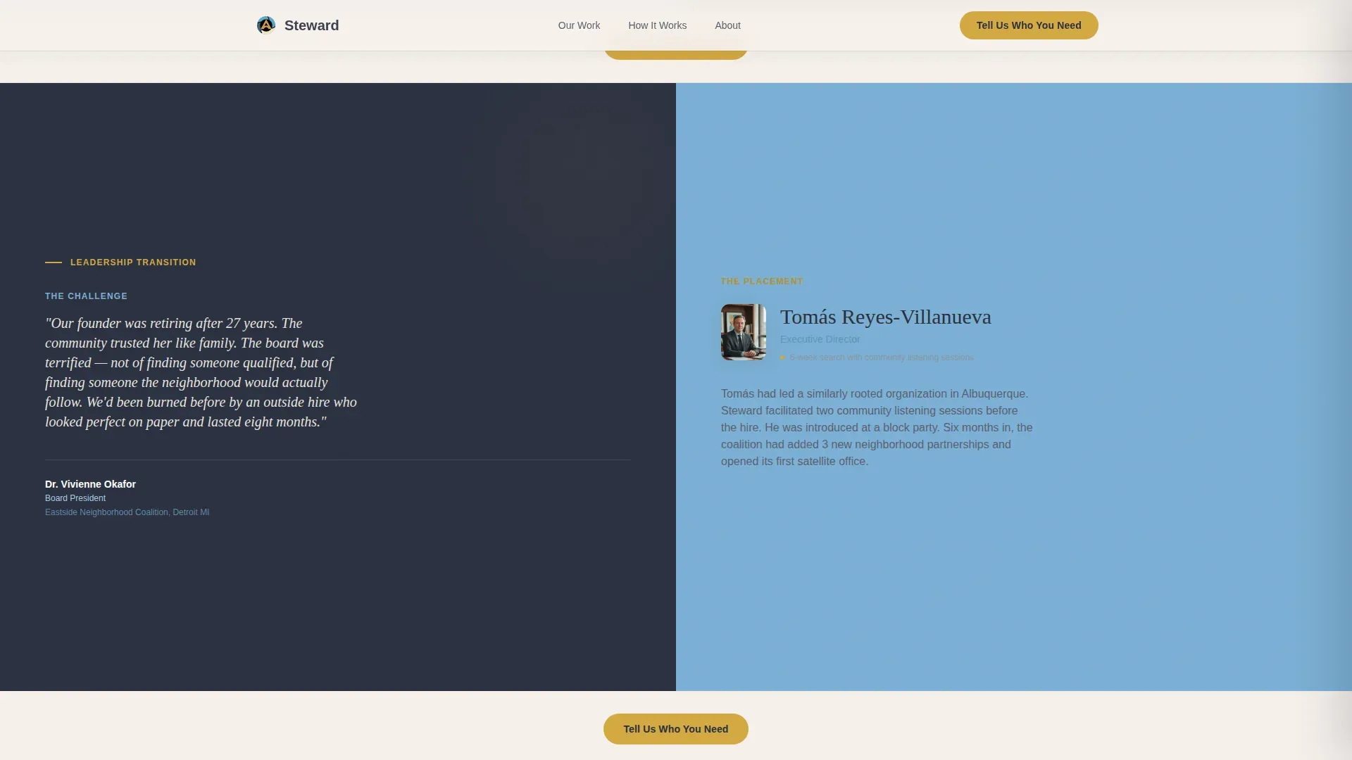
- Three escalating before-and-after case study sections that tell real placement stories
- A slide-out lead generation panel with a three-step sequential form and a secondary email capture path
Feature list
This template includes a focused set of design and interaction features drawn directly from the project brief.
Testimonial Card Hero
The hero section splits 50/50. The left half holds a softly shadowed testimonial card with a quote, name, title, and circular portrait set in a warm serif typeface. The right half displays a warm-toned candid photograph that feels editorial, not stock.
Escalating Case Study Narrative
Three scroll sections each split into a before-and-after story. The left side presents the nonprofit's challenge in the client's own voice, styled as a pull quote. The right side reveals the placement outcome, search timeline, and first-six-month impact.
Slide-Out Lead Generation Panel
The primary call-to-action, labeled "Tell Us Who You Need," opens a gentle slide-out panel. The form asks three sequential questions: organization name and mission, the role being hired for via dropdown, and a short open-text field describing what is not working right now.
Secondary Email Capture Path
A lower-commitment option labeled "Not Ready? Download Our Nonprofit Hiring Guide" captures visitor email addresses for nurture sequences. This gives the page two conversion paths without competing for attention.
Fixed Navigation Call-to-Action
The "Tell Us Who You Need" button stays fixed in the navigation bar throughout the entire scroll. Visitors can trigger the form at any point without scrolling back to the top.
Warm Editorial Design System
The Fraunces serif typeface handles all headings, giving the page a handwritten-recommendation warmth. DM Sans handles body text for clarity. Scroll reveals and staggered text animations add motion without distraction.
Page sections overview
| Section | Purpose |
|---|---|
| Hero Testimonial Split | Opens with social proof and a warm candid photograph to establish immediate trust |
| Program Hire Case Study | First before-and-after story showing a mid-campaign development officer placement |
| Director Search Case Study | Second story escalating to a director-level search with community trust at stake |
| Leadership Transition Case Study | Third story covering a full executive leadership transition and its six-month outcome |
| How We Work | Asymmetric editorial layout explaining the agency's matching process with warmth |
| Social Proof Stats | Placement statistics and additional named testimonials with titles |
| Lead Generation Call-to-Action | "Tell Us Who You Need" section anchoring the slide-out form panel |
| Footer Arc Split | Logo and tagline on the left, navigation links on the right |
Design & branding system
The visual identity uses a Slate and Sky color system built around four purposeful tones. Each color has a specific role and the palette stays disciplined throughout the layout.
- Deep charcoal slate (#3B4252) grounds all left-side panels, goldenrod (#D4A843) is reserved exclusively for buttons and hover states, and open-sky blue (#7BAFD4) accents right-side panels while warm parchment (#F5F0EB) softens backgrounds
- Fraunces serif handles all headings to create the feel of a handwritten recommendation; DM Sans handles body copy for clean, comfortable readability
- The overall visual direction is warm editorial with kitchen-table intimacy, referencing the look of a well-kept community center with framed photos and natural light
Mobile & speed optimization
The template is designed desktop-first, reflecting the reality that executive directors and board chairs typically research vendors at a desk. Mobile-responsive fallback is built in for all screen sizes.
- Interactive components, including the slide-out form panel, case study reveals, and hover states, use client-side rendering while static content uses server components for leaner page delivery
- Scroll reveal animations and staggered text are set to a medium intensity level, keeping motion purposeful without slowing the reading experience
- The fixed navigation call-to-action adapts gracefully across viewport sizes so the form trigger is always reachable
How this template helps you convert
Every structural decision in this template is oriented toward earning the lead form submission through demonstrated understanding, not through pressure.
- The three escalating case studies build a cumulative argument. Each story proves the agency understands a harder hiring challenge than the last, so by the third section the reader feels seen rather than sold to.
- The slide-out form panel asks only three focused questions in sequence, lowering friction for a busy executive director who has limited time and limited tolerance for forms that feel like intake paperwork.
- The secondary download path captures visitors who are not yet ready to submit, keeping them inside a nurture relationship rather than losing them entirely.
Other information about this template
This template is built using Next.js with a clear separation between server-rendered static sections and client-rendered interactive components. It is localized for the United States market in English.
- The footer follows Pattern 7, an Arc Browser-style split with the agency logo and tagline on the left and navigation links on the right
- The template is categorized under HR and Hiring, specifically within the Nonprofit HR subcategory, targeting the nonprofit recruiting agency niche
- Animation intensity is set to medium throughout, using scroll reveals and staggered text entry to add editorial rhythm without overwhelming the content
- The color system, typography pairing, and section sequencing are all designed to support the Family First theme and reflect the warmth of a community-rooted organization
Theme
Family First
Creative direction
Case Study Narrative
Color system
Slate & Sky
Style
Split Screen (50/50)
Direction
Lead Generation
Page Sections
Testimonial Card Hero Split
Three Escalating Case Study Sections
Slide-out Lead Generation Panel
Secondary Email Capture Path
Fixed Navigation Call-to-action
Warm Editorial Animation System
Related questions
Who is this landing page template designed for?
What does the lead generation form ask visitors?
How many case study sections does this template include?
Can this template support two different conversion goals at once?
What typography and colors does this template use?


