Fridge Art Subscription Box Landing Page Template
Stick is a masonry-style landing page template built for a monthly fridge art subscription box. It features a live-filtering search grid, a Flash Deal countdown banner, tiered subscription cards with bounce animations, and a billing toggle, all wrapped in a dopamine-pop gradient palette that makes browsing past and current box contents feel like unwrapping a gift.
by Rocket studio
Quick summary
Stick is a single-page subscription landing page for a monthly magnet and fridge art box. It uses a masonry grid filtered by real-time search, a countdown-driven Flash Deal banner, and animated tier cards to guide visitors from casual browsing to committed checkout. The soft gradient palette keeps the whole page feeling playful and warm.
Who this template is for
This template is built for independent art subscription brands that ship physical, collectible pieces to subscribers each month. It suits sellers who want to show off their product catalog visually before asking for a commitment.
- Creators launching a monthly magnet or miniature art print subscription box
- Gift-focused brands targeting shoppers who want something delightful under fifteen dollars
- Teachers or community organizers offering reward-based gifting subscriptions
What problem this template solves
Most subscription landing pages lead with pricing before visitors understand what they are actually buying. Stick flips that. It lets browsers explore the catalog first through search and the masonry grid, so by the time they reach a price card they already want what is inside.
- Visitors leave when they cannot visualize the product before committing
- Generic subscription pages treat all visitors the same, ignoring returning subscribers
- A single price card creates no urgency and no reason to upgrade
What you get with this template
You get a fully designed, single-page layout that handles the complete subscriber journey from discovery to checkout decision. Every major conversion moment is built in and visually distinct.
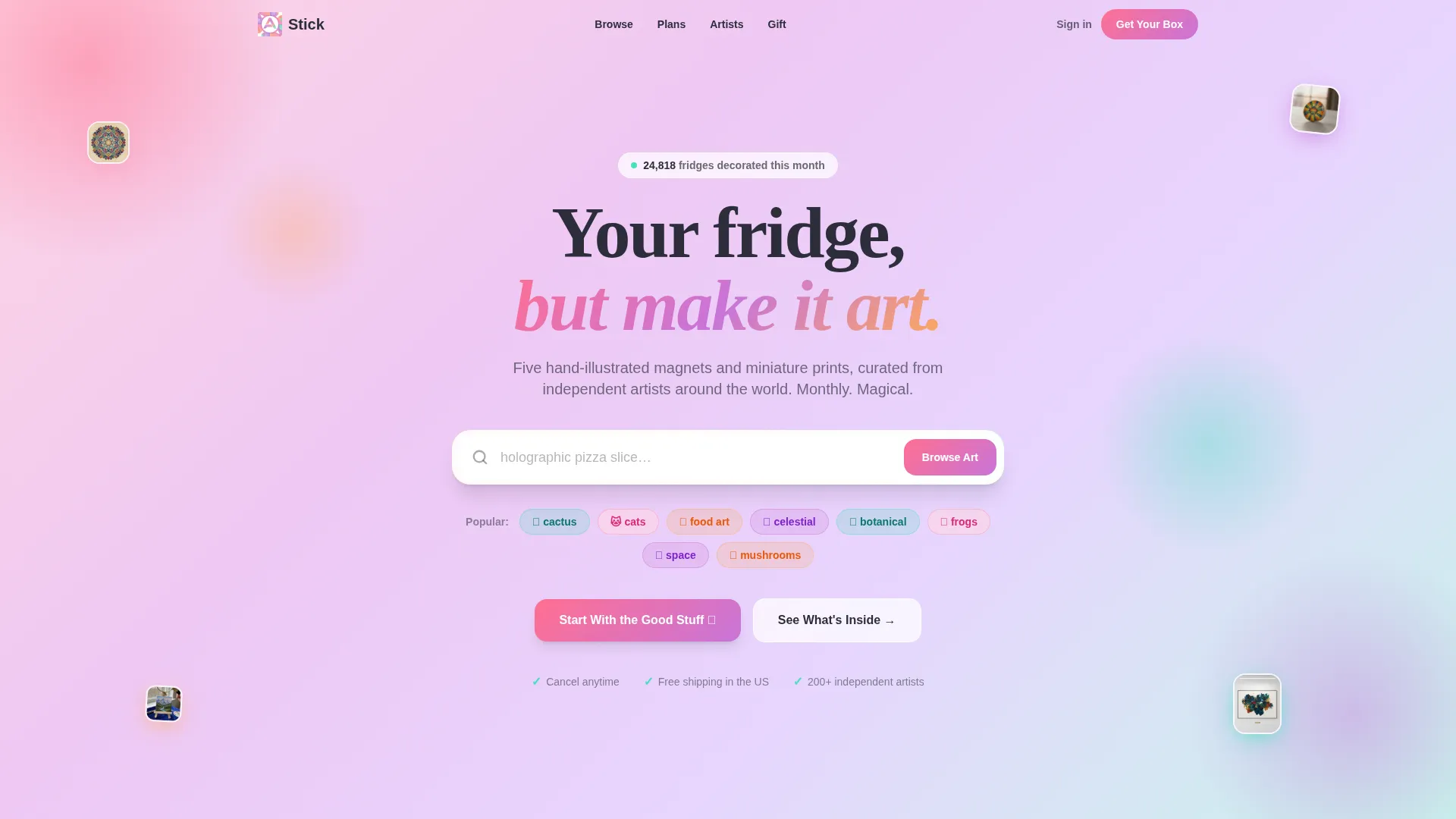
- A candy-colored search header with cycling placeholder text and real-time masonry grid filtering
- A sticky Flash Deal banner with countdown timer and escalating tier cards that animate into view
- A billing toggle, a gift send option, and returning-subscriber upgrade states baked into the layout
Feature list
This template packs a focused set of interactive and visual components. Each one is designed to serve a specific moment in the subscription decision journey.
Live-Filtering Search Grid
A large, rounded search field sits at the top of the page with placeholder text that cycles through product examples. Typing in the field filters the masonry grid below in real time, letting visitors browse current and past box contents like a visual catalog before a price is shown.
Masonry Product Grid
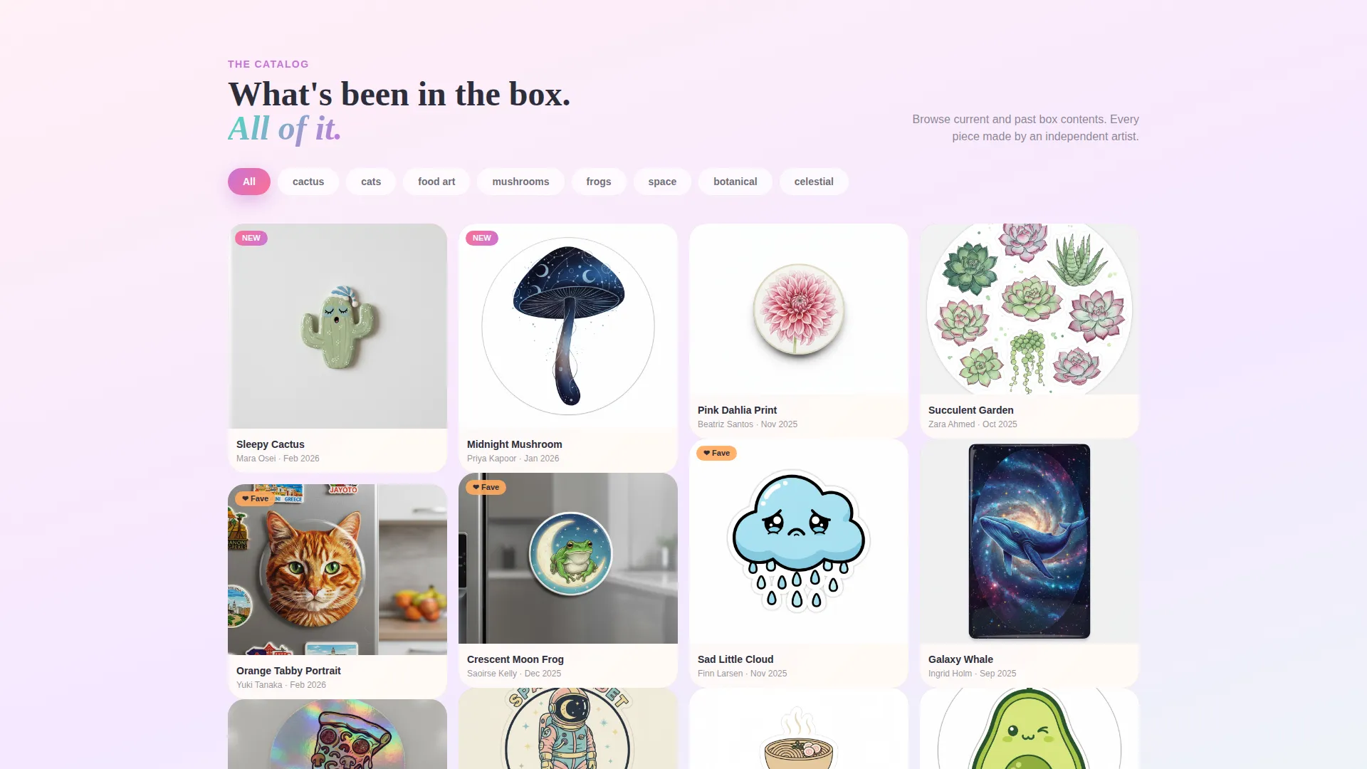
The grid displays each piece as a close-up photograph of a magnet or print on an actual fridge. Cards are tightly cropped and saturated. Every card carries a faint gradient border that shifts hue on hover, giving the whole grid a shimmering, sticker-sheet quality.
Flash Deal Countdown Banner
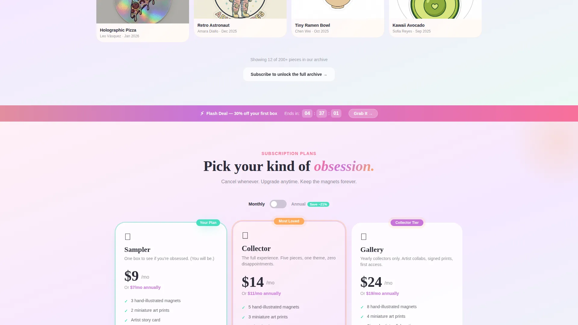
A sticky banner sits immediately below the search grid and pulses with a live countdown timer. The current subscriber tier is discounted for a limited window. As visitors scroll, deal tiers escalate from a single-box sampler up to a yearly collector tier, with the savings percentage growing visibly larger.
Animated Subscription Tier Cards
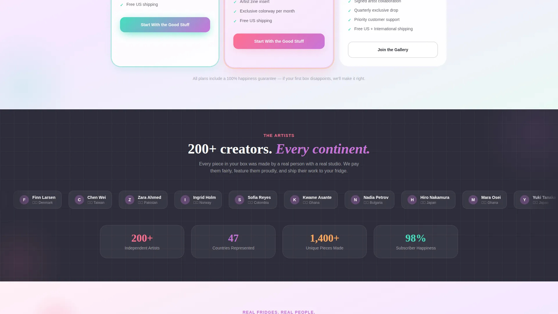
Each pricing tier animates into view with a slight bounce as the visitor scrolls. The entry tier shows a "Start With the Good Stuff" call to action for new visitors. Returning subscribers see their current plan softly highlighted, while the next tier up carries a tangerine "Most Loved" badge and an "Upgrade My Box" call to action.
Monthly and Annual Billing Toggle
A single toggle lets shoppers switch between monthly and annual billing. The annual discount is displayed as a crossed-out monthly price so the saving is immediately obvious without extra explanation.
Gift Send Option
A secondary conversion path invites visitors to send a box to someone else. A single field for the recipient's name makes the commitment feel personal before asking for an address, lowering the friction of gift checkout.
Page sections overview
| Section | Purpose |
|---|---|
| Gradient search header | Centers the live search field and pastel tag pills on a pink-to-lilac wash |
| Popular tags row | Floats pastel pill filters below the search field for quick catalog browsing |
| Masonry product grid | Displays box contents as tight fridge photographs with hover gradient borders |
| Flash Deal banner | Sticky countdown strip that announces the time-limited tier discount |
| Sampler tier card | Entry-level offer card with new-visitor call to action |
| Three-month tier card | Mid-tier subscription card with escalating savings badge |
| Yearly collector card | Top-tier card with exclusive artist collaboration callout and largest savings |
| Billing toggle row | Switches all tier cards between monthly and annual pricing display |
| Gift send section | Single recipient name field introducing the gift checkout path |
Design & branding system
The visual identity follows a Soft Gradient theme built on a dopamine-pop color system. Backgrounds wash slowly between sherbet pink and electric lilac like melted sorbet on a warm surface. Every accent has a clear job so the palette stays readable.
- Sherbet pink (#FF6F91) and electric lilac (#C874D9) form the background gradient wash; sunny tangerine (#FFAA5C) handles price badges, countdown timers, and hover states
- Mint (#45DFBF) marks confirmation buttons and trust badges to visually separate action moments from browsing moments
- All body text sits in soft charcoal (#2D2D3A) so the candy palette never trades readability for decoration
Mobile & speed optimization
The template is designed so the masonry grid, sticky banner, and tier cards all remain usable on small screens. Vertical scrolling on mobile follows the same dopamine-ladder structure as desktop.
- Masonry columns reflow to a single or double column on narrow viewports so product cards stay thumb-friendly
- The sticky Flash Deal banner remains visible during scroll on mobile so the countdown timer and discount are never out of reach
- Tier cards stack vertically on small screens, keeping the bounce animation and badge visibility intact
How this template helps you convert
Stick layers multiple conversion moments across a single scroll, each one building on the last. The structure mirrors the emotional arc of opening a package: curiosity first, delight in the middle, and a clear decision at the end.
- The search grid and masonry catalog build desire before any price appears, so visitors arrive at the tier cards already engaged with the product
- The Flash Deal countdown and escalating savings percentages create time-sensitive motivation that grows stronger the further a visitor scrolls
- The gift send option and the returning-subscriber upgrade state capture two additional buyer types without adding a second page or a separate flow
Other information about this template
This template is categorized under Retail and E-Commerce, specifically within the magnets and fridge art subscription niche. It uses an Overlap and Layered template style, meaning foreground cards visually rest on top of gradient wash backgrounds for a dimensional, tactile feel. The creative direction is Flash Deal, which means urgency and escalating value are structural features of the layout rather than optional additions. The header concept draws from an App Store Preview style, presenting product content upfront so visitors can evaluate quality before committing. The color system is built on a Cloud Canvas base elevated by the dopamine-pop accent colors described in the design section.
- Built for single-page, section-led subscription flows in the fridge art and collectible magnet category
- Overlap and Layered style gives cards a physical, gift-like depth that matches the unboxing feel of the brand
- Flash Deal creative direction makes time-limited pricing a core structural feature, not an afterthought
Theme
Soft Gradient
Creative direction
Flash Deal
Color system
Cloud Canvas
Style
Overlap/Layered
Direction
Marketplace/Multi
Page Sections
Live-filtering Search and Masonry Grid
Flash Deal Countdown Banner
Animated Subscription Tier Cards
Monthly and Annual Billing Toggle
Gift Send Option
Dopamine-pop Gradient Visual System
Related questions
Can new visitors and existing subscribers both use this same landing page?
Does the search field actually filter the product grid?
What subscription tiers does the template include?
Is a gift purchase option included in the layout?
Can I show both monthly and annual pricing without building two separate pages?



