Horse & Equestrian Reviews Website Template
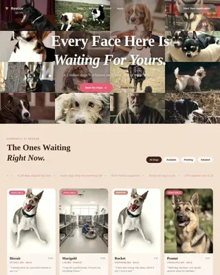
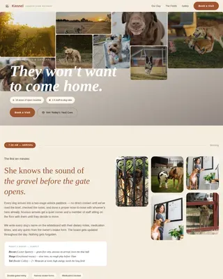
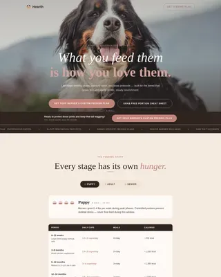
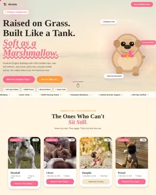
Stirrup is a single-column equestrian center landing page built around warmth, trust, and real family stories. It opens with a bold review score, unfolds through a scrolling testimonial mosaic, and leads visitors into a gentle lead-capture form. The Citrus Burst color palette and Family First theme make every section feel lived-in, sun-warmed, and genuinely welcoming.
by Rocket studio
Quick summary
Stirrup is a heartwarming equestrian center landing page designed for family-oriented riding programs. It leads with social proof, builds trust through layered family testimonials, and closes with a low-pressure lead generation form. The Citrus Burst palette and single-column scroll make the page feel as inviting as a Saturday morning at the barn.
Who this template is for
This template is built for equestrian centers that serve families, beginners, and community riders. It works especially well when the center's real strength is its people and its horses, not its facilities.
- Equestrian centers offering lessons for children, teens, and adult beginners
- Riding programs serving homeschool families, suburban parents, and gift-givers
- Barn owners who rely on word-of-mouth and want that warmth reflected online
What problem this template solves
Most equestrian centers struggle to translate their barn's atmosphere into a webpage. Photos alone don't capture what it feels like to watch a nervous child bond with a horse for the first time. Stirrup solves this by leading with voices, not images.
- Visitors leave before trusting the center because the page feels cold or generic
- Gift-buyers and new families can't picture themselves there without a story to hold onto
- Lead forms feel abrupt when visitors haven't been warmed up first
What you get with this template
You get a complete, ready-to-customize single-column landing page structured around social proof and story-first design. Every section has a clear job, and the layout guides visitors from curiosity to commitment without pressure.
- A review score header, scrolling testimonial mosaic, facility reveal, and a multi-step lead form
- A sticky mobile button for gift lesson bookings with a name, email, and delivery date picker
- A full Citrus Burst design system with tangerine, clementine, stable white, and saddle brown applied consistently across all sections
Feature list
This landing page includes a focused set of built-in components designed to convert warm, community-minded visitors into booked riders.
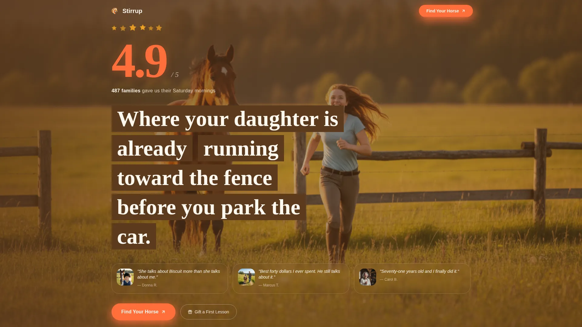
Display-Scale Review Score Header
The page opens with a hand-drawn-style 4.9 score rendered at display scale in clementine orange. A constellation of tiny gold stars drifts softly on load. Below the number, a trust line reads "487 families exposed to the review score," followed by three thumbnail family portraits with one-sentence quote fragments.
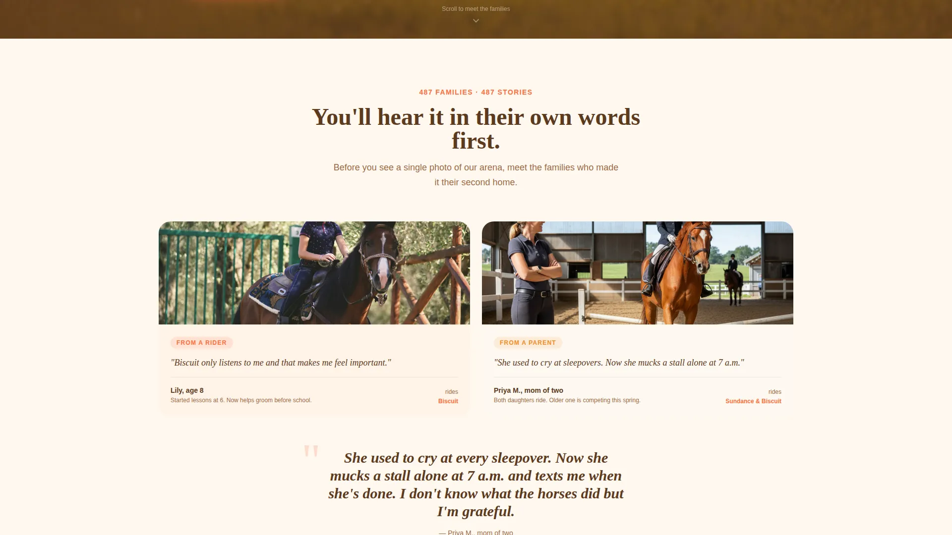
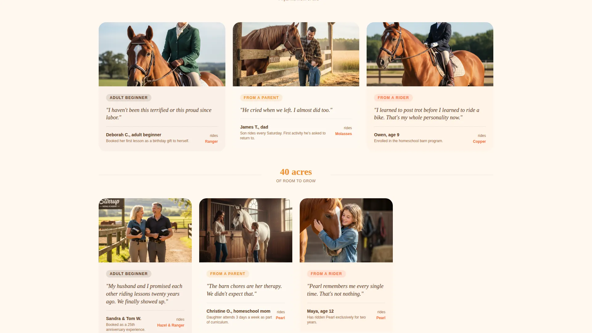
Scrolling Testimonial Mosaic
Rather than a carousel, the page builds a living wall of family voices as the visitor scrolls. Quotes from children, parents, and adult beginners appear first, then each family's photo, horse name, and journey detail follow. The mosaic grows from two columns to three, then four, building a chorus of real stories.
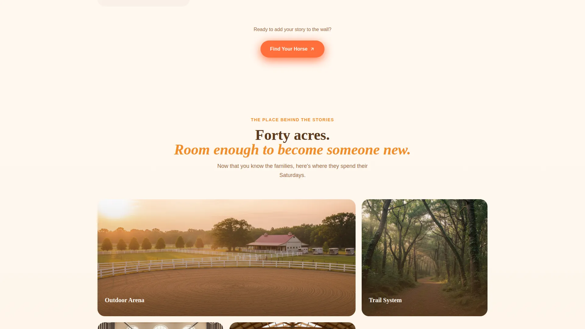
Story-First Facility Reveal
Arena and trail photos appear only after the testimonial mosaic has done its work. By the time visitors see the physical space, they already feel emotionally connected to the center. The reveal feels earned rather than promotional.
Multi-Step Lead Generation Form
The "Find Your Horse" form asks rider type first (child, teen, adult, or family group), then experience level, then preferred days. Name and email come last. This order mirrors how families naturally think about starting riding lessons and lowers drop-off at the form stage.
Sticky Gift Lesson Button
On mobile, a secondary call-to-action labeled "Gift a First Lesson" floats persistently for grandparents and gift-givers. It links to a simplified capture form with name, email, and a delivery date picker, keeping the gifting path frictionless.
Citrus Burst Color System
Tangerine gradients wash section backgrounds. Clementine fires up buttons and star ratings. Stable white creates breathing room between testimonial blocks. Saddle brown anchors every headline with the weight of worn leather.
Page sections overview
| Section | Purpose |
|---|---|
| Review Score Header | Opens with social proof and three family portrait teasers |
| Testimonial Mosaic | Builds trust through layered family voices and horse stories |
| Facility Photo Reveal | Shows the arena and trails after emotional connection is established |
| Find Your Horse Form | Captures rider type, experience, schedule, name, and email |
| Gift a First Lesson | Sticky mobile button linking to a simplified gift-booking capture |
Design & branding system
The Citrus Burst color system gives Stirrup a warm, energetic identity that feels personal rather than corporate. Every color choice connects back to a real sensory detail from barn life.
- Sun-warmed tangerine (#F28C28) and fresh clementine (#FF6F3C) carry the energy of outdoor riding on a bright morning
- Creamy stable white (#FFF8F0) provides generous spacing between testimonial blocks so each story can breathe
- Deep saddle brown (#5C3A1E) anchors headlines and grounding elements with the solidity of well-worn tack
Mobile & speed optimization
The single-column flow was designed to perform cleanly on mobile from the ground up. The sticky gift lesson button and the progressive form layout both reflect deliberate mobile-first thinking.
- Sticky "Gift a First Lesson" button stays accessible on mobile without interrupting the main scroll path
- Single-column layout keeps the reading order logical and the tap targets comfortable on small screens
- The multi-step form breaks a longer question set into simple, one-at-a-time steps that feel easy on any device
How this template helps you convert
Stirrup is structured to reduce hesitation at every stage of the visitor journey. The page earns trust before it asks for anything.
- The review score and family portraits establish credibility in the first five seconds, before a visitor has read a single word of marketing copy.
- The testimonial mosaic replaces sales language with real family voices, so visitors self-identify with someone already riding at the center.
- The "Find Your Horse" form sequences questions in the order a family naturally thinks, making the final name-and-email step feel like a natural next move rather than a demand.
Other information about this template
Stirrup was built specifically for the equestrian center niche within the broader pet and animal category. It reflects the horse and equestrian subcategory's unique emotional selling environment, where trust and community matter far more than facility specs.
- Template style: Single Column Flow, optimized for a top-to-bottom storytelling scroll
- Theme: Family First, centered on the relationships between riders, horses, and families
- Creative direction: Testimonial Mosaic, a wall of voices that grows more convincing as visitors scroll
- Header concept: Review Score, using aggregate social proof as the very first impression
- Landing page direction: Lead Generation, with two capture paths covering first-time riders and gift-givers
- Best used by equestrian centers, riding academies, and barn programs that serve multigenerational family audiences
Theme
Family First
Creative direction
Testimonial Mosaic
Color system
Citrus Burst
Style
Single Column Flow
Direction
Lead Generation
Page Sections
Display-scale Review Score Header
Scrolling Testimonial Mosaic
Story-first Facility Reveal
Multi-step Lead Generation Form
Sticky Gift Lesson Button
Related questions
Can I customize the testimonial content and family photos?
How does the two-path lead capture work?
Is this template suitable for a center that also offers adult lessons?
Can I change the color palette to match my existing brand?
Does this template work if I only want to promote one type of lesson?