Aprons & Kitchen Textiles Store Pricing & Packages Website Template
Stitch is a scroll-reveal landing page template built for artisan kitchen textile subscription boxes. It guides visitors through a progressive unboxing experience, section by section, building anticipation before the upgrade call to action appears. The design draws from a Neo-Retro ink-and-paper palette, blending warm cream, letterpress black, and faded red into a tactile, analog-feeling layout that converts browsers into full-tier subscribers.
by Rocket studio
Quick summary
Stitch is a single-page, scroll-reveal landing page template for kitchen textile subscription boxes. It unfolds like an unboxing, revealing each product detail as the visitor scrolls. A persistent countdown bar and a low-friction upgrade toggle push existing basic-tier subscribers toward the full box. The aesthetic is warm, handcrafted, and deliberately deliberate.
Who this template is for
This template is built for artisan product brands that sell through a subscription model. It fits sellers whose products carry a story, and whose buyers respond to craft, provenance, and limited availability.
- Subscription box operators selling hand-screened aprons, printed tea towels, and handcrafted pot holders
- Independent makers and curators targeting home cooks, weekend hosts, and thoughtful gift-givers
- Existing box brands running an upsell campaign to move basic-tier subscribers into a full kitchen set plan
What problem this template solves
Most subscription landing pages show everything at once and overwhelm visitors before they feel the value. Stitch solves that by withholding content deliberately, releasing each product reveal only as the visitor scrolls deeper. The result is a page that earns attention rather than demanding it.
- Subscribers who already own the basic tier need a reason to upgrade, not just a price comparison
- Gift-givers need a secondary path that feels considered, not bolted on as an afterthought
- Scarcity needs to feel earned and real, not manufactured by a generic countdown widget
What you get with this template
You get a complete, ready-to-customize landing page structured around a progressive scroll reveal. Every section is designed to serve a specific moment in the visitor's decision journey, from first impression to upgrade confirmation.
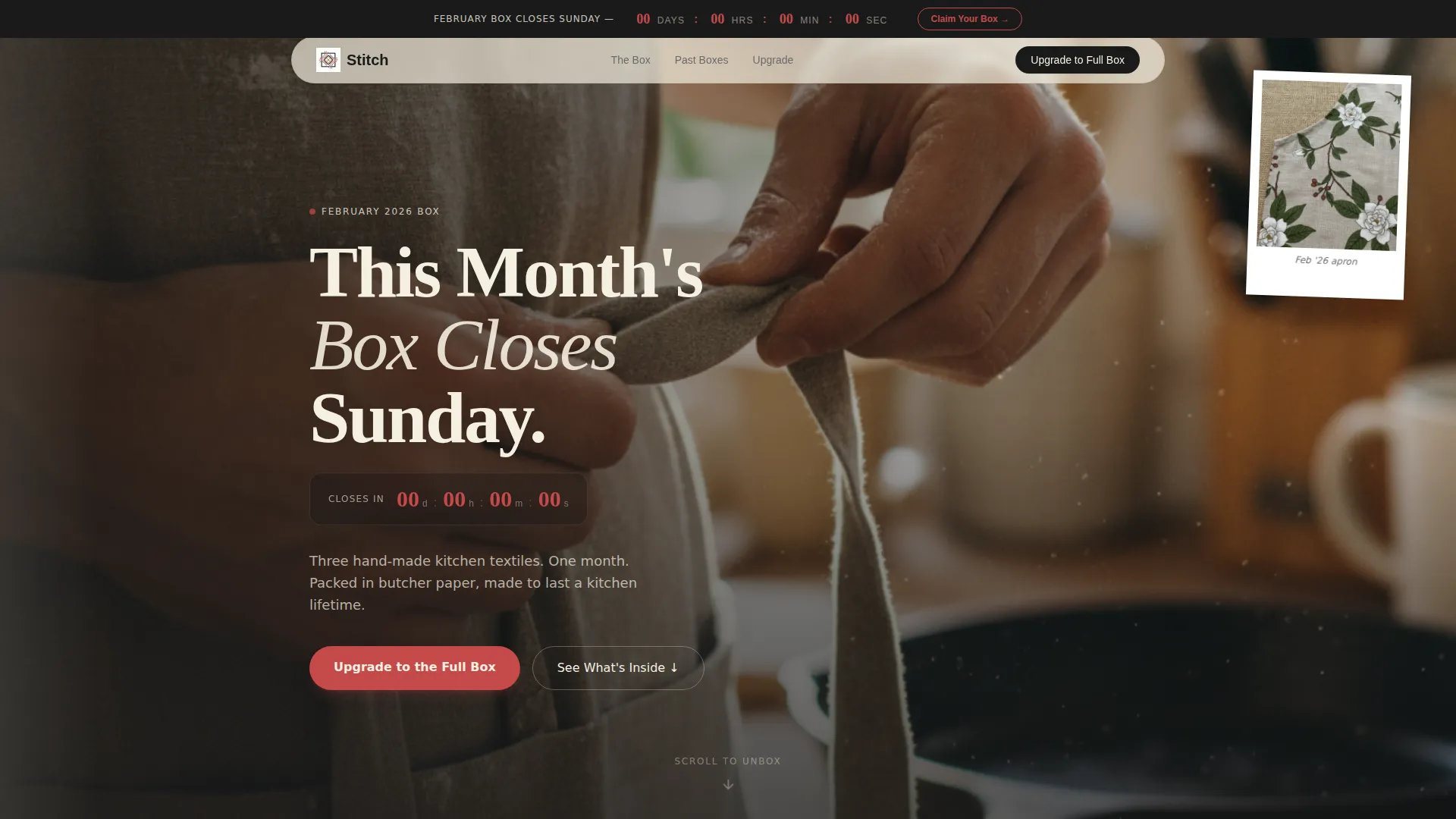
- A Polaroid-style lifestyle hero header with a real-time ticking countdown overlaid in faded red
- Three sequential product reveal sections, each loading on scroll to mimic peeling back tissue paper
- A side-by-side comparison strip, an upgrade toggle form, and a secondary gift path built into the layout
Feature list
This template includes purpose-built components for subscription upsell flows and artisan product storytelling.
Scroll-Reveal Unboxing Sections
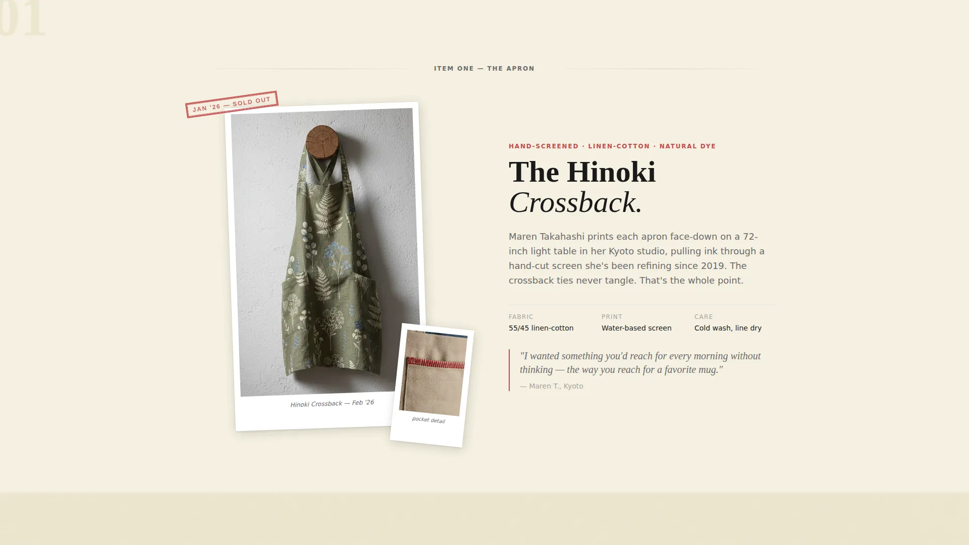
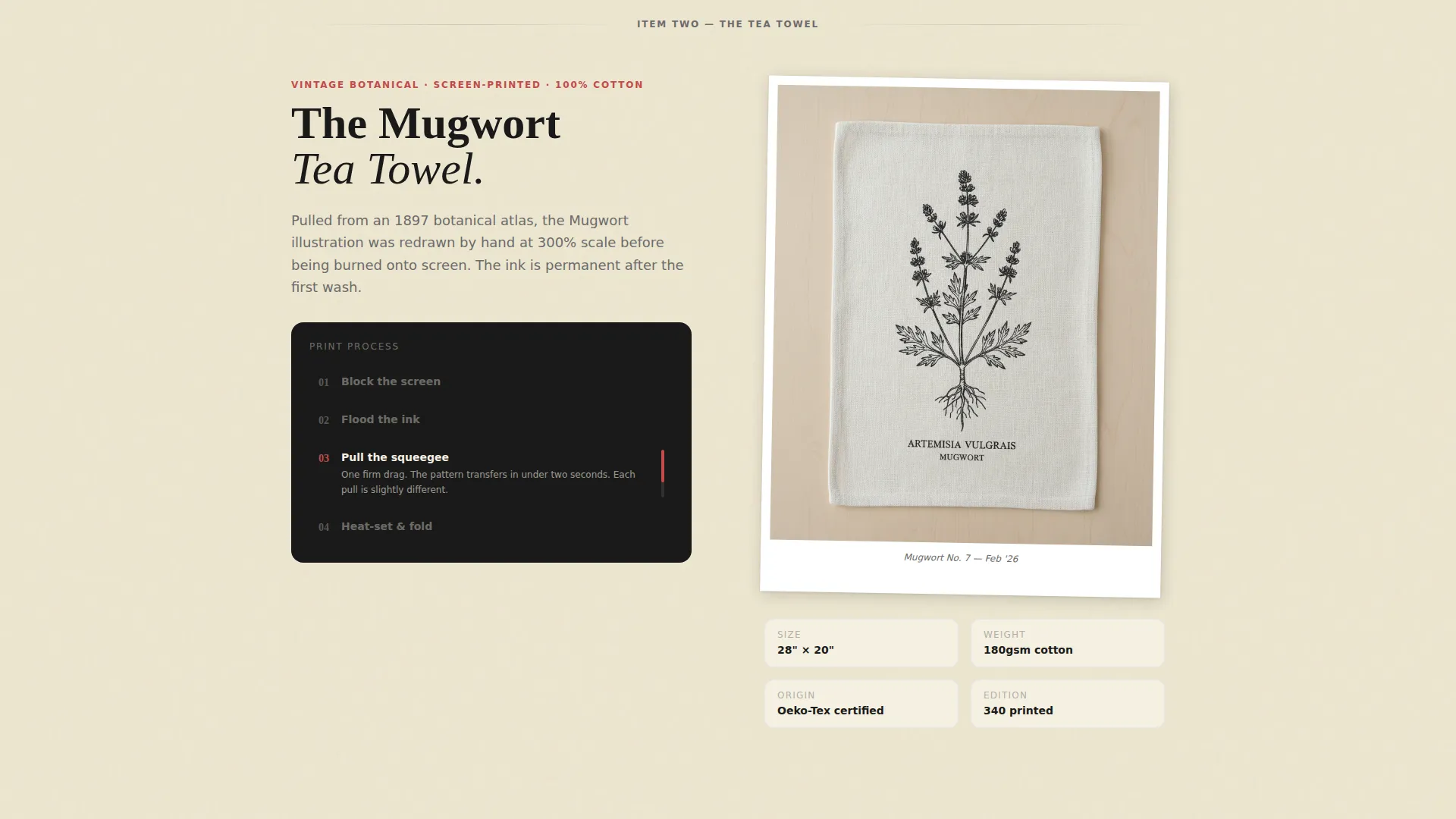
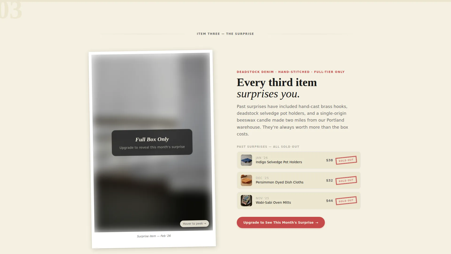
Each of the three product sections loads only when the visitor reaches it. The apron unfolds first with a detail shot and a two-sentence designer origin story. The tea towel pattern follows with an animated print-technique loop. The third item stays blurred and teased, with past-box comparisons shown alongside to prove value escalation.
Persistent Countdown Sticky Bar
A sticky bar sits at the top of the page throughout the entire scroll. It counts down to the box-close deadline in real time. The timer is inked in faded red, the single color of urgency threaded through the layout, keeping the limited-time pressure visible without interrupting the content flow.
Basic versus. Full Box Comparison Strip
A dedicated comparison section lays the two subscription tiers side by side. The price difference is framed per item rather than per month, making the upgrade feel like obvious value. Past items are stamped with a red "SOLD OUT" mark to reinforce that scarcity is real and documented.
One-Toggle Upgrade Form
The upgrade path is a single toggle with a confirmation step. No re-entering payment details. No new form fields. The interaction is designed to feel as frictionless as flipping a recipe card, because the decision has already been made by the time the visitor reaches it.
Lifestyle Hero Header
The header frames a pair of hands tying a crossback apron in a sun-drenched kitchen. Flour dusts the linen. A cast-iron skillet smokes softly in the background. The crop is waist-up, lit by natural window light blowing out the left edge. Hand-lettered type overlays the real-time box-close countdown.
Dual Call-to-Action Layout
The primary call to action, "Upgrade to the Full Box," appears after the third product reveal, once the visitor has seen everything they are missing. A secondary "Gift This Box" path is available for full-tier subscribers who want to share the experience rather than upgrade.
Page sections overview
| Section | Purpose |
|---|---|
| Lifestyle Hero Header | Opens with a Polaroid-style kitchen scene and a live countdown |
| Sticky Countdown Bar | Keeps box-close deadline visible throughout the full scroll |
| Apron Reveal Section | Introduces the apron with a detail shot and designer origin story |
| Tea Towel Reveal | Displays the print technique with an animated single-loop explanation |
| Surprise Item Tease | Blurs the third item and surfaces past-box comparisons for value proof |
| Comparison Strip | Shows basic versus. full box contents with a per-item price framing |
| Upgrade Toggle Form | Delivers the upgrade action as a single slide-and-confirm interaction |
| Gift This Box Path | Offers a secondary conversion route for existing full-tier subscribers |
Design & branding system
The visual identity follows a Neo-Retro theme built around an Ink and Paper color palette. Every color choice carries a tactile reference. The page feels like a 1940s general store receipt printed on thick, foldable stock.
- Unbleached cotton cream (#F5F0E1) dominates backgrounds like bolt fabric unrolled across a cutting table; letterpress black (#1A1A1A) anchors headlines in a typeface that reads as stamped rather than typed; pencil-graphite gray (#6B6B6B) carries secondary text and dividers
- Faded red-check (#C44A4A) appears only on countdown timers, sold-out stamps, badges, and hover states, functioning as the single thread of urgency pulled through every section
- Typography is hand-lettered in style and deliberate in weight, reinforcing the analog, artisan character of the brand without relying on decorative flourishes elsewhere
Mobile & speed optimization
The template is structured for clean rendering across screen sizes, with the scroll-reveal behavior designed to work in a natural vertical flow on both desktop and mobile viewports.
- Progressive section loading mimics tissue-paper unboxing on mobile, where vertical scroll is the native interaction mode
- The sticky countdown bar and toggle upgrade form are built for thumb-reach usability, keeping the most important actions accessible without zooming or scrolling back up
- The comparison strip reflows to a stacked layout on smaller screens so both tiers remain readable without horizontal scrolling
How this template helps you convert
The template structures the visitor's journey so that the upgrade decision feels inevitable rather than pressured. Every layout choice is in service of reducing hesitation and increasing perceived value.
- The scroll-reveal sequence withholds the upgrade call to action until after the third product reveal, so the visitor has seen the full box contents before being asked to pay for them.
- The one-toggle upgrade form removes every friction point at the moment of decision, making the action feel as light as confirming a recipe ingredient rather than committing to a new purchase.
- The persistent sticky countdown bar and red "SOLD OUT" stamps work together throughout the scroll to confirm that box availability is genuinely limited, not artificially implied.
Other information about this template
This template was designed for the Retail and E-Commerce category, specifically for the Aprons and Kitchen Textiles subscription niche. It is optimized for a direct sales landing page direction with a Limited Time creative framework built into the core layout logic.
- The template style follows a Card Grid (Modular) structure, meaning each product reveal section is a self-contained card that loads independently as the visitor scrolls
- The header concept uses a full-bleed lifestyle shot rather than a search-driven or product-grid entry point, prioritizing emotional connection over browsing behavior
- The intersection match score of 9 reflects strong alignment between the Neo-Retro theme, the Limited Time creative direction, and the subscription upsell use case this template is built to serve
- Customization is straightforward: swap the product photography, update the countdown end date, edit the two-sentence origin story per item, and adjust the comparison strip contents to match your actual tier differences
Theme
Neo-Retro
Creative direction
Limited Time
Color system
Dopamine Pop
Style
Card Grid (Modular)
Direction
Direct Sales
Page Sections
Scroll-reveal Unboxing Flow
Persistent Countdown Sticky Bar
Basic Versus. Full Box Comparison Strip
One-toggle Upgrade Form
Dual Conversion Path Layout
Neo-retro Lifestyle Hero Header
Related questions
Is this template designed for a single product page or a full store?
How does the scroll-reveal unboxing behavior work?
Can I use this template if I am not running a subscription box?
Who is the secondary gift path designed for?
Does the countdown timer require a live backend connection?



