Fashion E-Commerce Professional Website Template
Stitch is a bespoke fashion landing page template built for custom and personalized garment stores. It uses a layered, overlap-driven layout with a Citrus Burst color palette to guide visitors from browsing to buying. The progressive upsell flow, device mockup header, and comparison journey sections make upgrading feel natural and irresistible.
by Rocket studio
Quick summary
Stitch is a single-page fashion template designed for custom garment businesses. It opens with a floating device mockup, then walks visitors through a side-by-side comparison of standard versus personalized clothing. A progressive upsell reveal guides buyers toward their ideal piece, while a sticky call-to-action bar keeps the upgrade path always visible.
Who this template is for
This template is built for businesses and creators who sell made-to-order, personalized, or custom-crafted clothing. It works best when the product itself needs to be seen to be understood.
- Independent bespoke tailors and custom garment studios offering made-to-measure pieces
- Fashion brands or boutiques selling personalized items such as monogrammed jackets, embroidered pieces, or custom-lined blazers
- Gift-focused fashion stores where buyers want something personal and presentation-ready
What problem this template solves
Off-the-rack product pages fail custom fashion brands. A standard grid of product images cannot explain the craft, the options, or the emotional value of a garment made specifically for one person. Visitors leave because they cannot picture what they would actually get.
- Buyers struggle to understand the difference between base and upgraded options without a visual comparison
- The personalization process feels overwhelming or invisible, so visitors do not engage with add-ons
- High-intent buyers who want full custom work have no clear path to act immediately
What you get with this template
You get a fully structured, single-page layout built around the idea that seeing the upgrade is what sells it. Every section is designed to move a visitor one step closer to a personalized purchase.
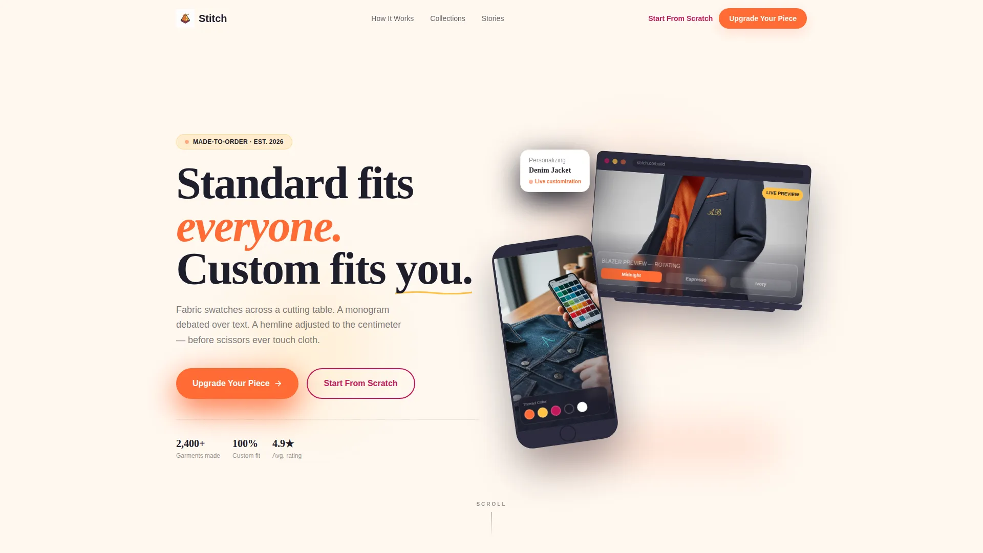
- A staggered device mockup header showing a live customization interface on both phone and laptop
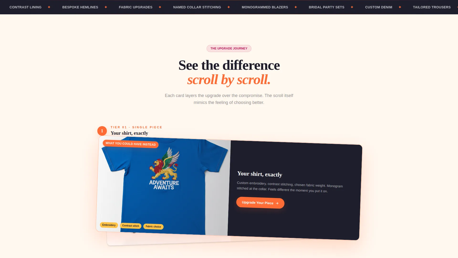
- A layered comparison journey that physically overlays a personalized garment card over a standard one with a parallax shift
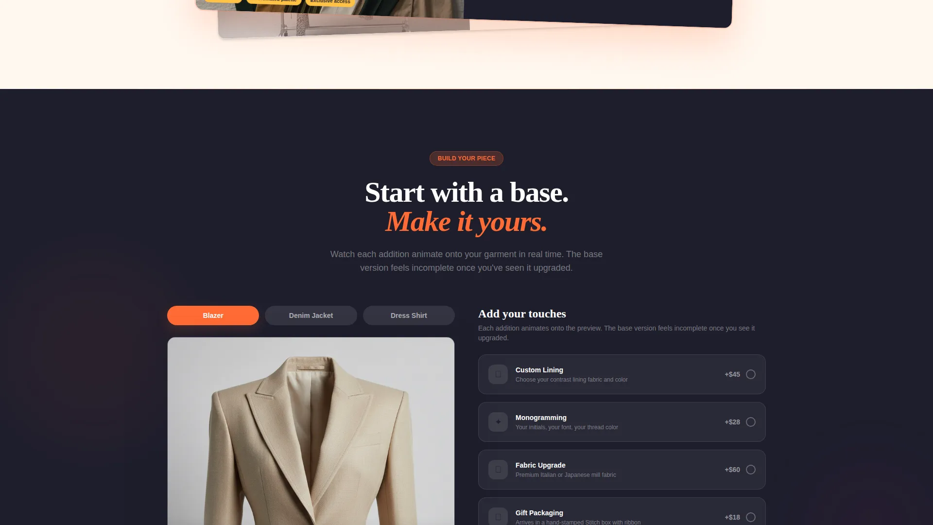
- A progressive upsell reveal that animates add-ons onto a garment preview, from custom lining to monogramming to gift packaging
Feature list
This template packs several purpose-built components into one cohesive layout. Each section plays a specific role in the buyer journey.
Floating Device Mockup Header
A phone and laptop float at staggered angles in the header, each screen showing the store's customization interface mid-use. The devices overlap, break the grid, and cast soft tangerine-tinted shadows onto the cream background. The headline sits between the devices: "Standard fits everyone. Custom fits you."
Layered Comparison Journey
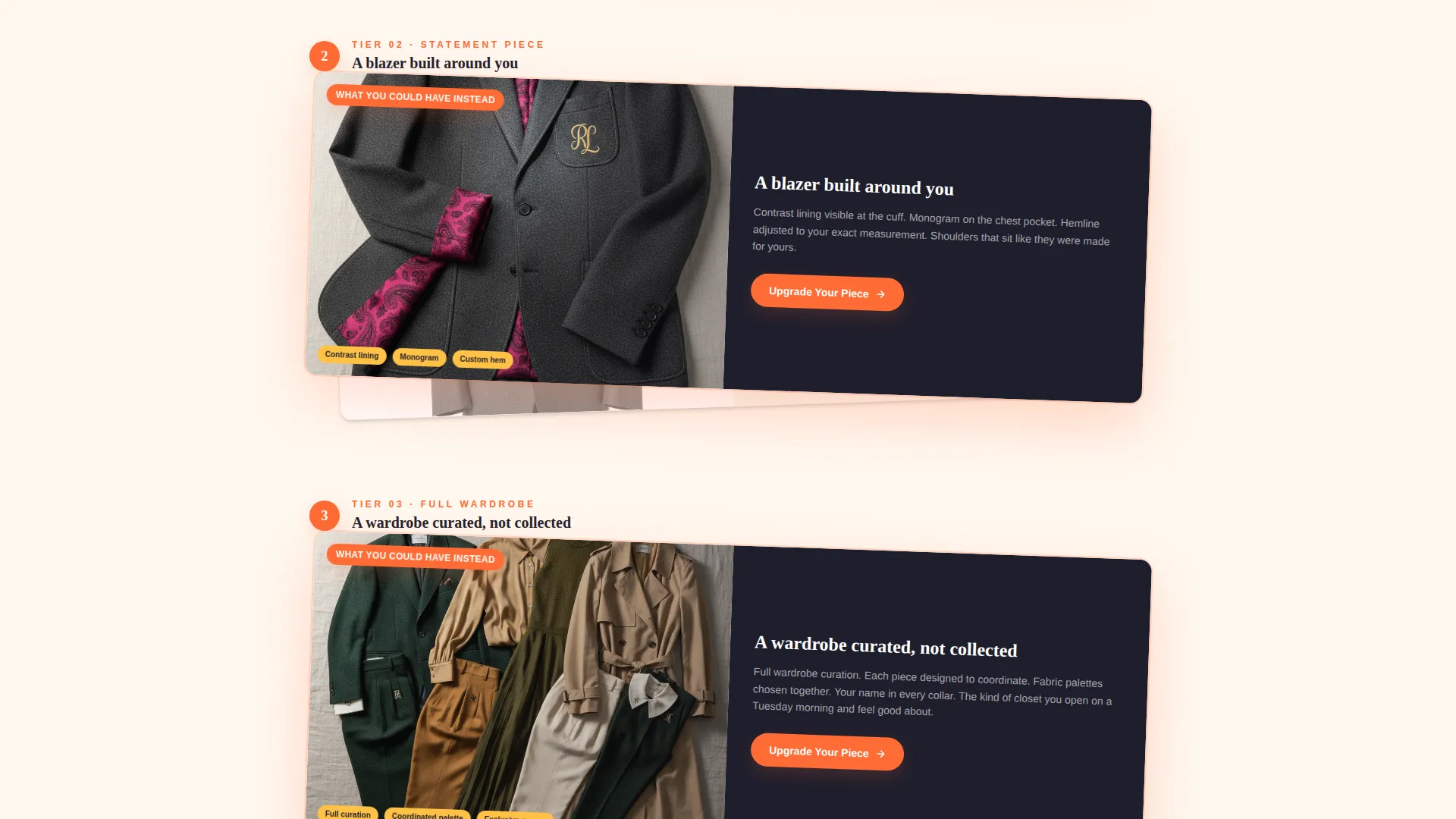
Each scroll step places a "what most people settle for" card underneath a "what you could have instead" card that slides on top with a slight parallax shift. The journey escalates from single-item personalization through to full wardrobe curation, making the upgrade feel earned and inevitable.
Progressive Upsell Reveal
Visitors begin by choosing a base garment. A reveal sequence then shows add-ons one at a time: custom lining, monogramming, fabric upgrade, and gift packaging. Each addition animates onto the garment preview, making the value of each tier visible in real time.
Sticky Upgrade Call-to-Action Bar
The primary call-to-action, "Upgrade Your Piece," first appears after the second comparison card and then locks into a sticky bottom bar. This keeps the conversion path present throughout the entire scroll without being intrusive.
Dual Conversion Paths
A secondary call-to-action, "Start From Scratch" in grapefruit pulp, sits alongside the primary button. It catches high-intent buyers who already know what they want and do not need the guided tier reveal to make a decision.
Citrus Burst Card Grid Layout
The modular card grid uses the full Citrus Burst palette to separate tiers, highlight upgrades, and signal urgency. Tangerine accent lines thread through layered cards like tailor's chalk marks. Badge backgrounds in sun-bleached lemon and urgency indicators in deep grapefruit pulp add visual hierarchy without clutter.
Page sections overview
| Section | Purpose |
|---|---|
| Device Mockup Header | Introduces the brand and customization experience through overlapping phone and laptop visuals |
| Comparison Card One | Contrasts a basic, flat garment with a personalized, embroidered version at entry level |
| First Upgrade call to action | Places the primary "Upgrade Your Piece" button after the first comparison moment |
| Comparison Card Two | Escalates the journey to full-look personalization and wardrobe curation |
| Progressive Upsell Reveal | Animates add-ons onto a live garment preview to show cumulative upgrade value |
| Sticky Bottom Bar | Keeps the upgrade call-to-action visible as visitors scroll through every section |
| Secondary call to action Block | Offers the "Start From Scratch" path for buyers ready to bypass the tier system |
Design & branding system
The visual identity follows a Directory and Discovery theme expressed through the Citrus Burst color system. The palette is warm, high-contrast, and deliberately tactile. It feels like a rooftop summer afternoon translated into a screen.
- Primary accents and hover states use electric tangerine (#FF6B35), while sun-bleached lemon (#FFC145) fills badge and highlight backgrounds
- Deep grapefruit pulp (#C2185B) marks urgency indicators and the "Start From Scratch" secondary call-to-action, and pressed charcoal (#1E1E2C) anchors body text and card shadows
- Backgrounds alternate between soft cream (#FFF8F0) and charcoal, with tangerine lines running through layered cards to echo tailor's chalk marks on dark fabric
Mobile & speed optimization
The overlap and layered card layout is built to stay legible and well-proportioned on smaller screens. Staggered device mockups reflow cleanly so the header remains impactful at any viewport.
- The sticky bottom bar is sized and positioned for thumb-reach on mobile, keeping the upgrade path accessible without covering key content
- Layered card animations are designed to maintain visual clarity on touch devices, so the comparison journey reads naturally whether swiped or scrolled
How this template helps you convert
The entire layout is structured as a one-way ramp toward a purchase decision. There is no dead end and no section that simply describes without prompting action.
- The comparison journey makes the base garment feel visually incomplete once a visitor has seen the upgraded version, creating a pull toward the upsell before any button is pressed.
- The progressive add-on reveal builds perceived value incrementally, so by the time a visitor reaches the final tier, the price of the upgrade feels proportionate to everything they have watched come together on screen.
Other information about this template
Stitch sits at the intersection of fashion retail and personalization commerce. The template style is a Card Grid with modular sections, making it straightforward to adapt the number of comparison tiers or add-on steps to match a specific product catalog. The creative direction is rooted in the Comparison Journey approach, which is particularly effective for categories where the difference between generic and bespoke is the entire sales argument. The lp direction is Direct Sales, meaning every section is oriented toward a single transaction rather than brand awareness or content discovery. Builders working on fashion auction platforms or adjacent discovery-led fashion retail concepts will find the Directory and Discovery theme a useful structural starting point.
- The template is built as a single landing page, not a multi-page site
- The modular card grid allows sections to be reordered or scaled without breaking the visual system
- The Citrus Burst palette is fully named with hex values, making brand color application consistent from the start
Theme
Directory & Discovery
Creative direction
Comparison Journey
Color system
Citrus Burst
Style
Card Grid (Modular)
Direction
Direct Sales
Page Sections
Floating Device Mockup Header
Layered Comparison Journey
Progressive Add-on Upsell Reveal
Sticky Upgrade Call-to-action Bar
Dual Conversion Path Design
Citrus Burst Card Grid System
Related questions
Who is the Stitch template best suited for?
Can I use this template if I sell only one type of garment?
What does the progressive upsell reveal actually show?
Does the template include two separate calls-to-action?
Is the layout fixed or can sections be reordered?



