Leather Worker & Saddler Business Portfolio Website Template
Stitch is a split-screen landing page template built for leather workers and saddlers who take commissions. It pairs a craft-focused photo panel with authoritative text, stacks client logos for quiet credibility, and guides visitors toward a portfolio gallery through repeated, well-placed call-to-action buttons. The design feels handmade, unhurried, and earned.
by Rocket studio
Quick summary
Stitch is a single-page, split-screen landing page template designed for bespoke leather workers and saddlers. It establishes craft credibility through a half-page photo header, a logo wall of partners and clients, and alternating project panels. Every section builds trust before asking for a click, directing visitors to a separate portfolio gallery.
Who this template is for
This template is built for skilled makers who work with bridle leather, custom tack, and bespoke leather goods. It speaks directly to craftspeople who earn commissions through reputation, not advertising.
- Independent saddlers and leather workers offering custom and repair services
- Portfolio-led makers who want a focused landing page that sends visitors to a full gallery
- Studio owners serving equestrians, ranch managers, and design-conscious clients
What problem this template solves
Many craftspeople with serious reputations have no web presence that reflects the quality of their work. A generic portfolio layout undersells a maker whose clients pay for precision and provenance.
- Factory-style layouts signal mass production, not the bespoke craft clients are actually paying for
- Scattered page structures dilute trust before visitors reach the work itself
- A lack of a clear click path leaves visitors browsing without converting
What you get with this template
This template delivers a complete, single-page layout structured entirely around building trust and directing the right clients toward the gallery. Every visual and textual decision reflects the craft it represents.
- A half-page photo and text header with a headline, supporting descriptor lines, and a primary call-to-action button
- A full-width logo wall displaying client and partner brands in a brass monotone treatment on parchment cream
- Alternating split-screen project panels, each pairing a finished piece image with a two-sentence story and client type label
Feature list
This template's layout and visual design work together to signal expertise, range, and intentionality from the first scroll.
Half-Page Photo and Text Header
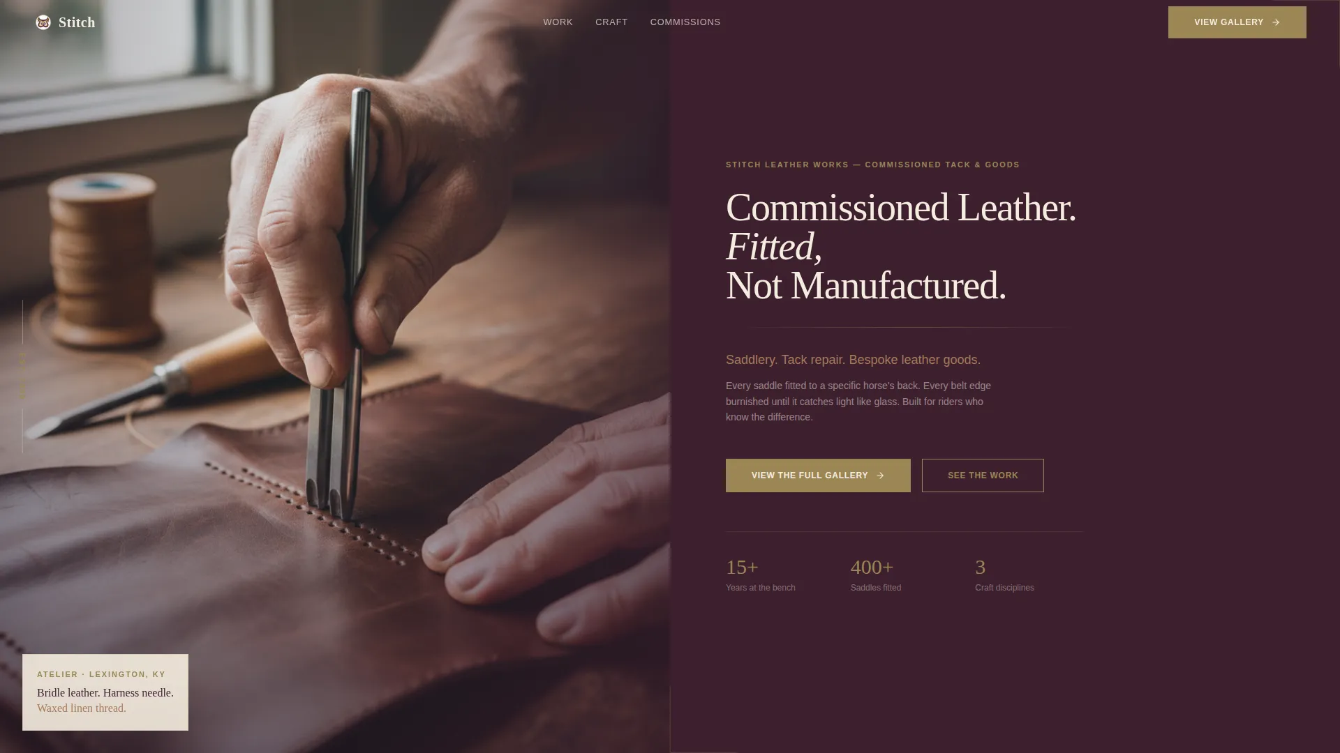
The header splits the viewport evenly. The left panel holds a tightly cropped photograph of hands mid-stitch, with a shallow depth of field. The right panel sits on deep plum and carries the headline in large cream type, two lines of saddle tan descriptor text, and a brass call-to-action button.
Logo Wall Authority Band
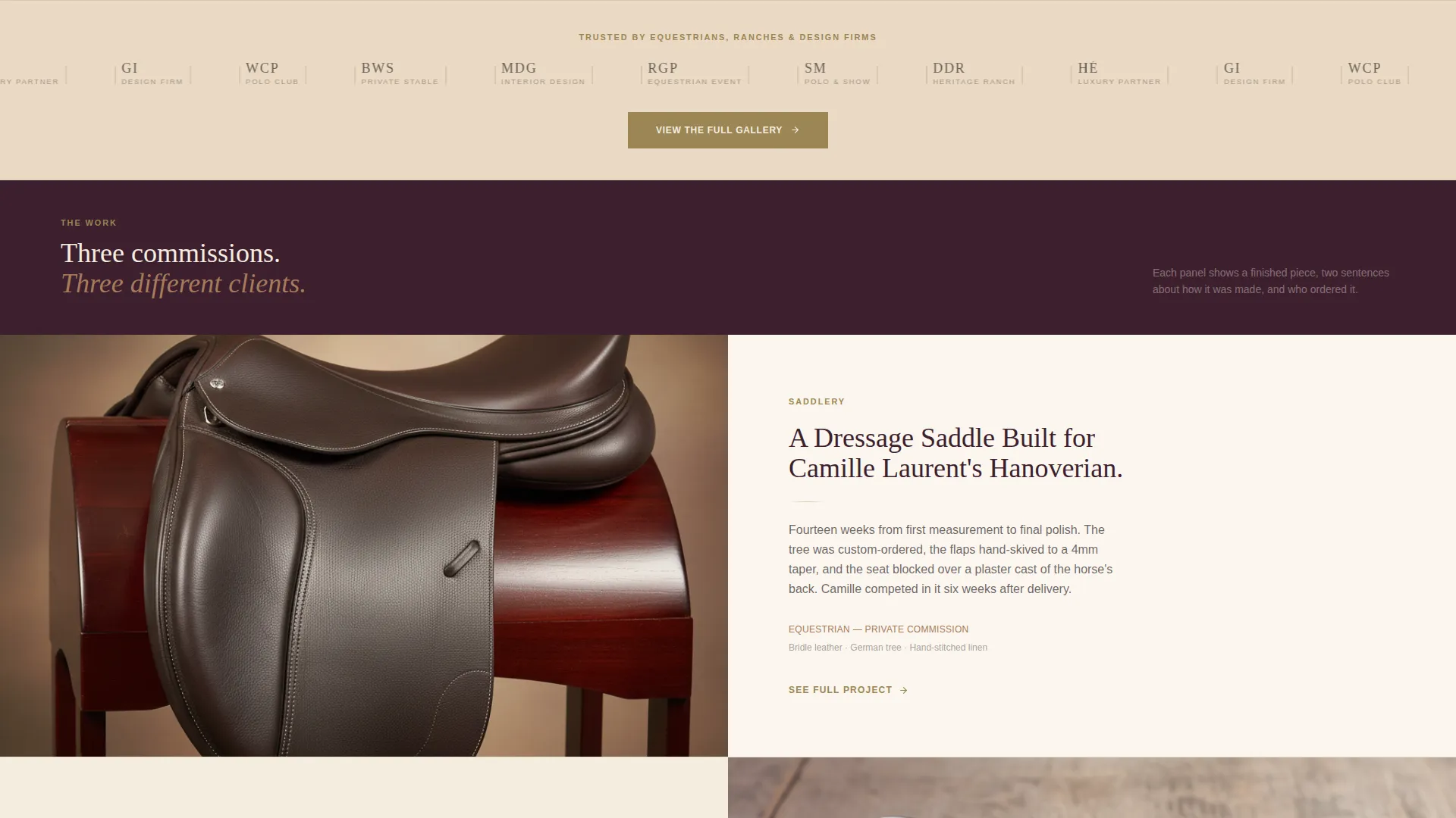
Immediately below the fold, a full-width band on parchment cream displays client and partner logos. Each logo is desaturated to a brass monotone, lending quiet credibility without visual noise. This placement ensures trust signals appear before visitors engage with any project content.
Alternating Split-Screen Project Panels
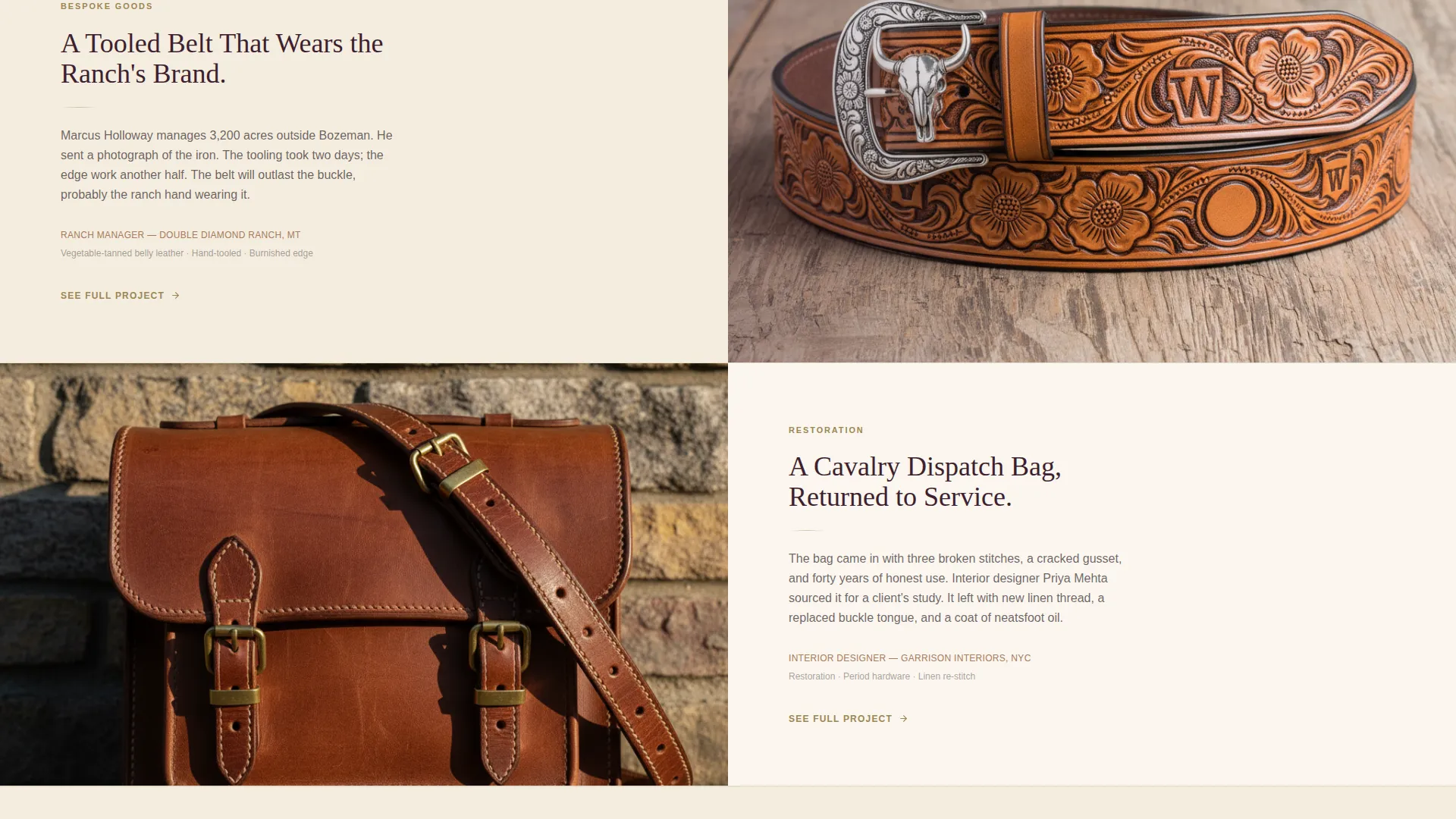
Each project panel pairs a finished-piece photograph on one side with two sentences of context and a client type label on the other. The rhythm of left-right alternation keeps the page visually active without requiring a grid layout. Each panel deepens trust by stacking evidence rather than escalating claims.
Repeated Call-to-Action Structure
The primary call-to-action, "View the Full Gallery," appears three times: in the header, after the logo wall, and at the page close. Each instance uses a brass button on a plum background. This repetition ensures the conversion path is always visible, regardless of where a visitor pauses.
Service Utility Theme with Plum Executive Color System
The layout follows a Service Utility theme, balancing functional clarity with a distinguished visual tone. The Plum Executive color system uses deep plum, worn saddle tan, parchment cream, and muted brass across backgrounds, text, and interactive elements. The palette feels like a private study with considered furnishings, dignified without performing dignity.
Page sections overview
| Section | Purpose |
|---|---|
| Split Header Panel | Introduces the maker with a craft photograph and headline |
| Logo Wall Band | Displays client and partner logos for quiet authority |
| Project Panel One | Pairs a finished piece image with a brief story |
| Project Panel Two | Continues the alternating evidence-stacking rhythm |
| Project Panel Three | Extends range with a third distinct piece and context |
| Closing call to action Section | Repeats the gallery call-to-action on deep plum |
Design & branding system
The Plum Executive color system defines every visual decision on this page. The palette draws from the physical world of the workshop itself, warm leather, aged brass, and worn parchment, to make the design feel materially honest.
- Deep plum (#3D1F2E) anchors headers, section backgrounds, and call-to-action panels; worn saddle tan (#A67B5B) warms secondary panels and descriptor text
- Parchment cream (#F5EDE0) opens breathing room in the logo wall and lighter content areas
- Muted brass (#9B8654) is reserved for buttons, divider lines, and hover states, giving interactive elements a restrained but intentional presence
Mobile & speed optimization
The split-screen structure is designed to adapt gracefully across screen sizes. On smaller viewports, the 50/50 panel layout stacks vertically so photographs and text remain legible and properly sequenced.
- Each panel is built to reflow cleanly, keeping image and copy pairings intact on mobile
- The minimal page structure, no forms, no embedded media players, and no complex widgets, keeps the layout light and fast to render
- Button placement is maintained at each call-to-action instance so the conversion path stays accessible on any device
How this template helps you convert
This landing page is built for click-through conversion, not form submission. It earns the gallery visit by proving range and reputation first, then asking for a single action.
- The logo wall signals trusted partnerships before visitors engage with any project detail, removing early skepticism quickly.
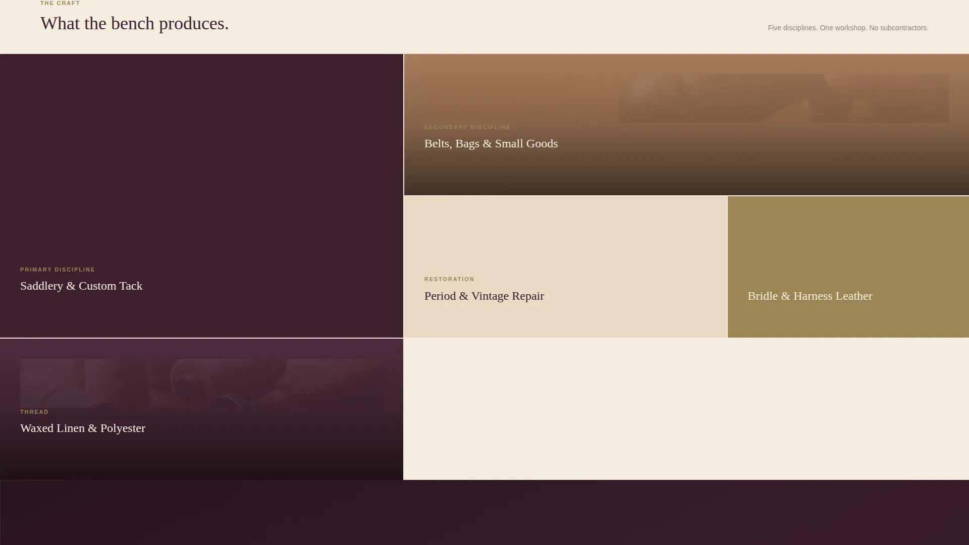
- Each alternating project panel adds a layer of evidence, showing the maker's range across saddles, tack, belts, and restored goods without over-explaining.
- Three strategically placed call-to-action buttons ensure the path to the gallery is always one step away, wherever the visitor stops reading.
Other information about this template
This template is designed as the front door to a deeper portfolio site. It functions as a focused, single-purpose landing page that routes qualified visitors to individual project pages, where inquiry forms live.
- The page deliberately carries no contact form; conversion happens through the gallery click, keeping the landing page clean and purposeful
- The template style is Split Screen (50/50), making it well suited to makers whose work is best understood through paired image and context
- The creative direction follows a Logo Wall Authority approach, a deliberate choice for service providers whose reputation precedes them in specific professional communities
- This template suits any leather worker, saddler, or bespoke goods maker who serves clients in equestrian, ranch, or interior design markets
Theme
Service Utility
Creative direction
Logo Wall Authority
Color system
Plum Executive
Style
Split Screen (50/50)
Direction
Click-Through
Page Sections
Half-page Photo and Text Header
Logo Wall Authority Band
Alternating Split-screen Project Panels
Repeated Click-through Call-to-action
Plum Executive Color System
Related questions
Does this landing page include a contact form?
Can I replace the project panel photographs with my own work?
How many times does the call-to-action button appear on the page?
Who is the logo wall section designed for?
Is this template suitable for a maker who offers both saddlery and general leather goods?



