Costume Designer Portfolio Portfolio Website Template
Stitch is a bold brutalist landing page template built for costume designers who need their portfolio to command immediate professional respect. The asymmetric 60/40 grid structures case studies to escalate in prestige from first scroll to last, while an Ink and Paper color system and giant headline header make the page feel like a heavyweight exhibition monograph.
by Rocket studio
Quick summary
Stitch is a single-page costume designer portfolio template built around an asymmetric 60/40 grid, a bold brutalist visual identity, and a scroll structure that builds a deliberate argument for the designer's prestige. It is designed to convert studio heads, showrunners, and theater directors into inquiries through focused click-through calls to action.
Who this template is for
This template is built for working costume designers whose clients operate at the level where a portfolio needs to close deals, not just display work. It speaks to designers who have production credits, award recognition, and a body of work that deserves a monograph-weight presentation.
- Senior costume designers pitching studio productions or period epics
- Freelance designers building credibility with showrunners and theater artistic directors
- Award-winning designers who need credentials to circulate quickly among decision-makers
What problem this template solves
Most portfolio templates treat costume design like graphic design, prioritizing visual grids over narrative authority. Stitch solves the specific problem of communicating craft depth and professional prestige to buyers who greenlight budgets, not just appreciate aesthetics.
- Generic portfolio layouts fail to convey the obsessive process behind hand-dyed silks, rebuilt military jackets, or multi-fitting collar adjustments
- Standard contact forms interrupt the moment of conviction, slowing the path from admiration to outreach
- Producers who need to share credentials internally have no quick path to circulate the work
What you get with this template
You get a single landing page structured as a rolling case study argument, where each section earns more trust than the last. The layout, typography, and color decisions are already made and aligned to a coherent brutalist identity.
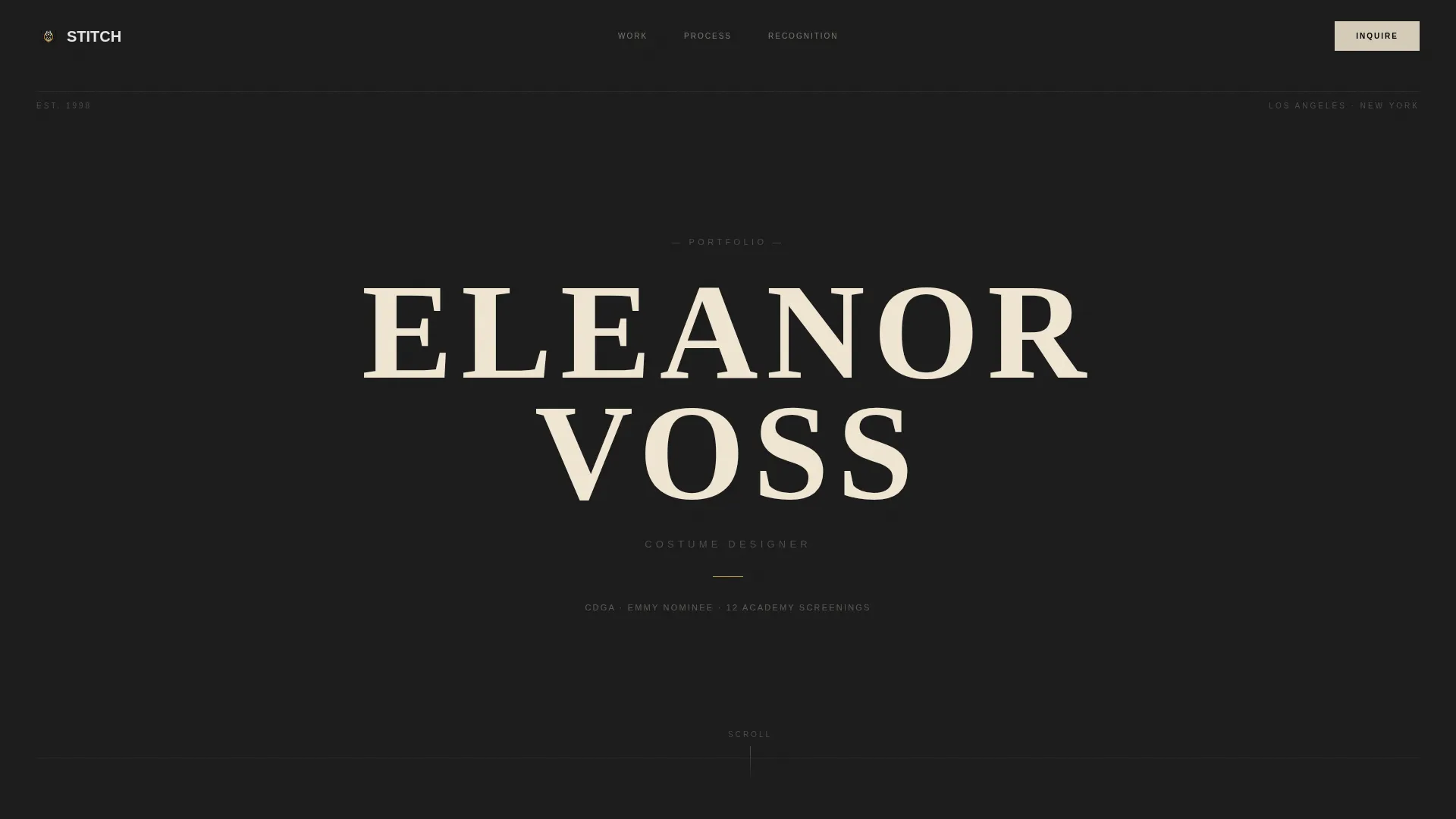
- A viewport-filling giant headline header with the designer's name set in wide-tracked brutalist slab-serif
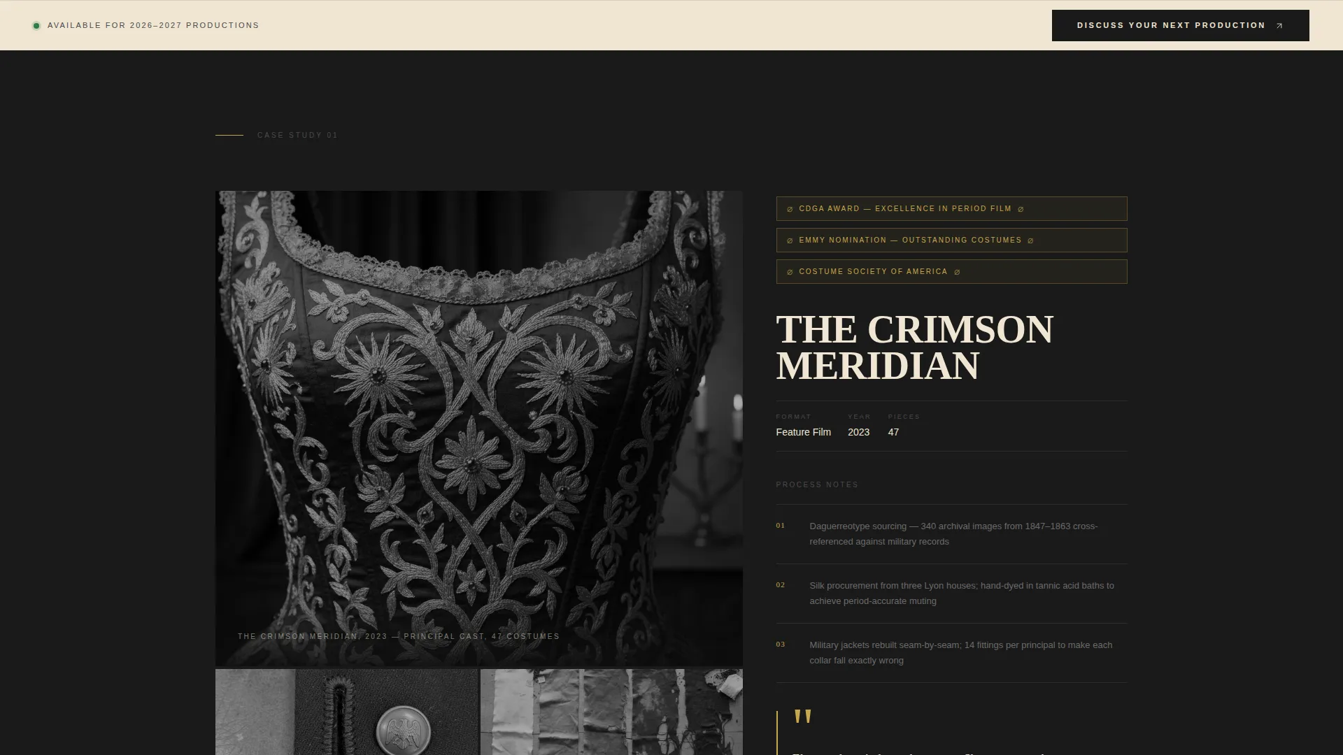
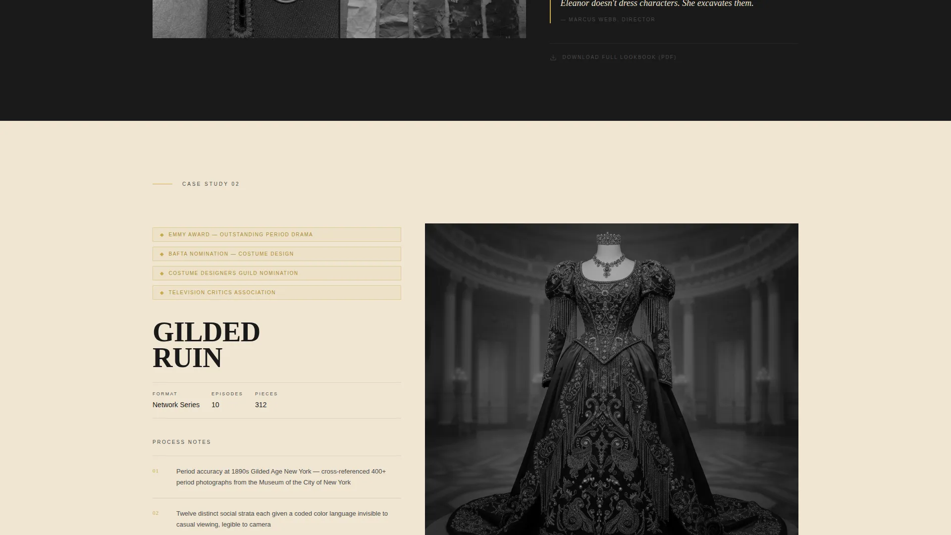
- Four escalating case study sections, each pairing a full-bleed production still with project title, award laurels, and process breakdown
- A fixed "Discuss Your Next Production" call-to-action bar that appears after the second case study, plus a per-case-study PDF lookbook download link
Feature list
This section covers the core built-in capabilities delivered by the Stitch template.
Asymmetric 60/40 Case Study Grid
Each case study uses a 60-column side for a full-bleed production still and a 40-column side for structured content. The split gives images the weight they deserve while keeping the process narrative readable and prominent.
Escalating Prestige Scroll Structure
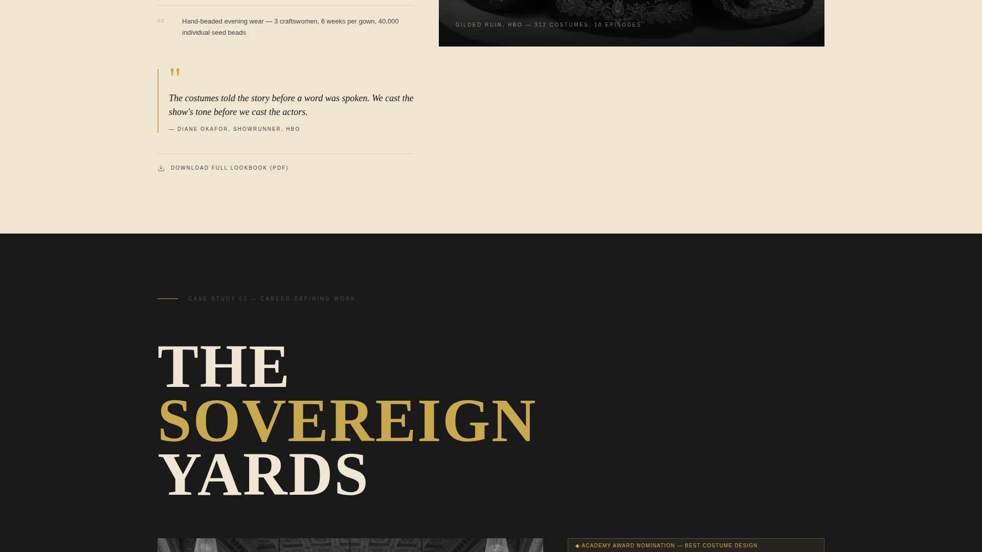
Case studies are sequenced to build a cumulative argument. The scroll moves from indie film through network series, studio feature, and career-defining work. Laurel counts grow and director pull quotes become more reverential with each section.
Giant Headline Centered Header
The header fills the viewport with the designer's name in an enormous slab-serif, tracked wide, with "Costume Designer" beneath it in thin uppercase graphite. No imagery, no motion. The confidence of showing nothing visual is the scroll-stopper.
Fixed Click-Through Call-to-Action Bar
A "Discuss Your Next Production" bar is anchored as a persistent element that appears after the visitor has scrolled past the second case study. The timing ensures the work earns the ask before the ask is made.
PDF Lookbook Download Link
A secondary text link, "Download Full Lookbook (PDF)," closes each case study section. This gives producers a direct path to circulate credentials internally without requiring any form submission.
Gold Accent Recognition System
Award laurels, pull-quote marks, and hover states use a single searing recognition gold (#C9A84C) that appears nowhere else on the page. The scarcity of the color makes every appearance a visual event.
Page sections overview
| Section | Purpose |
|---|---|
| Giant Headline Header | Establishes the designer's name as the dominant visual statement |
| First Case Study | Opens the prestige argument with production still, laurels, and process notes |
| Second Case Study | Escalates credibility; triggers the fixed call-to-action bar on scroll |
| Third Case Study | Deepens the narrative with a more prominent production credit |
| Career-Defining Piece | Closes the case study sequence at peak prestige and reverence |
| Fixed call to action Bar | Persists on screen after case study two to drive contact page click-through |
| PDF Lookbook Links | Appears at the close of each case study for producer credential sharing |
Design & branding system
The visual identity is built on an Ink and Paper color system that feels like a freshly printed exhibition catalog. Every design decision reinforces the weight and authority of the designer's body of work.
- Heavy slab black (#1A1A1A) dominates backgrounds and type weight; uncoated stock cream (#F0E6D3) breathes in the 40-column gutter and case study text blocks; pencil graphite (#4A4A4A) handles secondary navigation and captions
- Recognition gold (#C9A84C) is reserved exclusively for award laurels, pull-quote marks, and hover states, appearing so sparingly it becomes an event
- Typography uses a brutalist slab-serif at monumental scale for the header and maintains consistent weight contrast between display, body, and caption type throughout
Mobile & speed optimization
The template is structured to maintain its visual authority and readability across device sizes. The brutalist layout translates to smaller screens without losing the sense of weight and deliberate craft.
- The asymmetric 60/40 grid reflows to a stacked single-column layout on mobile, keeping production stills full-width above their paired content blocks
- The fixed call-to-action bar remains accessible on mobile scroll, preserving the click-through path without obscuring case study content
How this template helps you convert
Stitch is built specifically to move a qualified visitor from admiration to action without friction or distraction. The conversion logic is architectural, not cosmetic.
- The escalating case study sequence builds trust progressively, so by the time the fixed "Discuss Your Next Production" bar appears, the visitor has already made the emotional decision to reach out.
- Removing the contact form entirely from this page eliminates hesitation. The click-through sends a convinced visitor directly to a dedicated contact and availability page where the conversation can begin.
Other information about this template
Stitch is a strong fit for costume designers who are ready to present their practice at the level of a career monograph rather than a standard online portfolio. A few additional details worth noting:
- The template is categorized under Portfolio and Agency, specifically within the Costume Designer Portfolio subcategory, making it purpose-built for this professional niche
- The no-form, click-through structure means the portfolio page itself handles qualifying, while the separate contact page handles conversion mechanics
- The "Download Full Lookbook (PDF)" link at each case study close is a practical tool for productions with multiple decision-makers, letting one contact share credentials with a full committee
- The Bold Brutalist theme was chosen deliberately to signal that the designer's work is not decorative but structural, matching the sensibility of the clients this template is designed to attract
Theme
Bold Brutalist
Creative direction
Award & Recognition
Color system
Ink & Paper
Style
Asymmetric Grid (60/40)
Direction
Click-Through
Page Sections
Asymmetric 60/40 Case Study Grid
Escalating Prestige Scroll Structure
Giant Headline Centered Header
Fixed Click-through Call-to-action Bar
PDF Lookbook Download Link
Gold Accent Recognition System
Related questions
Can I use this template without award credits yet?
Does this template include a contact form?
How does the PDF lookbook link work?
Is this template suitable for theater designers as well as film designers?



