Inventory Optimization Landing Page Template
Stockline is a zigzag landing page template built for inventory optimization platforms. It opens with a high-impact testimonial card, then walks visitors through a transparent, step-by-step product demo flow. A lead-capture form and an embedded benchmark calculator work together to convert operations managers, supply chain directors, and CFOs into engaged prospects.
by Rocket studio
Quick summary
Stockline is a single-page landing page template designed for inventory optimization platforms. It uses an alternating section layout to guide visitors from the problem to the proof. The design feels like a freshly audited ledger: structured, credible, and impossible to ignore. A testimonial-first header and two conversion paths make every scroll count.
Who this template is for
This template is built for teams selling inventory intelligence to mid-market and enterprise operations. If your buyers live inside spreadsheets and carry costs, this page speaks their language directly.
- Operations managers at mid-market distributors who need to justify a platform switch
- Supply chain directors at direct-to-consumer brands scaling past multiple warehouse locations
- CFOs and finance leads who have recently discovered hidden carrying costs sitting on pallets
What problem this template solves
Most supply chain platforms lead with feature lists. Buyers who manage dead stock, overstock flags, and reorder gaps need proof, not promises. This template structures the page around that proof.
- Visitors cannot quickly connect a platform's claims to their own margin pain
- Generic landing pages bury the ROI story behind product screenshots with no context
- There is no clear path for skeptical buyers to self-qualify before giving up their email
What you get with this template
You get a fully structured, conversion-ready landing page template with every section pre-designed and purposefully ordered. Nothing needs to be invented from scratch.
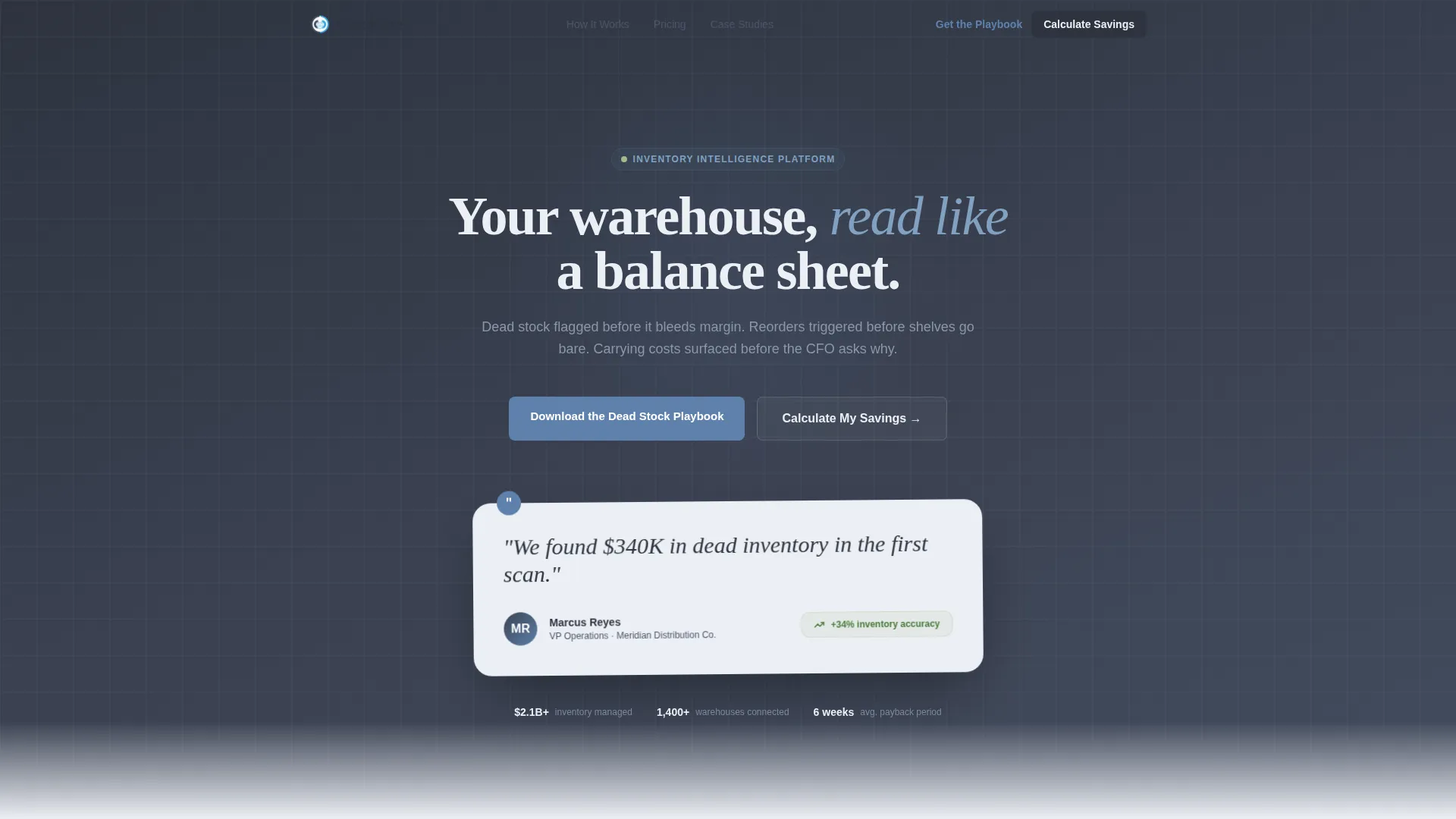
- A testimonial card header built around a real operator quote with metric badge and avatar layout
- An alternating zigzag content flow covering data ingestion, diagnostics, reorder logic, and ROI reporting
- A two-field lead capture form for the Dead Stock Playbook and an embedded benchmark calculator mid-page
Feature list
This template includes six purposefully designed components, each serving a specific role in moving a skeptical buyer toward conversion.
Testimonial Card Header
The page opens with one oversized testimonial card placed against the charcoal slate background. It carries a direct quote, a small avatar, the speaker's name and title, a company logo placeholder, and a metric badge showing inventory accuracy improvement. No stock photography. Just the weight of someone else's verified numbers.
Zigzag Section Layout
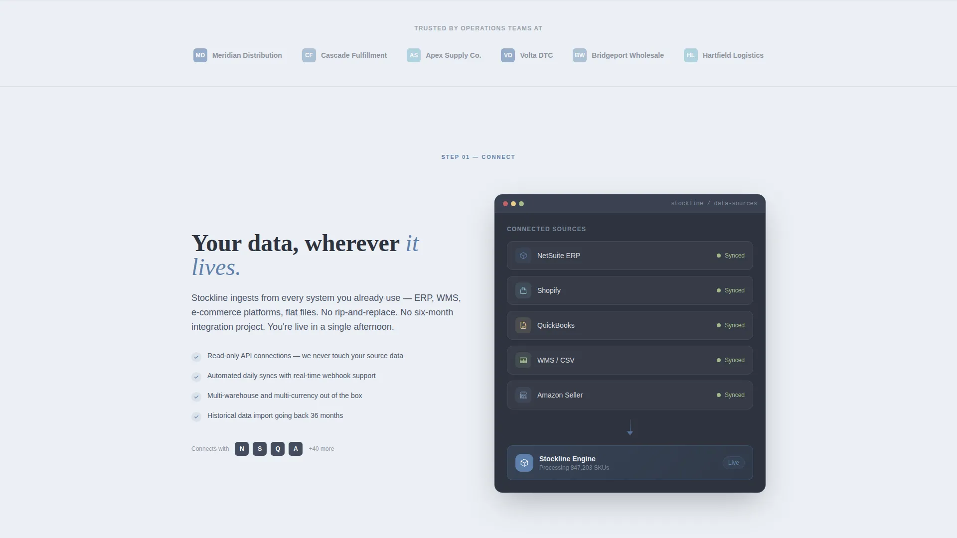
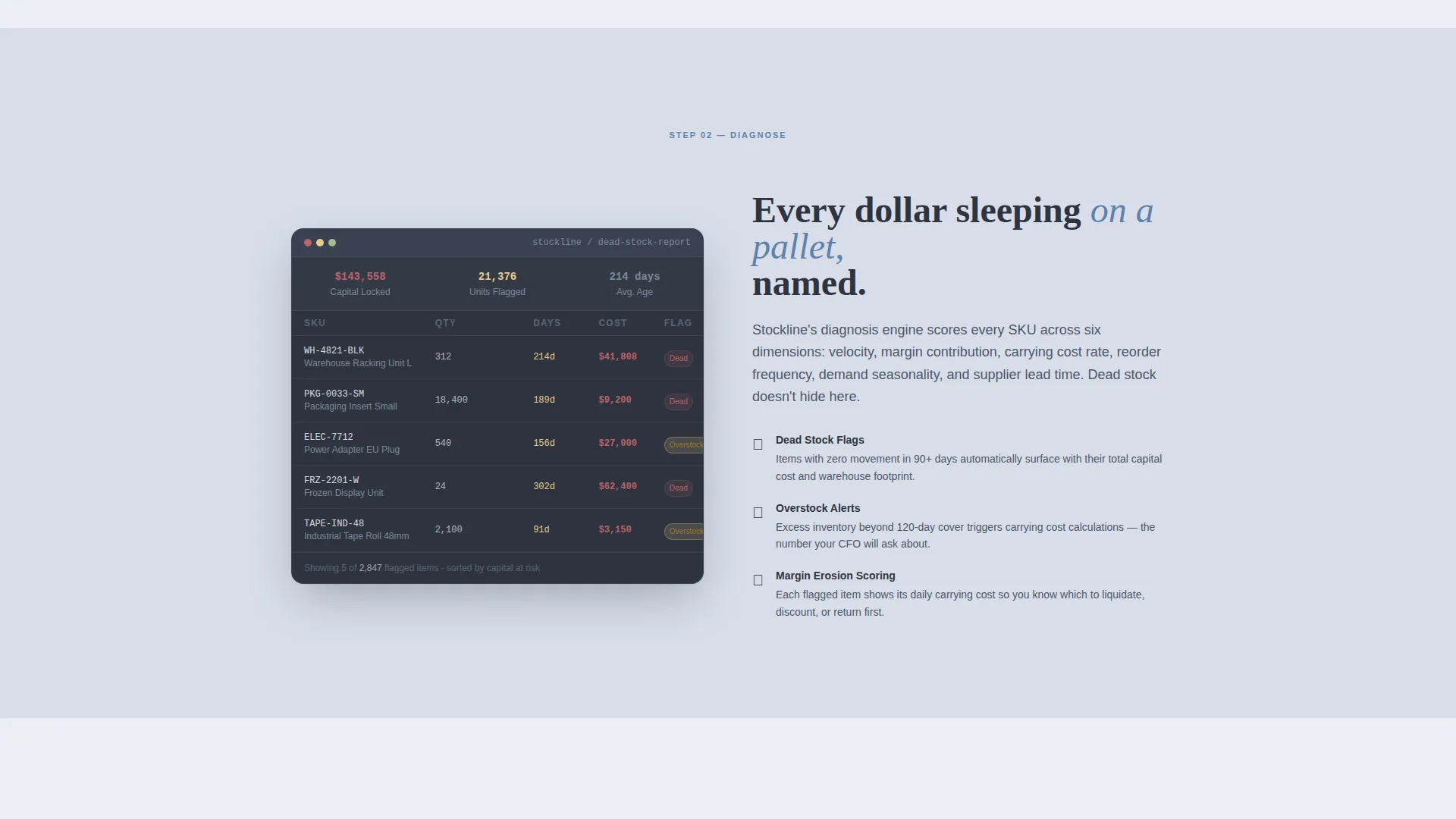
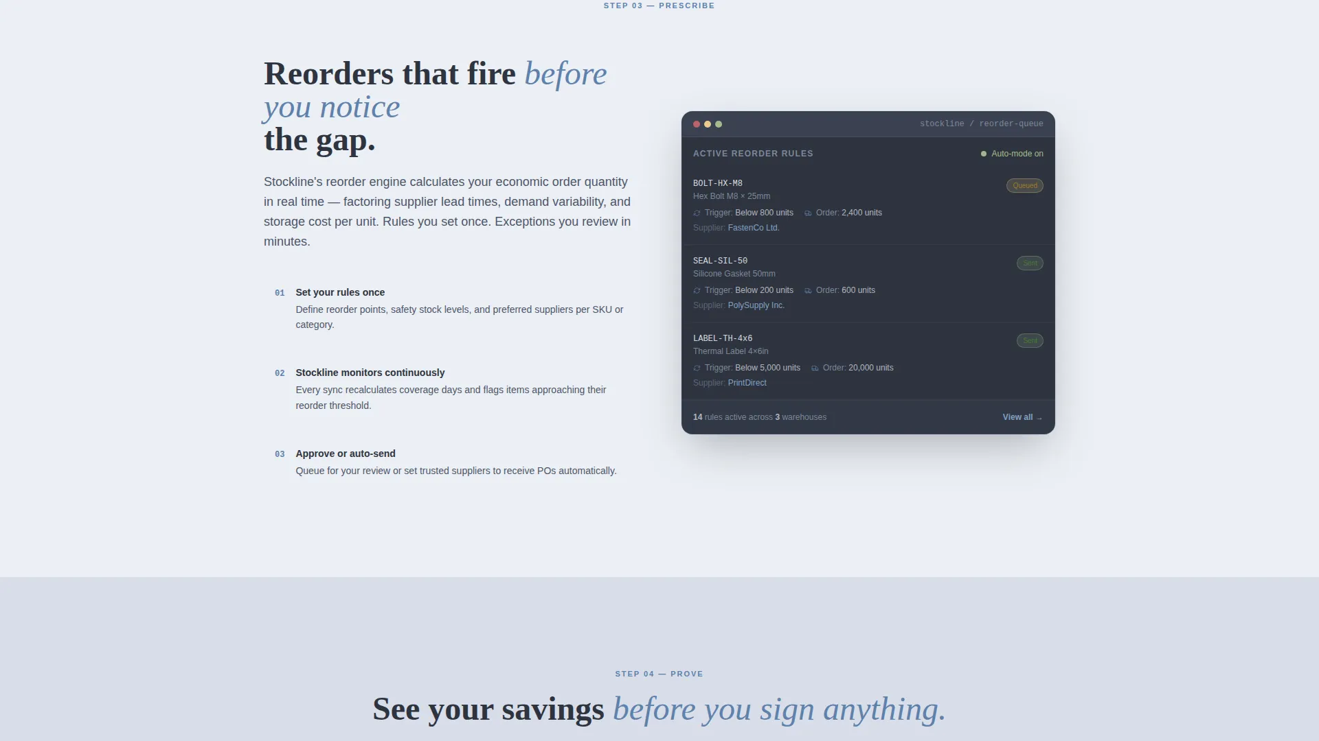
Each alternating section peels back one layer of how the optimization platform works. Narrative copy sits on one side; a dashboard screenshot or flowchart placeholder sits on the other. The scroll moves from connect to diagnose to prescribe to prove, building confidence through visible process clarity.
Dead Stock Playbook Form
The primary conversion path is a two-field gated content form. Visitors enter their work email and select their current SKU (stock keeping unit) count range from a dropdown with four tiers: under 500, 500 to 5K, 5K to 50K, and 50K and above. This qualifies leads by scale before a single conversation happens.
Embedded Benchmark Calculator
A mid-page interactive calculator lets visitors input their average carrying cost percentage and immediately see projected savings. It earns the email address by proving value before asking for it, making the second conversion path feel like a service rather than a gate.
Slate and Sky Color System
The palette is built around four deliberate tones. Charcoal slate anchors headers and data panels. Policy gray softens background sections. Clear-sky blue marks interactive elements and trust indicators. Compliance white provides visual breathing room. Together they feel like a platform that has nothing to hide.
Transparent Process Creative Direction
Every section is designed to feel like a live product demo unfolding on scroll. The layout does not use mystery or abstract claims. Instead, each zigzag block explains one specific mechanism, so buyers understand exactly what the platform does before they ever fill out a form.
Page sections overview
| Section | Purpose |
|---|---|
| Testimonial Card Header | Opens with a credible operator quote and inventory accuracy metric badge |
| Connect Data Section | Explains the data ingestion step with a dashboard visual placeholder |
| Diagnose Dead Stock | Shows dead stock and overstock flagging logic with a flowchart placeholder |
| Prescribe Reorder Logic | Covers automated reorder triggering with a live-style screenshot placeholder |
| Benchmark Calculator Block | Mid-page interactive tool that shows projected savings from carrying cost input |
| Prove ROI Section | Surfaces ROI reporting outcomes with a supporting visual placeholder |
| Playbook Capture Form | Two-field gated form collecting work email and SKU count range |
Design & branding system
The visual identity follows a Legal Shield theme expressed through the Slate and Sky color system. Every color choice has a functional role, not just a decorative one.
- Charcoal slate (#3B4252) anchors headers, data panels, and high-authority content zones
- Policy gray (#D8DEE9) softens background sections, clear-sky blue (#5E81AC) marks calls to action and trust indicators, and compliance white (#ECEFF4) maintains visual breathing room throughout
Mobile & speed optimization
The zigzag layout is structured to restack cleanly on smaller screens. Each alternating block converts to a single-column flow without losing its narrative sequence.
- Dashboard screenshot and flowchart placeholders are sized to render at appropriate proportions on mobile viewports
- Form fields and the calculator input are laid out for easy tap interaction on touch devices
How this template helps you convert
This template runs two parallel conversion paths, each designed to meet buyers at a different level of readiness.
- The Dead Stock Playbook form captures early-stage visitors who want to learn before they commit, qualifying them by SKU scale through the dropdown field.
- The embedded benchmark calculator converts mid-funnel visitors by showing real projected savings from their own carrying cost data, making the value tangible before any email is exchanged.
Other information about this template
This template is part of the Stockline design system, built specifically for the supply chain and procurement professional services category. A few additional details worth knowing before you use it:
- The template style is classified as Zigzag/Alternating, meaning sections alternate layout direction throughout the page for visual rhythm and reading momentum
- The landing page direction is Content/Resource, optimized for gated asset delivery and lead qualification rather than direct demo booking or free trial sign-up
- The header concept is a Testimonial Card, a format chosen specifically because social proof from a credible operator carries more weight with CFOs and supply chain directors than product feature callouts
- The theme follows a Legal Shield aesthetic, which communicates accountability and auditability through structured, clean visual design
Theme
Legal Shield
Creative direction
Transparent Process
Color system
Slate & Sky
Style
Zigzag/Alternating
Direction
Content/Resource
Page Sections
Testimonial Card Header with Metric Badge
Zigzag Alternating Section Flow
Two-field Gated Playbook Form
Embedded Benchmark Calculator
Slate and Sky Color System
Transparent Process Creative Direction
Related questions
Who is the ideal buyer for this landing page template?
Can I change the testimonial quote and avatar details?
What does the benchmark calculator do on the page?
Is this template suitable for a direct demo booking flow?
How does the zigzag layout support the sales narrative?



