Construction OEM Supplier Landing Page Template
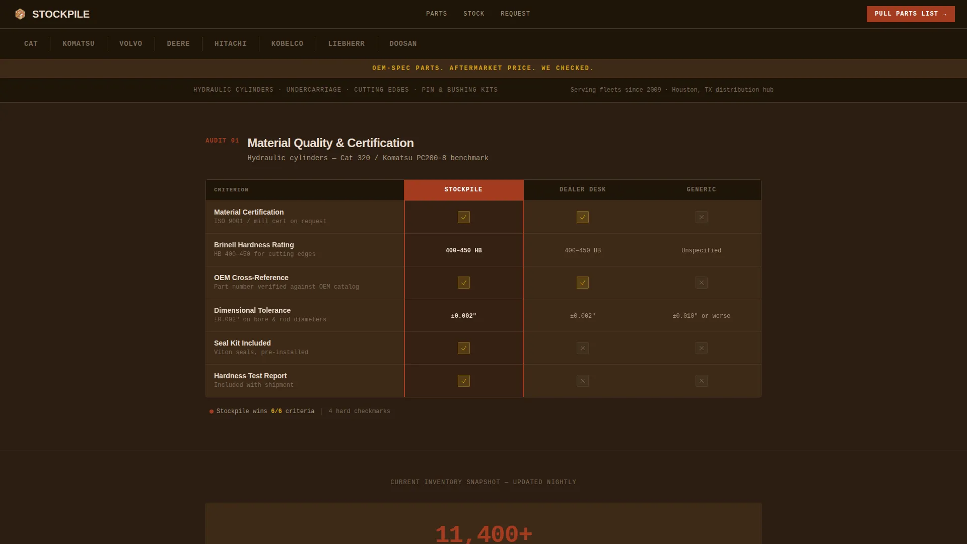
Stockpile is a single-column landing page built for construction OEM parts suppliers. It uses a Checklist and Audit layout to compare your offer against dealership desks and generic vendors, row by row. The Fire and Earth color palette, logo bar header, and pinned call-to-action form work together to turn every scroll into a buying decision.
by Rocket studio
Quick summary
Stockpile is a high-conviction landing page for construction parts warehouses. It opens with a trusted manufacturer logo bar, then walks fleet managers and contractors through a series of head-to-head audit tables. Single-stat callout blocks punctuate each section. Every design and copy choice builds toward one clear next step: submitting a parts request.
Who this template is for
This template is built for construction parts businesses that ship real inventory to real job sites. It speaks directly to buyers who already know what they need and just want proof they are dealing with the right supplier.
- Fleet managers tracking machine hours and managing scheduled part replacements
- Independent contractors keeping older equipment running through tight budgets
- Rental yard mechanics who need specific kits available and ready to ship overnight
What problem this template solves
Most parts supplier pages bury the proof. Visitors have to hunt for warranty terms, lead times, and freight policy before they can trust the price. That friction costs orders. Stockpile removes the friction by putting the evidence front and center, in a format buyers already understand.
- Dealership comparisons are scattered or missing, leaving buyers unsure of the value
- Generic supplier pages feel like they could be selling anything, not certified OEM-specification parts
- Fleet buyers need something they can forward to a purchasing department, not just skim
What you get with this template
You get a fully structured single-column landing page designed around evidence and conversion. The layout uses a deliberate scroll rhythm: audit table, stat block, audit table, stat block. The primary call-to-action form appears after the third comparison table and stays pinned to the bottom of the viewport.
- A trusted manufacturer logo bar header with hover color reveal
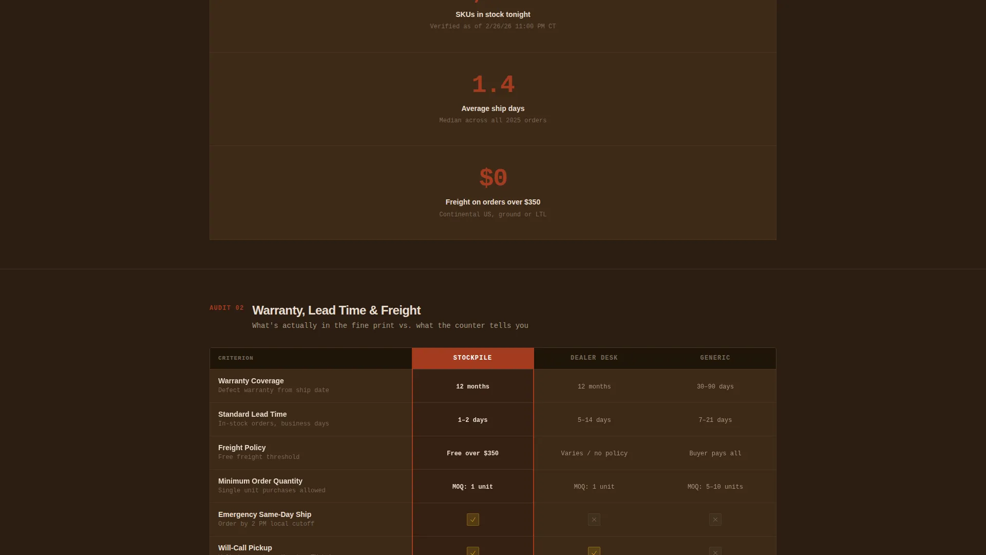
- Head-to-head audit tables comparing material certification, hardness rating, warranty terms, lead time, freight policy, and minimum order requirements
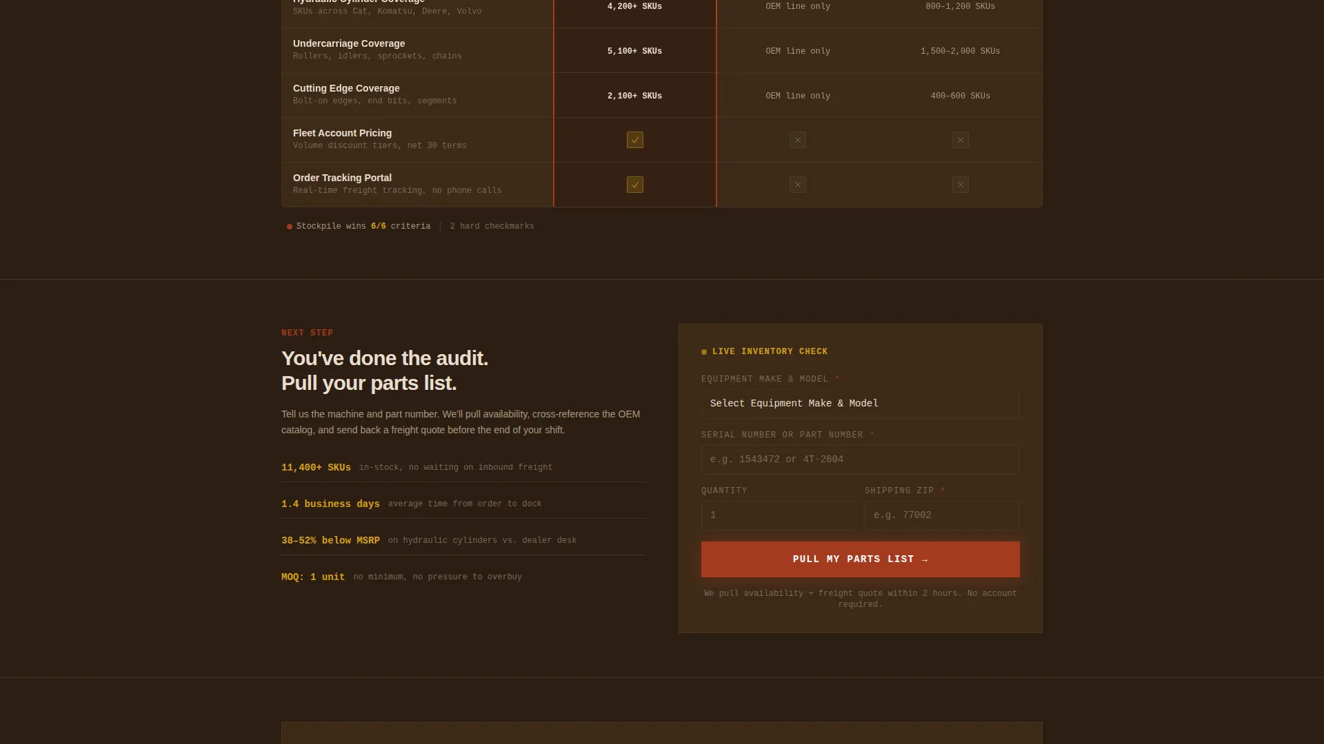
- A pinned parts-request form collecting equipment make, model, serial number, part number, quantity, and shipping zip code
- A secondary lead path offering a downloadable comparison PDF gated behind an email field
Feature list
The following features are built directly into the Stockpile template layout.
Manufacturer Logo Bar Header
A horizontal ribbon displays equipment manufacturer logos in monotone against a deep mud-brown background. Each logo shifts to full color on hover, instantly signaling brand-level credibility without a single line of copy.
Head-to-Head Audit Tables
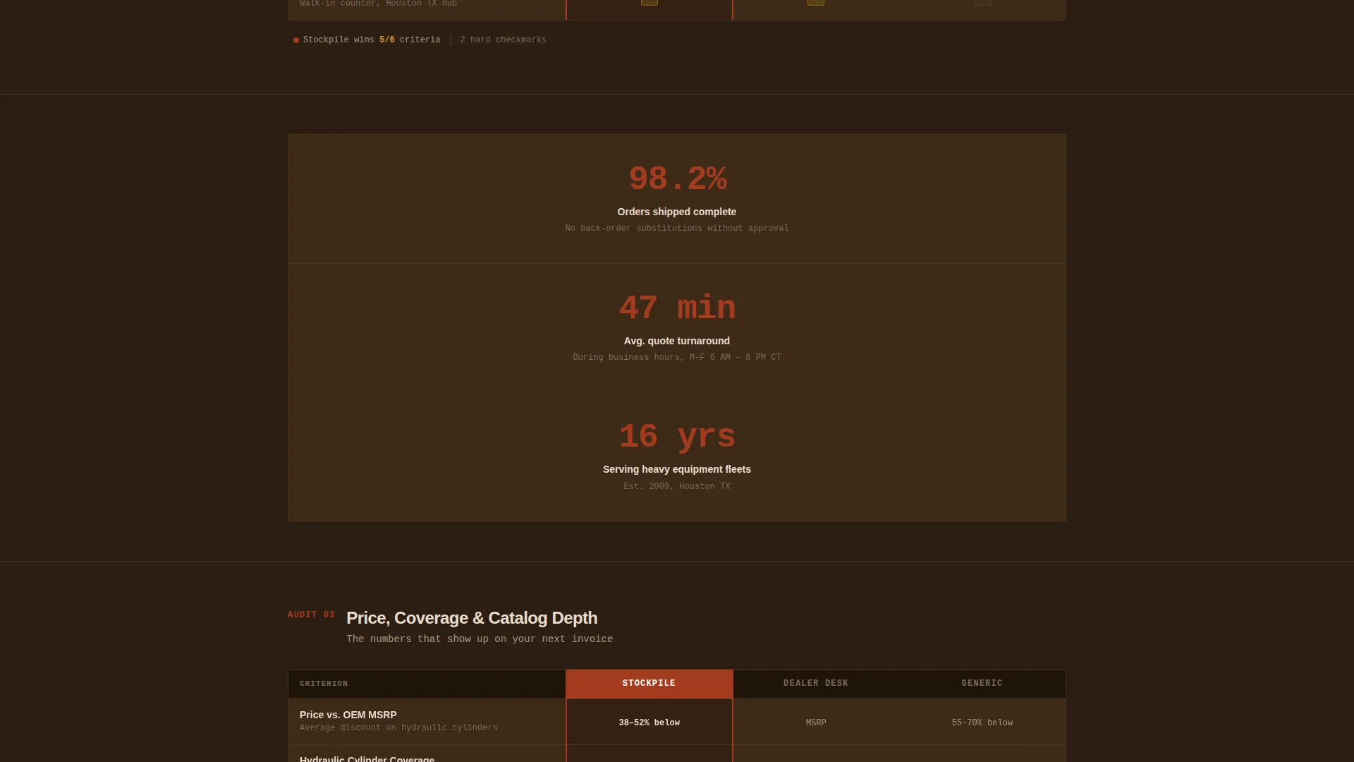
Each scroll section contains a structured comparison table measuring this supplier against dealership parts desks and generic aftermarket vendors. Criteria include material certification, hardness rating, warranty terms, lead time, freight policy, and minimum order quantities. Caution-yellow checkmarks stack visibly on the supplier side.
Single-Stat Callout Blocks
Between audit tables, bold single-number blocks land key proof points at a glance. Stats like stock count and average ship time are presented as punchy standalone statements that reinforce the audit findings without repeating them.
Pinned Parts-Request Form
After the third audit table, a primary call-to-action form appears and stays fixed to the bottom of the screen as the visitor continues scrolling. The form collects equipment make and model via dropdown, serial or part number via free text, quantity, and shipping zip code.
PDF Lead Capture Path
A secondary conversion path offers a downloadable full comparison document. Visitors submit only an email address to access it. This path is designed specifically for fleet managers who need to share the supplier case with a purchasing team.
Fire and Earth Color System
Iron oxide drives calls to action and price callouts. Excavator yellow marks comparison winners and checkmarks. Packed-dirt tan softens section dividers. Deep site-mud brown grounds body copy. The palette reads as immediately functional and industry-appropriate.
Page sections overview
| Section | Purpose |
|---|---|
| Logo Bar Header | Establishes brand credibility through recognized manufacturer logos |
| Headline Bar | Delivers the core value proposition in a single excavator-yellow line |
| First Audit Table | Opens the head-to-head comparison on material and certification criteria |
| Stat Callout Block | Punctuates the first table with a single bold inventory figure |
| Second Audit Table | Continues the comparison on warranty terms and lead time criteria |
| Second Stat Block | Reinforces shipping speed with a single average ship-time figure |
| Third Audit Table | Closes the comparison on freight policy and minimum order criteria |
| Parts Request Form | Presents the pinned primary call-to-action after three rounds of evidence |
| PDF Download Gate | Captures fleet manager emails through a secondary lead path |
Design & branding system
The visual identity follows a Service Utility theme grounded in a Fire and Earth color palette. Every color choice has a functional role in the layout, making the design feel like a working document rather than a marketing page.
- Iron oxide (#A33B20) is used for call-to-action buttons and price callouts to drive attention toward conversion points
- Excavator-yellow caution (#D4A017) marks comparison winners, checkmarks, and the headline value statement at the top of the page
- Packed-dirt tan (#C4A882) softens visual transitions between sections without breaking the industrial tone
- Deep site-mud brown (#2C1E12) anchors all background and body copy areas for zero-distraction readability
Mobile & speed optimization
The single-column flow layout is a natural fit for vertical scrolling on any screen size. The audit table rhythm and pinned form are both designed to work within a narrow viewport without requiring horizontal scrolling or layout shifts.
- Single-column structure scales cleanly from desktop to mobile without layout complexity
- Pinned call-to-action stays visible at the bottom of the screen across device sizes, keeping the conversion step always in reach
- Lean section structure with minimal decorative elements keeps the page focused and fast to scan
How this template helps you convert
Stockpile is built around a Comparison and Versus conversion model. The page does not ask for trust upfront. It earns it criterion by criterion, then makes the next step feel obvious.
- The audit tables remove buyer hesitation by answering price, quality, and logistics questions before they are asked, turning passive reading into active evaluation
- The pinned parts-request form stays present throughout the scroll, so the moment a visitor decides they are convinced, the action is immediately available without any back-scrolling required
- The secondary PDF download path captures decision-influencers who are not yet the final buyer, extending reach into purchasing workflows at no extra friction cost
Other information about this template
This template is category-matched to the Manufacturing and Industrial vertical, specifically the Construction Manufacturing subcategory and the Construction OEM Supplier niche. It is well-suited to businesses supplying parts for heavy equipment including hydraulic cylinders, undercarriage rollers, cutting edges, and pin-and-bushing kits.
- The template style is Single Column Flow, making it straightforward to populate with your own SKU data, stat figures, and comparison criteria
- The creative direction is Checklist and Audit, which is a proven format for high-consideration B2B purchases where buyers need to justify their decision internally
- Equipment brands referenced in the design context include Caterpillar, Komatsu, Volvo, John Deere, Hitachi, and Kobelco as representative logo bar examples
- The header concept is a Logo Bar, which can be updated to reflect the specific manufacturers your business actually stocks and supports
- The landing page direction is Comparison and Versus, aligning with buyers who arrive already comparing options and need a clear reason to choose
Theme
Service Utility
Creative direction
Checklist & Audit
Color system
Fire & Earth
Style
Single Column Flow
Direction
Comparison/Versus
Page Sections
Manufacturer Logo Bar Header
Head-to-head Audit Tables
Single-stat Callout Blocks
Pinned Parts-request Form
PDF Lead Capture Path
Fire and Earth Color System
Related questions
Who is this landing page template designed for?
Can I update the audit table criteria to match my own offer?
How does the secondary PDF download path work?
Does the parts-request form support equipment-specific dropdowns?
What makes this template different from a generic supplier page?