Neo-Retro B2B Wholesale Platform Landing Page Template
Stockroom is a Neo-Retro gallery and detail landing page built for B2B wholesale platforms. It uses an Obsidian and Gold color system, seasonal flip-card galleries, and a tier-upgrade sales flow to help independent retailers place bulk orders at volume pricing. The page speaks directly to boutique owners, convenience store operators, and salon owners restocking before their own doors open.
by Rocket studio
Quick summary
Stockroom is a gallery and detail landing page template designed for B2B wholesale platforms serving independent retailers. It combines a Neo-Retro industrial aesthetic with a conversion-focused upsell flow. Buyers scroll through seasonal buying moments, review unit economics on flip cards, and are guided toward tier upgrades through a sticky bottom bar and a single-modal checkout path.
Who this template is for
This landing page template is built for wholesale platform operators who sell inventory to independent retail businesses. The target audience includes boutique owners, convenience store operators, and salon professionals who need to restock seasonal product lines at volume pricing. If your platform runs on tiered pricing and you want buyers to move up tiers, this template is engineered for exactly that sales process.
- Boutique owners restocking candle lines and gift ranges ahead of the holiday surge
- Convenience store operators searching for margin on trending snack and consumable lines
- Salon owners locking in backbar product at volume pricing before a rate card changes
What problem this template solves
Wholesale platforms face a longer sales cycle than retail storefronts. Buyers arrive knowing what they need, but they often leave without upgrading their plan because the savings math is never clearly visible. This landing page solves that by making the unit economics impossible to ignore at every scroll position.
- Buyers who stay at a lower pricing tier leave margin on the table with every purchase
- Seasonal buying urgency is rarely communicated visually, so wholesale visitors lose context for acting now
- The upgrade path on most platforms involves too many unnecessary steps, reducing conversion rates
What you get with this template
This template delivers a fully structured single-page layout that moves buyers through a carefully sequenced buying journey. Every section serves a specific role in the sales funnel, from cinematic hero to sticky upgrade bar. The layout keeps potential customers engaged and oriented toward one desired action: unlocking the next pricing tier.
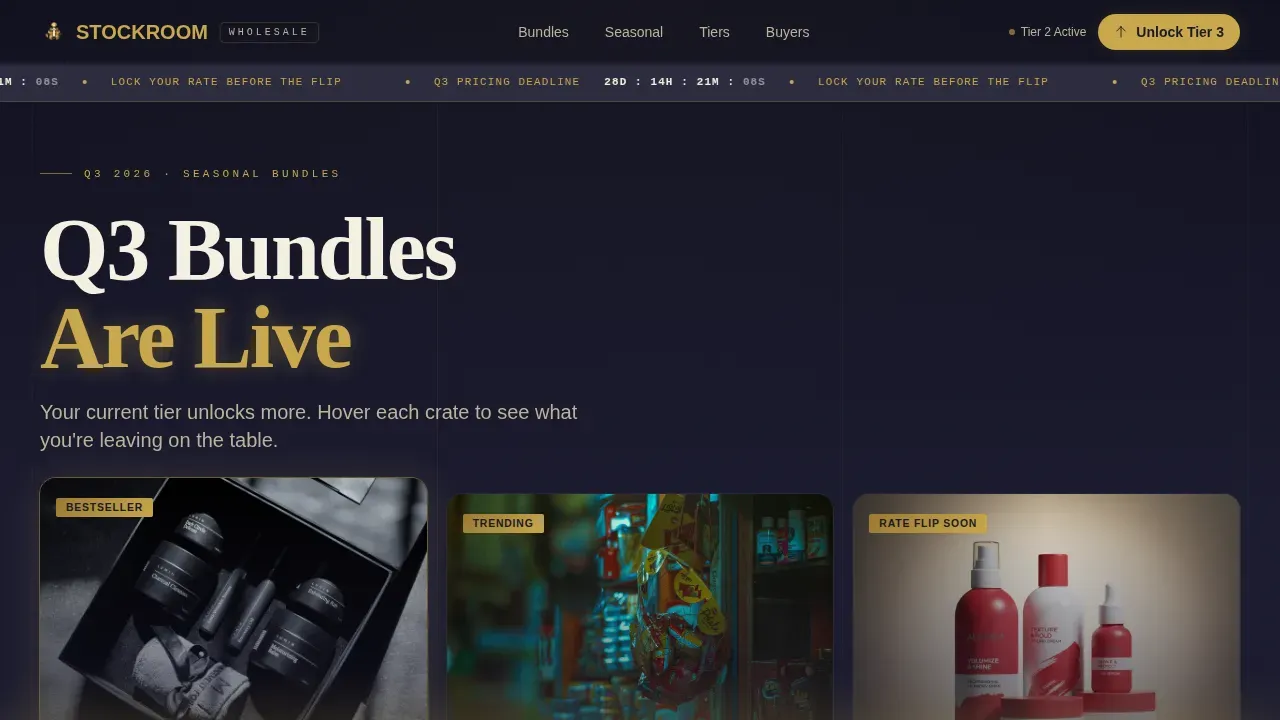
- A hero section with a seasonal bundle triptych, countdown timer, and condensed slab-serif headline
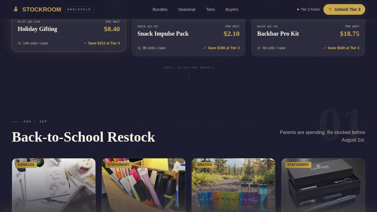
- Three seasonal gallery sections using hover flip cards that reveal per-item unit economics and tier comparison data
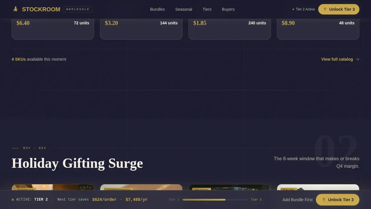
- A sticky bottom bar with a real-time savings calculator and a single-modal tier upgrade flow
Feature list
This landing page template includes a focused set of interactive and visual features. Each one is grounded in the wholesale buying context and designed to keep visitors engaged and moving toward a purchase decision. Below are the key features built into the Stockroom template.
Cinematic Hero Section with Countdown Timer
The hero section opens with three curated seasonal pallets arranged as a triptych. Each crate is shot from a three-quarter overhead angle with dramatic side-lighting. A burnished gold countdown ribbon tracks the quarterly pricing deadline, creating urgency without interrupting the browsing flow. The headline lands in a condensed slab-serif typeface, setting the tone for the entire landing page.
Seasonal Gallery with Flip Card Economics
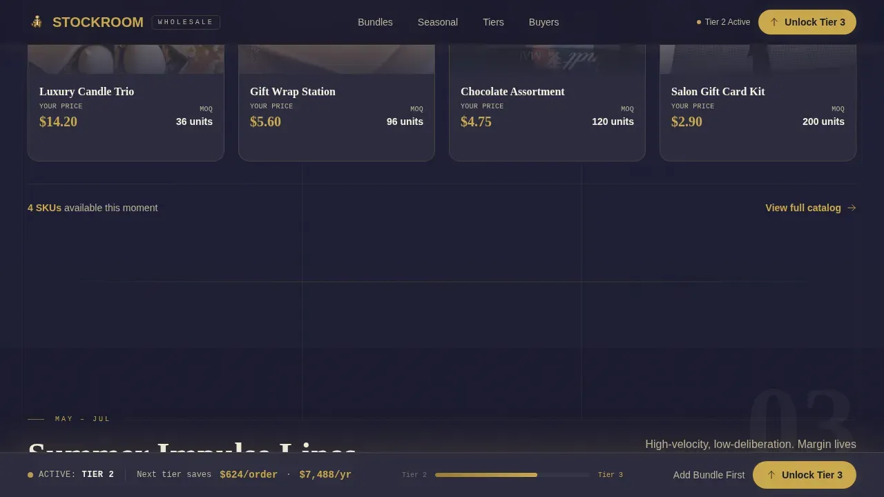
Three gallery sections each represent a distinct buying moment: Back-to-School restock, Holiday gifting surge, and Summer impulse lines. Product cards flip on hover to reveal per-item cost at the buyer's current tier versus the next tier up. The savings gap renders as a growing gold bar, making the value proposition tangible and visual. This interactive experience keeps website visitors engaged as they scroll through the curated selection.
Tier Upgrade Math Panels
By mid-scroll, the page shifts from product specs to upgrade math. Detail panels present case studies of similar buyers who moved up a tier and recouped the cost within a single order cycle. These panels use real buyer scenarios to build trust and speak directly to the hesitations that stall the sales process. Social proof in this form is more persuasive than generic testimonials.
Sticky Upgrade Bar with Savings Calculator
A persistent bottom bar activates after the visitor passes the second gallery section. It displays the buyer's current tier and a real-time savings calculator showing the gap between their current plan and the next level. The primary call to action, "Unlock Next Tier Pricing," is rendered in high-contrast gold on obsidian. This bar keeps the desired action visible throughout the entire landing page scroll without interrupting the browsing experience.
Single-Modal Tier Upgrade Flow
The upgrade flow lives inside a single modal window. Buyers confirm their business name, select from three tier options with annual savings pre-calculated in gold type, and enter payment. The flow removes unnecessary steps and reduces form fields to only what is essential for completing the transaction. A secondary path, "Add This Bundle to Current Plan," lets hesitant buyers test volume pricing on one seasonal crate before committing to a full tier change.
Bundle Detail Panel with Unit Economics
A dedicated bundle detail panel breaks down the featured seasonal crate by unit count, per-item cost, and total savings at the buyer's current and next tier. This panel functions as a product demo for the platform's pricing logic, showing buyers exactly what they gain by acting now. It sits between the gallery sections and the upgrade bar, bridging the gap between browsing and committing to a purchase.
Page sections overview
| Section | Purpose |
|---|---|
| Hero Bundle Triptych | Opens with three seasonal pallets and a gold countdown timer to establish urgency |
| Back-to-School Gallery | Flip-card product cards reveal tier pricing and unit savings for school-season SKUs |
| Holiday Gifting Gallery | Showcases holiday product moments with hover economics and a gold savings bar |
| Summer Impulse Gallery | Displays summer lines with per-item cost comparison across current and next tier |
| Tier Upgrade Math | Case study panels show ROI of moving up a tier within one order cycle |
| Bundle Detail Panel | Full unit economics breakdown for the featured seasonal crate with add-to-plan call to action |
| Sticky Upgrade Bar | Pinned bottom bar with live savings calculator and "Unlock Next Tier" call to action |
| Single-Modal Checkout | Confirms business name, tier selection, and payment in one focused modal window |
| Footer Row | Linear single-row footer with navigation and brand anchor links |
Design & branding system
The visual identity of this landing page is built around a Neo-Retro industrial aesthetic. A neo-retro landing page must blend high conversion practices with distinctive design elements, and Stockroom does this by pairing old-money weight with new-world minimalism. The color palette features warm, muted tones alongside deep backgrounds, which is exactly what this style demands. Background textures include subtle grain overlays that evoke vintage aesthetics without overwhelming the product imagery. Typography for the template uses a condensed slab-serif for headlines paired with a clean sans-serif for body text, following the retro serif plus sans-serif body convention for this design space.
- Deep obsidian black (#1A1A2E) as the primary background, warehouse shadow gray (#2D2D3F) for card surfaces, burnished gold (#C9A84C) on pricing callouts and tier badges, and warm cream (#F5F0E1) for body text
- Gold appears only where money is being saved, never as decoration, keeping the visual elements disciplined and purposeful
- Imagery follows an editorial, lifestyle approach that feels candid and film-like, shot from three-quarter overhead angles with dramatic side-lighting on premium SKUs
Mobile & speed optimization
This template is designed desktop-first, reflecting the reality that wholesale buyers typically place bulk orders early in the morning before their own stores open. That said, 80% of B2B buyers use mobile devices to research products, so the layout is structured to adapt cleanly to smaller screens. Wholesale platform landing page examples that perform best are responsive across all devices and load quickly enough to hold attention at every screen size.
- The layout uses CSS transforms and GPU-accelerated animations to keep flip cards, countdown timers, and scroll-linked gold bars smooth on desktop and mobile devices alike
- Staggered reveals and scroll-linked interactions are optimized so they do not block the core content from loading first
- The sticky upgrade bar is designed to remain usable on mobile devices, keeping the primary call to action accessible throughout the entire landing page scroll
How this template helps you convert
B2B landing pages are designed to convert businesses visiting your website into leads or customers. The primary goal of this landing page is to encourage visitors to take a desired action, which in this case is upgrading to a higher pricing tier. Every section in Stockroom is sequenced to move potential customers through a defined sales funnel, from awareness of seasonal urgency to a clear moment of commitment.
- The hero section and seasonal galleries use strong visual cues and countdown timers to establish urgency and prime buyers before they reach the upgrade decision point, improving conversion rates significantly compared to static catalog pages
- The tier upgrade math panels and bundle detail panel present social proof and unit economics that build trust, reduce hesitation, and make the desired action feel financially obvious rather than a leap of faith
- The sticky upgrade bar and single-modal checkout eliminate unnecessary steps from the buying journey, keeping the sales process short and the path to purchase direct for every visitor who reaches the bottom half of the landing page
Other information about this template
The Stockroom landing page template belongs to the Retail and E-Commerce category, within the Marketplace and Multi-Vendor subcategory. It is classified under the B2B Wholesale Platform niche and uses the Neo-Retro theme with a Gallery and Detail template style. Understanding where this template fits helps buyers evaluate whether it matches their business context before building.
- This landing page is the stockroom neo retro b2b wholesale platform landing page template, meaning it is purpose-built for wholesale operators who run a tiered pricing model and want to convert buyers to higher spend tiers
- The template follows the Upsell and Upgrade landing page direction, with a Bundle Deal header concept and a Seasonal and Moment creative direction that organizes the scroll by buying occasion rather than product category
- B2B ecommerce websites have transformed from optional marketing strategies into essential business infrastructure, and this template is designed to reflect that shift by giving wholesale platforms a professional, conversion-ready landing page without building from scratch
- The platform's multi-vendor marketplace model allows the addition of new product lines and vendor categories as the business scales, and the template's gallery structure can support that growth visually
- Social proof in the form of buyer case studies with specific savings numbers and tier upgrade return-on-investment math is baked into the mid-scroll detail panels, aligning with best practice for B2B landing page examples that rely on satisfied clients and real outcomes rather than generic endorsements
- Partner logos and trust badges can be placed in the hero or tier panel areas to reinforce credibility with potential customers who are evaluating the platform for the first time
- Security badges and payment options placeholders are included in the modal checkout section, addressing the need to build trust at the moment of financial commitment
- The template supports lead generation flows through the secondary "Add This Bundle to Current Plan" path, which seeds the upgrade conversation for buyers not yet ready for a full tier jump, reducing the impact of a longer sales cycle on overall conversion rates
- Customer registration unlocks order history and personalized pricing, both of which are referenced in the tier upgrade math panels as benefits of moving to a higher plan
- The landing page is localized for English, United States dollar currency, and United States date format, making it ready for domestic wholesale markets and adaptable for international trade scenarios with minor copy updates
- For teams evaluating landing page examples across the wholesale and marketplace space, this template reflects the most successful examples of how to combine neo-retro visual identity with a high-performance conversion structure
- The advertising campaign direction for this template is Seasonal and Moment-led, meaning each gallery section can serve as a standalone focal point for a targeted advertising campaign aimed at buyers in a specific restocking season
- Marketing tools and a sales team can use the individual gallery sections as campaign-specific landing page destinations, with each seasonal moment acting as a focused entry point for different buyer segments
- An online platform using this template can offer a personalized demo of its tier pricing to new visitors by directing them to the bundle detail panel, where the unit economics are pre-populated for the most relevant seasonal crate
- Demo requests and personalized demo flows can be supported through the secondary call to action path, giving the sales team a warm lead before a full upgrade conversation begins
- Free resources such as a downloadable tier comparison guide or a pricing frequently asked question can be linked from the footer row without disrupting the core landing page conversion flow
- Curated marketplaces that connect retailers to unique, indie, or vintage brands will find the gallery and detail layout particularly well-suited to showcasing unique pieces from niche vendors in a visually compelling way
- Customer satisfaction and loyalty programs can be referenced in the case study panels as additional reasons why satisfied clients choose to stay on the platform and increase their tier commitment over time
- International orders are accommodated by the modal checkout structure, which supports multiple payment options and flexible form fields for buyers placing orders across borders
Theme
Neo-Retro
Creative direction
Seasonal/Moment
Color system
Obsidian & Gold
Style
Gallery + Detail
Direction
Upsell/Upgrade
Page Sections
Cinematic Hero with Countdown Timer
Seasonal Flip Card Galleries
Tier Upgrade Math Panels
Sticky Bottom Upgrade Bar
Single-modal Checkout Flow
Bundle Detail Panel with Unit Economics
Related questions
Who is the Stockroom template designed for?
Can I use this template for a single seasonal advertising campaign?
How does the template handle the tier upgrade flow?
Does the template include social proof elements?
Is the template suitable for international wholesale buyers?



