Sustainable Office Supplies Landing Page Template
Stockroom is a modular card-grid landing page built for organic and natural office supplies stores. It pairs a warm parchment-and-sage visual identity with a quiz-led conversion flow, rotating seasonal product cards, and hover-flip sourcing details. The result is a crisp, trust-building page that guides eco-conscious buyers from discovery to a personalized starter kit in minutes.
by Rocket studio
Quick summary
Stockroom is a single-page template designed for sustainable office supply retailers. It opens with a device-framed header that previews a curation quiz, then flows through modular product cards, countdown-tagged seasonal drops, and a five-step quiz that ends with a personalized, time-limited bundle offer. Every layout choice reinforces the organic, tactile brand story.
Who this template is for
This template was built for brands that sell thoughtfully sourced desk and workspace supplies. It suits sellers who lead with material honesty and need a page that reflects that standard.
- Eco-conscious office managers outfitting coworking or studio spaces
- Creative directors and procurement leads at sustainability-focused companies
- Independent retailers launching a curated, natural office supplies storefront
What problem this template solves
Generic e-commerce templates cannot carry the weight of a values-driven product story. Visitors land, see a standard grid, and leave without understanding why the products cost more or matter more.
- No visual language to communicate organic sourcing and material quality
- No structured path from browsing to a personalized, purchase-ready recommendation
- No gentle urgency mechanism that fits a quiet, premium brand tone
What you get with this template
You get a fully structured landing page ready for a natural office supplies store. Every section is purpose-built and visually connected through a single cohesive design system.
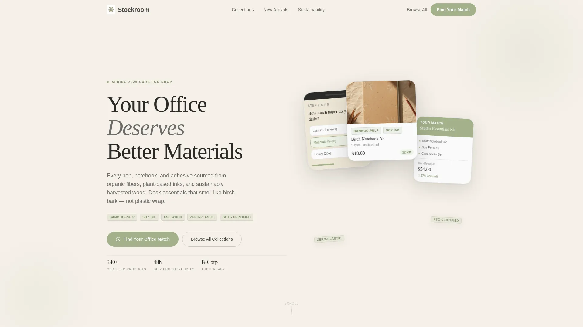
- A device-framed App Store Preview header with product card mockups and material tags
- A modular card grid with hover-flip sourcing details and seasonal countdown timers
- A five-step quiz flow that delivers a personalized starter kit with a 48-hour bundle price
Feature list
This template packs several purposeful components into one clean, scrollable layout. Each feature serves a specific role in the buyer journey.
Device-Framed Header Walkthrough
The header displays tilted, device-framed screens showing the curation quiz interface mid-swipe. Product cards appear with visible material tags like "bamboo-pulp," "soy ink," and "zero-plastic," giving visitors an immediate sense of the store's sourcing standards before they scroll further.
Modular Seasonal Card Grid
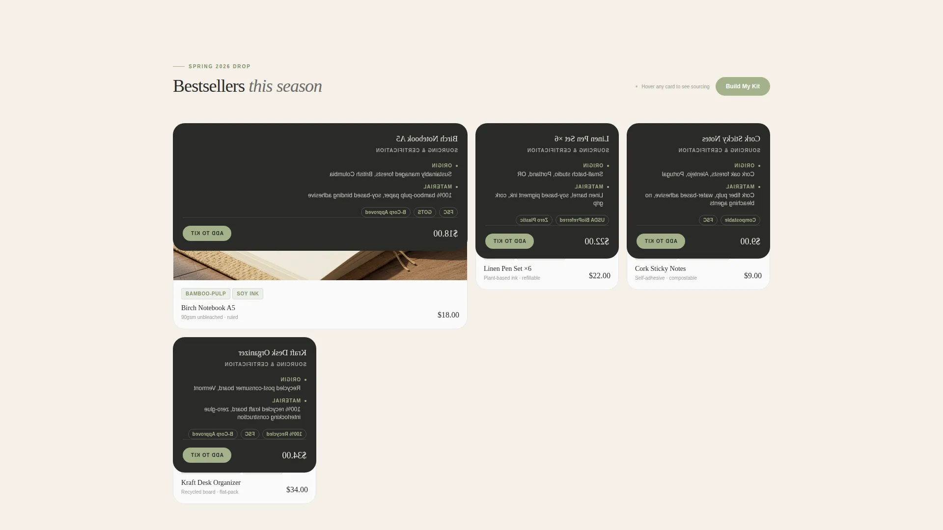
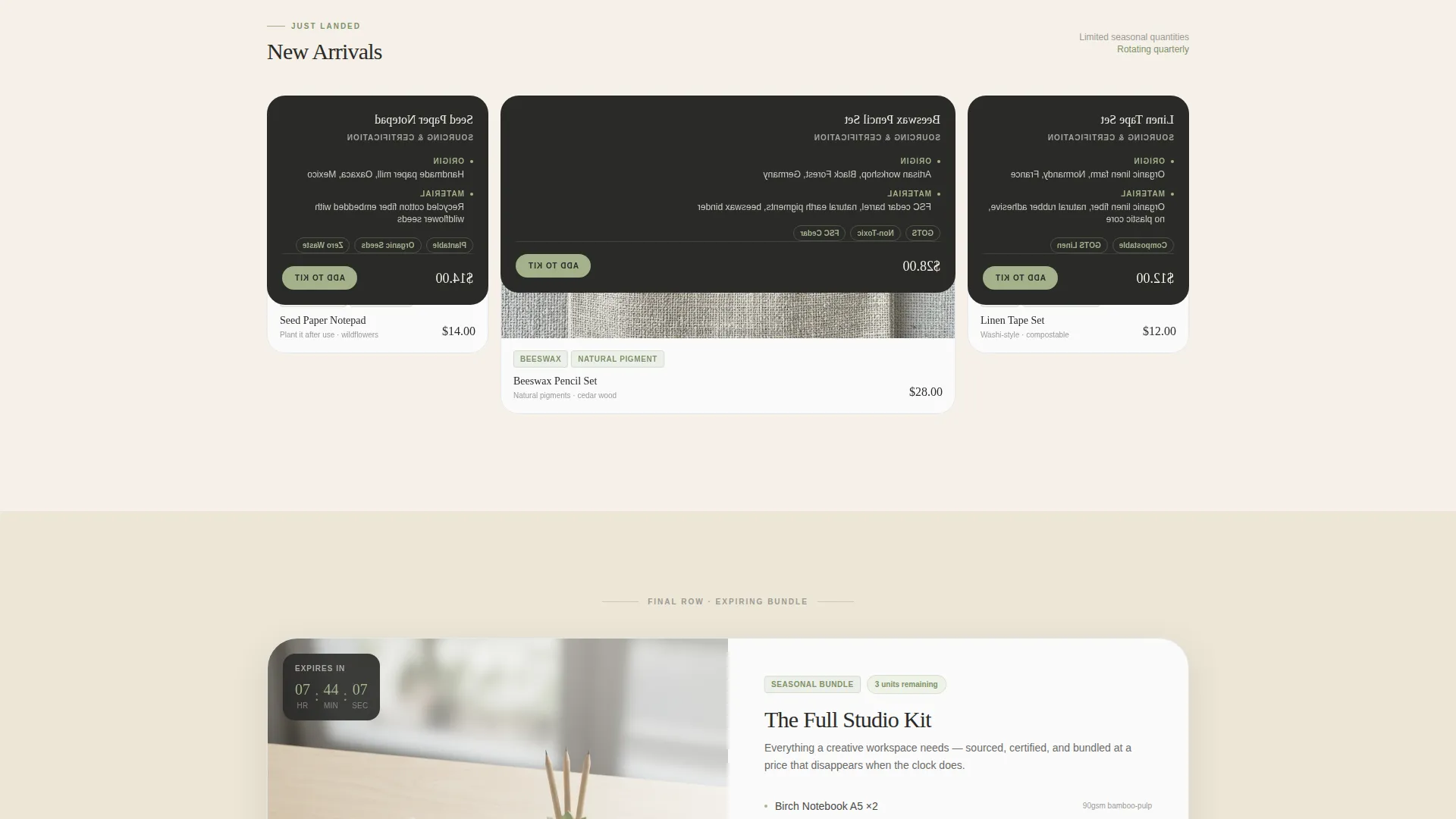
Product cards are arranged in a modular grid that shifts from bestsellers to new arrivals to expiring bundles as the visitor scrolls. Each card is tagged with an availability countdown rendered in sage numerals, building natural urgency without disrupting the quiet, premium tone.
Hover-Flip Sourcing Cards
Every product card flips on hover to reveal sourcing origin, material certifications, and close-up material details. This single interaction answers the most common trust question a sustainability-minded buyer has, directly inside the product browse experience.
Five-Step Personalization Quiz
The primary call to action launches a quiz covering workspace type, daily paper usage, material sensitivities, aesthetic preference, and monthly budget. Results generate a unique starter kit bundle with a price valid for 48 hours, creating a second, high-intent conversion moment.
Dual Conversion Path Design
Beneath the primary quiz call to action, a quieter "Browse All Collections" link gives self-directed visitors an unforced path. The two-path layout respects different buyer behaviors without splitting the visual focus of the page.
Luxe Minimal Typography System
The headline "Your Office Deserves Better Materials" is set in a fine serif styled to feel letterpressed. The typographic system pairs that serif headline weight with clean body text, keeping the page readable and consistent with the organic, tactile brand identity.
Page sections overview
| Section | Purpose |
|---|---|
| Header Quiz Preview | Introduces the store and quiz with device-framed screens and material tags |
| Bestseller Card Row | Showcases top-selling products in the modular card grid |
| New Arrivals Row | Highlights recently added curated products with seasonal context |
| Expiring Bundle Row | Displays countdown-tagged bundles to signal limited availability |
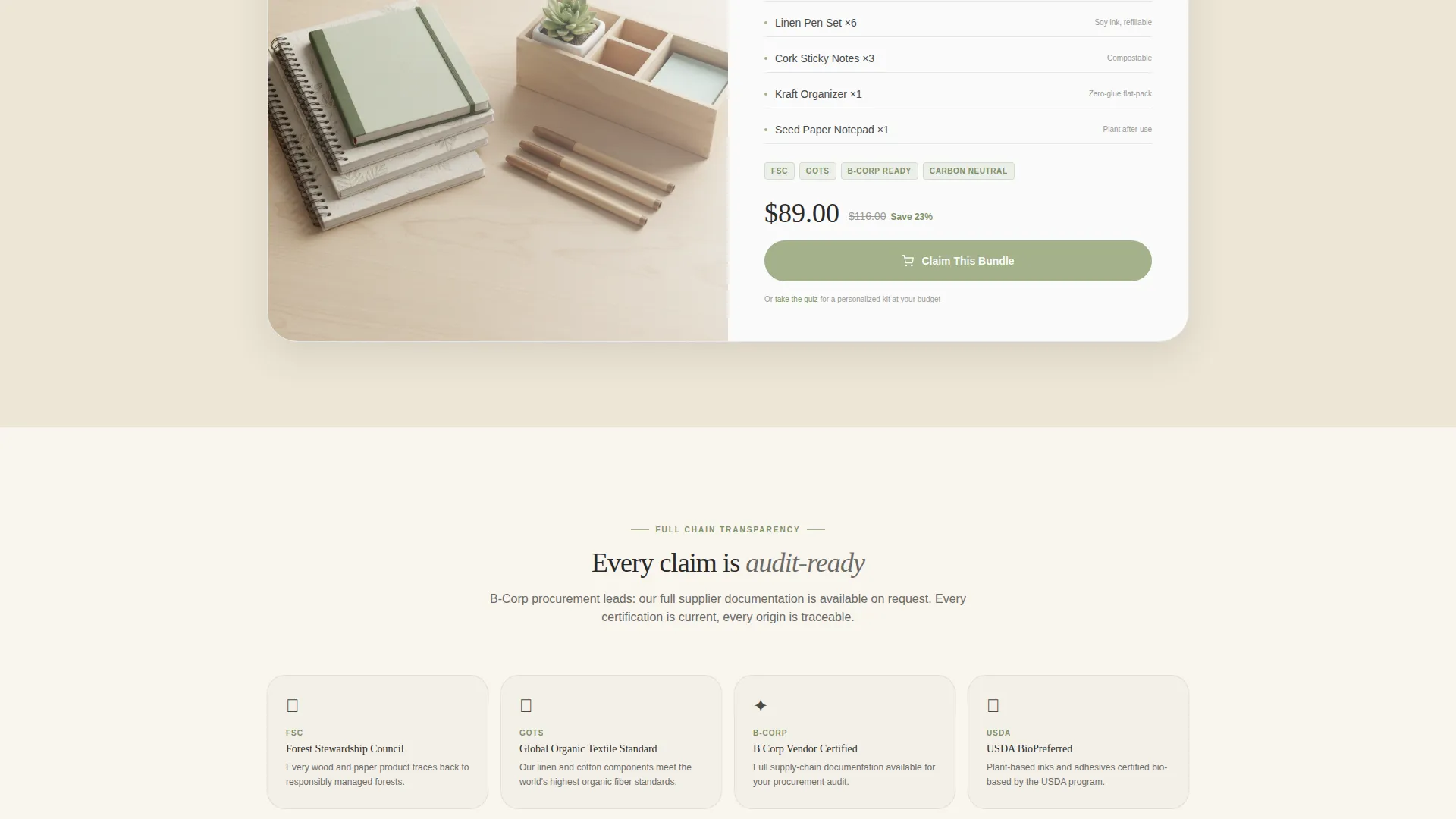
| Featured Bundle Spotlight | Closes the scroll with a single hero bundle and hours-remaining timer |
| Quiz Launch Section | Presents the "Find Your Office Match" call to action and quiz entry point |
| Browse Collections Path | Offers a secondary navigation route for self-directed visitors |
Design & branding system
The visual identity follows a Luxe Minimal theme built around a warm, organic palette. Every color, typeface, and spacing choice reinforces a sense of calm precision.
- Cloud Canvas color system: warm parchment (#F5F0E8), soft graphite (#4A4A48), mist white (#FAFAFA), and muted sage (#A3B18A) for buttons, badges, and hover states
- Fine serif headline typography styled to feel letterpressed, paired with clean readable body text
- Soft shadows, slight card tilts, and breathing white space that make the layout feel tactile and unhurried
Mobile & speed optimization
The modular card grid adapts naturally to smaller viewports without losing the hover-flip sourcing interaction or the countdown timer visibility. The layout is built for clean reflow across screen sizes.
- Modular grid columns reflow to single or double columns on narrow screens
- Countdown timers and sage badge elements remain legible at mobile scale
- Device-framed header screens scale proportionally to preserve the tilted, shadow-cast presentation
How this template helps you convert
The page is structured around two complementary conversion paths that work for different visitor intents. Both paths feel natural rather than pushy.
- The five-step quiz creates a personalized recommendation, then locks in a 48-hour bundle price that motivates first-time buyers to act before the session ends.
- The scroll rhythm moves visitors from browsing bestsellers to urgency-tagged expiring bundles, ending on a single featured product with a visible hours-remaining countdown that anchors the final purchase decision.
Other information about this template
This template sits within the Retail and E-Commerce category, specifically the Office Supplies E-Commerce subcategory. It is a strong fit for brands that need a landing page to communicate values alongside product range.
- Template style is a modular card grid, suitable for stores with rotating seasonal collections
- The Luxe Minimal theme and Cloud Canvas palette are designed to work for premium, sustainability-focused product lines
- The quiz-led layout direction makes this template suitable for stores where a personalized recommendation increases average order value
- The header concept uses an App Store Preview framing, which works well for stores that also have or plan a digital product or app companion
Theme
Luxe Minimal
Creative direction
Unboxing Experience
Color system
Lavender Dream
Style
Masonry/Pinterest
Direction
Quiz/Assessment
Page Sections
Device-framed Header Walkthrough
Modular Seasonal Card Grid
Hover-flip Sourcing Cards
Five-step Personalization Quiz
Dual Conversion Path Layout
Letterpressed Serif Typography
Related questions
Can I change the product cards and countdown timers to match my own inventory?
Does the quiz deliver personalized results automatically?
Is this template suitable for a store with a small product range?
Can I use this template without the countdown timers?
How many pages does this template include?



