Falconer Directory Website Template
Stoop is an editorial landing page template built for professional falconry services targeting facility managers, vineyard operations directors, and airport wildlife biologists. It pairs a case-study narrative structure with an Executive Suite visual identity, delivering three complete client stories before a gated download call to action, earning trust through measurable results and site-specific proof.
by Rocket studio
Quick summary
Stoop is a single-page editorial template for a professional falconry and bird abatement service. It reads like a magazine feature and closes like a facility services proposal. Three location-specific case studies anchor the page, each quantifying the bird problem, naming the raptor deployed, and showing measurable results before the visitor ever sees a contact form.
Who this template is for
This template is built for working falconers who serve commercial and institutional clients. It speaks directly to the buyers those clients rely on to make infrastructure decisions.
- Facility managers at pharmaceutical campuses dealing with recurring bird fouling on walkways and loading areas
- Vineyard operations directors facing flock pressure on ripening clusters close to harvest
- Airport wildlife biologists who need compliant bird abatement records filed on a regular schedule
What problem this template solves
Most pest control service pages look interchangeable. A falconer offering bird abatement at this level of complexity needs a page that communicates professionalism, specificity, and proof. Generic service pages lose the trust of facility buyers before they even read the offer.
- No way to show the scale or seriousness of the work without a structured narrative format
- Buyers arrive skeptical that falconry is a credible infrastructure solution, not a novelty service
- Contact-first page structures ask for commitment before delivering enough evidence to justify it
What you get with this template
You get a full editorial landing page that builds the case study by case study. Every layout decision supports the goal of converting a skeptical facility professional into a confident proposal drafter.
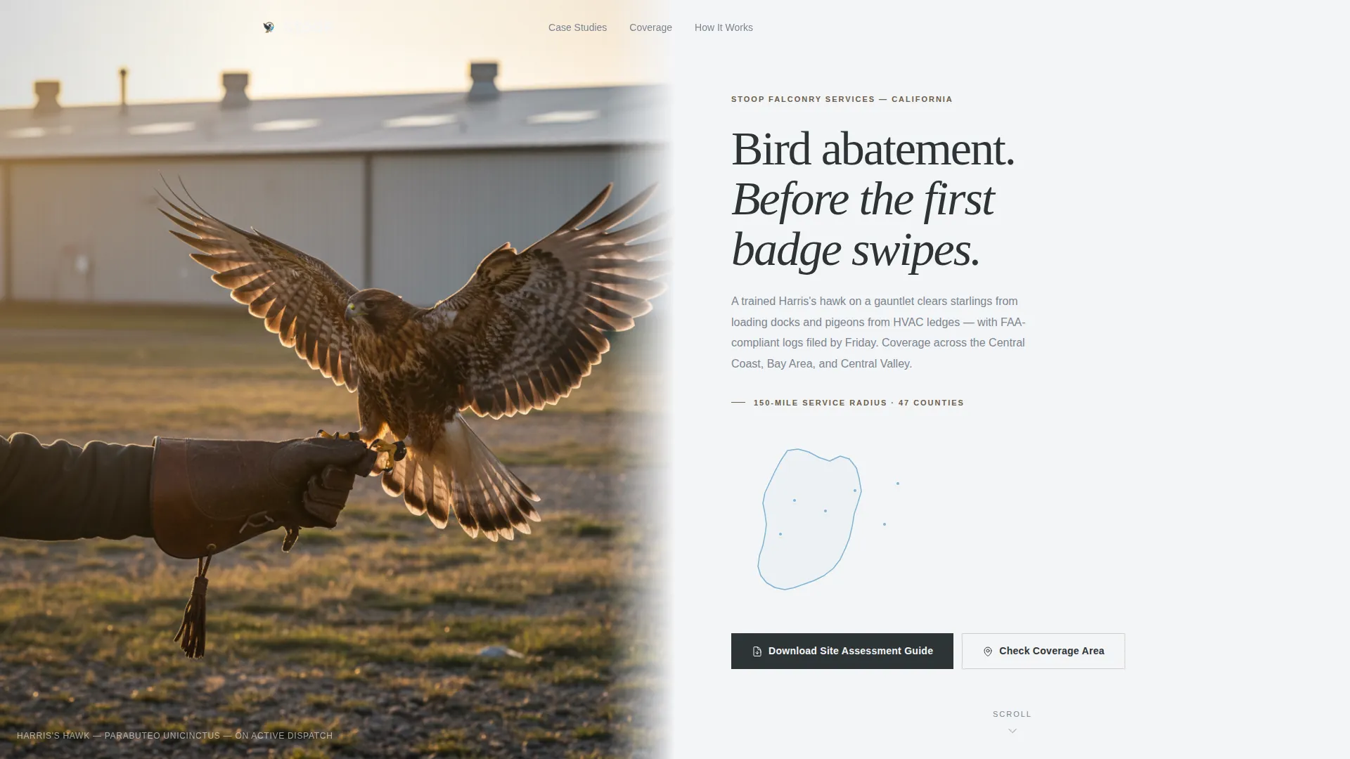
- A half-page photo and text header with an animated county-by-county map outline drawing the service region
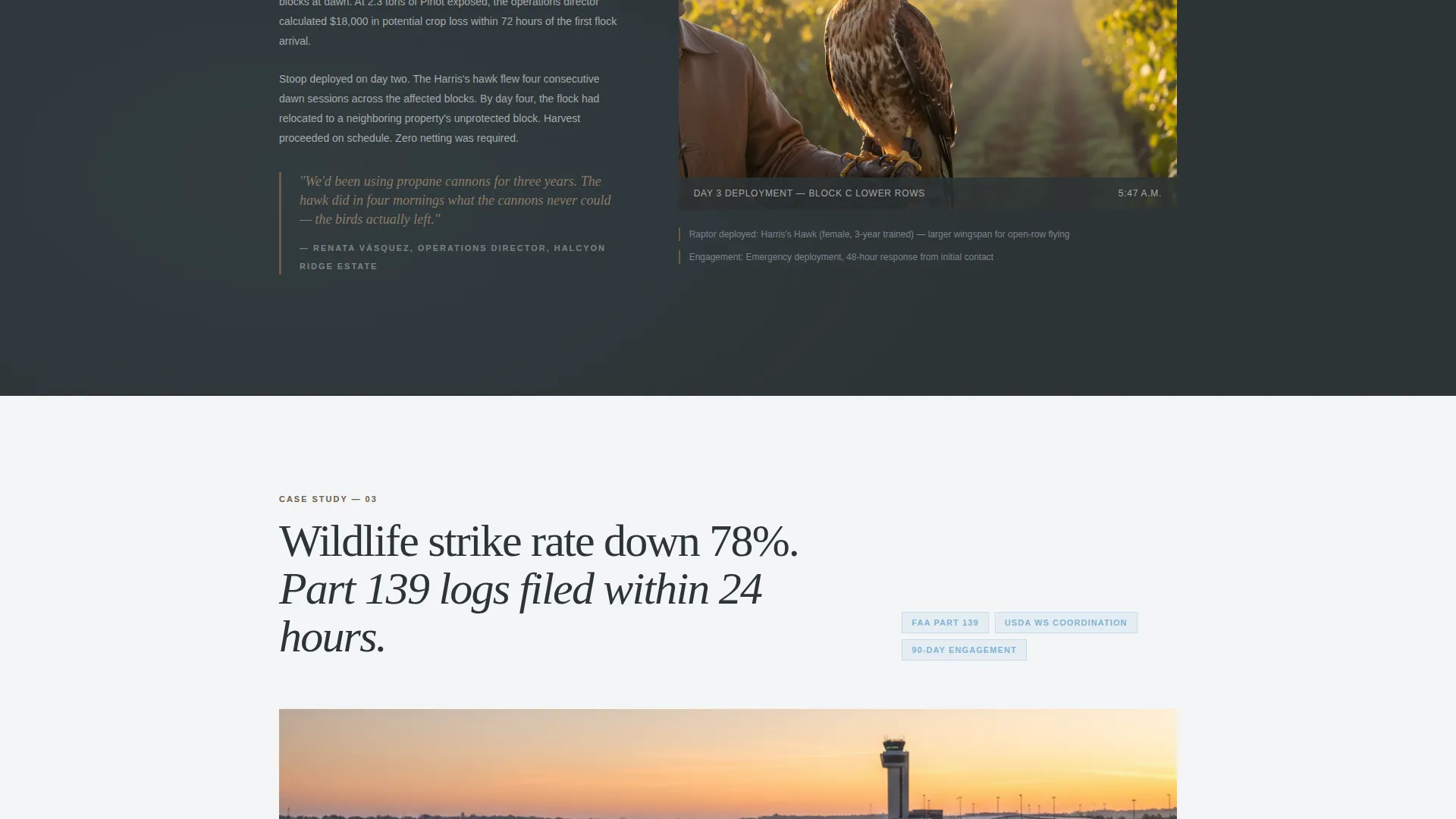
- Three complete case study sections alternating full-bleed photography with tight two-column text and margin annotations
- A gated download call to action with a single-field email capture that expands to reveal a facility type dropdown and zip code field
Feature list
This section covers the core built-in components that define how the template functions and looks.
Half-Page Editorial Header
The header splits the viewport into two equal halves. The left side holds a tightly cropped photograph shot from behind the falconer, gloved arm extended, a hawk launching toward a warehouse roofline at golden hour. The right side displays the service region headline in editorial serif type over cloud white, with a coverage radius line and an animated map outline that draws itself county by county.
Case Study Narrative Scroll
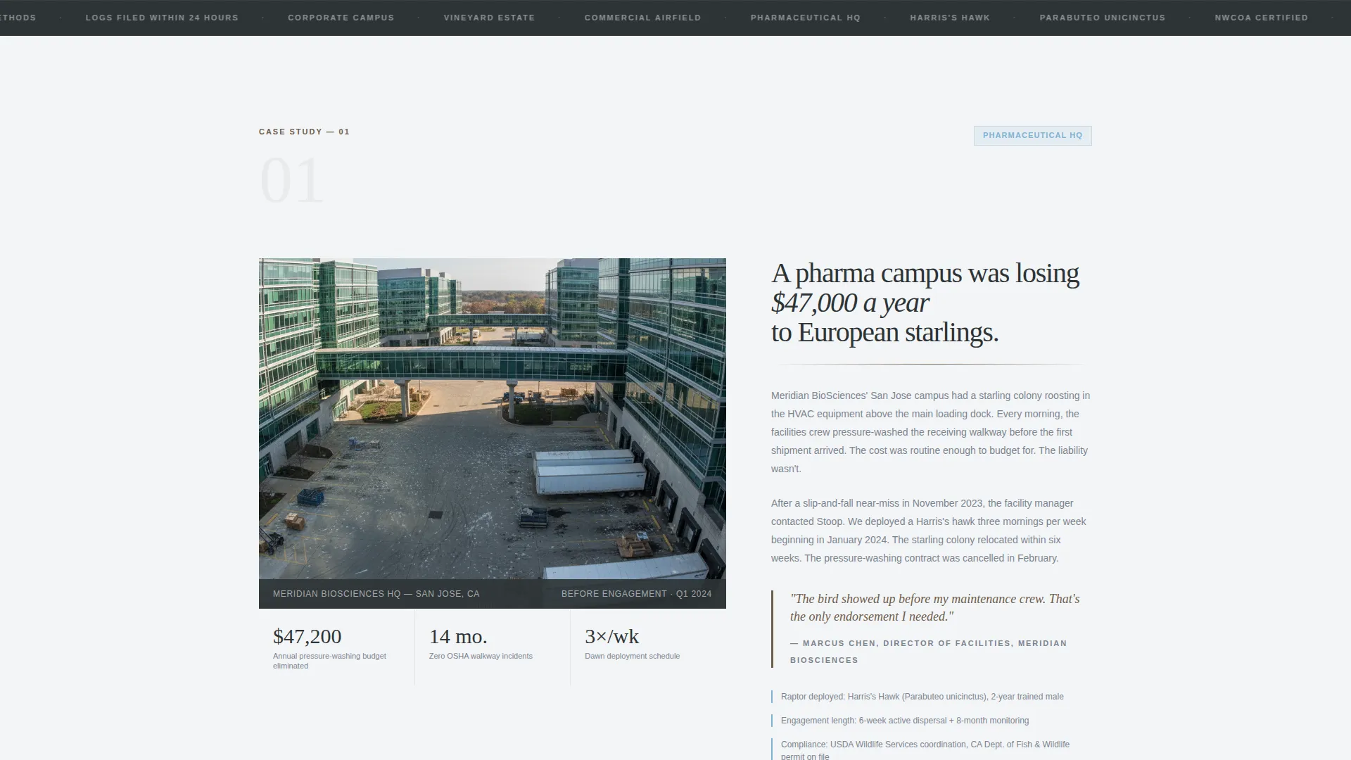
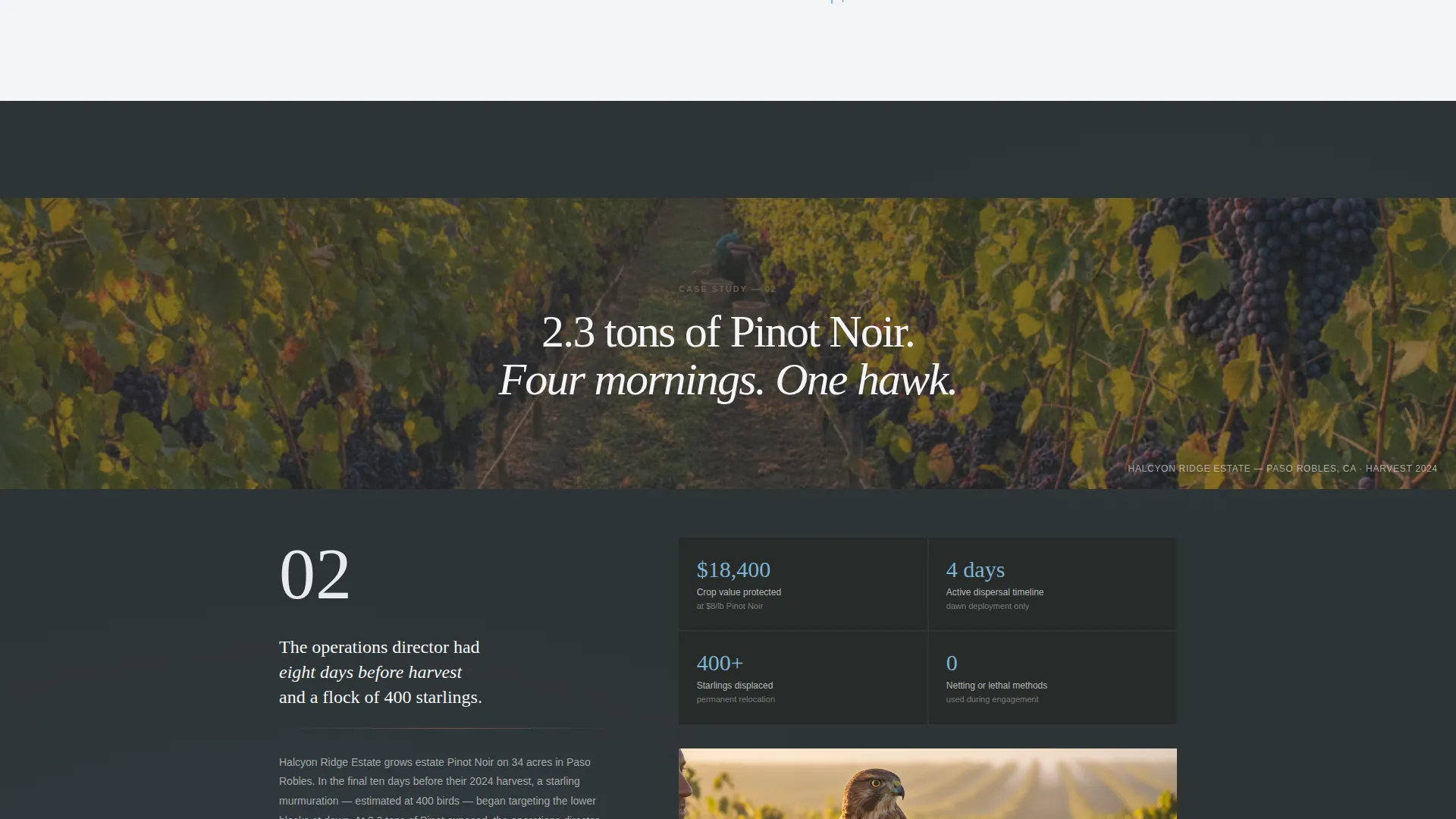
Each scroll section is structured like a magazine feature. It names the facility, quantifies the bird problem in dollars or compliance terms, identifies the raptor deployed, states the timeline, and presents a photographed and captioned result. Sections alternate between full-bleed site photography and tight two-column text with margin annotations, building complexity from corporate campus to vineyard to airfield.
Gated Resource Download call to action
The primary call to action reads "Download the Site Assessment Guide." A single email field expands on click to reveal a facility type dropdown and a zip code field. This keeps the entry barrier low while qualifying the lead before the download is delivered.
Secondary Coverage Map Path
A secondary call to action labeled "Check Your Coverage Area" links to an interactive service map with hover-activated map pins. Visitors can verify their location is within the service radius before committing to the download flow.
Pull Quote and Divider System
Weathered gauntlet brown is used throughout for pull quotes and horizontal divider rules. This creates visual rhythm between dense case study text blocks, giving readers a natural pause point and reinforcing the editorial tone of a field journal.
Escalating Complexity Structure
The three case study sections are sequenced deliberately. The page opens with a corporate campus story, moves to a vineyard estate, and closes with an airfield scenario. Each story raises the stakes in regulatory complexity and operational consequence, making the service feel progressively more essential.
Page sections overview
| Section | Purpose |
|---|---|
| Editorial Header | Establish service region and visual authority |
| Coverage Map Line | Show radius and invite area check |
| Campus Case Study | Prove value at pharmaceutical facility |
| Vineyard Case Study | Show harvest-critical bird pressure results |
| Airfield Case Study | Demonstrate compliance and log-filing capability |
| Download call to action Block | Gate the Site Assessment Guide behind email |
| Interactive Service Map | Let visitors confirm coverage before converting |
Design & branding system
The visual identity follows an Executive Suite theme built on the Slate and Sky color system. Every color choice reinforces the tone of a leather-bound field journal open on a mahogany conference table, with a sky visible through a corner-office window.
- Deep charcoal slate (#2D3436) anchors primary backgrounds and long-read text columns, grounding the page in seriousness
- Weathered gauntlet brown (#6D5D4B) marks pull quotes and divider rules, adding a tactile, field-worn quality to the editorial structure
- Open-sky blue (#7FB3D3) activates on hover states and map pins, providing a clean moment of visual lift without breaking the professional register
Mobile & speed optimization
The template is designed to remain readable and functional on smaller screens. The editorial structure adapts without losing the case study rhythm that makes the page persuasive.
- The half-page header stacks vertically on mobile, keeping the hawk photograph prominent and the headline text clear
- Case study sections reflow from two-column layouts to single-column reading order, preserving margin annotations as inline callouts
How this template helps you convert
The page earns the conversion before asking for it. Three complete case studies with real numbers appear before any contact or download prompt appears on screen.
- Delivering full proof first positions the gated download as a logical next step for a visitor already mentally drafting an internal proposal, rather than a barrier to basic information.
- The expanding email capture field keeps the initial commitment low, then qualifies the lead with a facility type dropdown and zip code field once the visitor has already decided to engage.
Other information about this template
This template belongs to the Editorial and Magazine template style category. It is paired with the Executive Suite theme and built on the Slate and Sky color system. The Case Study Narrative creative direction and the Half-Page Photo and Text header concept are both matched intersection fields confirmed for this template configuration.
- The template is categorized under Professional Services and the Falconer Online Presence subcategory, designed specifically for the Falconer Service Area and Location Page niche
- The Content and Resource landing page direction means the page is built to deliver value before conversion, which suits buyers who need internal justification before signing a service contract
- The intersection match score of 13 confirms this configuration was purpose-matched across all five intersection fields: color system, creative direction, header concept, landing page direction, and template style
Theme
Executive Suite
Creative direction
Case Study Narrative
Color system
Slate & Sky
Style
Editorial/Magazine
Direction
Content/Resource
Page Sections
Half-page Editorial Header with Animated Map
Three-section Case Study Narrative
Gated Site Assessment Guide Download
Interactive Coverage Area Map
Pull Quote and Divider Rhythm System
Related questions
Can I replace the case study locations with my own client stories?
Does the animated county map outline require custom development to edit?
What does the gated download flow look like for the visitor?
Can this template work for a falconer who specializes in only one facility type?
How does the interactive service map help visitors decide to convert?



