Commercial & Office Design Professional Website Template
Storefront is a masonry-layout landing page built for retail experience design studios. It pairs a looping abstract geometric hero with a progressively loaded project gallery, a full-width client quote break, and a persistent coral call-to-action pill. The result is a page that lets the work do the convincing before a single inquiry form appears.
by Rocket studio
Quick summary
Storefront is a single-page, gallery-led template for retail experience design studios. It opens with floating geometric shapes and a strong headline, then flows into a masonry project grid, a client quote moment, a behind-the-scenes process section, and a three-card client-type panel. Every interaction is built to earn a project inquiry by letting the work speak first.
Who this template is for
This template is made for studios and independent designers who shape physical retail environments. If your work lives in the space between a floor plan and a finished store, this page was built for you.
- Direct-to-consumer brand founders opening their first flagship location
- Legacy retailer marketing or real-estate VPs looking to drive in-store foot traffic
- Pop-up event producers who need a three-day space to feel like a permanent home
What problem this template solves
Most design studio pages lead with credentials. Visitors skim a bio, see a logo wall, and leave before they feel anything. Storefront flips that sequence by putting the work front and center, building desire before asking for a click.
- Project photography loads progressively so the gallery feels alive, not static
- Case study overlays deliver scope, timeline, and results without sending visitors to a new page
- The persistent floating call-to-action button appears only after a visitor has already spent time scrolling
What you get with this template
You get a fully structured single-page layout with every section pre-built and ready to fill with your own project content. The design system, animation logic, and interaction patterns are included from the start.
- An abstract geometric hero with looping CSS animation and no dependency on project photography
- A masonry grid with hover-tilt cards, one-line captions, project tags, and case study overlay panels
- A full-width quote break, a process reveal section, and three ideal-client-profile cards
Feature list
This template ships with a specific set of designed, interactive components. Each one supports the gallery-first, inquiry-focused goal of the page.
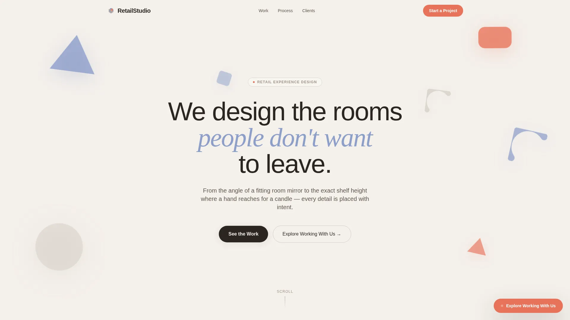
Animated Abstract Hero
The header uses overlapping triangles, arcs, and rounded rectangles in periwinkle and coral. They drift and separate in a looping CSS animation, casting soft shadows as if they are paper cutouts floating above a surface. The headline sits cleanly inside the composition without relying on any project photography.
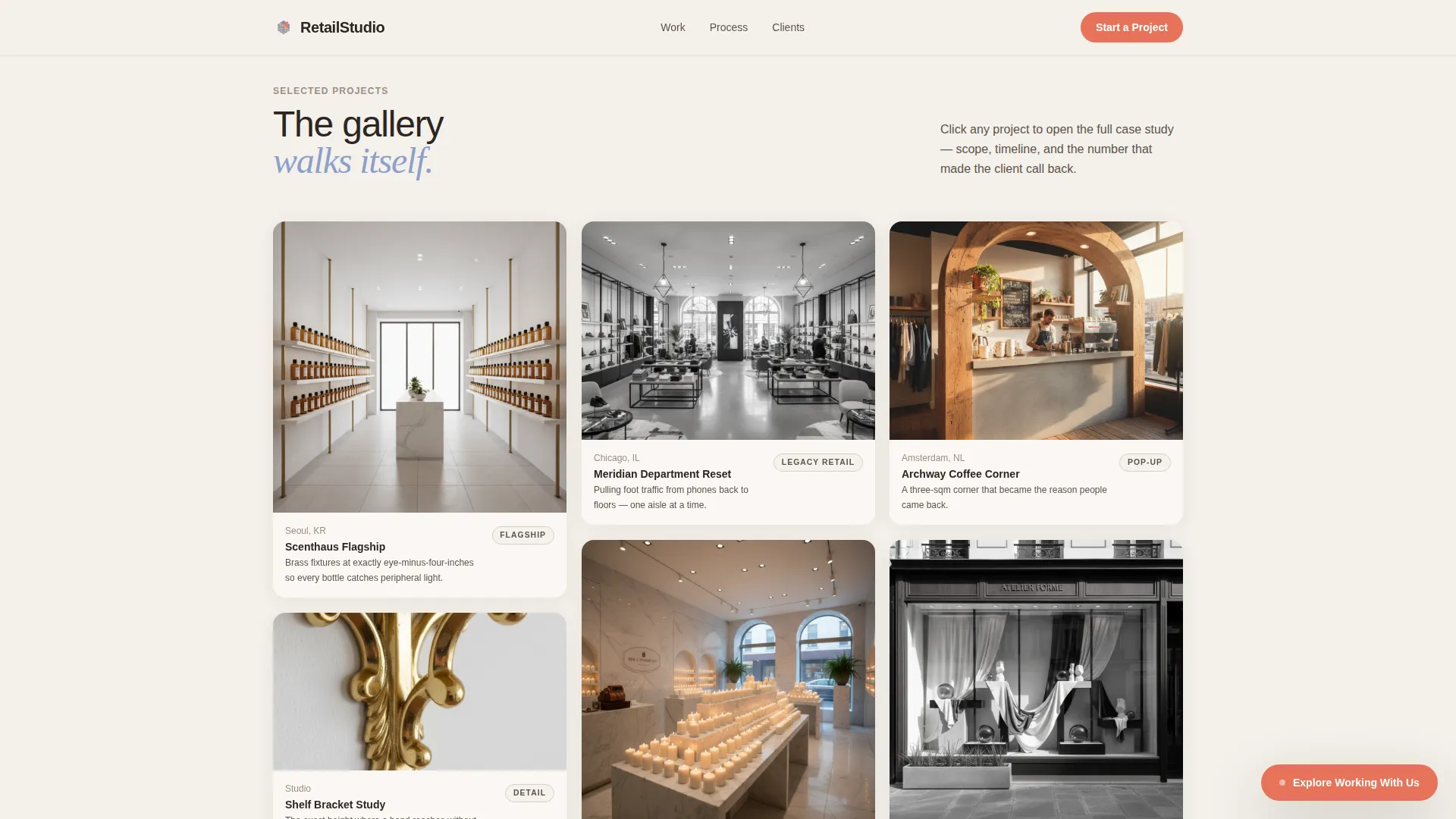
Masonry Project Gallery
Cards load progressively as the visitor scrolls, using an Intersection Observer pattern. Tall cards sit next to squat ones, full-color next to desaturated, so the eye keeps moving. Each card tilts subtly on hover and reveals a one-line caption and project category tag.
Case Study Overlay Panels
Clicking any project card opens an expanded overlay with the project scope, timeline, and results. Every overlay ends with a "Start a Project Like This" call-to-action pre-tagged with that project's category, creating a warm, contextual path to inquiry.
Floating Coral Call-to-Action Pill
A persistent "Explore Working With Us" button appears at the bottom-right corner after three seconds of scrolling. It stays visible throughout the page without interrupting the gallery experience. The coral color ensures it stands out against the soft cloud-white background.
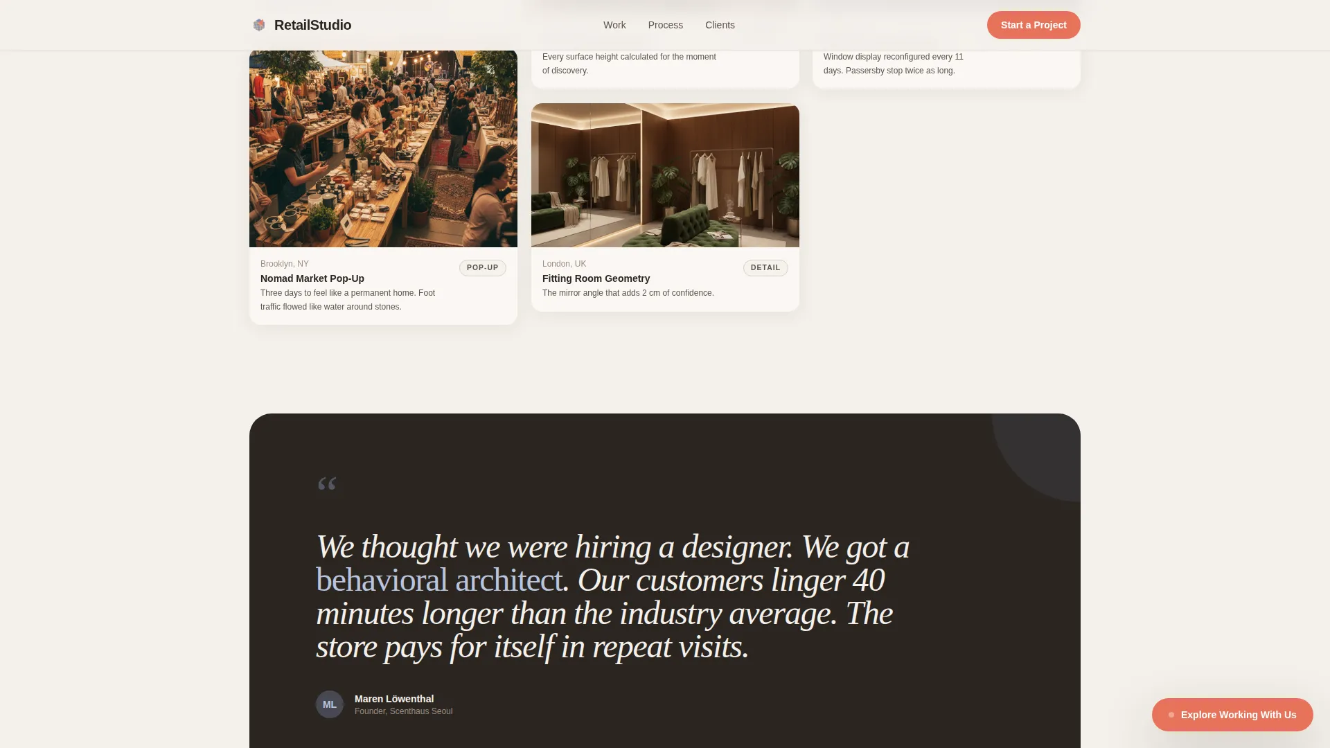
Full-Width Quote Break
Midway through the page, a single full-width card interrupts the masonry grid. It presents an oversized italic client quote set in a serif accent typeface. This moment anchors the gallery with social proof before the process section continues.
Three Ideal Client Profile Cards
Near the footer, three cards identify the studio's core client types: direct-to-consumer flagship, legacy retail, and pop-up production. Each card speaks directly to a different audience segment, helping visitors self-identify and feel seen before they inquire.
Page sections overview
| Section | Purpose |
|---|---|
| Animated Hero | Introduce studio with floating geometric shapes and headline |
| Masonry Gallery | Showcase projects with progressive load and hover interactions |
| Quote Break | Deliver social proof via oversized full-width client quote |
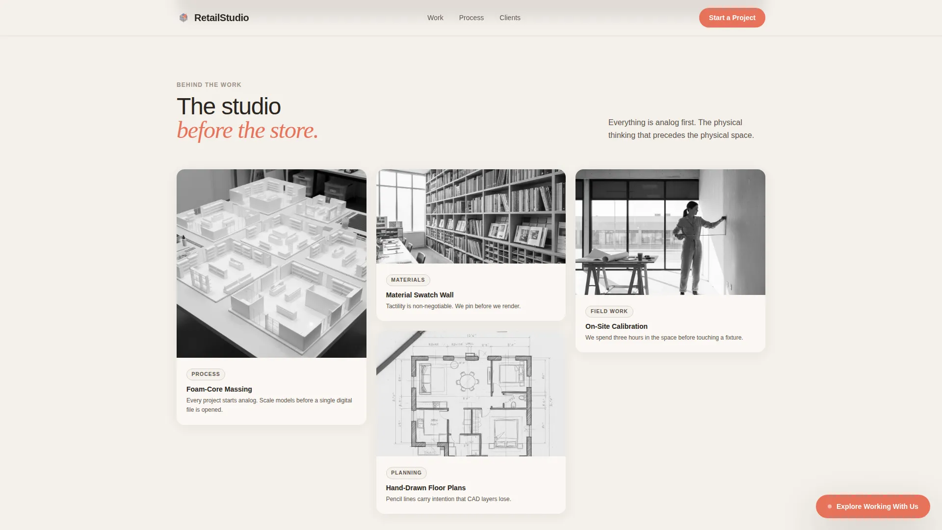
| Process Reveal | Show behind-the-scenes work through continued masonry grid |
| Client Type Cards | Help visitors self-identify across three core audience segments |
| Footer Row | Close page with a clean single-row linear footer pattern |
Design & branding system
The visual identity follows a Playful Geometric theme built on the Cloud Canvas color system. The palette is airy and restrained, letting color arrive in small, deliberate doses rather than filling the entire viewport.
- Core colors: cumulus white (#F4F0EB) background, warm mist gray (#D6CFC7) for secondary surfaces, sky-washed periwinkle (#8E9FCA) for shapes and accents, and punchy coral (#E8735A) reserved for hover states and call-to-action elements
- Typography: DM Sans as the primary geometric sans-serif for body and headings, paired with Fraunces as a serif accent for quotes and display moments
- Visual texture: overlapping geometric shapes, intentionally uneven card rhythms, and a gallery-like quiet confidence that feels tactile without being busy
Mobile & speed optimization
The template is built desktop-first to match how design studio clients typically browse, but the layout responds cleanly to smaller screens. Animation and interactivity scale down gracefully on mobile without losing the core gallery experience.
- CSS transforms power all card tilts, shape animations, and overlay transitions, keeping rendering smooth
- Intersection Observer drives progressive card loading so the masonry grid never blocks the initial page paint
- The floating call-to-action pill and overlay panels reposition sensibly on narrower viewports
How this template helps you convert
Storefront earns the inquiry instead of demanding it. The page is structured so that by the time a visitor reaches any call-to-action, they have already spent time inside the work.
- The abstract hero creates curiosity without photography, pulling visitors into the scroll before they can form a judgment
- The masonry gallery builds desire card by card, and each overlay closes the loop with a pre-tagged project inquiry path
- The floating coral pill provides a persistent, low-pressure way to convert at any moment after engagement has already started
Other information about this template
This template is built specifically for the retail experience design niche inside the broader architecture and commercial design space. A few additional details worth knowing before you customize it.
- The template sits in the Architecture and Design category, under the Commercial and Office Design subcategory, with a focus on retail experience design
- The page direction is Click-Through, meaning the primary goal is routing qualified visitors toward a detailed project inquiry page rather than capturing a form submission on the page itself
- The footer uses a Linear Single-Row pattern for a clean, uncluttered close
- All animation is handled with CSS and browser-native JavaScript APIs, with no third-party animation libraries specified in the brief
- The template is designed in English for a United States audience with pricing and context set in USD
Theme
Playful Geometric
Creative direction
Gallery Walk
Color system
Cloud Canvas
Style
Masonry/Pinterest
Direction
Click-Through
Page Sections
Animated Abstract Geometric Hero
Progressive Masonry Project Gallery
Hover-tilt Cards with Project Tags
Case Study Overlay Panels
Floating Coral Inquiry Button
Three Ideal Client Profile Cards
Related questions
Do I need project photography to launch this template?
How does the case study overlay work?
Is this template suitable for pop-up or event-based retail design work?
Can I update the color palette to match my studio's brand?
What type of inquiry flow does this template support?