Retail Web Design Agency Landing Page Template
Storefront is a bold brutalist landing page template built for retail web design agencies. It opens with a draggable Before/After Slider, walks visitors through full-viewport case study sections, and drives B2B leads through a two-path conversion system. The Obsidian and Gold color system makes every section feel intentional, industrial, and built to close deals.
by Rocket studio
Quick summary
Storefront is a full-page landing page template for retail web design agencies. It combines a dramatic Before/After Slider header, immersive case study sections, and a focused lead-capture system. The bold brutalist design uses deep blacks and molten gold to signal craft and confidence. Every section is built to show results before asking for anything.
Who this template is for
This template is built for agencies and studios that redesign retail storefronts for a living. It speaks directly to teams whose work is visual, results-driven, and pitched to brand-side buyers.
- Retail web design agencies pitching direct-to-consumer founders and brand directors
- Digital studios whose portfolio centres on conversion-focused storefront rebuilds
- Agency creative directors who want a landing page that sells the work, not just displays it
What problem this template solves
Most agency landing pages describe what they do. They rarely prove it. Retail brand buyers, such as direct-to-consumer founders and chief marketing officers, are sceptical by default. They have seen redesign pitches before. They need to feel the difference before they trust the agency behind it.
- Visitors leave before the value is clear because the page takes too long to build credibility
- Generic portfolio layouts bury the metrics that actually matter to brand-side decision makers
- Contact forms appear too early, before the visitor has seen enough to care
What you get with this template
This template delivers a complete single-page layout engineered around retail agency storytelling. Every section has a defined role in the buyer journey, from first impression to form submission.
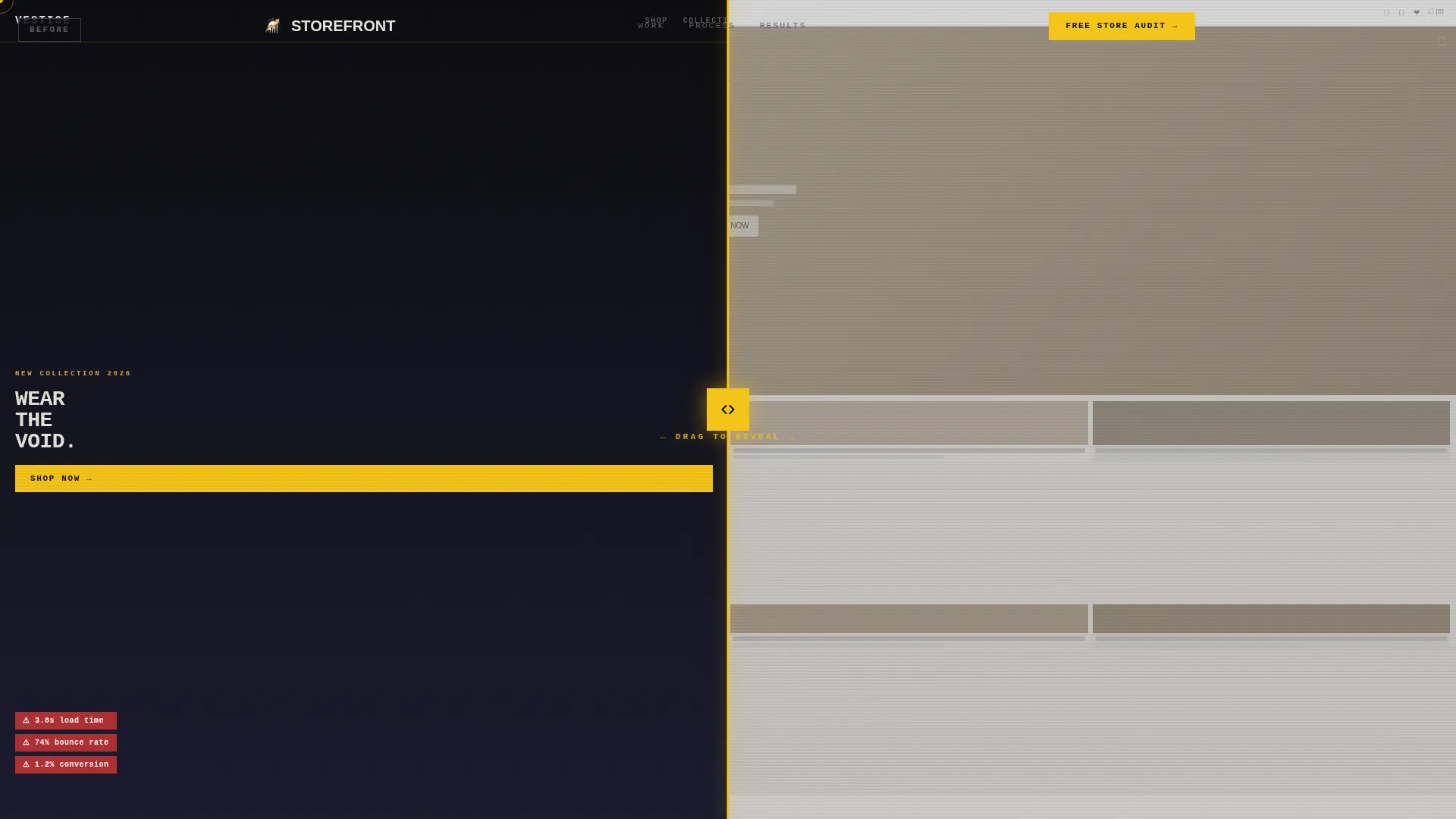
- A full-viewport Before/After Slider header with a headline that appears only when the slider crosses centre
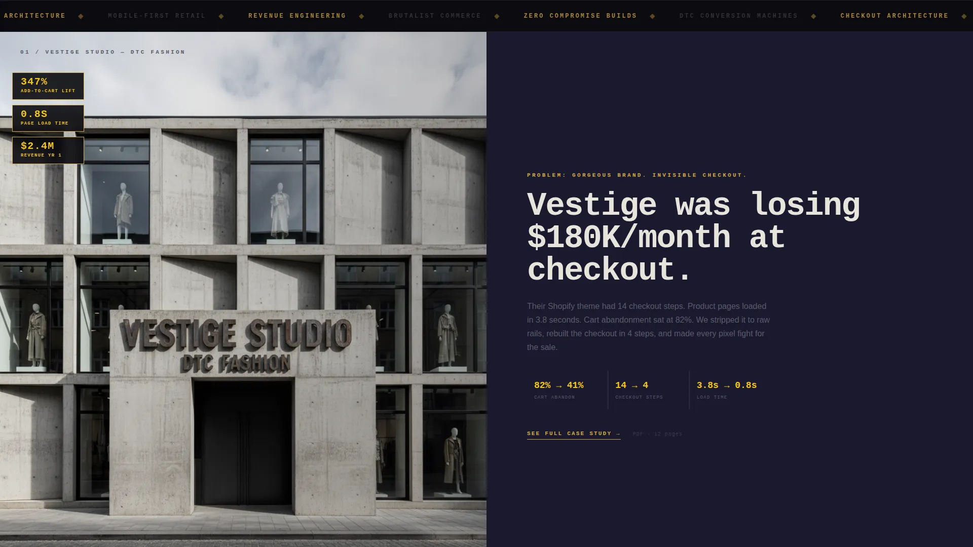
- Three full-page case study sections with revenue overlays, session recordings, and isometric mobile grids, separated by oversized single-stat interstitials
- A two-path conversion system: a fixed gold pill call to action in the navigation and a brutalist three-field modal triggered after the second case study
Feature list
This template covers all the visual and structural components described below. Each feature is built into the layout and ready to customise with your own content and branding.
Interactive Before/After Slider Header
The header fills the entire viewport with a draggable slider. On the left sits a cluttered, slow-feeling retail homepage. On the right sits the rebuilt version. The headline "We don't redesign stores. We rebuild revenue." slams in with monospaced type only after the slider crosses centre, rewarding the interaction before delivering the message.
Full-Viewport Case Study Sections
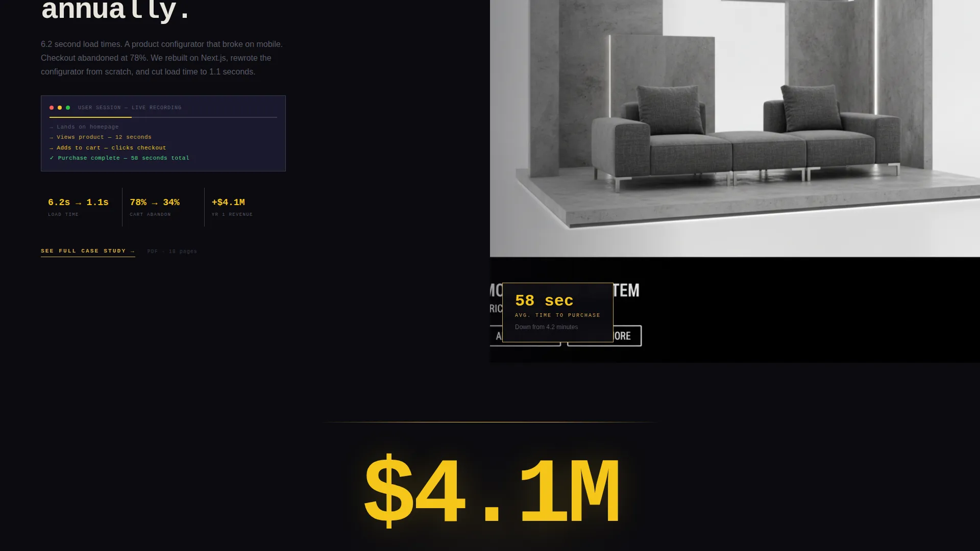
Each case study occupies the entire screen. No shared space, no competing content. The first section overlays revenue metrics directly on the design. The second autoplays a screen recording of a user session flowing to checkout. The third arranges mobile frames in an isometric grid that rotates subtly on scroll.
Single-Stat Interstitial Breaks
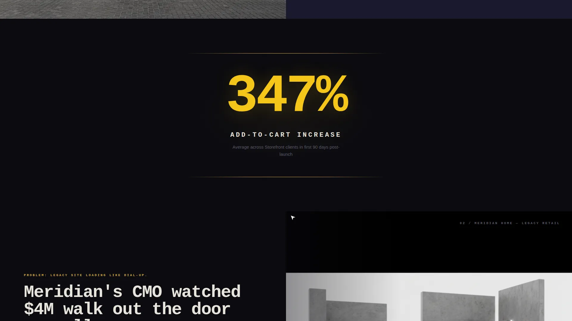
Between each case study, a full-screen interstitial displays one oversized statistic in molten gold numerals on deep black. The rhythm builds deliberately: immerse, prove, stagger, repeat. The escalating stakes keep the visitor scrolling and the credibility growing with each pass.
Fixed Gold Pill Navigation call to action
The primary call to action "Get Your Free Store Audit" appears as a fixed gold pill in the top navigation bar. It stays visible throughout the entire scroll, giving the visitor a clear conversion path at any point without interrupting the content flow.
Brutalist Three-Field Lead Modal
Clicking the primary call to action opens a modal designed in the same brutalist visual language as the rest of the page. The three fields appear in sequence: store URL first, monthly revenue band second, and email address third. This order reduces friction by leading with intent before asking for contact details.
Secondary Email-Gated Case Study Links
Each case study section carries a secondary conversion path in the form of a "See Full Case Study" link. These links gate detailed content behind an email capture, giving the visitor a lower-commitment way to engage while still moving them into the lead funnel.
Page sections overview
| Section | Purpose |
|---|---|
| Before/After Slider | Opens with interactive transformation demo |
| Monospaced Headline | Delivers the core agency positioning statement |
| Case Study One | Shows revenue metrics overlaid on live design |
| Stat Interstitial One | Reinforces impact with a single bold number |
| Case Study Two | Autoplays user session recording to checkout |
| Stat Interstitial Two | Escalates credibility with a second key metric |
| Case Study Three | Displays isometric mobile grid on scroll |
| Primary call to action Modal | Captures store URL, revenue band, and email |
| Secondary Capture Links | Gates full case studies behind email input |
Design & branding system
The visual identity is built on a Bold Brutalist theme. The palette pairs luxury materials with raw industrial textures, using contrast and weight to direct attention and signal confidence.
- Core colors: deep volcanic black (#0B0B0F), polished obsidian (#1A1A2E), molten gold (#D4A843), searing highlight amber (#F5C518) reserved for calls to action and hover states, and concrete gray (#3A3A4A) for body text and dividers
- Typography uses aggressive weights and monospaced styles to reinforce the raw, intentional aesthetic of the brutalist grid
- Every layout decision is full-viewport and uncompromising, with no decorative padding or softening elements between sections
Mobile & speed optimization
The template is structured for a smooth experience on smaller screens while preserving the full visual impact of the brutalist layout. The storybook format naturally stacks into a strong single-column mobile flow.
- Full-viewport sections reflow cleanly on mobile without losing the immersive feel
- The isometric mobile frame grid in the third case study is designed to remain legible and visually striking at smaller sizes
- The fixed navigation call to action stays accessible throughout scroll on both desktop and mobile viewports
How this template helps you convert
The page is built around a deliberate proof-then-ask sequence. Visitors see results before a single form field appears. This approach is designed to make the conversion feel earned rather than forced.
- The Before/After Slider and escalating case study sections build credibility progressively, so by the time the primary call to action appears after the second case study, the visitor already trusts the work.
- The three-field modal leads with the lowest-friction field first, a store URL, which signals high intent before asking for personal contact information, reducing drop-off at the form stage.
Other information about this template
This template is built specifically for the retail web design agency niche and aligns closely with the needs of studios pitching to direct-to-consumer brands and retail marketing teams. It works as a standalone portfolio and pitch page.
- The Storybook/Full-Page format means the entire narrative lives on one scrollable canvas, keeping the visitor inside a single continuous experience
- The Partnership and B2B conversion direction means every design decision prioritises qualified lead capture over vanity traffic
- Agencies using this template can replace placeholder case study content with their own project metrics, screen recordings, and mobile screenshots
- The template style is well suited to agencies that want to differentiate from clean minimal portfolios and position their work as high-performance and results-first
Theme
Bold Brutalist
Creative direction
Immersive Visual
Color system
Obsidian & Gold
Style
Storybook/Full-Page
Direction
Partnership/B2B
Page Sections
Interactive Before/after Slider Header
Full-viewport Case Study Sections
Single-stat Interstitial Breaks
Fixed Gold Pill Navigation Call to Action
Brutalist Three-field Lead Modal
Email-gated Case Study Links
Related questions
What kind of agency is this template built for?
Can I replace the placeholder case studies with my own work?
How does the lead capture system work?
Is the Before/After Slider interactive for visitors?
Does this template work as a full agency website?



