Specialist Indigenous-Owned Business Comparison Website Template
Storykeeper is a modular card-grid landing page built for an Indigenous-owned bookstore. It pairs a full-bleed photo header with a scroll-driven comparison journey, curated bundle grids, and a persistent upsell bar. The result is a page that feels intimate and purposeful, guiding every visitor from a first browse toward a deeper, committed reading life.
by Rocket studio
Quick summary
Storykeeper is a single-page landing page template designed for an Indigenous-owned bookstore. It opens with a warm, grain-filtered photo header and moves visitors through a deliberate comparison journey built from modular card grids. Curated bundles, tiered collections, and a persistent bundle-tally bar work together to turn casual browsers into committed readers.
Who this template is for
This template speaks directly to bookstore owners and cultural retailers who want their page to reflect the weight and warmth of what they sell. It suits anyone running a curated, mission-driven shop where the inventory tells a story.
- Indigenous-owned bookstores and literary retailers carrying under-represented voices
- Educators and cultural organizations building reading programs or syllabi resources
- Independent shop owners who want a landing page that earns trust before it asks for a purchase
What problem this template solves
Most e-commerce landing page templates are built for volume, not meaning. They default to generic grid layouts that treat every product the same. For a bookstore rooted in sovereignty and cultural depth, that approach fails the inventory and the reader.
- Mainstream templates offer no way to contrast curated depth against surface-level discovery
- There is no built-in reading journey that moves a visitor from beginner bundles to deeper collections
- Standard upsell patterns feel transactional rather than educational or relational
What you get with this template
You get a fully structured single-page layout built around a card-grid system that teaches as it sells. Every section is designed to deepen the visitor's understanding of the inventory before presenting an upgrade path.
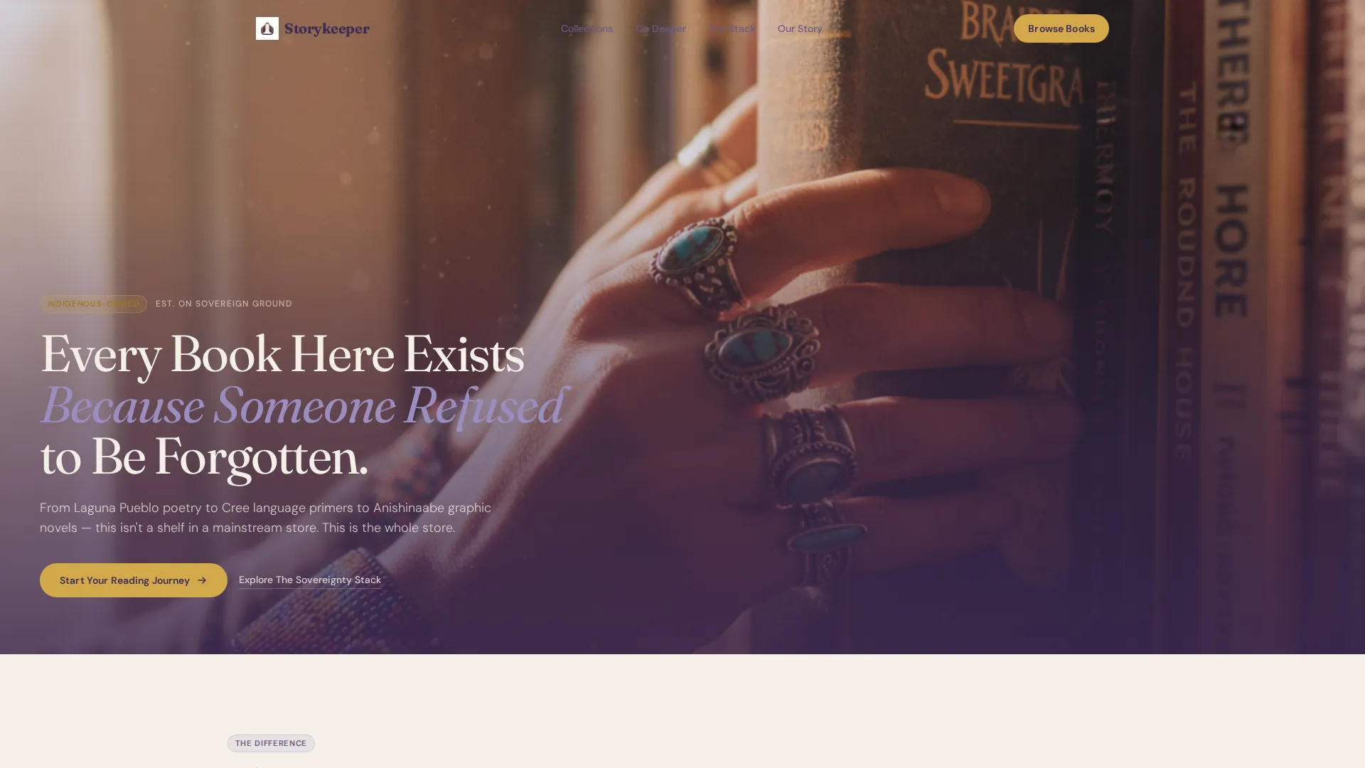
- A full-bleed photo header with a fade-in headline overlay anchored in the lower third
- Modular card grids organized by reading tier, from starter bundles to advanced collections
- A persistent bottom bar that tallies selected items and surfaces a bundle-savings nudge in real time
Feature list
This template is built around purposeful layout decisions. Each feature below is drawn directly from the design and functional brief.
Full-Bleed Photo Header
The header uses a warm, grain-filtered photograph of hands pulling a book from a packed shelf. Natural window light, visible dust motes, and readable Indigenous title spines create an immediate sense of place. A hand-lettered headline fades in over the lower third of the image.
Modular Card Grid Layout
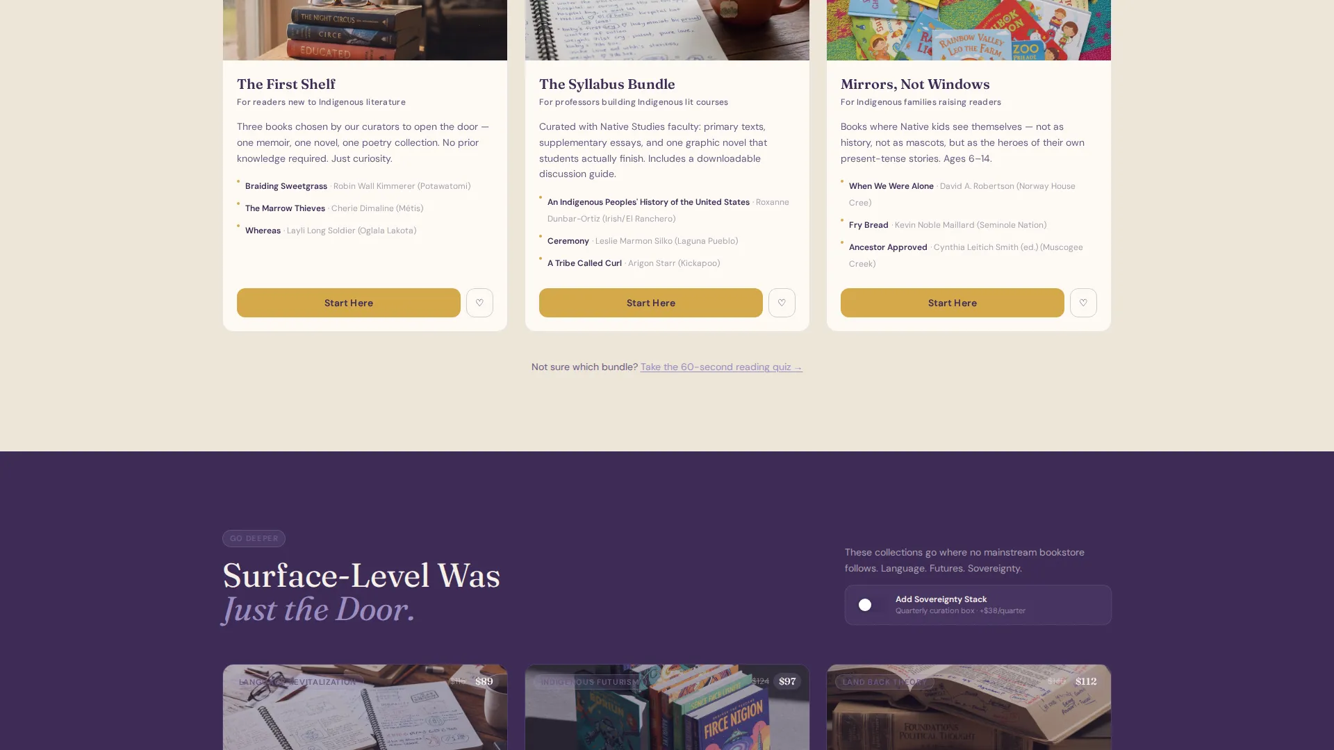
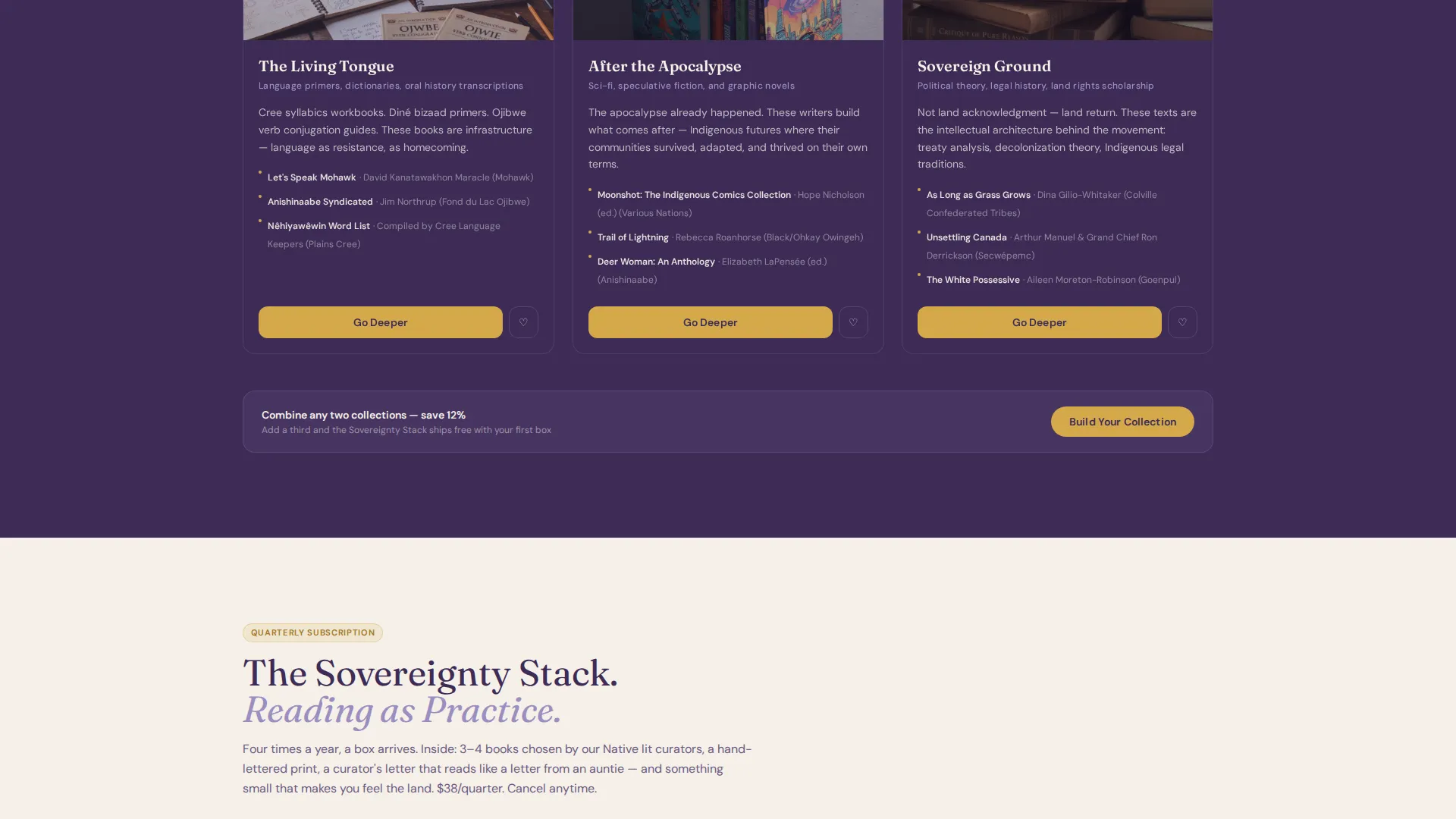
The page is organized into distinct card grid sections. The first grid presents curated starter bundles for beginners, educators, and young readers. Subsequent grids reveal deeper collections, with cards growing richer in color and thumbnails shifting from single books to stacked sets.
Comparison Journey Scroll Structure
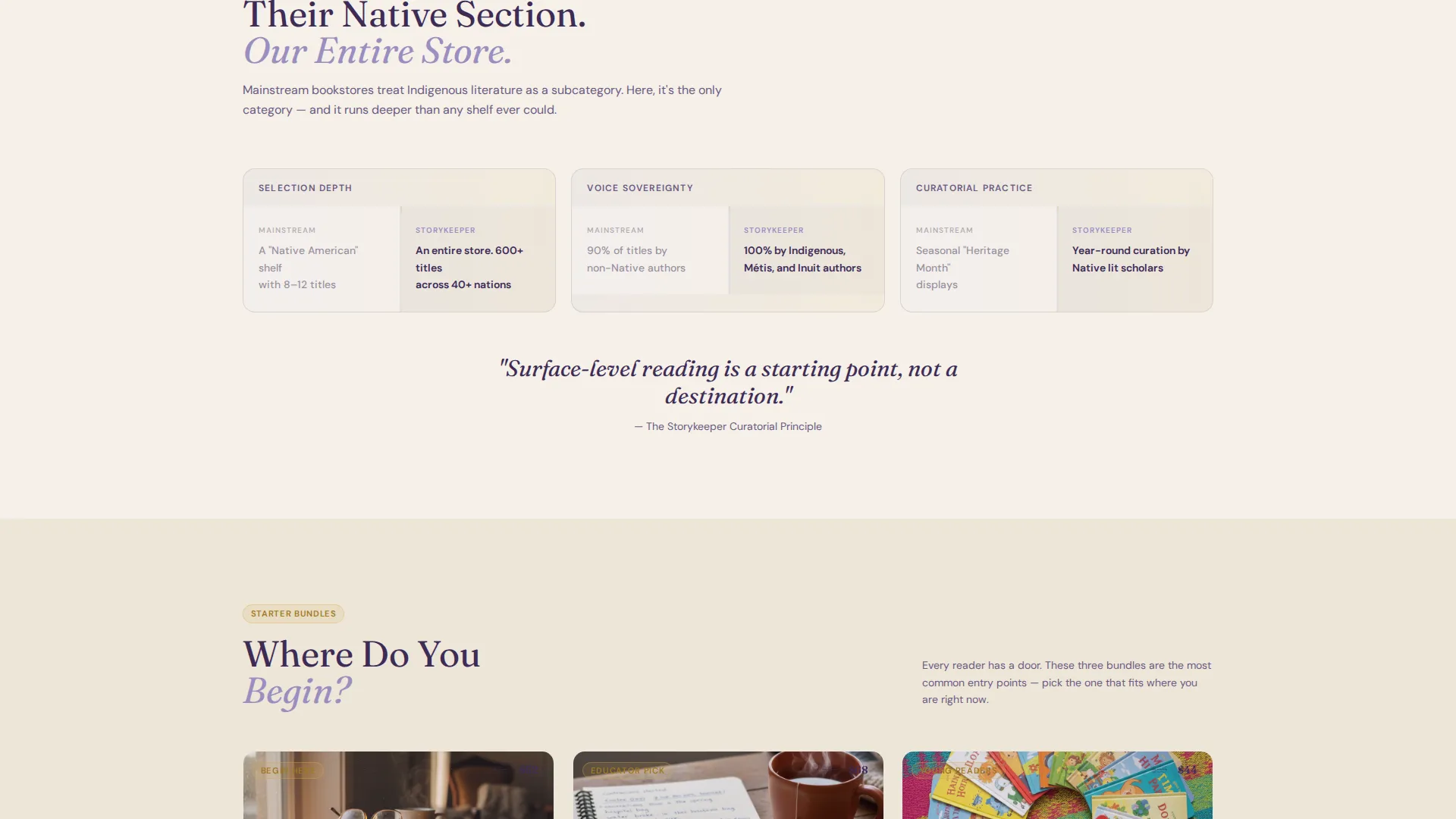
Each scroll section is built as a deliberate contrast engine. Paired callouts set mainstream shelf habits against the store's full inventory, walking the visitor through why surface-level reading is a starting point and not a destination.
Tiered Call-to-Action Buttons
Starter bundle cards carry a "Start Here" button. Upgraded collection cards use "Go Deeper." Each card also includes a one-click "Add to Bundle" button, keeping the path from discovery to action short and frictionless.
Persistent Bundle Tally Bar
A sticky bottom bar tracks the visitor's selections across the page. When two items are chosen, the bar surfaces a nudge: adding a third saves fifteen percent. The bar makes the upsell feel like a helpful reminder rather than a push.
Sovereignty Stack Subscription Toggle
Each upgraded collection card includes a toggle option to add a quarterly subscription box called The Sovereignty Stack. This gives visitors a clear upgrade path without requiring a separate page or flow.
Page sections overview
| Section | Purpose |
|---|---|
| Full-Bleed Header | Opens with atmosphere and headline |
| Comparison Contrast Row | Frames mainstream shelves versus. this store |
| Starter Bundle Grid | Presents beginner, educator, young-reader cards |
| Deep Collections Grid | Reveals language, futurism, land-back tiers |
| Subscription Toggle Cards | Offers The Sovereignty Stack add-on |
| Persistent Tally Bar | Tracks selections and surfaces bundle savings |
Design & branding system
The visual identity follows a Neo-Retro theme. The palette draws on ceremonial softness and vintage depth, feeling like a reservation general-store sign repainted by a graphic-designer granddaughter. Lavender does not whisper here; it hums with quiet authority.
- Core colors: soft ceremonial purple (#9B8EC1), faded trading-post cream (#F5F0E8), and deep elderberry (#3D2B56)
- Accent use: warm sweetgrass gold (#D4A94B) reserved for hover states, badges, and call-to-action edges
- Typography leans hand-lettered for headlines and clean-serif for body, reinforcing the inherited-yet-modern feel
Mobile & speed optimization
The card grid layout is built to reflow cleanly at smaller breakpoints. Each section stacks in a logical reading order so the comparison journey stays coherent on a phone screen.
- Card grids collapse from multi-column to single-column without losing the tiered visual rhythm
- The persistent bottom bar remains accessible at the bottom of the viewport on mobile, keeping the bundle tally visible throughout the scroll
- Image composition in the header is tight and chest-level, which crops well across both portrait and landscape orientations
How this template helps you convert
The page earns its upsell by making the visitor feel like they have only scratched the surface. Every layout decision is designed to build trust before presenting a purchase decision.
- The comparison journey reframes the visitor's expectations early, establishing the store's depth before any product card appears, so the catalog feels like a discovery rather than a catalog scroll.
- The tiered card grid creates a natural reading path from "Start Here" to "Go Deeper," making each upgrade feel like a personal progression rather than a sales prompt.
- The persistent tally bar with the fifteen-percent bundle nudge converts passive browsing into active selection by giving the visitor a clear, low-pressure reason to add one more item.
Other information about this template
This template is categorized under Retail and E-Commerce with a specific focus on Indigenous-owned business retail. It is well-suited to shops operating at the intersection of cultural mission and direct-to-consumer sales.
- The template style follows a Bento Grid approach adapted into a modular card structure, making sections easy to rearrange for different inventory priorities
- The creative direction is a Comparison Journey, a layout strategy that pairs contrasting ideas to educate the visitor through the scroll rather than overwhelming them with product listings
- The landing page direction is click-through, meaning the primary goal of each card is to move the visitor toward a selection action rather than capture a lead form
- The header concept in the matched intersection context is a Search Box variant, though the Storykeeper brief specifies a full-bleed photo header as the implemented approach; builders can adapt the header zone to incorporate search functionality if needed
- This template can support a wide range of Indigenous-owned retail niches beyond books, including art prints, language learning materials, and culturally specific gift sets, as long as the card grid structure maps to the available inventory tiers
Theme
Neo-Retro
Creative direction
Comparison Journey
Color system
Dopamine Pop
Style
Bento Grid
Direction
Click-Through
Page Sections
Full-bleed Grain-filtered Photo Header
Comparison Journey Scroll Layout
Tiered Modular Card Grids
Dual Call-to-action Button System
Persistent Bundle Tally Bar
Sovereignty Stack Subscription Toggle
Related questions
Can I use this template for a bookstore that sells both physical and digital titles?
How does the persistent bundle tally bar work for visitors?
Is this template suitable for a non-bookstore Indigenous-owned retail business?
Can I add or remove card grid sections from this template?
What makes the upsell approach in this template different from a standard sales funnel?



