Subscription Box Professional Website Template
Strand is a personalized haircare subscription landing page built around an interactive quiz flow. Visitors type their biggest hair concern into a bold search box, answer five quick questions, and watch a live product-match counter narrow 200-plus products to their perfect three. The design uses an electric Dopamine Pop palette to make every scroll feel urgent, specific, and impossible to ignore.
by Rocket studio
Quick summary
Strand is a single-page haircare subscription template built for quiz-led conversion. The page opens with a full-width search box, flows through a comparison journey grid, and closes the sale with a sticky "Find My Formula" call to action. The Dopamine Pop color system keeps energy high while the structured layout guides visitors from curiosity to committed subscriber.
Who this template is for
This template is built for haircare subscription brands that sell personalization. It fits founders and marketers who need a page that does the qualifying work before a visitor ever reaches checkout.
- Subscription box brands matching products to hair type, porosity, or scalp condition
- Haircare retailers launching a curated monthly box for diverse curl patterns and concerns
- Entrepreneurs targeting underserved audiences such as postpartum shedding, thinning hair, or bleach-damaged strands
What problem this template solves
Most haircare pages show a grid of products and hope visitors figure out what fits. That approach fails subscribers who have already wasted money on the wrong bottles. Strand replaces passive browsing with an active, guided experience.
- Visitors arrive with specific concerns like humidity frizz or flaky scalp and the template meets them there immediately
- The comparison journey shows real before-and-after context instead of generic lifestyle photography
- The five-step quiz converts hesitation into commitment by making every answer feel like progress toward a match
What you get with this template
You get a fully structured single landing page designed specifically for a personalized haircare subscription offer. Every section is purpose-built to move a visitor from problem-aware to quiz-complete.
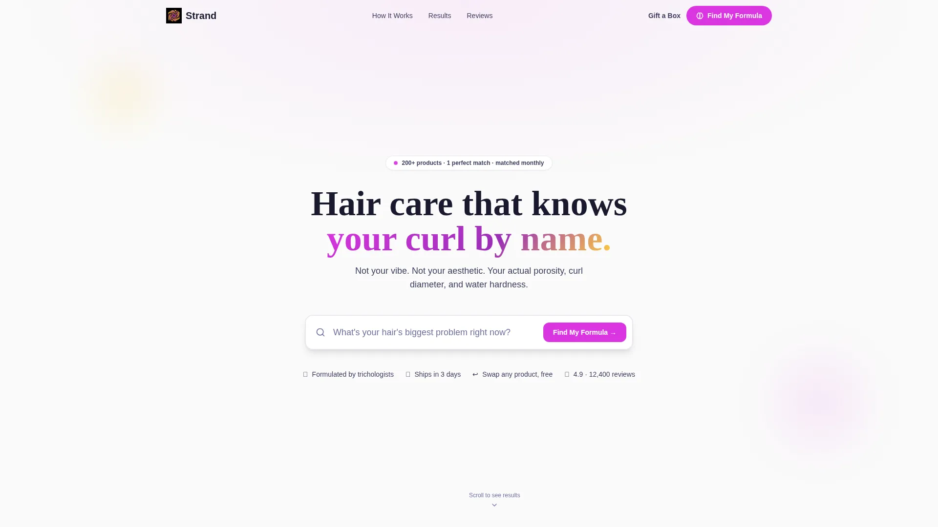
- A header search box with autocomplete suggestions and a fallback "Find My Formula" button
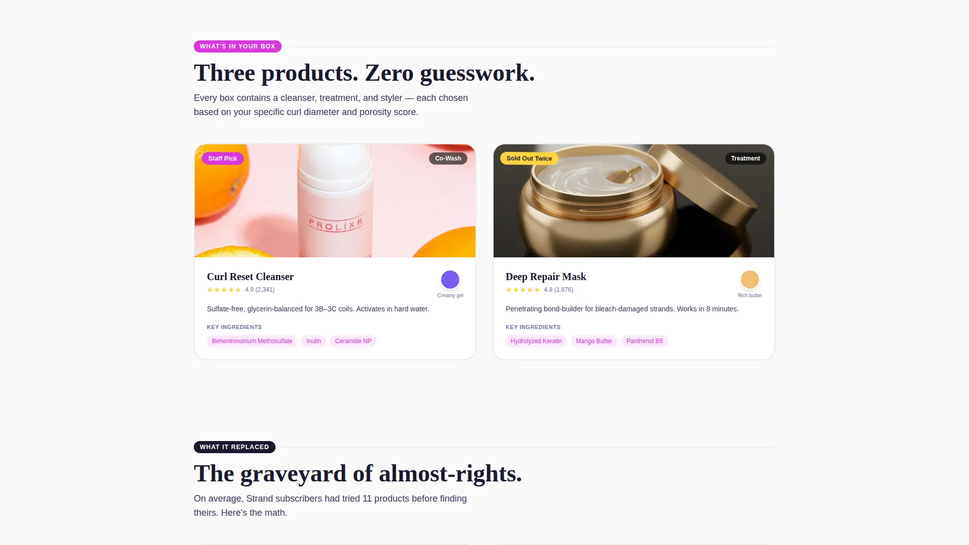
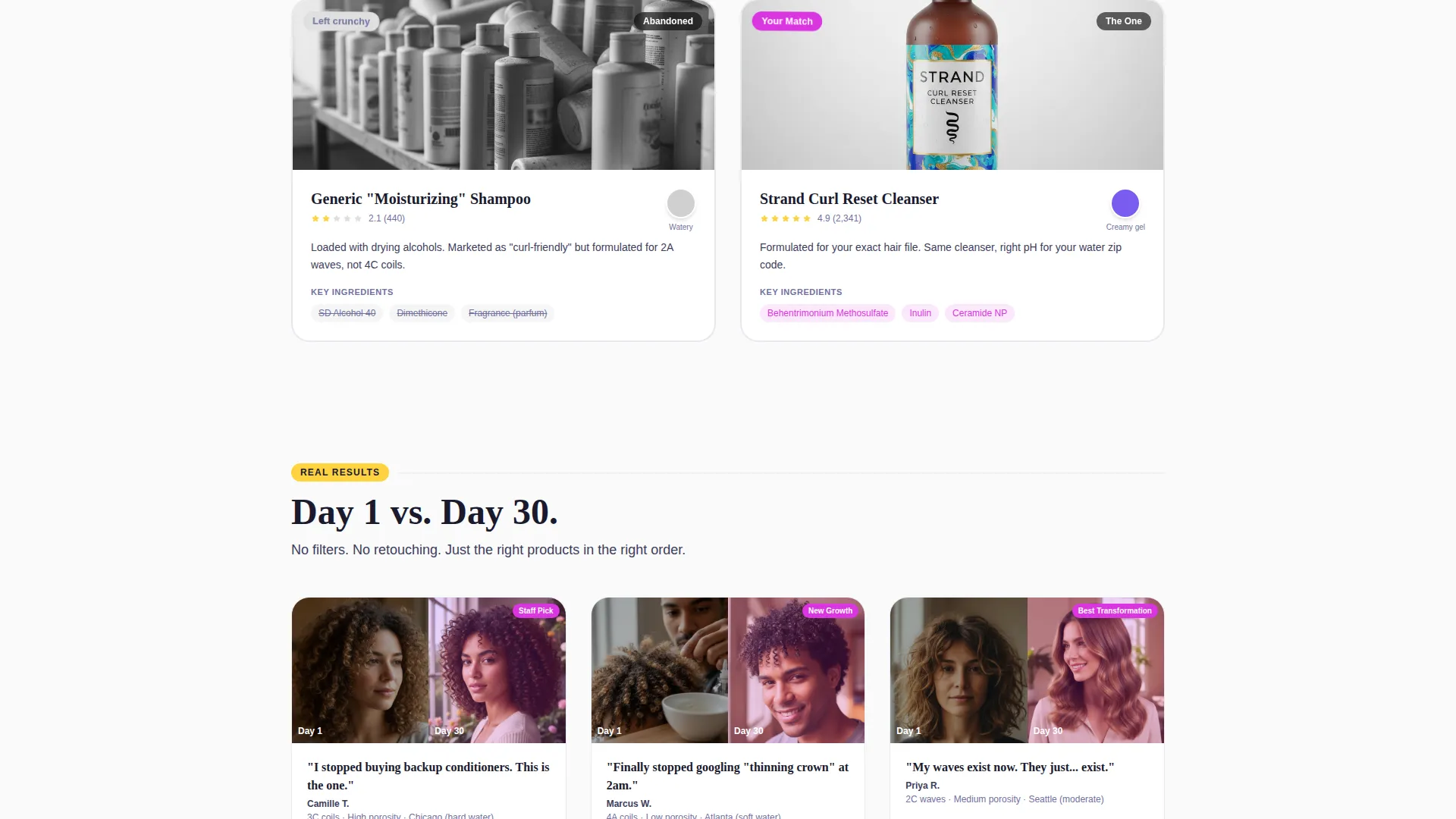
- A scrollable comparison journey grid with side-by-side product panels, ingredient callouts, texture swatches, and Day 1 versus Day 30 subscriber photos
- A five-step quiz flow with a live product-match counter, citrus micro-burst animations, and a sticky bottom-bar call to action
Feature list
This template ships with a focused set of components designed around quiz-led subscription conversion.
Intelligent Search Header
The header is a single, centered search input on a clean white canvas. A pulsing prompt asks visitors what their hair's biggest problem is right now. Autocomplete suggestions appear as they type, each tagged with a small orchid dot, covering concerns like postpartum shedding, bleach damage, and flaky scalp.
Five-Step Quiz Flow
The quiz runs in five taps: a hair type visual selector, a top concern ranking, a current routine length input, a fragrance preference pick, and a budget tier selector. Each answer triggers a citrus micro-burst animation and reveals the next question, keeping the experience fast and satisfying.
Live Product-Match Counter
A counter in the corner of the quiz panel climbs with every answer. It shows the algorithm narrowing 200-plus products down to the visitor's perfect three in real time. This visible narrowing builds trust and encourages quiz completion.
Comparison Journey Grid
Below the header, a scrollable grid places two or three products side by side. Each panel includes ingredient callouts, texture swatches, and real subscriber photos showing Day 1 versus Day 30 results. The grid escalates from "what's in the box" to "what it replaced," complete with a visual graveyard of abandoned bottles.
Progressive Background Tinting
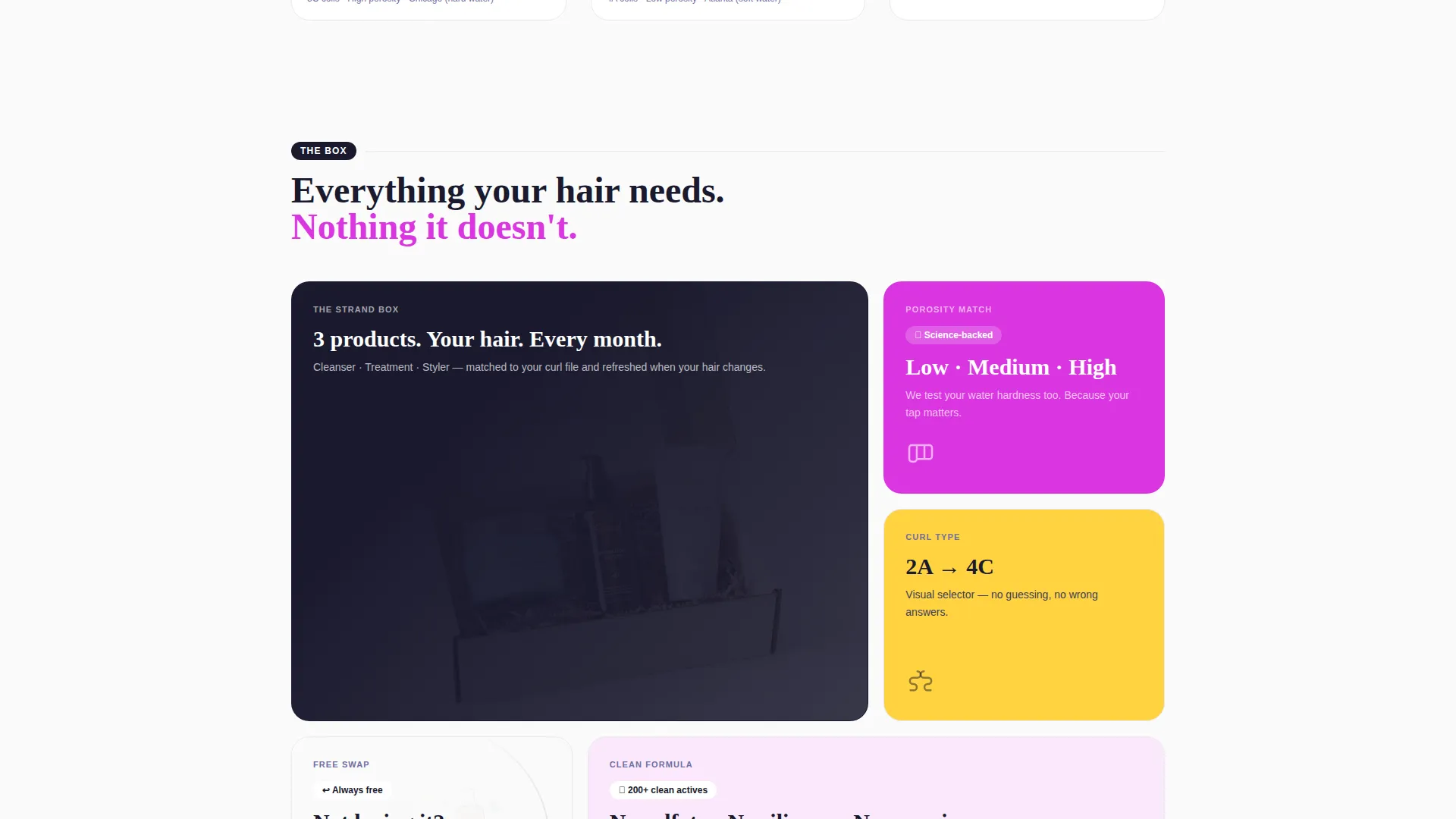
As visitors scroll deeper into the comparison journey, section backgrounds shift from clean white to a soft orchid wash. The tint change creates a sensation of personalization building in real time without requiring any account or login.
Sticky Conversion Bar
After the first scroll, a persistent bottom bar appears carrying the primary "Find My Formula" call to action. It stays visible throughout the comparison journey so the conversion path is always one tap away.
Page sections overview
| Section | Purpose |
|---|---|
| Header Search Box | Captures hair concern and opens quiz entry |
| Autocomplete Suggestions | Narrows visitor intent before quiz begins |
| Comparison Journey Grid | Shows product matchups with real results |
| Ingredient Callout Panels | Highlights key formula differences per product |
| Texture Swatch Display | Gives tactile context for product feel |
| Day 1 versus Day 30 | Provides social proof through subscriber photos |
| Abandoned Bottle Gallery | Contrasts past failures with winning formula |
| Five-Step Quiz | Collects preference data across five answers |
| Live Match Counter | Visualizes algorithm narrowing to top picks |
| Sticky call to action Bar | Keeps primary action visible at all times |
| Gift a Box Nav Link | Offers a quiet secondary path for gift buyers |
Design & branding system
The visual identity uses a Dopamine Pop color system built on four intentional colors. The palette feels energetic and specific, like a neon sign above a bodega at golden hour.
- Electric orchid (#DA35E0) dominates hover states, active quiz selections, and autocomplete dots; citrus squeeze (#FFD23F) marks callout badges and micro-burst animations
- Deep scalp black (#1A1A2E) grounds all typography and product detail panels, while clean lather white (#FAFAFA) breathes between grid tiles so each color hit lands harder
- The Marketplace Grid theme arranges products in a structured, scannable layout that supports the side-by-side comparison format throughout the scroll journey
Mobile & speed optimization
The landing page layout is designed to perform well on small screens where quiz-style interactions happen most often. Touch-friendly tap targets and vertically stacked grid panels keep the experience smooth on mobile devices.
- The five-step quiz is built for single-tap answers, making it easy to complete on a phone without zooming or scrolling sideways
- The sticky bottom bar sits naturally in the thumb zone on mobile, keeping the "Find My Formula" action reachable without scrolling back to the top
How this template helps you convert
Every design decision in Strand points toward one action: getting visitors to start and finish the quiz so they receive a matched product set.
- The search box opens the page with the visitor's own words, creating immediate relevance and reducing the chance they bounce before reading a single product name.
- The live match counter makes the quiz feel productive rather than intrusive, showing visible progress with each tap and reinforcing that a specific result is coming.
- The sticky "Find My Formula" bar removes the need to scroll back, so the primary conversion action is always visible no matter how deep into the comparison journey a visitor travels.
Other information about this template
Strand is categorized under Retail and E-Commerce, specifically within subscription box services. It is designed as a single-page gallery-plus-detail landing page that supports a multi-grid layout direction. The template is well-suited for haircare brands positioning around science-based personalization rather than trend-based marketing.
- A secondary "Gift a Box" navigation link is included for visitors shopping on behalf of someone else, providing a quiet alternative path without disrupting the primary quiz funnel
- The template supports badge callouts such as "Staff Pick" or "Sold Out Twice" in citrus squeeze to add social urgency to featured products in the comparison grid
- The page is built as a standalone landing page, so it does not require a multi-page site structure to function effectively
Theme
Neo-Retro
Creative direction
Curated Collection
Color system
Lavender Dream
Style
Overlap/Layered
Direction
Marketplace/Multi
Page Sections
Intelligent Search Header
Five-step Quiz Flow
Live Product-match Counter
Comparison Journey Grid
Progressive Background Tinting
Sticky Conversion Bar
Related questions
Can I change the quiz questions to match my own product range?
Does the template include the actual quiz logic or just the visual layout?
Who is the primary audience this landing page is designed to reach?
Is the 'Gift a Box' option a separate page in the template?
Can this template work for a one-time purchase haircare brand instead of a subscription?



