Osteoporosis Care Booking Website Template
Fortify is a single-column landing page template built for osteoporosis telehealth practices. It leads with an interactive six-step fracture risk calculator, moves through a trust-building testimonial mosaic, and closes with a streamlined booking form. The design feels clinical enough to reassure and warm enough to welcome patients who are scared and ready for real answers.
by Rocket studio
Quick summary
Fortify is a single-column landing page template designed for osteoporosis telehealth services. It opens with an interactive fracture risk calculator, builds trust through a staggered testimonial mosaic, and converts visitors with a focused scheduling form. The visual identity balances clinical clarity with quiet warmth, so patients feel informed rather than overwhelmed.
Who this template is for
This template is built for telehealth practices that specialize in bone health and want to convert worried patients into booked consultations. It works especially well for services that review DEXA scan results and manage bisphosphonate treatment protocols remotely.
- Post-menopausal women who received a frightening T-score and have no clear treatment path yet
- Men over sixty who were dismissed by their primary care physician with generic advice
- Adult children actively researching options after a parent experienced a hip fracture
What problem this template solves
Patients arriving at a bone health website are often scared, confused, and skeptical. They have a number from a scan, no context for what it means, and no obvious next step. A generic medical website does nothing to close that gap.
- There is no immediate, personalized signal that tells the visitor their specific risk level
- Testimonials without clinical detail feel hollow to medically literate visitors
- Booking flows that ask too much too soon lose visitors before they convert
What you get with this template
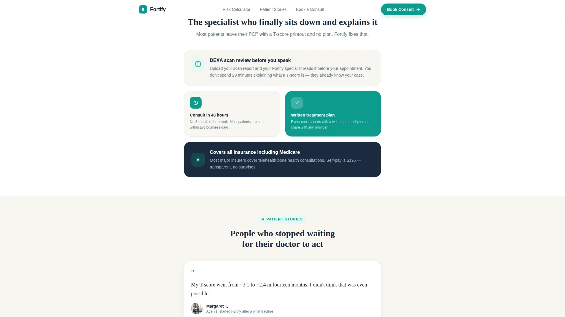
Fortify delivers a focused, three-section landing page that moves a visitor from fear to a scheduled appointment in one continuous scroll. Every section is designed for a specific job in the conversion journey.
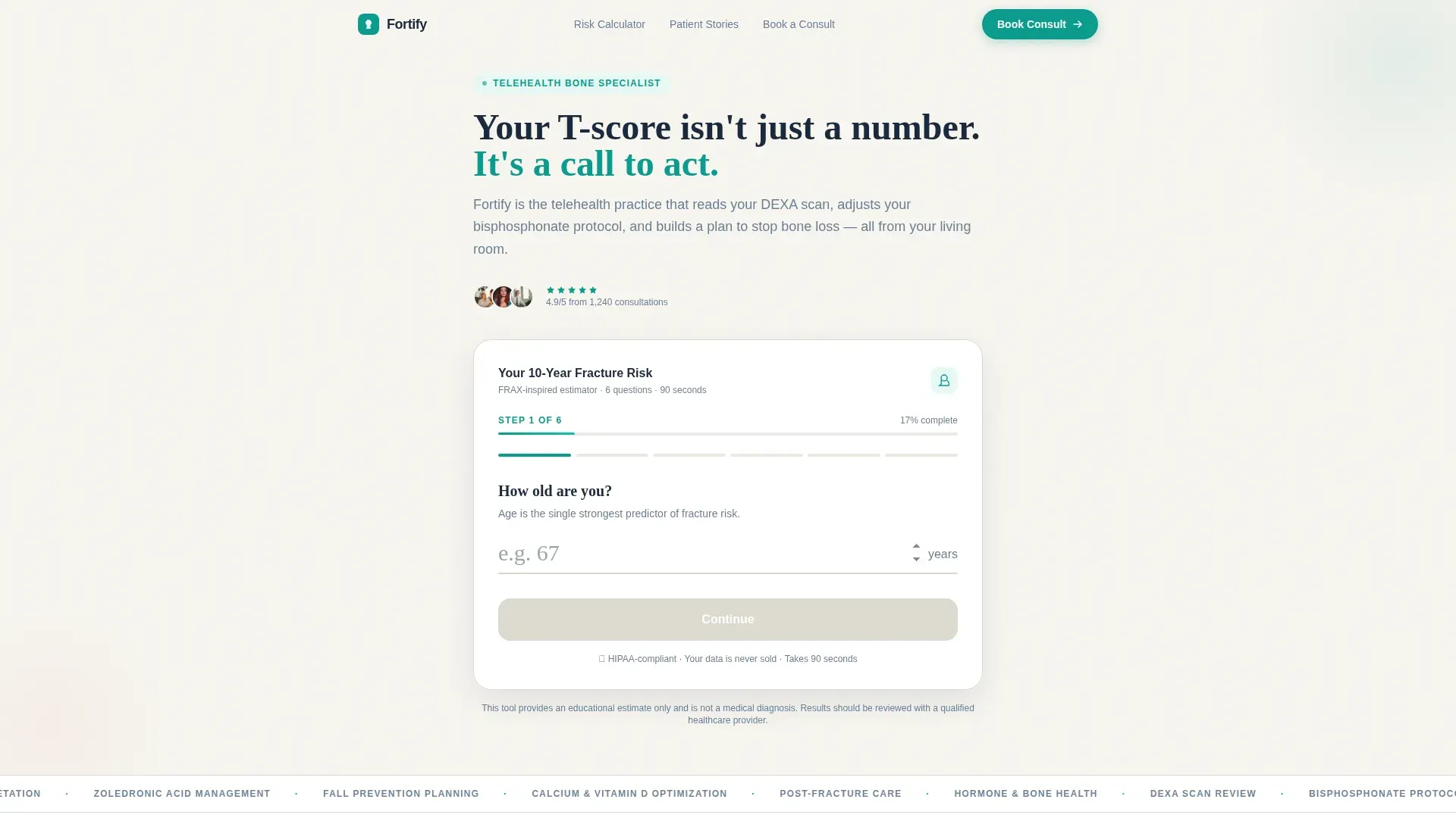
- An interactive six-step fracture risk calculator with a coral-highlighted personalized risk output
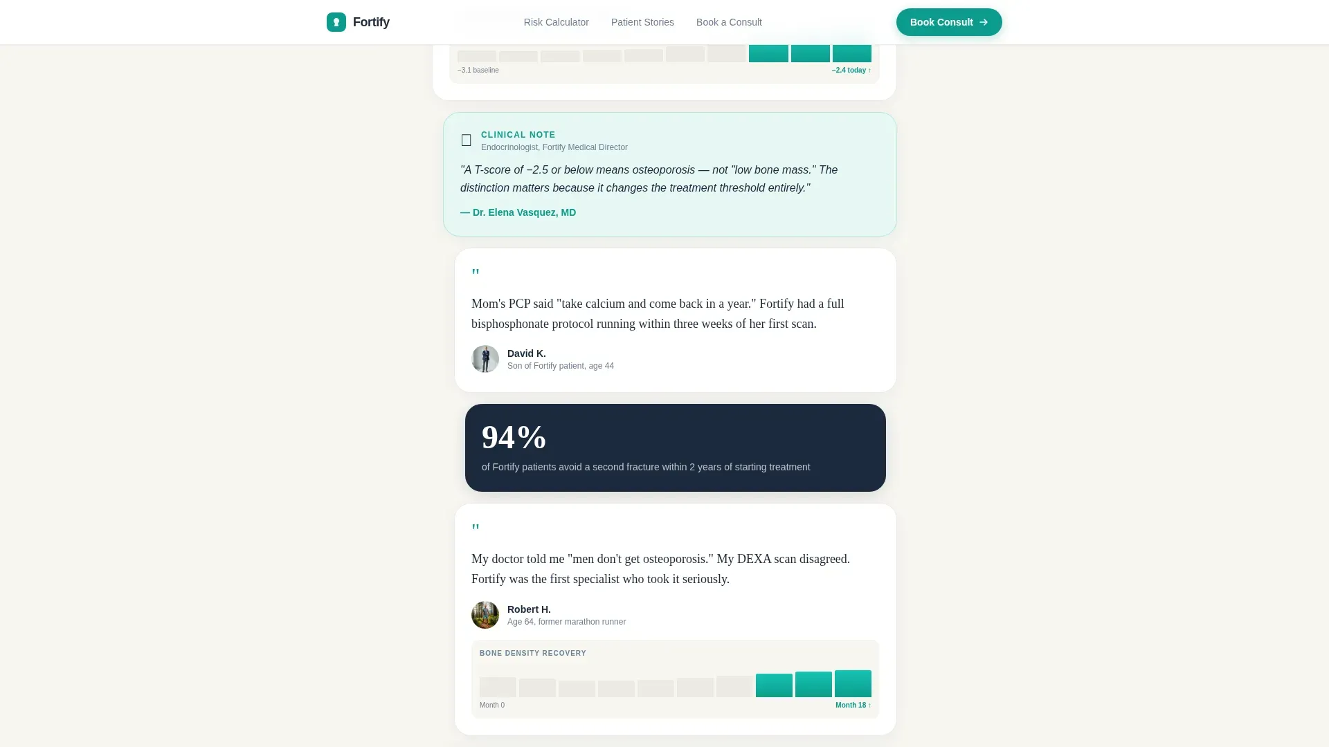
- A testimonial mosaic that pairs patient quotes with specific clinical data like T-score improvements and trend charts
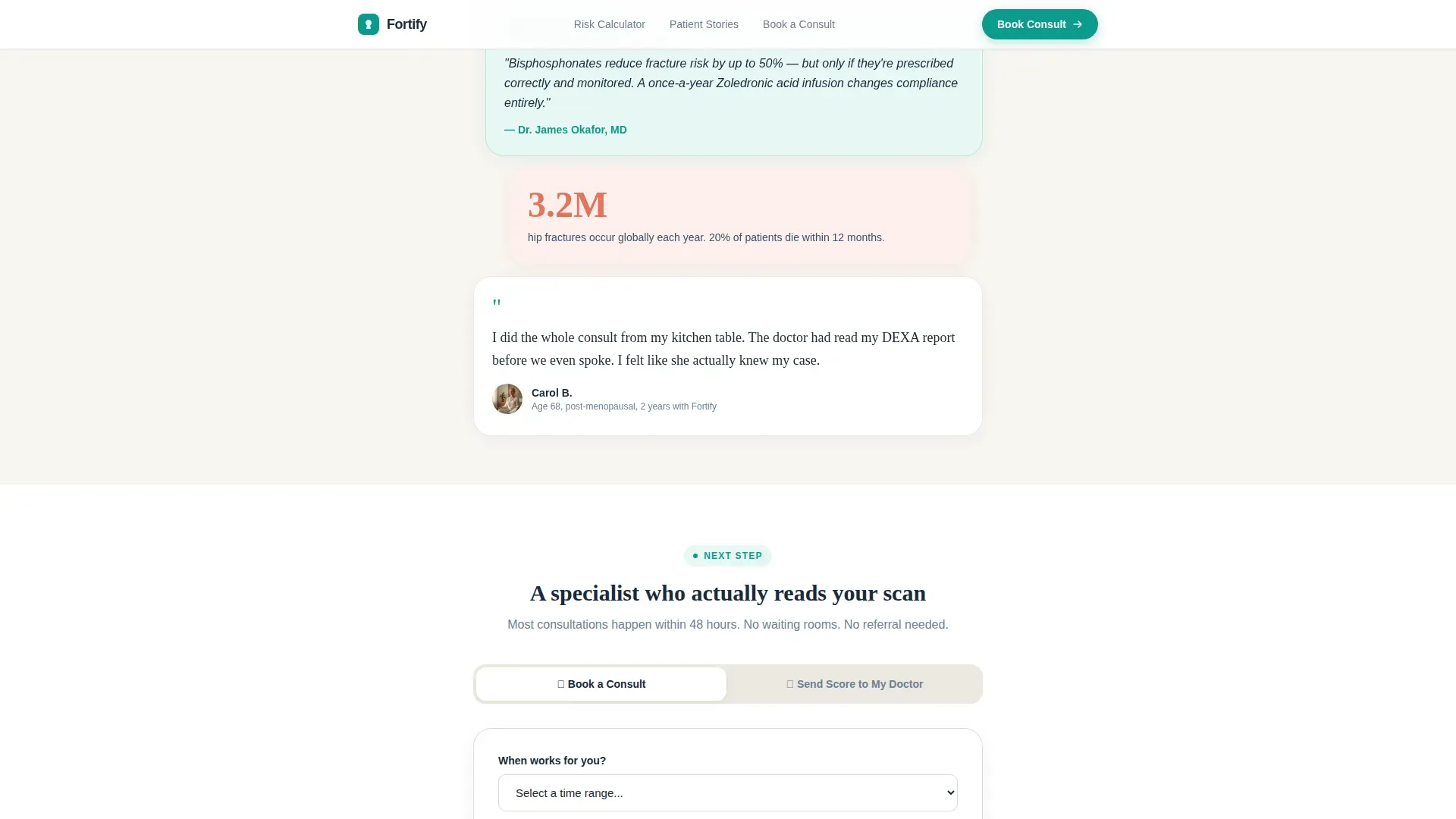
- A three-field booking form with an insurance provider dropdown and a secondary email capture path for visitors who are not yet ready to book
Feature list
Fortify is structured around three high-impact sections and a set of carefully considered interaction patterns. Here is what each major feature delivers.
Interactive Fracture Risk Calculator
The header section features a six-step estimator styled after the FRAX risk assessment format. Each step uses a large, tap-friendly input field with a thin teal underline that visually fills as the visitor progresses. Plain-language labels replace clinical jargon throughout, so the experience feels like a conversation rather than a form. Once the final field is completed, a coral-highlighted ten-year fracture probability percentage animates into view alongside a single interpretive sentence.
Coral Risk Score Reveal
When the calculator completes, the result appears as a coral-accented percentage with a one-sentence plain-language interpretation. The animation uses a count-up effect so the number draws the eye immediately. This moment is the primary conversion trigger: it gives the visitor a specific, personal reason to book.
Testimonial Mosaic Layout
Patient stories are arranged in asymmetric, staggered cards that break the single-column flow into a visually dynamic section. Each card pairs a one-sentence quote with a specific clinical detail, such as a T-score change over time paired with a miniature bone density trend chart. The mosaic alternates between emotional patient voices and brief clinician explanations, so each story answers the skeptical question the previous one raised.
Booking and Scheduling Form
The booking section contains a focused three-field form: a preferred date range selector, an insurance provider dropdown that includes a self-pay option revealing a transparent price, and a free-text field asking what prompted the visit. A secondary path lets visitors send their risk score to their doctor via email capture, converting people who are not yet ready to book but still want to move forward.
Sticky Mobile Call to Action
After the calculator result appears, a bottom bar pins to the screen on mobile devices with the primary call to action: "Book Your Bone Health Consult." This keeps the booking prompt visible as the visitor continues scrolling through testimonials and information, reducing drop-off on mobile.
Medical Clarity Visual System
The template uses a Teal Catalyst color system with clear role assignments for every hue. Clinical teal handles primary actions and trust anchors. Deep charcoal carries body text and authority copy. Bone-white provides a clean, breathing background. Warm coral is reserved exclusively for urgent callouts and the fracture risk score output. DM Sans handles interface and body text while Fraunces serif brings authority to key headlines.
Page sections overview
| Section | Purpose |
|---|---|
| Hero + Calculator | Opens the page and delivers a personalized fracture risk score to trigger booking intent |
| Testimonial Mosaic | Builds emotional and clinical trust through alternating patient stories and clinician context |
| Booking Form | Converts ready visitors with a three-field scheduling form and a secondary email capture path |
| Footer | Closes the page with a linear single-row footer layout |
Design & branding system
Fortify uses a Medical Clarity theme that feels like a freshly printed lab report: sterile enough to trust, warm enough to stay approachable. Every color has a defined role and nothing competes with the risk score reveal.
- Teal (#0D9B8C) for primary actions and trust anchors, charcoal (#1B2A3D) for body text, bone-white (#F7F5F0) as the page background, and coral (#E8735A) exclusively for urgent callouts and the risk output
- DM Sans for body text and user interface elements, Fraunces serif for authority headlines that anchor key moments in the scroll
- Medium animation level: calculator step transitions, coral number count-up on result reveal, scroll-triggered mosaic stagger for testimonials
Mobile & speed optimization
The template is built mobile-first, reflecting the reality that post-menopausal women use phones and adult children researching fracture care often use tablets. Every interaction is designed to work cleanly on a small touch screen.
- All calculator inputs use large, tap-friendly fields sized for thumbs, not mouse clicks
- The sticky bottom bar with the booking call to action appears only after the risk score reveals, keeping the screen clean during the calculator steps
- Static sections use server components while the calculator and booking form use client components, keeping interactive elements fast without slowing the rest of the page
How this template helps you convert
Fortify is built around a specific conversion logic: give the visitor a personal, clinical reason to act before asking them to book. The layout follows that logic from top to bottom.
- The fracture risk calculator produces a personalized result that makes the consultation feel immediately relevant. A visitor who sees their own risk percentage is far more likely to take the next step than one who read generic copy about bone health.
- The testimonial mosaic answers doubt at every stage. By alternating emotional patient voices with specific clinical outcomes like T-score improvements, the section builds compounding trust across the scroll rather than delivering one big claim upfront.
- The booking form removes friction at the moment of decision. The three-field structure is short enough to complete in under a minute, the insurance dropdown reduces uncertainty about cost, and the secondary email capture retains visitors who need more time before committing.
Other information about this template
Fortify is a single-column flow landing page template, meaning all content lives in one continuous vertical scroll without separate pages or navigation tabs. The template is designed specifically for the osteoporosis telehealth niche and is not a general medical template stretched to fit.
- The template is localized for United States use: dates follow the MM/DD/YYYY format, the insurance dropdown is pre-configured for US providers, and pricing displays in USD
- The "Send My Risk Score to My Doctor" secondary path is an email capture that helps practices convert visitors who want to loop in their primary care physician before booking
- Animation intensity is set to medium: enough to guide attention through the calculator and mosaic without feeling clinical or cold
- The footer uses a linear single-row pattern that keeps the closing section clean and uncluttered
- This template suits practices offering remote DEXA scan review, bisphosphonate protocol management, or any bone density telehealth consultation service
Theme
Medical Clarity
Creative direction
Testimonial Mosaic
Color system
Teal Catalyst
Style
Single Column Flow
Direction
Booking/Scheduling
Page Sections
Six-step Fracture Risk Calculator
Animated Coral Risk Score Reveal
Staggered Testimonial Mosaic
Three-field Booking Form
Sticky Mobile Booking Bar
Doctor Email Capture Path
Related questions
Who is this landing page template designed for?
What does the fracture risk calculator actually ask visitors?
What happens if a visitor is not ready to book immediately?
How does the booking form work?
Is this template built for mobile users?



