Industrial Raw Trail Running Coaching Landing Page Template
Stride is an Industrial Raw trail running coaching landing page template built for coaches who train serious athletes on technical terrain. It uses a bento grid layout, a cinematic vertical hero section, and a Ruby and Chrome color system to create a landing page that feels as relentless as a pre-dawn ridgeline start. One clear call to action drives every visitor toward a coaching plan selection page.
by Rocket studio
Quick summary
Stride is a single-page bento grid landing page template designed for trail running coaching services. It pairs a full-viewport hero section with a cinematic scroll sequence, an Industrial Raw design system, and a focused click-through funnel. Every section of this landing page is built to move trail runners off the fence and onto a coaching plan selection page with one clear, repeated call to action.
Who this template is for
This landing page template is built for trail running coaches who work with athletes on technical terrain. It speaks directly to a coaching market where generic fitness websites fall flat and runners need to feel the methodology before they sign up. If your coaching service is built around structured programs, race-day strategy, and real elevation data, this template is your starting point.
- Trail running coaches serving mid-pack ultramarathon hopefuls stuck at 50K plateaus
- Running coaches working with road runners making their first jump to technical terrain
- Age-group competitors and coaches who support athletes with a history of Did Not Finish results on race day
What problem this template solves
Most coaching website landing pages do not convert because they are not designed to. They try to say everything at once, they bury testimonials, and they give visitors too many paths to follow. A high-performing landing page has one job and one next step. This template solves that problem by giving trail running coaches a landing page structure that keeps the message clear and guides every visitor toward a single action: choosing a coaching plan.
- Coaches lose potential clients when their site feels cluttered, unfocused, or generic
- Road runners and ultramarathon hopefuls need to feel the training philosophy before they commit money to a program
- A weak or missing social proof section kills trust before visitors ever reach the call to action
What you get with this template
You get a complete, one-page landing page template built specifically for trail running coaching services. The layout is a bento grid that alternates between full-bleed imagery tiles and coaching philosophy text tiles. Every design choice, from the forge-black backgrounds to the ruby call-to-action buttons, is made to build confidence in the coaching brand and lead the visitor to a plan selection page.
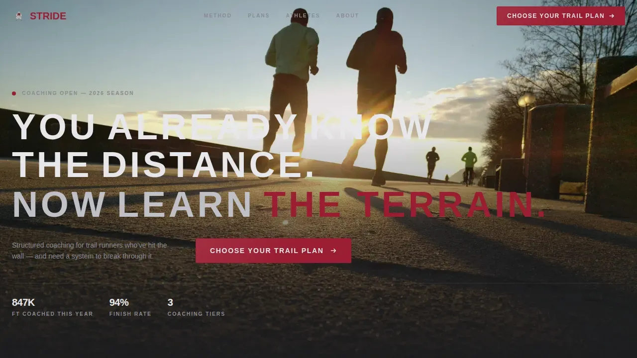
- A full-viewport vertical hero section with a cinematic pre-dawn ridgeline concept and bold tracked-out uppercase headline
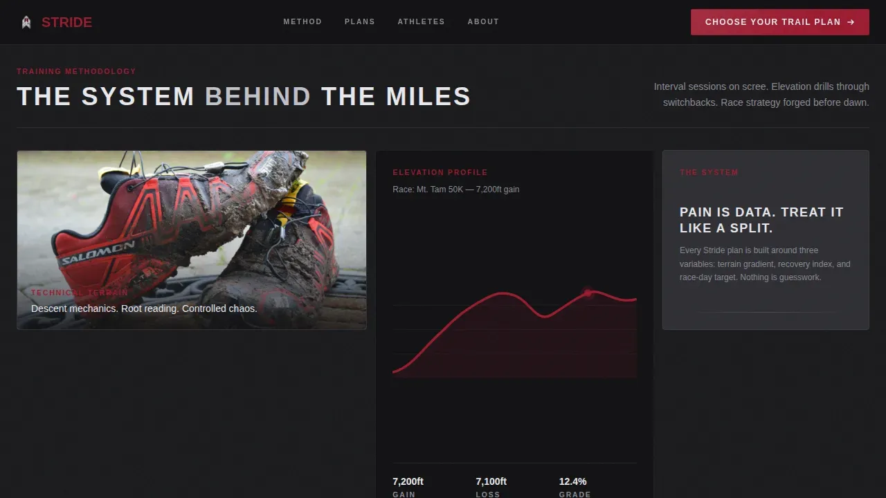
- A bento grid training methodology section with staggered image tiles and coaching text paired in clean chrome type
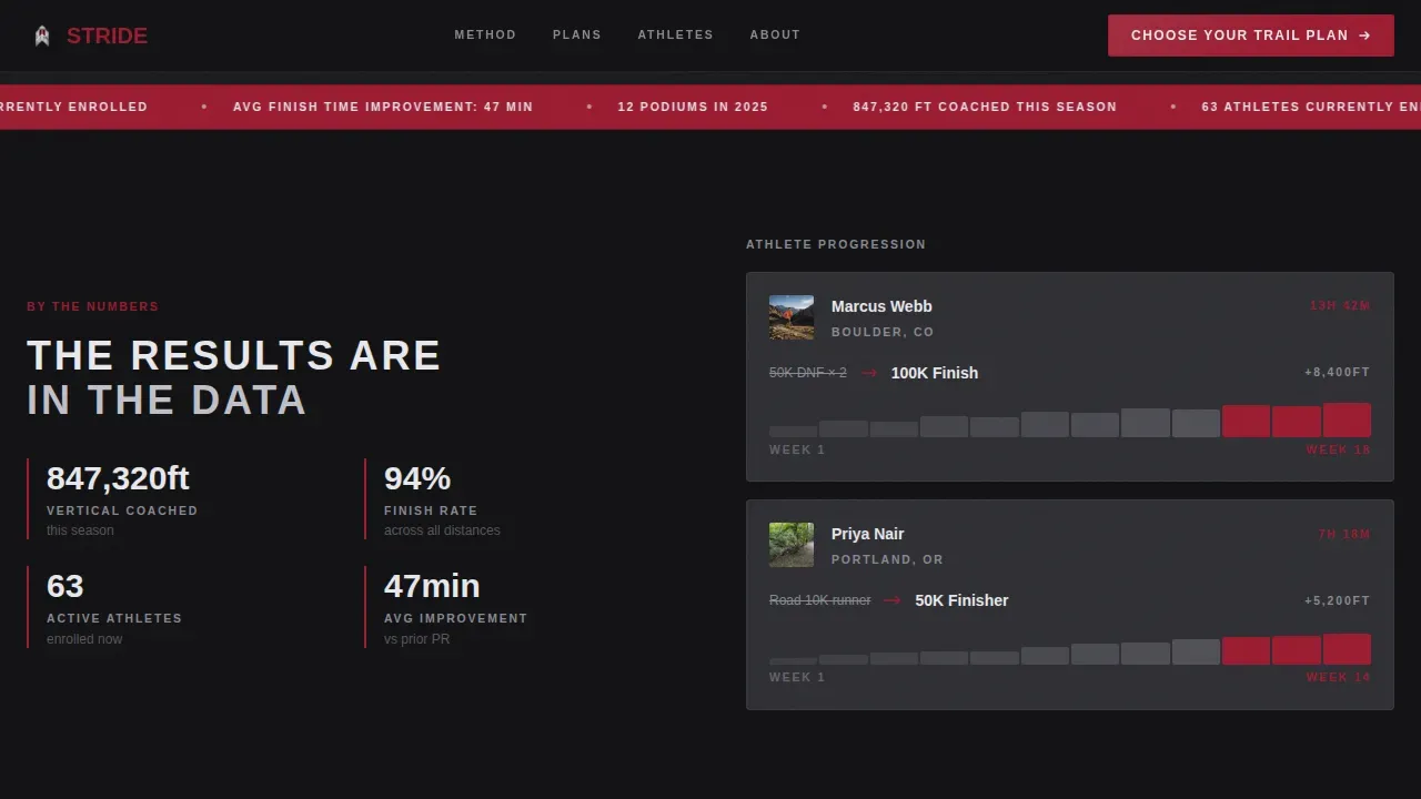
- A proof strip with an elevation ticker, athlete progression stats, and testimonials embedded as social proof tiles
- Three runner archetype tiles showing exactly who the coaching programs are for
- A single testimonial plus call-to-action gateway section that drives the final click
- A fixed mobile call-to-action bar so runners checking the site from a trailhead always see the next step
Feature list
This landing page template is built to feel and function like a precision training tool. Every feature below is drawn directly from the template brief.
Full-Viewport Cinematic Hero Section
The hero section opens with a tall vertical portrait frame: a trail runner silhouetted against a bruised pre-dawn sky, headlamp flaring into the lens. Bold, tracked-out uppercase type sits in the lower third of the frame. This benefit-driven hero section is designed to capture a visitor's attention within seconds by addressing the specific emotional state of a trail runner standing at a start line. The Ruby call-to-action button anchors below the portrait, giving the visitor an immediate path forward.
Bento Grid Training Methodology Layout
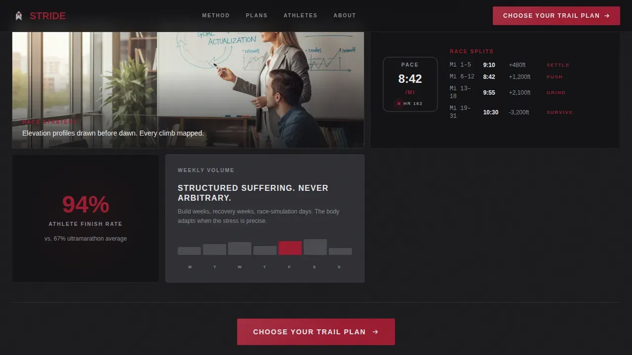
The template uses an asymmetric bento grid to build its training methodology section. Image tiles and coaching philosophy text tiles alternate in staggered reveals as the page scrolls. The first tile shows a close-up of mud-caked shoes on a root-laced descent. The second tile expands wide to show a coach drawing an elevation profile. The third tile shows a split-pace watch face. Each row escalates the stakes from training footage to race-day chaos to finish-line data, while coaching text occupies adjacent tiles in clean chrome type on a forge-black background. This layout lets a visitor feel the trail and read the system at the same time.
Proof Strip with Stats and Social Proof
The proof strip is a dedicated section for athlete data and trust signals. It includes a scrolling elevation ticker showing total elevation coached this year, Strava screenshot cards displaying athlete progression, and athlete stats presented in a clean, data-dense layout. This section uses real social proof to build trust before asking the visitor to click. Including testimonials and social proof on a landing page can significantly enhance trust and credibility, and this section is designed with that principle at its core.
Runner Archetype Tiles
Three bento-style archetype tiles address the three core audiences the coaching service works with: the mid-pack ultramarathon hopeful, the road runner new to technical terrain, and the age-group competitor with a Did Not Finish history. Each tile speaks to a current struggle and a desired transformation. A landing page that speaks directly to a runner's situation makes the coaching offer feel personal rather than generic, and these tiles do exactly that.
Single Testimonial and Plan Selection Gateway
One testimonial tile from an athlete who finished their first hundred-mile race anchors the final section before the plan selection call to action. A single, well-placed testimonial carries more weight than a wall of generic reviews. This section then funnels the visitor to a plan comparison page covering three coaching tiers: First Trail, Ultra Build, and Race-Day Edge. The call-to-action button here matches the ruby accent from the hero section, keeping the visual language consistent.
Fixed Mobile Call-to-Action Bar
A fixed bottom bar appears on mobile screens throughout the entire landing page scroll. Runners often check a coaching site from their phone at a trailhead, mid-run, or right after a race. This bar ensures the call to action is always visible, no matter where the visitor is in the page flow, without requiring them to scroll back to the top.
Page sections overview
| Section | Purpose |
|---|---|
| Hero Portrait | Full-viewport cinematic runner silhouette with headline and primary ruby call-to-action button |
| Methodology Bento | Staggered bento grid alternating trail imagery tiles and coaching philosophy text tiles |
| Proof Strip | Elevation ticker, Strava progression screenshots, and athlete stats for social proof |
| Runner Archetypes | Three bento tiles identifying the coaching service's three core runner audiences |
| Testimonial Gateway | Single finish-line testimonial paired with plan selection call to action |
| Footer | Linear single-row footer with essential links and brand mark |
Design & branding system
The design system follows an Industrial Raw visual language that feels machined and relentless. There is no decorative softness anywhere on this landing page. The color palette reads like the inside of a timing chip: precise, cold, and built to measure. Typography uses tracked-out uppercase lettering in bold weight, creating a tone that matches the start-line tension the coaching brand wants to communicate. Every design decision serves the landing page's click-through goal by keeping the visitor focused on the call to action.
- Forge-black (#1A1A1D) across all background tiles, brushed chrome silver (#C0C0C8) for secondary type and divider lines, exposed aluminum (#E8E8EC) for card surfaces and hover states
- Deep arterial ruby (#9B1B30) used sparingly for primary accents and all call-to-action states, the way a heart rate spike appears on a watch face
- Cabinet Grotesk and DM Sans typefaces in tracked-out uppercase and bold weight, paired with visible grain texture for an authentic trail and industrial feel
Mobile & speed optimization
This landing page template is built mobile-first. Runners are the core audience, and runners check sites on their phones. The fixed bottom call-to-action bar ensures the coaching programs are always one tap away, no matter how far down the page a visitor has scrolled. The bento grid design adapts cleanly from desktop to mobile without losing the visual hierarchy that makes each section work.
- Fixed bottom call-to-action bar on mobile keeps the plan selection button visible throughout the entire scroll
- Bento grid layout adapts from desktop asymmetric tiles to a clean mobile column flow without breaking the cinematic sequence
- GSAP stagger reveals and scroll-linked animations are included in the design concept to build momentum as the visitor scrolls through each section
How this template helps you convert
A landing page is either working for you or quietly working against you. This template is built around one conversion goal: getting the visitor to click through to the plan selection page. Clarity beats inspiration every time when it comes to landing page headlines, and every section here is designed to deliver the right message at the right time rather than trying to say everything at once.
- The ruby call-to-action button appears three times: below the hero section, inside the bento methodology section, and as a fixed mobile bar. Repeating a clear call to action throughout a landing page is one of the most reliable ways to lead a visitor toward the next step without pressure.
- The runner archetype tiles and testimonial section work together to address mismatched-client concerns, build trust, and create the interest that turns a curious runner into a committed coaching client. Using a benefit-driven hero section paired with well-placed social proof can capture attention fast and hold it long enough to close the click.
Other information about this template
This template belongs to a broader set of coaching-oriented landing page templates designed for coaches and service providers who need a high-impact site without building from scratch. It is a one-page, no-code solution featuring modular sections that you can customize to match your coaching brand's voice and programs. The design is well-suited to coaches across the sports and recreation market who need a landing page that sells a clear outcome rather than a list of features. Whether you are putting together your first coaching website or refreshing a current site that is not converting, the bento grid layout and clean design system give you a strong starting point.
The Stride series by I Make Templates offers a modern, high-impact aesthetic suitable for coaching. The Stride Personal Trainer Edition includes pre-configured sections for client transformations, consultation booking, and training packages, making it a useful reference point for coaches who want to learn what modular coaching landing page templates can include. Rocket.new is an AI-powered platform that allows users to build full, production-ready apps and websites from natural-language prompts. It handles deployment and code generation, enabling non-technical users to create applications without traditional programming. Rocket.new is subscription-based, with a free trial and paid plans starting at $25 per month, and it is designed for product managers, solopreneurs, front-end developers, and small to medium businesses who want to quickly build and launch production-ready websites using AI with minimal coding skills.
- This is a single landing page template, not a multi-page website. It is designed to serve one conversion goal: driving the visitor to a plan comparison page.
- The template is modular. You can add, remove, or reorder sections to match your coaching curriculum and the specific programs you offer.
- The three-tier plan structure (First Trail, Ultra Build, Race-Day Edge) is built into the call-to-action flow. You can relabel each tier to match your own coaching suite.
- The proof strip is designed to support real athlete data. Replace the placeholder stats, Strava screenshots, and testimonials with your own to make the social proof section work for your community.
- The template is a freebie-compatible starting point. Coaches who want to offer a free training resource or lead magnet can adapt the call-to-action flow to support a free download before the paid plan selection step.
- The template is suited to the USA market with imperial units in mind, but all copy is fully editable to serve any locale or currency.
- Coaches who rely on community as a selling point can add a community section or adapt the archetype tiles to highlight group training programs alongside individual plans.
- The design system is built to grow with your brand. As your coaching business gets bigger and your stats and testimonials advance, simply update the proof strip and archetype tiles to reflect your current results.
Theme
Industrial Raw
Creative direction
Cinematic Sequence
Color system
Ruby & Chrome
Style
Bento Grid
Direction
Click-Through
Page Sections
Cinematic Vertical Hero Section
Asymmetric Bento Grid Layout
Proof Strip with Athlete Stats
Runner Archetype Identification Tiles
Fixed Mobile Call-to-action Bar
Industrial Raw Ruby and Chrome Color System
Related questions
Is this template designed for a single landing page or a full website?
Can I customize the coaching plan tiers and section copy?
Does the template include a social proof section?
Is this landing page template mobile-friendly?
How many times does the primary call-to-action button appear on this landing page?