Advanced Subscription Box Services Pricing & Packages Website Template
Stride is a gallery and detail landing page template built for running gear subscription boxes. It guides visitors through a visual Before/After journey, from worn-out gear to curated performance kit, across four gear categories. A tier comparison toggle and a pinned upgrade call to action help convert both new visitors and existing subscribers into higher-value plans.
by Rocket studio
Quick summary
Stride is a single-page subscription box landing page template designed for running gear brands. It opens with a dramatic Before/After Slider header, then walks visitors through a scrolling catalog reveal across shoes, compression, accessories, and recovery. A tier comparison toggle and a pinned "Upgrade My Miles" call to action drive conversions at every scroll milestone.
Who this template is for
This template is built for subscription box businesses selling curated running gear. It works best when the brand wants to show, not just tell, the difference curation makes over impulse buying.
- Running gear subscription brands launching or refreshing their sales page
- Box services targeting serious amateur runners, from 5K regulars to marathon qualifiers and trail runners
- Teams managing both new visitor acquisition and existing subscriber upgrades on one page
What problem this template solves
Most subscription landing pages describe their product in generic terms. Runners already own a drawer full of gear that failed them. The real job is to make the gap between what they have and what they deserve feel undeniable.
- Visitors arrive skeptical; the Before/After Slider makes the transformation tangible before a single line of copy is read
- Existing subscribers often do not know what they are missing; the tier comparison toggle reveals exactly which items the current plan excludes
- Generic gallery layouts cannot carry the narrative weight of a category-by-category gear reveal with mileage logs and fabric details
What you get with this template
The template delivers a complete, section-led landing page flow from header to upgrade form. Every component is built around the running gear subscription use case, with no filler sections.
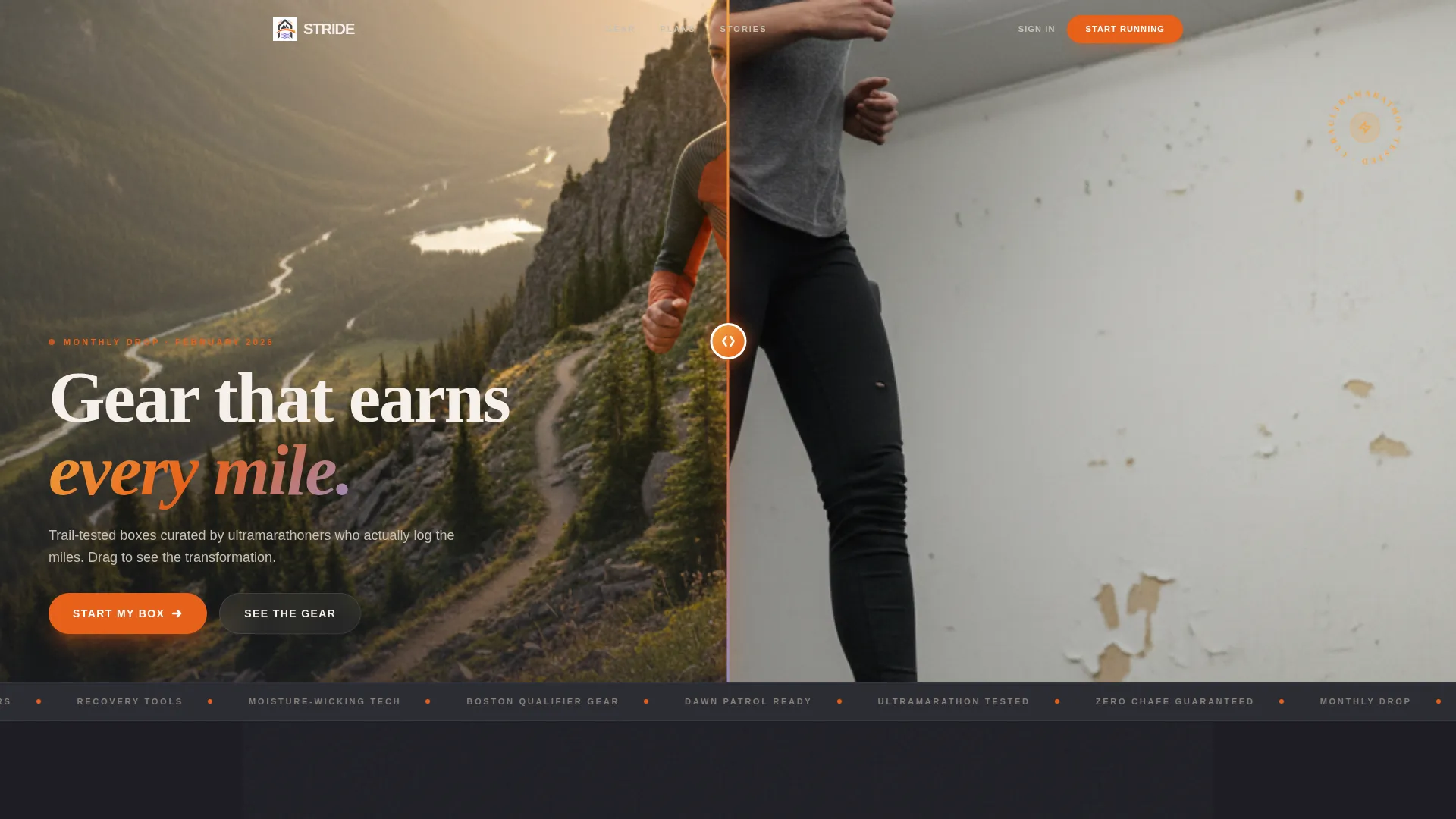
- A viewport-spanning Before/After Slider header with an amber drag handle and interactive gear hotspots on the "after" side
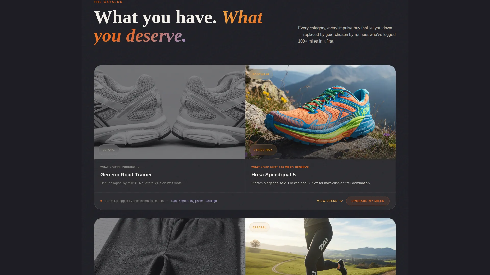
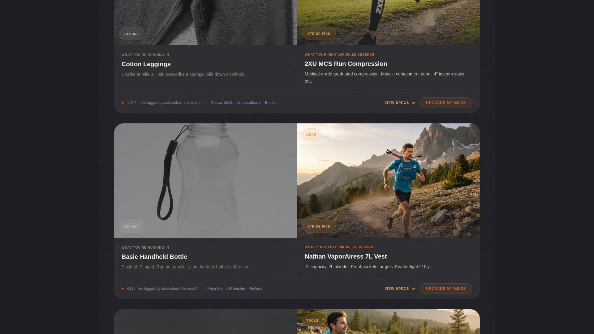
- A scrolling catalog reveal across four gear categories, each with detail panels showing fabric weight, reflectivity ratings, and real subscriber mileage logs
- A three-tier comparison toggle (Basic, Premium, Elite) with a pre-filled upgrade form asking only for size confirmation and preferred terrain type
Feature list
This section covers the core components built into the Stride template.
Before/After Slider Header
The header splits the viewport into two states. The left side shows a runner in worn, failing gear under flat light. The right side shows the same runner on a mountain trail in curated subscription kit, shot in golden hour light. Visitors drag the glowing amber handle to reveal the transformation, and interactive hotspots on the "after" side tag individual gear pieces.
Scrolling Gear Category Reveal
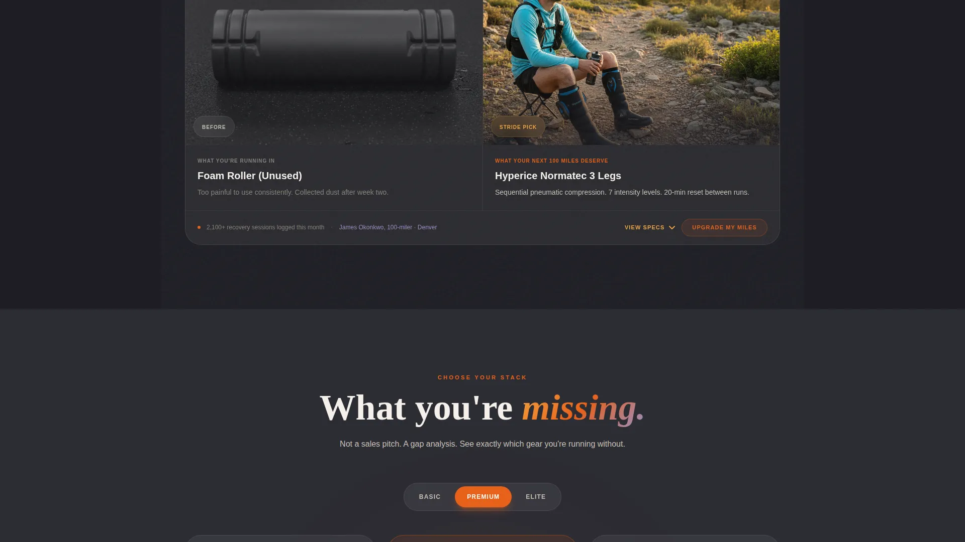
Each gallery row is dedicated to one gear category: shoes, compression layers, accessories, and recovery tools. The visitor's old gear fades out as the curated replacement fades in. Detail panels slide open to display fabric weight, reflectivity ratings, and subscriber mileage logs.
Three-Tier Comparison Toggle
A toggle lets visitors switch between Basic, Premium, and Elite subscription tiers side by side. The layout is designed to surface what each plan excludes, making the upgrade decision feel like discovery rather than a sales push.
Pinned Upgrade Call to Action
After each category reveal, a "Upgrade My Miles" call to action button stays pinned and visible. This keeps the conversion path present without interrupting the catalog scroll.
Pre-Filled Upgrade Form
The upgrade form pulls existing account data so the visitor only needs to confirm their shoe size and preferred terrain type. Reducing form friction at the decision point lowers the barrier to completing an upgrade.
Gear Hotspot Tags
On the "after" side of the header slider, interactive hotspots appear over individual gear items. Each tag identifies the product and its role in the curated kit, giving visitors specific detail before they even reach the catalog scroll.
Page sections overview
| Section | Purpose |
|---|---|
| Before/After Slider Header | Opens the page with a visual transformation that anchors the brand promise |
| Gear Hotspot Tags | Highlights individual curated items directly on the hero image |
| Shoes Category Reveal | Shows old footwear fading into trail-tested subscription shoes with detail panel |
| Compression Layers Reveal | Presents moisture-wicking layer upgrade with fabric and mileage data |
| Accessories Category Reveal | Transitions worn accessories into curated running kit additions |
| Recovery Tools Reveal | Introduces recovery gear chosen by ultramarathoners with log data |
| Tier Comparison Toggle | Lets visitors compare Basic, Premium, and Elite plans side by side |
| Pinned Upgrade call to action | Keeps the upgrade action visible after each category section |
| Pre-Filled Upgrade Form | Captures size and terrain preference to complete the upgrade |
Design & branding system
The visual identity uses a Sunset Gradient palette inspired by the final mile of an evening run. Every color choice is intentional: grounded, earned, and built for a performance-minded audience.
- Deep asphalt (#2C2C34) forms the base layer, keeping the page grounded and contrast-ready for bright gear photography
- Burnt horizon orange (#E8611A) drives primary calls to action and progress indicators, including the drag handle on the header slider
- Golden hour amber (#F2A541) warms section transitions, while cool dusk lavender (#9B8EC4) marks secondary text and category tags
Mobile & speed optimization
The template layout is designed to remain legible and functional on smaller screens. The Before/After Slider, detail panels, and tier toggle all adapt to touch-based interaction.
- The drag handle on the header slider responds to touch swipe, keeping the hero interaction usable on mobile devices
- Detail panels in the gear reveal rows open on tap rather than hover, matching standard mobile interaction patterns
- The pinned upgrade call to action remains accessible during scroll on both portrait and landscape orientations
How this template helps you convert
Every design and copy decision in Stride is oriented toward moving a skeptical runner from curiosity to commitment.
- The Before/After Slider creates an emotional entry point before any product copy appears, reducing immediate bounce by making the value visible at first glance.
- The category-by-category reveal builds a cumulative case for curation, so by the time the visitor reaches the tier toggle, they already believe the upgrade is worth it.
- The pre-filled upgrade form removes the last friction point, so an existing subscriber needs only two inputs to complete the upgrade.
Other information about this template
Stride fits within the Retail and E-Commerce category, specifically within the Subscription Box Services subcategory, with a focus on the activewear subscription niche. It is a single landing page template, not a multi-page site.
- The template theme follows a Neo-Retro direction with an Overlap/Layered template style, giving sections a sense of depth and intentional layering as the visitor scrolls
- The Curated Collection creative direction means the layout is built to communicate selection expertise, not just product volume
- The color system aligns with a Lavender Dream base extended into the full Sunset Gradient palette described in the prompt
- This template suits any running subscription brand that wants a page experience strong enough to carry both first-time visitor conversion and existing subscriber upsell in a single scroll
Theme
Neo-Retro
Creative direction
Curated Collection
Color system
Lavender Dream
Style
Overlap/Layered
Direction
Marketplace/Multi
Page Sections
Before/after Slider Hero
Scrolling Category Reveal
Three-tier Comparison Toggle
Pinned Upgrade Call to Action
Pre-filled Upgrade Form
Interactive Gear Hotspot Tags
Related questions
Is this template suitable for both new visitors and existing subscribers?
What gear categories does the catalog scroll cover?
Can the tier comparison toggle show all three plans at once?
Does the upgrade form require visitors to re-enter all their account details?
What type of running audience is this template designed for?



