Podiatrist New Patient Landing Page Template
Stride is a single-page podiatrist landing page built to turn first-time visitors into booked patients. A guided four-step assessment replaces a generic booking form, walking each visitor from symptom selection to a personalised treatment recommendation. The design pairs deep teal with warm sandstone and eucalyptus tones, making the page feel clinical enough to trust and human enough to relax in.
by Rocket studio
Quick summary
Stride is a podiatrist new patient landing page template built around a four-step quiz that personalises each visitor's recommended treatment path. It combines a multi-step header form, a testimonial-embedded comparison table, a scroll-reveal manifesto, and a sticky call-to-action bar into one cohesive, mobile-first page. The result feels prescribed rather than pushed.
Who this template is for
This template is built for podiatry clinics that want to replace a flat booking form with something that actually speaks to patients. It suits both self-referred and GP-referred patient pipelines, and it is particularly well matched to clinics seeing a mix of active patients and chronic-condition referrals.
- Podiatrists and clinic owners targeting new patients with heel pain, skin and nail concerns, or foot injuries
- Clinics managing diabetic foot screening referrals alongside walk-in appointments
- Healthcare practitioners who want a warm, guided first impression rather than a cold intake form
What problem this template solves
Most podiatry booking pages ask patients to fill in a form before they understand why they should trust the clinic. That friction drives people away. Stride removes the wall of fields and replaces it with a conversation that starts the moment someone lands on the page.
- Patients with vague or overlapping foot complaints do not know which service to book, so the assessment guides them to the right first visit
- Generic booking forms feel transactional; the quiz makes the experience feel like a clinical conversation
- Clinics struggle to build trust quickly online; the comparison table with embedded patient stories does that work at a glance
What you get with this template
You get a fully structured single-page layout with five distinct sections, each serving a specific role in the patient journey from awareness to booking. Every component is defined in the brief, from the animated hero illustration to the linear single-row footer.
- A four-step assessment form with tile selection, a duration slider, toggle buttons, and a contact and appointment window step
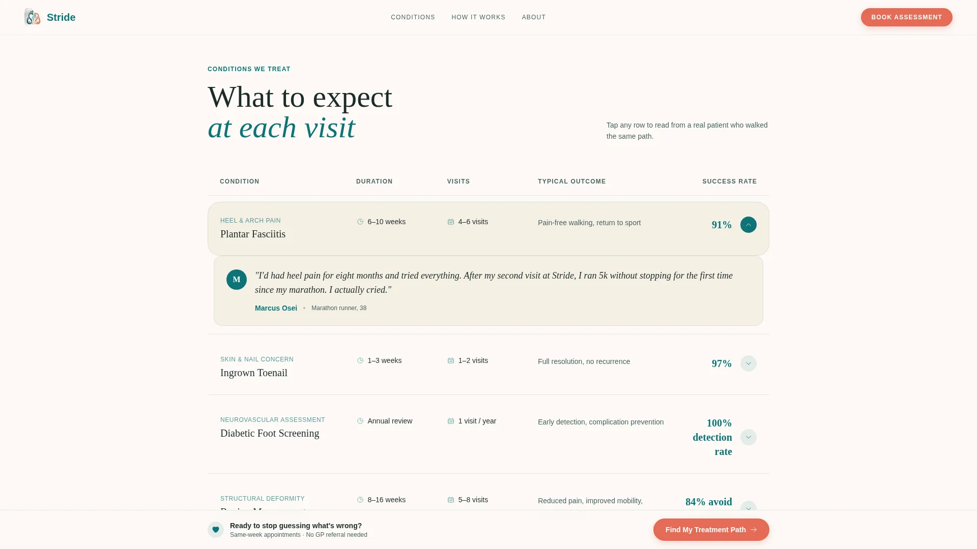
- A comparison table covering plantar fasciitis, ingrown toenail, and diabetic foot screening, with treatment duration, visit frequency, expected outcome, and a real patient quote per row
- A scroll-reveal manifesto, a three-step How It Works visual, and a sticky call-to-action bar that appears after the first testimonial row
Feature list
This template is built around five tightly integrated components that work together to guide a new patient from curiosity to confirmed appointment.
Four-Step Guided Assessment Form
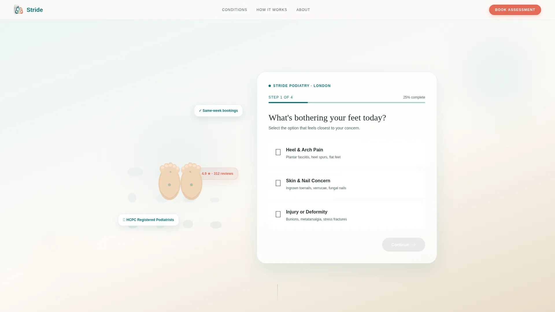
The form opens mid-conversation with a single question: "What's bothering your feet today?" Visitors select a concern tile, use a slider to indicate how long the issue has persisted, choose a referral or insurance preference via toggles, then enter their name, phone number, and preferred appointment window. The result is a personalised condition summary with a recommended first-visit type.
Testimonial-Embedded Comparison Table
Each row in the comparison table covers a specific condition and compares it across treatment duration, visit frequency, and typical outcome. A real patient quote sits beneath each row, layering data with human proof. The table rows alternate between sandstone and eucalyptus backgrounds to create visual breathing room.
Scroll-Reveal Manifesto Section
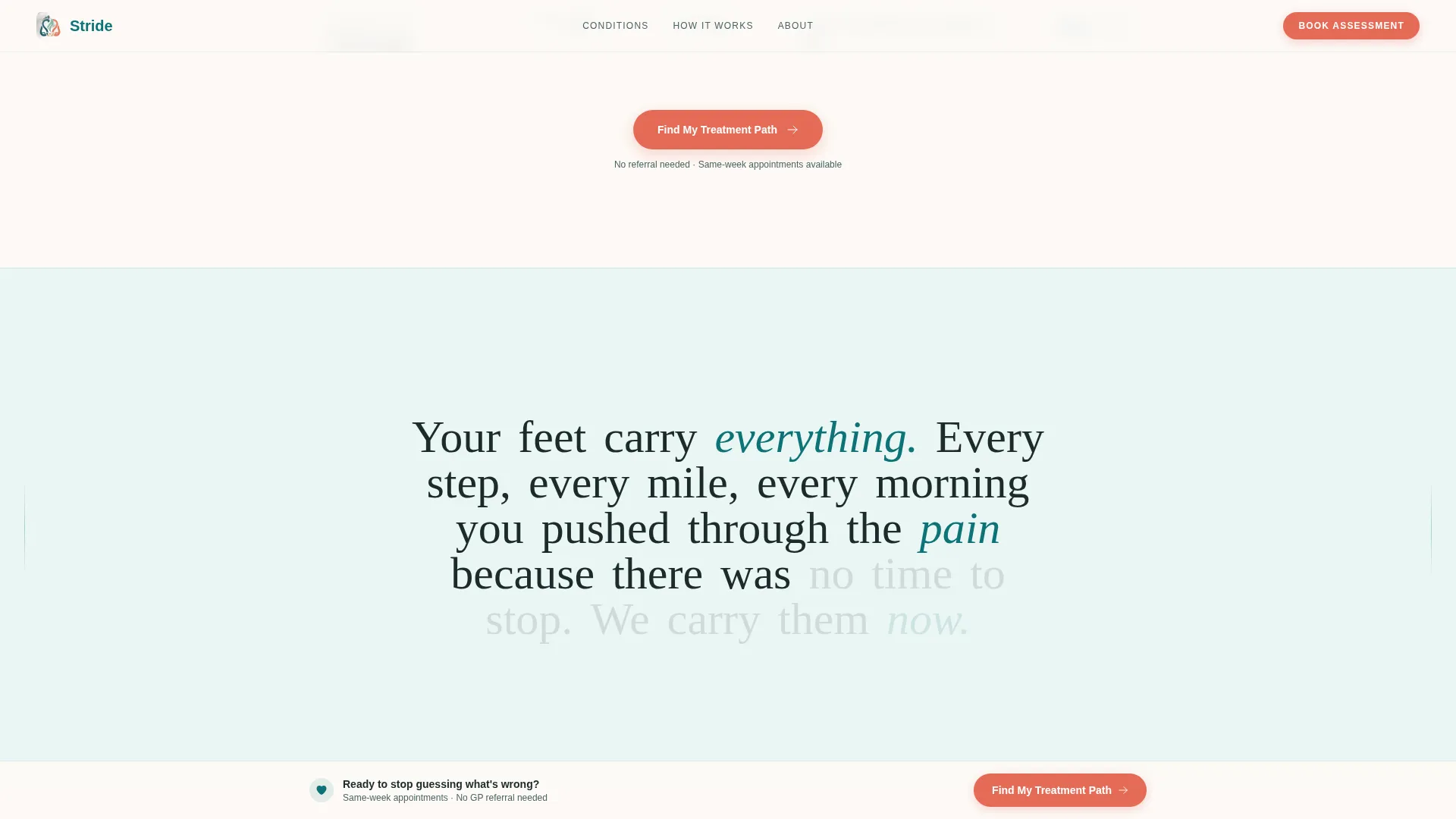
A word-by-word animated reveal displays the clinic's core message as the visitor scrolls. The phrasing, "Your feet carry everything. We carry them.", builds emotional connection between the comparison table and the How It Works section.
Three-Step How It Works Visual
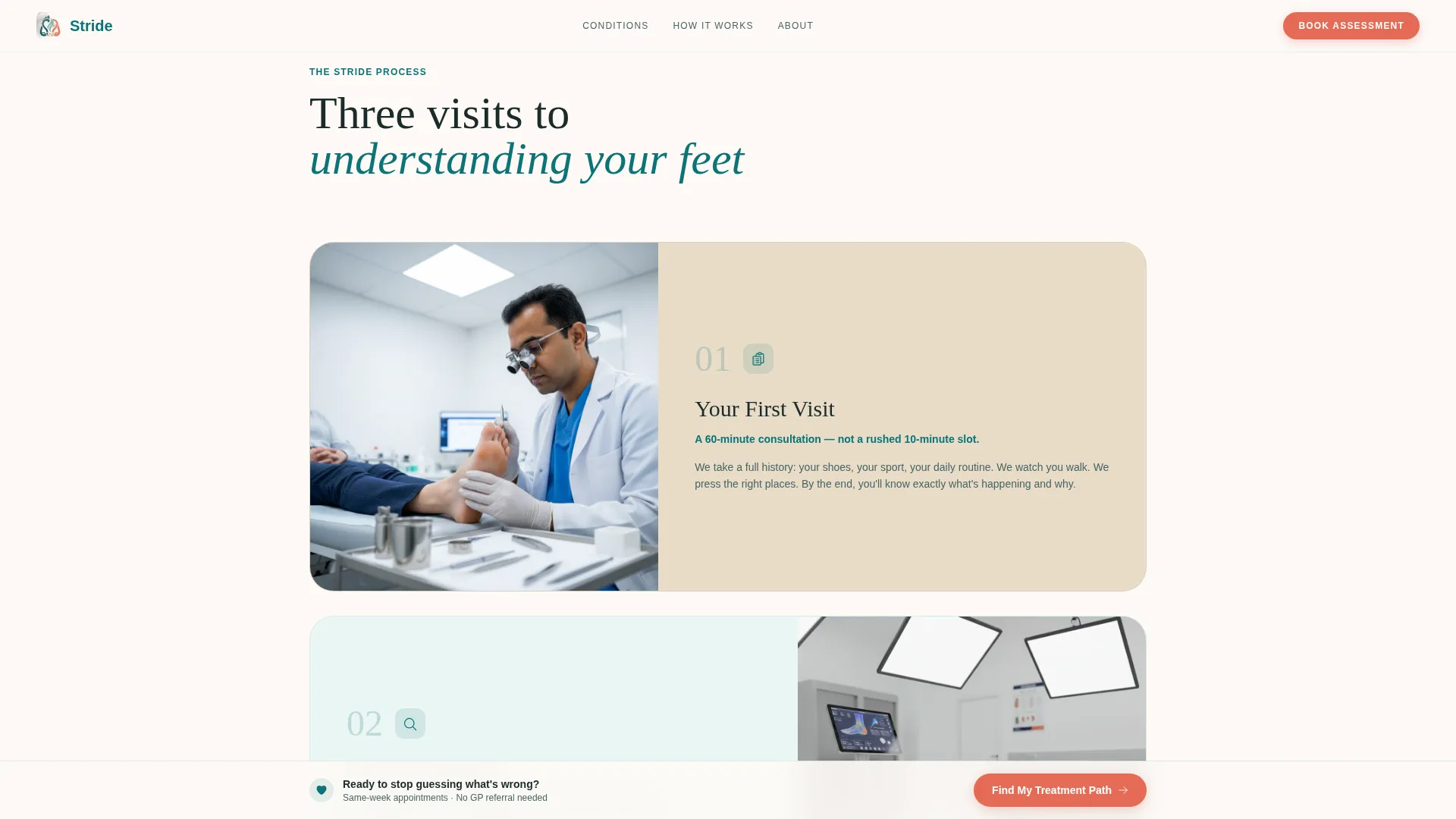
An asymmetric three-step layout walks new patients through First Visit, Assessment, and Treatment Plan. It removes uncertainty about what happens after booking and makes the clinical process feel approachable.
Sticky Call-to-Action Bar
After a visitor scrolls past the first testimonial row, a sticky bar appears at the bottom of the screen with the primary call to action, "Find My Treatment Path." It remains in view without interrupting reading, making it easy to re-enter the assessment at any point.
Page sections overview
| Section | Purpose |
|---|---|
| Hero Assessment Form | Opens the four-step quiz with concern tile selection over an animated feet illustration |
| Comparison Table | Compares conditions by treatment duration, visit frequency, and outcome with embedded patient quotes |
| Scroll-Reveal Manifesto | Delivers the clinic's emotional message word by word as the visitor scrolls |
| How It Works | Shows the three-step patient journey from first visit through to treatment plan |
| Sticky Call-to-Action Bar | Keeps the primary quiz entry point visible after the first testimonial row |
| Footer | Single-row linear footer providing essential clinic contact and navigation links |
Design & branding system
The visual identity follows an Organic Flow theme, pairing clinical precision with the warmth of a treatment room lined with living walls and natural linen. Typography uses Fraunces for serif headings and DM Sans for body text and user interface elements, creating a clear hierarchy that feels human without sacrificing authority.
- Deep therapeutic teal (#0D7377) anchors primary headings and the progress bar; soft eucalyptus (#A8D5D0) washes alternate section backgrounds; warm sandstone (#E8DCC8) grounds comparison table rows
- Catalyst coral (#E56B56) is reserved exclusively for buttons and progress indicators, making every call-to-action visually distinct
- Section backgrounds alternate between sandstone and eucalyptus throughout the page, creating a natural rhythm that guides the eye without relying on hard dividers
Mobile & speed optimization
The template is built mobile-first, with the assessment tiles designed for large, confident touch interactions. Every interactive element is sized and spaced to work on a phone screen without pinching or mis-tapping.
- Assessment tiles are designed with touch targets of at least 48 pixels to meet comfortable mobile interaction standards
- The four-step form uses step transitions and a teal progress bar so mobile visitors always know how far along they are
- Static sections such as the manifesto and How It Works use Server Components, while interactive elements such as the form and sticky bar use Client Components to keep the page responsive
How this template helps you convert
Stride is structured so that every section moves a hesitant visitor one step closer to booking, without ever feeling like a hard sell.
- The hero form starts with a single tappable tile rather than a blank form, reducing the effort needed to begin and immediately personalising the experience for each visitor's specific foot concern.
- The comparison table pairs clinical information with real patient stories in the same view, so a visitor can read about their likely condition and a real outcome in one place, building confidence before they commit to booking.
Other information about this template
Stride is localised for a London-based clinic with English (UK) copy conventions, GBP pricing formatting, and a 24-hour time format for appointment windows. The animation level across the page is high, covering scroll-reveal text, form step transitions, a floating hero illustration, and a slide-in sticky bar entrance. Interactivity is equally high, with the four-step form, expandable comparison table rows, and a persistent sticky call to action all requiring Client Component rendering.
- The template is designed for the Health and Medical category, specifically within the podiatrist new patient welcome page niche
- The comparison table is the structural centrepiece of the page, functioning as both a clinical reference and a social proof layer through its embedded quotes
- The footer follows Pattern 1, a linear single-row layout, keeping the page close-ended and focused on the single conversion goal
Theme
Organic Flow
Creative direction
Testimonial Mosaic
Color system
Teal Catalyst
Style
Comparison Table
Direction
Quiz/Assessment
Page Sections
Four-step Guided Assessment Form
Testimonial-embedded Comparison Table
Scroll-reveal Manifesto Section
Asymmetric How It Works Visual
Persistent Sticky Call-to-action Bar
Related questions
What type of page is this template designed for?
Can I adapt the comparison table for different conditions?
What happens at the end of the four-step assessment?
Is the sticky call-to-action bar always visible on screen?
Who is the ideal patient profile this landing page speaks to?



