Ultra Running Equipment Landing Page Template
Stride is a storybook landing page built for ultra running equipment brands. It opens with a full-viewport short-form reel, then guides visitors through an immersive race narrative across five cinematic chapters. The Carbon Fiber color system, parallax depth, and a single pacer-orange call to action drive serious gear-focused runners toward the seasonal collection.
by Rocket studio
Quick summary
Stride is a single-page landing page template engineered for ultra running equipment brands. It pairs a full-viewport video reel with a chapter-by-chapter race narrative, moving visitors from pre-dawn gear check to final descent. Every scroll deepens emotional investment before a confident, pacer-orange call to action pushes buyers toward the seasonal collection.
Who this template is for
This template is built for ultra running gear brands that sell to serious distance athletes. If your customers obsess over pack weight, pole selection, and layering decisions made at mile sixty, Stride speaks their language without needing a single word of explanation.
- Ultra running equipment brands targeting mid-pack and competitive finishers
- Gear founders or creative directors launching a seasonal collection campaign
- Performance outdoor brands whose audience tracks grams, not just features
What problem this template solves
Most gear landing pages present products like a catalog. They show specs in a table and hope the visitor cares. Stride solves a different problem: it makes the visitor feel the race before they ever click buy.
- Generic product pages fail to connect emotionally with athletes who buy on conviction, not impulse
- Brands struggle to communicate ultra-specific value (ounces saved, reliability at mile sixty) through standard layouts
- Standard templates do not reflect the visual identity that performance gear buyers expect from a brand they will trust on a hundred-mile course
What you get with this template
You get a complete, conversion-focused landing page structure that doubles as a brand story. Every section earns its place, the same way every piece of kit on a runner earns its weight.
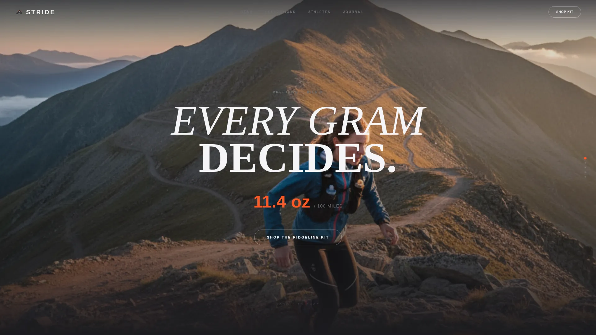
- A full-viewport short-form reel header with an autoplay-muted, seamlessly looping vertical video slot and a punchy on-screen stat overlay
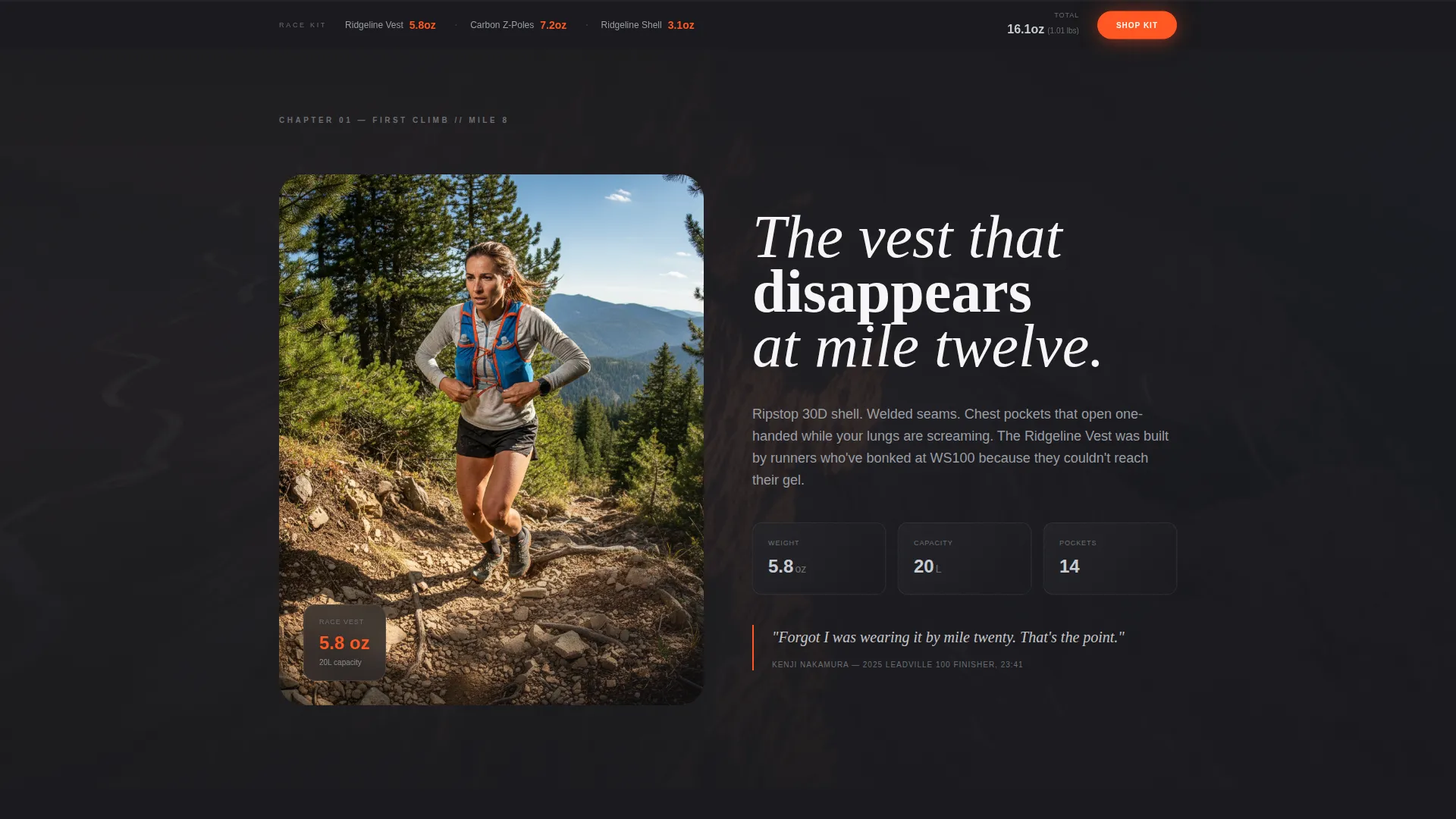
- Five immersive scroll chapters, each isolating a single product in a distinct race moment, with parallax layering separating athlete from terrain
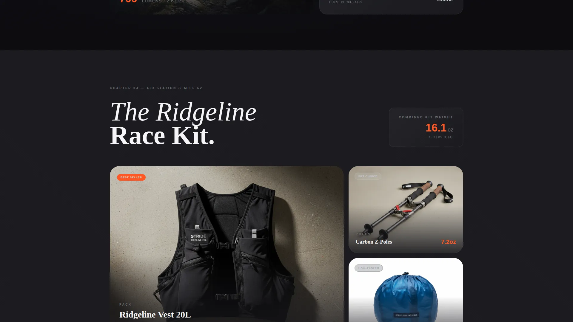
- A persistent bottom bar showing a curated three-item race kit with combined weight, reinforcing the brand's gram-counting value proposition throughout the entire page
Feature list
This section covers the built-in design and layout capabilities that come with the Stride template.
Full-Viewport Video Reel Header
The header fills the entire first viewport edge to edge with a vertical-format short-form reel slot. The opening sequence moves from mud-caked shoes on a switchback to a drone-wide ridgeline reveal. A single stat, formatted as "11.4 oz / 100 miles," punches onto screen at the cut, anchoring the brand's performance promise before the visitor reads a single word.
Five-Chapter Race Narrative Layout
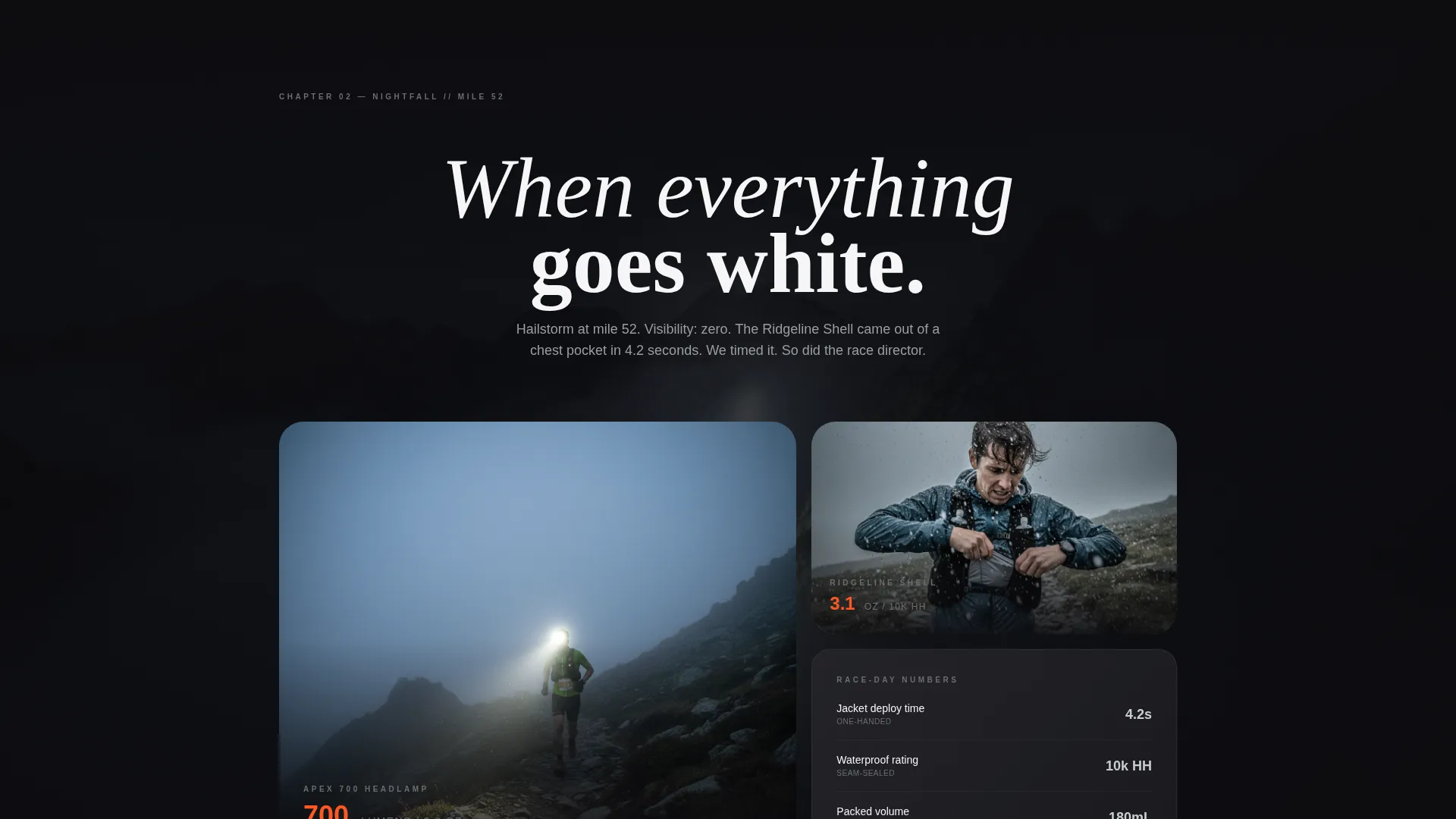
The page is structured as five sequential chapters that mirror a single race arc: pre-dawn gear check, first climb, aid station chaos, nightfall, and the final descent. Each chapter is built to isolate one product in its natural context, so the vest appears mid-stride and the shell appears mid-hailstorm, not on a studio mannequin.
Parallax Depth Scrolling
Parallax layers separate the foreground athlete from the background terrain on every chapter section. The effect creates a sense of physical depth that matches the disorienting, immersive experience of moving through mountain terrain at pace.
Race-Clock Color Transitions
Section transitions darken and lighten to mirror the time of day within the race narrative. The page moves from night to dawn to night again as the visitor scrolls, creating a cohesive visual arc that reinforces storytelling rather than interrupting it.
Progressive Call-to-Action Strategy
The primary call to action, "Shop the Ridgeline Kit," appears first as a subtle ghost button over the reel, then solidifies into pacer-orange after the third chapter. This pacing lets emotional investment build before the brand asks for the click.
Persistent Race Kit Bottom Bar
A fixed bottom bar displays a curated three-item race kit with combined weight visible at all times. It keeps the brand's weight-obsessed value proposition anchored throughout the scroll without requiring the visitor to navigate back to any product section.
Page sections overview
| Section | Purpose |
|---|---|
| Video Reel Header | Opens with looping reel and stat overlay to establish brand intensity immediately |
| Ghost call to action Button | Introduces "Shop the Ridgeline Kit" softly before emotional investment is established |
| Chapter One: Gear Check | Pre-dawn gear check scene isolates the pack in context |
| Chapter Two: First Climb | Uphill sequence presents poles or layers in active use |
| Chapter Three: Aid Station | Mid-race chaos section highlights vest accessibility and quick transitions |
| Chapter Four: Nightfall | Low-light scene features the headlamp in whiteout fog conditions |
| Chapter Five: Final Descent | Closing chapter shows the shell in a hailstorm and solidifies the orange call to action |
| Race Kit Bottom Bar | Persistent bar showing three-item kit and combined weight throughout the page |
Design & branding system
The Carbon Fiber color system is the visual backbone of Stride. The palette is built for a specific emotional register: matte darkness broken by metallic flashes, with a single high-contrast accent that commands attention exactly when the brand wants it.
- Deep carbon black (#1A1A1E) as the dominant background, titanium mid-gray (#6B6E73) for body text and secondary elements, and reflective silver (#C8CDD3) for data callouts and highlights
- Pacer-orange (#FF5722) reserved exclusively for calls to action and performance metrics, so it never loses its urgency
- Competition Edge theme applied through stark contrast, hard-cut transitions, and a visual rhythm that reads like a race, not a retail catalog
Mobile & speed optimization
The Stride template is built with a vertical-first visual logic that maps naturally to mobile viewports. The short-form reel header uses a vertical format, which means the opening experience is already optimized for how most athletes browse on a phone between training sessions.
- Vertical-format reel fills mobile screens without cropping or letterboxing, preserving the full visual impact of the opening sequence
- Autoplay-muted video prevents audio friction on mobile devices and respects default browser behavior for silent autoplay
- Parallax and chapter transitions are designed for scroll-driven interaction, which performs consistently across both touch and mouse-based navigation
How this template helps you convert
Stride is built around a deliberate, stage-by-stage persuasion arc. It does not ask for the click immediately. It earns it.
- The reel header and stat overlay establish brand credibility and product specificity in the first three seconds, qualifying the visitor before they scroll at all.
- The five-chapter narrative builds emotional investment progressively, so by the time the pacer-orange call to action fully appears after chapter three, the visitor has already mentally run the race in the brand's gear.
- The persistent race kit bottom bar keeps a purchase pathway visible at all times without interrupting the storytelling, so the visitor is never more than one tap away from the collection page.
Other information about this template
Stride is categorized under Sports and Recreation, specifically in the ultra running equipment niche. It is built as a click-through landing page, meaning its single conversion goal is to move visitors into the seasonal collection page with no forms, no required sign-ups, and no friction between story and purchase.
- Template style is Storybook/Full-Page, suited to brands that lead with identity before product
- Creative direction is Immersive Visual, using full-bleed imagery, parallax layering, and chapter-driven scroll to create a branded environment rather than a standard product page
- The intersection match between Competition Edge theme, Carbon Fiber color system, Short-Form Reel header concept, and Click-Through landing page direction reflects a tightly coordinated template built for one specific type of brand and one specific type of buyer
Theme
Competition Edge
Creative direction
Immersive Visual
Color system
Carbon Fiber
Style
Storybook/Full-Page
Direction
Click-Through
Page Sections
Full-viewport Video Reel Header
Five-chapter Race Narrative
Parallax Depth Layers
Race-clock Color Transitions
Progressive Pacer-orange Call to Action
Persistent Race Kit Bottom Bar
Related questions
What kind of brand is Stride built for?
Do I need video footage to use this template?
Can I update the call-to-action destination?
Is Stride suitable for a brand with multiple product categories?
How do I configure the race kit bottom bar?