Joint Replacement Landing page Template
A hub and spoke landing page built for joint replacement centers. It guides knee and hip pain patients through every stage of the surgical journey, from eligibility self-assessment to recovery milestones, using radical transparency to replace anxiety with confidence. The three-step eligibility form, anchor navigation, and week-by-week recovery tracker are all included and ready to customize.
by Rocket studio
Quick summary
This is a single-page, hub and spoke landing page designed for a joint replacement surgical center. It uses anchor navigation to move patients through eligibility, procedure details, recovery timelines, and patient stories. The goal is simple: turn anxious, pain-limited adults into booked consultations by showing them exactly what the process looks like before they ever make a call.
Who this template is for
This template is built for orthopedic surgical centers that specialize in knee and hip replacements. It works best when the practice is ready to lead with transparency rather than generic reassurance.
- Joint replacement centers targeting adults aged 55 to 75 with chronic knee or hip pain
- Orthopedic practices that want to convert cautious, research-driven patients into consultation bookings
- Medical marketing teams building a lead generation page that reflects a real surgical process
What problem this template solves
Most patients considering joint replacement are not afraid of surgery itself. They are afraid of the unknown. They do not know what the implant looks like, how long the operation takes, or what week three of recovery actually feels like. That anxiety quietly keeps them from booking.
- Patients delay calling because they cannot picture the process end to end
- Generic clinic pages offer reassurance but no real information, which erodes trust
- Practices lose warm leads to competitors who answer patient questions more directly
What you get with this template
This template delivers a fully structured, information-led landing page organized around a central hub with five distinct spokes. Every section is designed to answer the question the previous one raised.
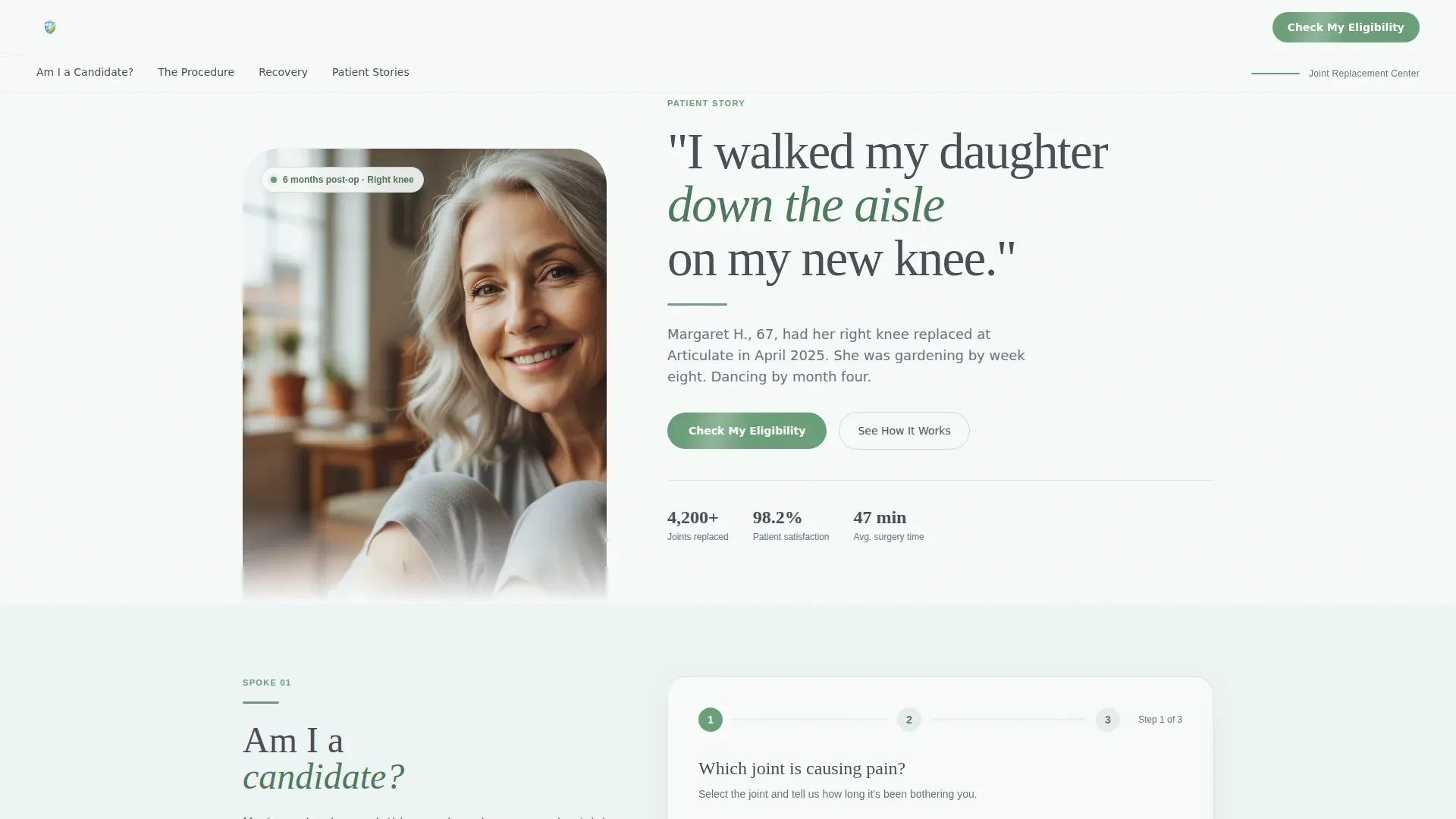
- A portrait-centered hero section with an editorial headline and a pulsing anchor navigation bar
- Five clearly mapped content sections covering eligibility, procedure, recovery, and patient stories
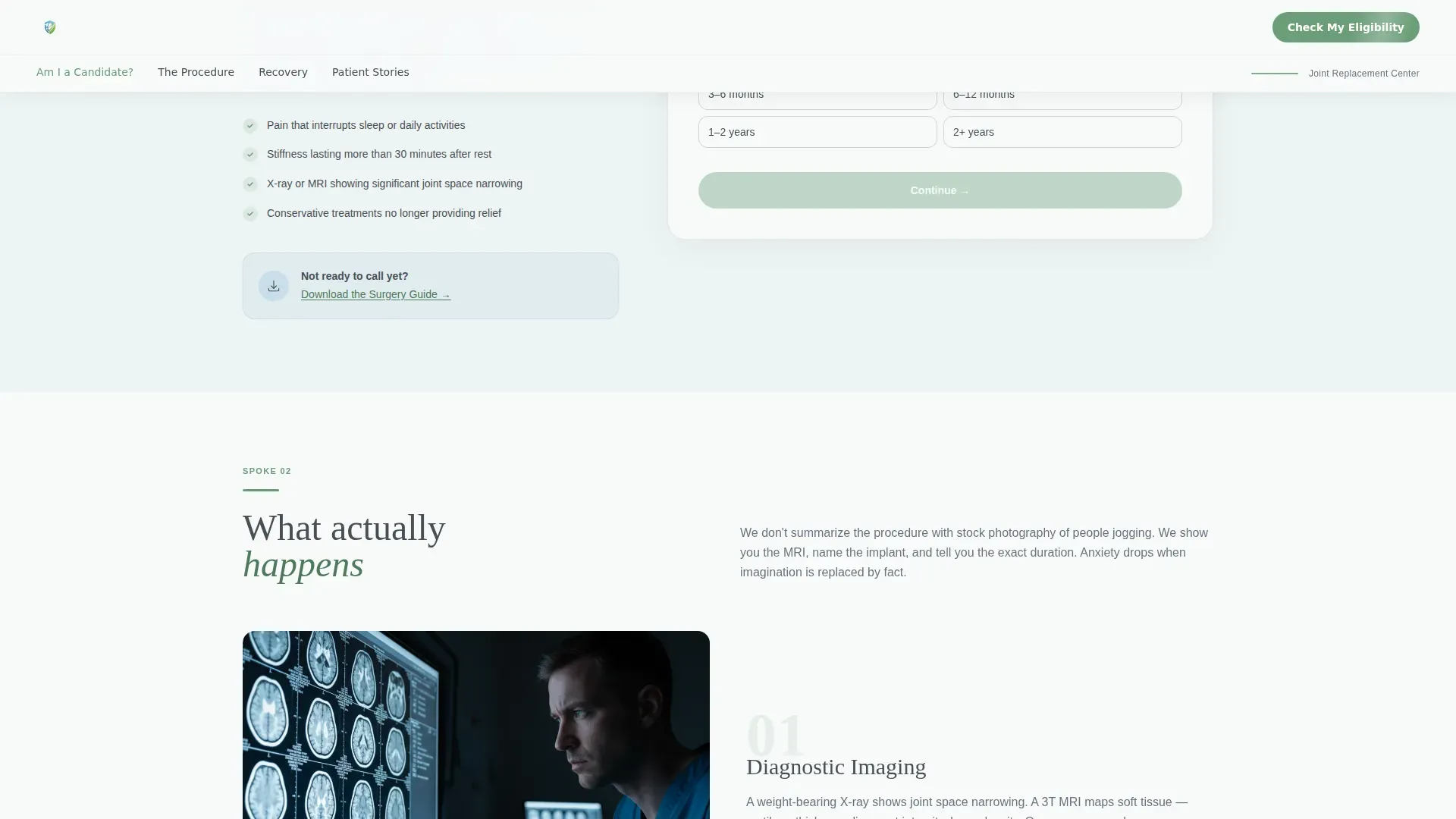
- A three-step progressive disclosure eligibility form and a secondary email capture path for the surgery guide
Feature list
This template includes six core features, each grounded in the page's lead generation purpose and transparent-process creative direction.
Portrait-Centered Hero with Anchor Navigation
The hero section pairs a single patient portrait, shot against soft natural light, with an editorial headline in serif display type. A thin meadow-green line pulses gently beneath the headline and draws the eye directly into the anchor navigation bar, which links to every spoke on the page.
Three-Step Progressive Eligibility Form
The primary call to action, "Check My Eligibility," opens a three-step form with progressive disclosure. Step one asks which joint is affected and how long the pain has lasted. Step two collects age and current mobility level using a simple slider. Step three requests name, phone number, and preferred consultation format, either in-person or virtual.
Transparent Procedure Spoke
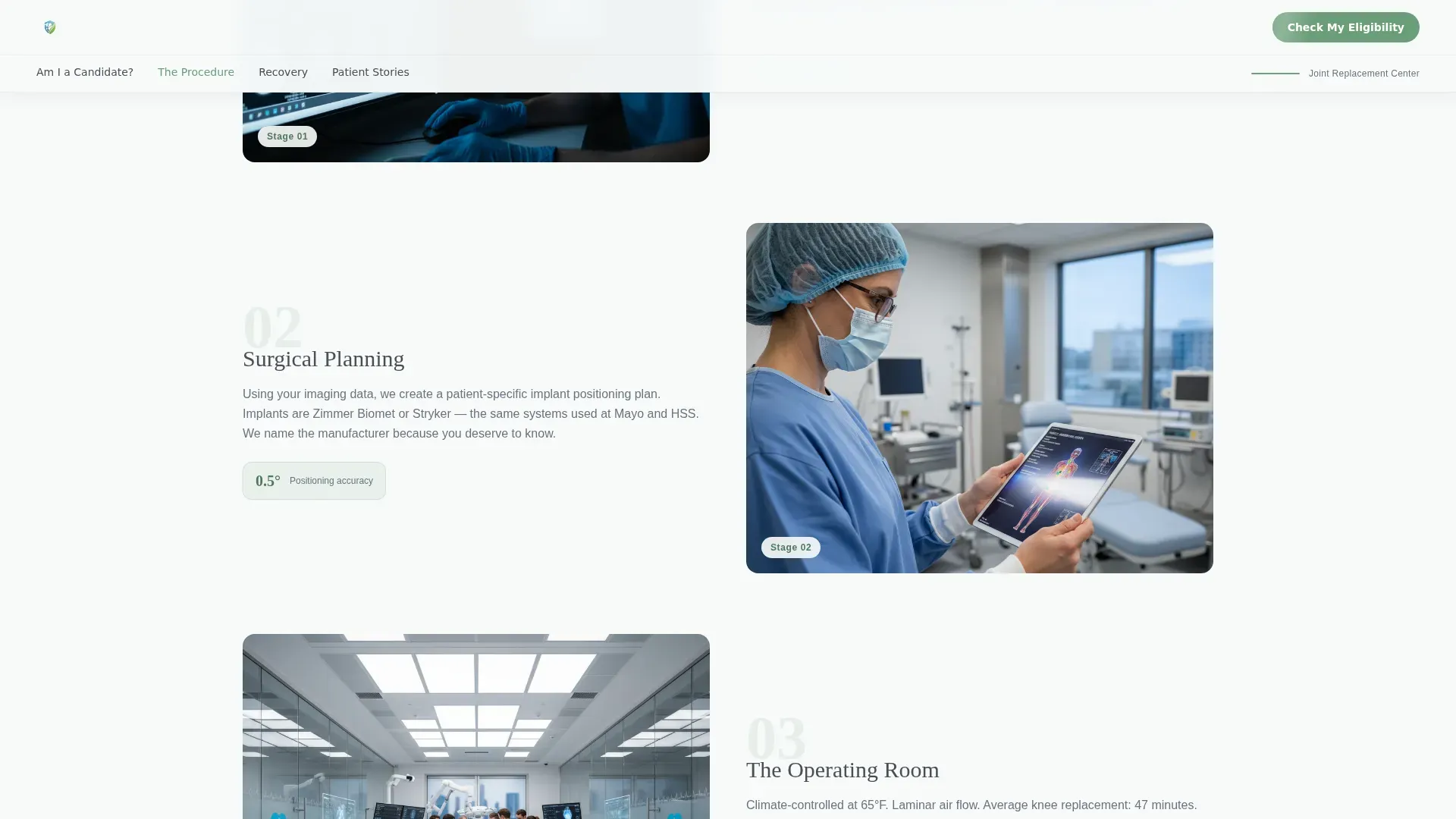
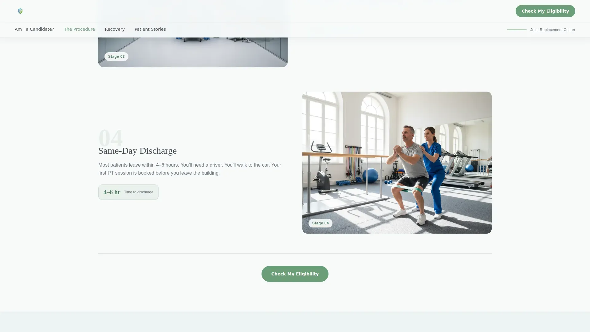
This section walks patients through the full surgical process in plain language. It covers the MRI and imaging stage, implant details including manufacturer names, average operating room duration in minutes, and the names of the surgeons involved. Nothing is hidden or softened.
Week-by-Week Recovery Timeline
The recovery spoke displays a tracker that maps patient-reported mobility scores across each week of recovery. Real data points replace vague reassurances, giving patients a concrete picture of what progress looks like from day one through full restoration of activity.
Named Patient Story Section
The patient stories spoke features specific testimonials tied to named individuals, the joint they had replaced, and the activity they returned to. Each story is concrete and personal, not a generic five-star quote.
Secondary Lead Capture Path
Patients who are not ready to call can follow a secondary path: "Download the Surgery Guide." This captures an email address and keeps the patient connected to the practice's transparency promise while they continue their research.
Page sections overview
| Section | Purpose |
|---|---|
| Hero Hub | Anchor nav, portrait, editorial headline, primary call to action |
| Eligibility Spoke | Joint selector, pain duration input, mobility self-assessment |
| Procedure Spoke | MRI details, implant info, OR stats, surgeon names |
| Recovery Timeline Spoke | Week-by-week mobility tracker with real patient data |
| Patient Stories Spoke | Named testimonials with joints replaced and activities restored |
| Footer | Linear single-row pattern with secondary links |
Design & branding system
The visual identity follows a Healing Space theme using the Alpine Fresh color system. The palette feels clinical without being cold, and warm without being generic. Every color choice serves a functional role on the page.
- Glacier white (#F7FAFA) dominates backgrounds and open space; clean granite (#4A4F57) anchors all body text; alpine meadow green (#6B9E78) marks every interactive element and progress indicator
- Morning frost blue (#A8C5D6) appears in soft illustration fills and hover states, adding a secondary accent without competing with the primary palette
- Typography pairs DM Sans for body text with Fraunces, a serif display face, for headlines, creating a contrast between clinical clarity and human warmth
Mobile & speed optimization
This template is built desktop-first, with full mobile parity so patients researching on tablets in bed get the same complete experience as desktop users. Performance decisions prioritize the elements patients see first.
- Hero image loads with priority to ensure the portrait and headline appear immediately on any device
- Animations and scroll reveals are deferred so they do not delay the initial page load
- The three-step form and mobility slider are fully functional on touch screens and tablet viewports
How this template helps you convert
The page is structured so that every section moves a hesitant patient one step closer to booking. Transparency does the persuasion work; the layout simply keeps it organized and easy to follow.
- The anchor navigation lets patients jump directly to the section that answers their most urgent question, whether that is eligibility, the procedure, or recovery, reducing drop-off from impatient visitors
- The "Check My Eligibility" call to action appears at the hero hub and at the end of every spoke, so the invitation to book is always one scroll away without feeling pushy
- The secondary "Download the Surgery Guide" path captures email addresses from patients who need more time, keeping them in the funnel without requiring an immediate phone call
Other information about this template
This template is specifically designed for the joint replacement niche within orthopedic and sports medicine. A few additional details are worth noting before you customize it.
- The page uses medium animation intensity: scroll reveals, a pulsing green indicator line, and progress indicators inside the eligibility form
- Interactivity is high by design. The anchor navigation, three-step form, and mobility slider all require JavaScript and are included in the template structure
- Social proof elements are built into the layout, including surgery volume statistics, implant manufacturer name placements, average procedure duration metrics, and named patient testimonials
- Localization is set to English (US) with date formatting in MM/DD/YYYY and currency in USD where applicable
- The footer follows a linear single-row pattern and is included in the template
Theme
Healing Space
Creative direction
Transparent Process
Color system
Alpine Fresh
Style
Hub & Spoke (Anchor Nav)
Direction
Lead Generation
Page Sections
Portrait-centered Hero with Anchor Nav
Three-step Progressive Eligibility Form
Transparent Procedure Section
Week-by-week Recovery Tracker
Named Patient Testimonial Section
Secondary Email Capture Path
Related questions
Who is the ideal patient audience this landing page targets?
How does the three-step eligibility form work?
What is the secondary lead capture path for?
Can I customize the patient testimonials and surgeon details?
What level of animation and interactivity does this template include?



