Certified Local Brick & Mortar Business Appointment Booking Website Template
Stride is a bento grid landing page template built for prosthetics and orthotics practices. It pairs flash-deal urgency with a warm, geometric visual identity to move first-time visitors from curiosity to a booked fitting. Reserve-My-Fitting calls to action, a coverage-check path, and scarcity-driven product tiles work together to reduce the industry's biggest conversion barrier: fear of the bill.
by Rocket studio
Quick summary
Stride is a single-page bento grid template designed for prosthetics and orthotics shops. It blends flash-deal urgency with a calming, playful visual identity to convert anxious first-time visitors into booked patients. Every tile is a self-contained card with a product image, pricing, and a direct call to action. The layout keeps deals fresh on every return visit.
Who this template is for
This template is built for independent prosthetics and orthotics practices that serve a wide range of patients and need to convert online visitors into booked appointments quickly. It is especially useful for shops that offer time-sensitive promotions and want to reduce patient hesitation around cost and insurance.
- Certified prosthetists and orthotists running a local or regional clinic
- Practice managers who handle both patient intake and promotional scheduling
- VA-contracted providers and pediatric orthotics specialists with weekly slot limits
What problem this template solves
Patients searching for prosthetic or orthotic care face two major barriers: not knowing whether their insurance will cover the cost, and not knowing how to take the first step with a provider. A generic website does little to address either concern. Stride is designed to remove those friction points directly within the page layout.
- Insurance fear keeps qualified patients from booking, even when they are ready to commit
- Flash deals and restocked inventory go unnoticed without a layout that surfaces urgency visually
- Pediatric and VA referral cases need clear, reassuring pathways that feel nothing like a clinical intake form
What you get with this template
Stride delivers a complete single-page layout structured around bento grid cards. Each card is independently designed to carry a product offer, a time-sensitive badge, and a direct action. The result is a page that works as both a storefront and a conversion funnel.
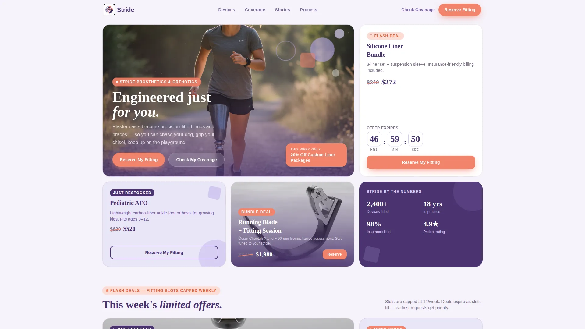
- A hero tile with a lifestyle photograph, geometric lavender accent shapes, and a coral flash-deal banner overlay
- Self-contained product tiles with original and slashed pricing, countdown clocks, restock tags, and bundle offers
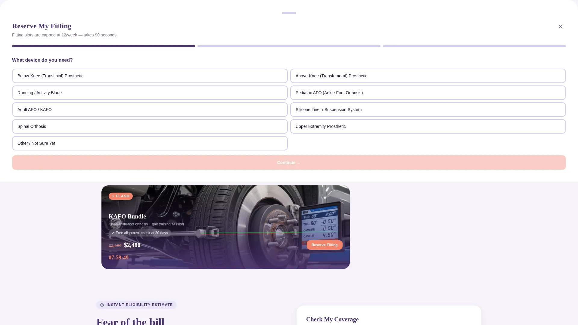
- A slide-up Reserve My Fitting form and a secondary Check My Coverage path for policy eligibility
Feature list
The template delivers the following built-in features based on the design brief.
Bento Grid Product Layout
Each offer lives in its own card tile, complete with a product image, pricing details, a geometric accent shape, and a one-line benefit statement. The grid reorders tiles by deal priority so the freshest offers always appear top-left, making every return visit feel distinct.
Flash-Deal Urgency System
Countdown timers on discounted silicone liners, "Just Restocked" badges on pediatric ankle-foot orthoses (AFOs), and bundle deal tiles create real, visible scarcity. Fitting slots are capped weekly, so the urgency is grounded in an actual supply constraint rather than artificial pressure.
Reserve My Fitting Slide-Up Form
Every product tile carries a primary "Reserve My Fitting" call to action. Tapping it opens a slide-up form that collects device type, insurance carrier, and preferred appointment window. The form design keeps the intake process lightweight and non-clinical.
Check My Coverage Secondary Path
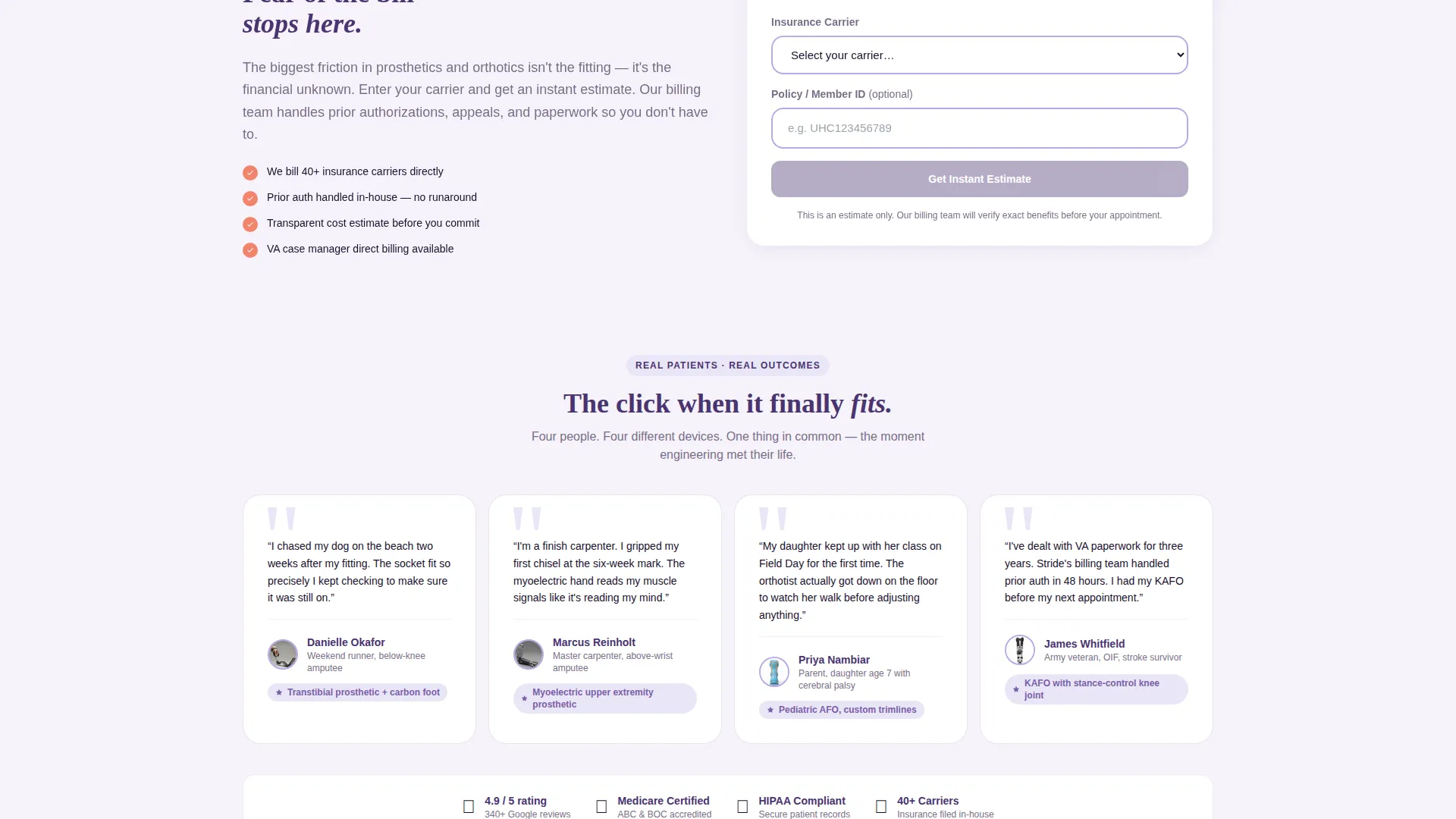
A second conversion path lets visitors enter their insurance policy number to receive an instant eligibility estimate. This feature directly addresses the industry's most common friction point and keeps hesitant visitors engaged rather than bouncing.
Playful Geometric Hero Section
The top bento tile spans double width and features a lifestyle photograph of a woman running with a below-knee prosthetic. Geometric lavender shapes float behind her. A coral flash-deal banner overlays the bottom corner, combining emotional storytelling with promotional intent from the first scroll.
Dual-call to action Conversion Architecture
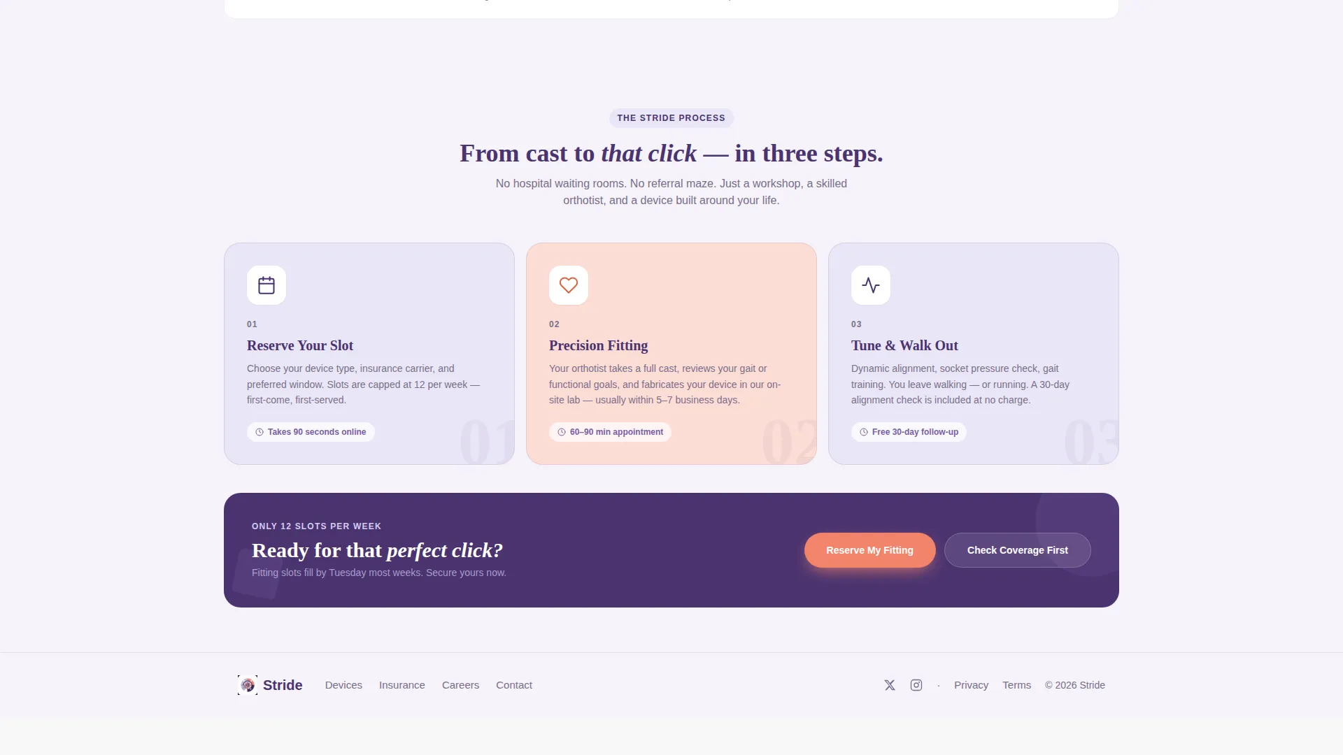
The page supports two simultaneous conversion goals. "Reserve My Fitting" drives direct appointment bookings. "Check My Coverage" captures visitors who need more reassurance before committing. Both paths are present on every major tile, giving different visitor types a clear next step.
Page sections overview
| Section | Purpose |
|---|---|
| Hero Lifestyle Tile | Anchors emotional identity and surfaces the flash deal banner |
| Countdown Liner Deal | Drives urgency for discounted silicone liner packages |
| Pediatric AFO Tile | Highlights restocked inventory with a "Just Restocked" badge |
| Running Blade Bundle | Presents a paired product and fitting session offer |
| Reserve My Fitting | Collects device type, insurance info, and appointment preference |
| Check My Coverage | Lets visitors verify insurance eligibility before booking |
Design & branding system
The visual identity follows a Playful Geometric theme built on the Lavender Dream color system. The palette is intentionally soft enough to calm a first-time patient while staying bright enough to signal a modern, expert practice. Geometric shapes are used as decorative accents throughout the grid rather than as structural elements.
- Soft lavender (#B8A9E8) fills card backgrounds and section areas; deep violet (#4A3370) anchors headlines and navigation
- Cloud white (#F5F2FA) serves as the primary canvas, keeping the layout airy and easy to scan
- Warm coral (#F2836B) is reserved for badges, countdown timers, and all call-to-action buttons to draw the eye immediately
Mobile & speed optimization
The bento grid layout is designed to reflow cleanly across screen sizes. On smaller screens, each tile stacks as a full-width card, preserving the product image, pricing, and call-to-action hierarchy. The slide-up form and coverage-check path remain accessible without horizontal scrolling.
- Product tiles retain their badge overlays and pricing details at every viewport width
- Countdown timers and "Just Restocked" tags remain visible and tappable on touch devices
- The hero tile's low-angle lifestyle photograph and floating geometric shapes scale proportionally to avoid cropping key visual elements
How this template helps you convert
Stride is structured to move a hesitant, insurance-aware visitor toward a committed booking in as few steps as possible. The page layout removes the usual reasons people leave without acting.
- Flash-deal tiles create genuine urgency by surfacing real weekly slot limits and time-bound pricing, giving visitors a concrete reason to act now rather than return later.
- The slide-up Reserve My Fitting form reduces commitment anxiety by asking only three questions: device type, insurance carrier, and preferred appointment window, keeping the first step feel manageable.
- The Check My Coverage path intercepts cost-hesitant visitors before they bounce, turning an unanswered insurance question into a reason to stay on the page.
Other information about this template
Stride was built specifically for the prosthetics and orthotics retail niche within a local brick-and-mortar business context. The template's conversion architecture was designed around the real purchasing journey of patients who balance clinical need, insurance navigation, and emotional readiness simultaneously.
- The template sits within the Retail and E-Commerce category, optimized for local service businesses with appointment-based sales models
- The bento grid structure supports a marketplace and multi-conversion goal, meaning the page handles several offers and two distinct visitor paths at once
- Suitable for practices serving amputees, stroke rehabilitation patients, pediatric orthotic cases, and VA-referred patients under a single unified layout
Theme
Neo-Retro
Creative direction
Unboxing Experience
Color system
Citrus Burst
Style
Masonry/Pinterest
Direction
Marketplace/Multi
Page Sections
Bento Grid Product Layout
Flash-deal Urgency System
Reserve My Fitting Slide-up Form
Check My Coverage Secondary Path
Playful Geometric Hero Section
Dual-cta Conversion Architecture
Related questions
Who is the Stride template designed for?
Can I customize the product tiles and pricing in the bento grid?
How does the Check My Coverage feature work for patients?
Is the flash-deal urgency tied to real scarcity or just visual styling?
Does the template support more than one call to action per page?



