Local Brick & Mortar Professional Website Template
Stride is a gallery and detail landing page template built for prosthetics and orthotics shops serving active amputees, pediatric patients, and veterans. It presents upgrade components in an expandable bento-style gallery, pairs each card with measurable specs data, and drives visitors toward a pinned "Upgrade My Limb" call to action through a Playful Geometric, lavender-forward visual identity.
by Rocket studio
Quick summary
Stride is a precision-crafted, single-page template designed for prosthetic upgrade shops. It moves visitors through a curated gallery of components, from cosmetic covers to full rebuild packages, using scroll-reveal animations, expandable detail cards, and a qualifier form that matches each person to the right prosthesis upgrade path.
Who this template is for
This template is built for prosthetics and orthotics businesses that serve a performance-driven clientele. It works especially well when your patients arrive already wearing a functioning prosthetic limb and want something better, lighter, or more activity-specific.
- Active amputees chasing running, surfing, or dancing goals who want measurable prosthetic improvements
- Parents of pediatric patients navigating socket fittings and wanting a clear, trustworthy upgrade path
- Veterans and clinicians looking for devices matched to specific activity levels and body mechanics
What problem this template solves
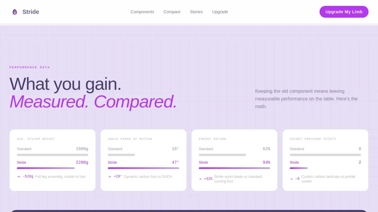
Most prosthetic shop pages read like medical catalogs. They list products without showing what changes when you upgrade. Stride solves that by making the performance case visually and numerically clear, so users can see exactly what they gain before they book a fitting.
- Visitors cannot easily compare their current prosthesis to a premium alternative without side-by-side data
- Urgency signals like insurance-cycle deadlines and limited colorways go uncommunicated on generic pages
- There is no guided path for users who are unsure which upgrade tier fits their activity level
What you get with this template
Stride delivers a complete, ready-to-adapt single-page layout built around the upgrade decision journey. Every section is produced to move a visitor from awareness to action without unnecessary clicks.
- A full-bleed hero section, bento gallery grid, specs comparison strip, social proof block, qualifier call-to-action section, and a single-row footer
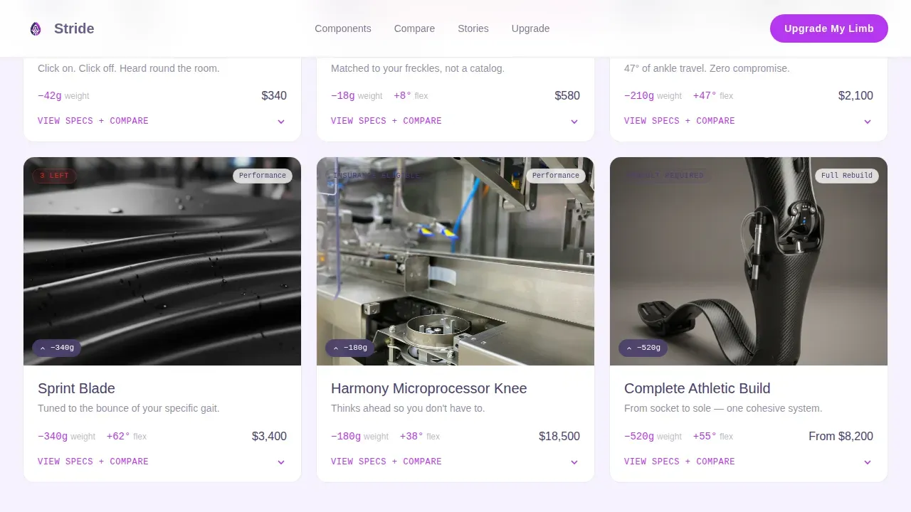
- Expandable detail cards showing weight savings, flexibility ratings, and side-by-side comparisons to standard-issue prosthetic components
- A pinned mobile call-to-action button and a "Not Sure What Fits?" quiz modal to support every stage of the decision
Feature list
Stride is equipped with a tightly coordinated set of interactive and visual features. Each one is built to close the gap between a visitor reading product data and a patient booking their next fitting.
Full-Bleed Hero with Cinematic Tagline
The hero opens with a knee-height photo of a runner mid-stride, blade prosthesis catching stadium light. A single tagline fades in after a beat. The composition creates immediate emotional sign-off from visitors who recognize their own ambition in the image.
Bento-Style Expandable Gallery
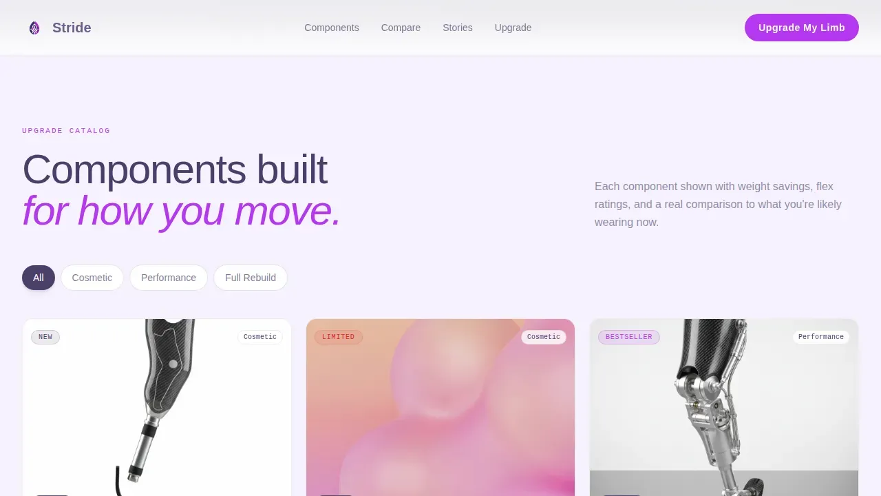
Component cards are arranged in a bento grid, each showing a prosthetic part isolated against soft lavender with a geometric pattern. One click expands to a detail panel with specifications, grams saved, degrees of flex gained, and a comparison to the standard-issue equivalent. This lets users read real data before they reach out.
Qualifier Form and Quiz Modal
A short qualifier form asks for current device type, component of interest, and insurance provider. A secondary path opens a guided quiz that recommends upgrade tiers based on activity level and current prosthesis setup. Together they build a two-step funnel that supports both decisive and exploratory patients.
Scroll-Reveal Animations and Counter Effects
High-motion scroll reveals, card expand and collapse transitions, counter animations on spec numbers, and hover state changes on electric orchid buttons create an engaging, data-forward experience. Clinicians and patients alike can check each metric as it animates into view.
Pinned Mobile Call-to-Action
On mobile viewports, the "Upgrade My Limb" button is pinned to the bottom of the screen at all times. This ensures that every step of the scroll keeps the primary action within reach, making it straightforward for users to participate in the upgrade journey without hunting for a button.
Urgency and Availability Signals
Limited-run colorways, insurance-cycle deadline notices, and seasonal fitting slot alerts are built into the gallery and section flow. These signals create natural time pressure in a way that feels informative rather than aggressive, giving patients context that helps them act before their insurance window closes.
Page sections overview
| Section | Purpose |
|---|---|
| Hero Full-Bleed | Open with a cinematic blade-runner photo and a floating tagline to sign visitors in emotionally |
| Bento Gallery Grid | Display upgrade components in expandable cards, ordered from cosmetic to full rebuild |
| Specs Comparison Strip | Show side-by-side prosthetic data: grams saved, flex gained, patient comparisons |
| Social Proof Block | Feature patient testimonials with activity types and measurable outcome numbers |
| Qualifier Call-to-Action | Capture device type, component interest, and insurance info via form and quiz modal |
| Single-Row Footer | Close the page with a clean, linear footer that keeps the layout light |
Design & branding system
Stride follows a Playful Geometric visual identity. The palette feels like a science museum after hours: clinical surfaces softened by purple light, geometry everywhere but nothing sharp. Typography is set in DM Sans for headlines and Manrope for body copy, with JetBrains Mono reserved for specs and data readouts.
- Soft digital lavender (#C3B1E1) for section backgrounds, deep iris (#4A3F6B) for headlines and navigation, warm cloud white (#F6F2FF) as breathing space between gallery cards
- Electric orchid (#B537F2) on buttons, badges, and hover states to create a clear visual hierarchy for calls to action
- Geometric pattern overlays behind each component card build visual consistency without making the layout feel rigid or clinical
Mobile & speed optimization
Stride is built mobile-first. The pinned call-to-action button means the upgrade path is always one tap away. High-quality hero imagery is prioritized for fast largest contentful paint (LCP) so the page loads quickly and holds attention from the first second.
- The pinned "Upgrade My Limb" button stays fixed to the mobile viewport bottom, keeping conversion within reach at every scroll point
- Image-heavy sections are structured to prioritize LCP on the hero so the page does not lose visitors to slow load times
- All interactive elements, including the quiz modal and expandable cards, are designed for touch-first interaction
How this template helps you convert
Stride earns its conversions by making improvement measurable and the next step obvious. Every design decision supports a visitor moving from curiosity to booking.
- Expandable detail cards show exact weight and flex improvements, so patients can check the data themselves and build confidence before they visit the shop
- The qualifier form and quiz modal create two parallel paths: one for users who know what they want, and one for users who need guidance, so no visitor reaches a dead end
- Urgency signals around insurance cycles and seasonal fitting slots give patients a real reason to act now rather than defer the upgrade decision
Other information about this template
This template is a strong fit for the current prosthetic market, where patients increasingly arrive informed and expect to participate actively in their upgrade decisions. Research supported by institutions including the NIH confirms that user feedback is essential in prosthetic design to ensure comfort, safety, and long-term usability. Prosthetic devices must conform closely to the user's body, and sensory feedback systems, including pressure and temperature sensors, help users regain a sense of control. Modern prosthetics also utilize AI-controlled systems and machine learning to improve responsiveness, making next-generation devices feel closer to a natural extension of the body. The design of Stride reflects this world of precision, giving clinicians and patients a shared language built on real data and measurable result. The template's content structure makes it straightforward to read upgrade terms, check specifications, and learn about available colorways or fitting slots.
- The Stride precision upgrade prosthetics landing page template is available to download and adapt immediately from the template marketplace
- You can download the template files and begin making adjustments to colors, copy, and component order without starting from scratch
- Rights to use and modify the template are included with your download; read the platform terms of use for full rights details on permitted use cases

Theme
Playful Geometric
Creative direction
Flash Deal
Color system
Lavender Dream
Style
Gallery + Detail
Direction
Upsell/Upgrade
Page Sections
Cinematic Full-bleed Hero Section
Expandable Bento Component Gallery
Qualifier Form and Guided Quiz Modal
Pinned Mobile Upgrade Button
Scroll-reveal Animations and Spec Counters
Urgency Signals and Availability Notices
Related questions
Can clinicians use this template to present upgrade options to patients?
Does the template include the quiz modal and qualifier form layouts?
Can I adjust the gallery order to match my product range?
Is this template suitable for pediatric prosthetic services as well as adult performance upgrades?
Where do I find the download and usage rights for this template?



