Outdoor Senior Fitness Trainer Quiz-Matching Website Template
Stride is a senior fitness landing page designed for outdoor movement practices serving adults aged 60 and older. It uses a modular card grid layout, a nature-inspired watercolor illustration style, and an event registration flow. The page guides visitors from a hand-drawn alpine hero scene through a Day-in-the-Life content arc, ending with a simple spot-reservation form built for trust and clarity.
by Rocket studio
Quick summary
Stride is a fitness landing page template built for senior outdoor movement practices. It follows a Day-in-the-Life card grid structure, moving visitors through a single training day from early-morning warm-ups to lakeside cool-downs. The page is designed to drive event registrations with a sticky coral call to action, a short form, and a secondary email-capture path for visitors not yet ready to commit.
Who this template is for
This template is designed specifically for fitness professionals and wellness coaches who serve active-aging adults. It suits anyone running structured outdoor sessions, community movement classes, or nature-based fitness programs for people aged 60 and older.
- Personal trainer and coach businesses focused on the 60-plus age group
- Wellness practitioners running small-group outdoor sessions with a capped class size
- Senior fitness program operators who need a focused event registration landing page without building from scratch
What problem this template solves
Many fitness landing page designs are built around a gym floor aesthetic: bold neon, heavy muscle imagery, and aggressive urgency tactics. That tone alienates older adults who are looking for movement that respects their body and their experience. A generic fitness landing page often fails this audience entirely.
Stride solves that mismatch directly. It gives senior fitness trainers a landing page that feels like the program itself: calm, grounded, and genuinely inviting.
- Removes the visual and tonal mismatch between mainstream fitness content and the senior wellness market
- Replaces high-pressure conversion tactics with social proof, class-size transparency, and illustrated participant stories that build trust naturally
- Gives visitors the detailed information they need about session format, mobility comfort levels, and registration dates before they are asked to commit
What you get with this template
This fitness landing page template delivers a complete, ready-to-adapt page structure for senior outdoor movement registration. Every section is pre-designed with purpose, so you can simply add your program details and start building your participant list.
- A full modular card grid layout covering the entire training day arc, from the 6:45 a.m. warm-up circle to the afternoon cool-down stretch
- A registration form with first name, age-range dropdown, illustrated mobility comfort icons, and a visual class calendar
- A secondary lead-capture path offering a free stretching guide download for visitors who are not yet ready to register
Feature list
This fitness landing page template includes the following built-in design and layout capabilities.
Alpine Meadow Hero Illustration
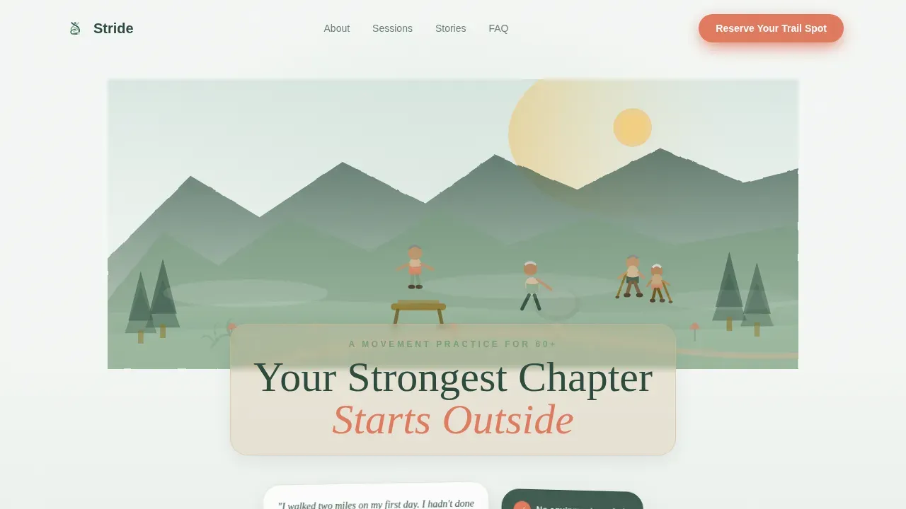
The hero image is a wide, hand-drawn panoramic scene rendered in loose ink with watercolor washes. It shows senior figures balancing on a log bridge, stretching against a boulder, and walking a ridge with trekking poles. A hand-lettered headline sits inside the landscape like a carved trail marker, creating an immediate emotional connection and a clear sense of what the fitness program is about.
Day-in-the-Life Bento Card Grid
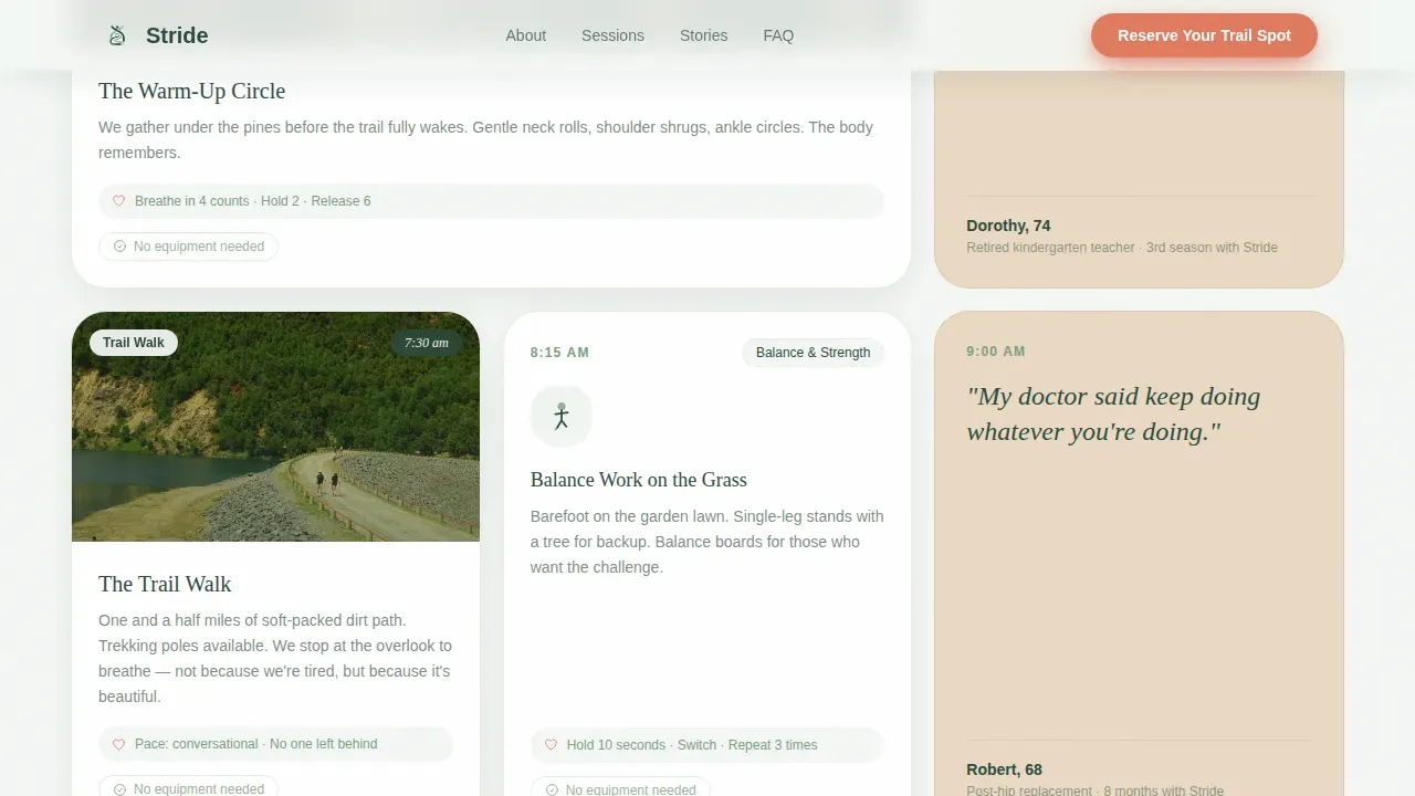
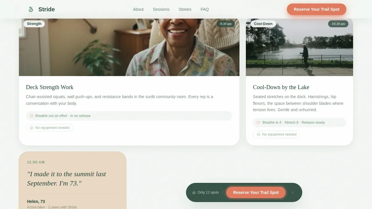
The main content section uses a modular bento-style card grid. Cards alternate between illustrated movement vignettes, participant quotes in handwritten-style type, and short movement descriptions with breath counts. The scroll experience moves through a single training day chronologically, from morning pines to lakeside cool-down, making the page feel like turning pages in a morning journal.
Event Registration Form with Mobility Icons
The registration form is short and accessible, asking only for first name, age range, mobility comfort level, and preferred session date. Mobility comfort is selected through three illustrated icons: independent, some support, and recovering. A visual calendar displays upcoming outdoor class dates. Keeping the form short lowers the barrier for sign-ups and reduces bounce rate.
Sticky Coral Call to Action
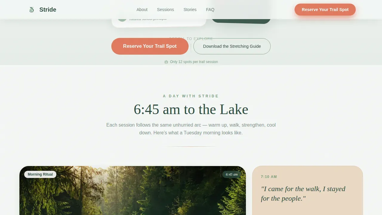
A coral-colored "Reserve Your Trail Spot" button appears as a sticky element after the third card row and repeats at the page base. The call to action stays visible as users scroll, ensuring the registration path is never more than one tap away. This persistent placement addresses a key element of high-converting fitness landing page design: the call to action must be clear, contrasting, and repeated.
Participant Story Cards
Asymmetric testimonial cards showcase real participant illustrations paired with names, ages, and outcomes. This social proof section builds trust before the registration ask. It directly shows visitors what they can expect from the fitness program, which is especially important for seniors who may feel anxious about starting something new.
Secondary Stretching Guide Lead Capture
Visitors who are not ready to register can download a free stretching guide through an email capture modal. This secondary path nurtures potential clients toward registration over time, giving the fitness business a warm lead list without losing visitors who need more time to decide.
Page sections overview
| Section | Purpose |
|---|---|
| Alpine Hero Banner | Establishes tone, headline, and primary call to action |
| Day-in-the-Life Grid | Showcases training day with modular cards |
| Participant Story Cards | Builds social proof through illustrated testimonials |
| How It Works | Explains session types, cap, and no-equipment badge |
| Registration Form | Captures name, age, mobility, and date selection |
| Stretching Guide Modal | Secondary email capture for nurture path |
| Page Footer | Linear single-row footer with essential links |
Design & branding system
The visual identity follows a Nature-Inspired theme using the Alpine Fresh color system. Every color has a defined role, so the page feels intentional rather than decorated.
- Morning fog white (#F4F7F5) carries the background; deep evergreen (#2C4A3E) anchors headlines and body type; trail-worn sage (#7A9E7E) accents section dividers and backgrounds
- Warm birch bark (#D4B896) warms card surfaces; wildflower coral (#E07A5F) is reserved exclusively for buttons and active states, so users always know exactly where to tap
- Typography pairs Fraunces serif for headlines (giving a hand-lettered, trail-journal feel) with DM Sans for body copy, keeping text readable at the large sizes needed for older users
Mobile & speed optimization
Senior users browse heavily on tablets and smartphones, so mobile-first design is not optional for this audience. The Stride template is built with this priority at its core, and every layout decision reflects that reality.
- The card grid stacks cleanly on smaller screens, maintaining the Day-in-the-Life narrative flow without horizontal scrolling or layout breaks
- The registration form uses large tap targets, illustrated icons instead of small checkboxes, and a visual calendar that works well on touch screens
- Scroll-reveal animations, card hover lifts, and the sticky call to action are implemented with medium animation weight, keeping the experience lively without overwhelming users on slower connections
How this template helps you convert
A fitness landing page converts best when it earns trust before it makes an ask. Stride structures every page section to do exactly that.
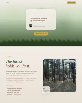
- The illustrated hero image, hand-lettered headline, and floating participant quote card communicate the program's tone and value within the first few seconds, reducing bounce rate before visitors reach the first call to action
- The Day-in-the-Life card arc, participant story cards, and visible class-size cap ("Only 12 spots per trail session") give visitors the social proof, scarcity context, and detailed information they need to feel confident registering
- The dual-path conversion structure lets visitors choose between immediate registration and a free stretching guide download, so the page captures leads at both levels of readiness rather than relying solely on one conversion point
Other information about this template
This template fits naturally into a broader fitness landing page strategy and can support several adjacent use cases within the senior wellness and fitness world.
- A fitness landing page is a standalone web page designed for a single goal. Stride is built around that principle: every section points toward one single goal, which is spot registration for outdoor fitness sessions.
- The key elements of high-converting landing pages are all present here: a strong hero image, high quality visuals, clear program benefits, social proof, a short lead-generation form, and prominent calls to action.
- For the fitness industry, a strong Unique Value Proposition (UVP) is essential. Stride highlights its UVP directly: small-group outdoor movement designed for 60-plus bodies, with no equipment needed and only 12 spots per session.
- Senior fitness programs benefit from addressing the four pillars of health: endurance, strength, balance, and flexibility. This template's Day-in-the-Life card sequence naturally surfaces all four through its movement vignettes and breath-count descriptions.
- Video testimonials can enhance the credibility of any fitness landing page. While this template uses illustrated participant cards as its primary social proof format, the card grid layout can support video embed cards for practices that have recorded session highlights.
- A fitness app or digital scheduling tool can be linked from the visual calendar section for practices that manage bookings through a separate platform. Simply add your booking link to the calendar component and the registration form confirmation step.
- Platforms like Landingi and Unbounce make it straightforward to create high-converting landing pages for fitness businesses. Landingi, for example, is a dedicated platform offering professionally designed templates tailored to the fitness industry, along with a drag-and-drop editor that needs no technical skills. Leadpages also provides conversion-optimized templates for fitness landing pages, and tools like these support A/B testing to help you fine-tune your fitness landing page over time.
- Fitness Together's landing page is a great example of leading with a compelling call to action for a complimentary evaluation. Orangetheory Fitness is another great example that uses vibrant visuals and bold headlines to capture attention fast. Stride draws on these same principles while adapting them to the tone and individual needs of the senior outdoor fitness market.
- The template's clean layout eliminates sidebars and competing navigation. This sleek design keeps visitors focused on the registration path and reduces the visual clutter that raises bounce rate on more complex pages.
- Key takeaways for anyone using this template: keep your registration form short, let the illustrated social proof do the heavy lifting on trust, and use the secondary stretching guide path to capture every visitor, not just the ones ready to register today.
- The no-equipment-needed badge on every card provides reassurance that builds trust with visitors who may worry about weight loss goals, physical limitations, or the cost of joining a new fitness program.
- Actionable insights from well-performing senior fitness landing pages show that mobile-first design, accessible font sizes, and high-contrast color schemes all reduce drop-off. This template applies those lessons directly.
- A professional landing page built around engaging content and vibrant visuals gives your fitness business a competitive presence without requiring a full website build. This is a standalone web page that works as its own fitness marketing destination.
- Missing a secondary lead path is one of the most common conversion gaps in the fitness industry. The stretching guide modal makes sure you do not miss visitors who need a lower-commitment first step.
Theme
Nature-Inspired
Creative direction
Day-in-the-Life
Color system
Alpine Fresh
Style
Card Grid (Modular)
Direction
Event Registration
Page Sections
Hand-drawn Alpine Hero Illustration
Day-in-the-life Modular Card Grid
Accessible Event Registration Form
Sticky Coral Call-to-action Button
Illustrated Participant Story Cards
Free Stretching Guide Email Capture
Related questions
Can I use this template if my sessions are indoors, not on trails?
Do I need design experience to customize this template?
How does the social proof section work in this fitness landing page?
What is the secondary lead-capture path, and do I need it?
Is this template suitable for a solo personal trainer or only larger programs?