Specialty Beauty Treatments Expert Professional Website Template
Stroke is a single-column landing page template built for a precision microblading and permanent makeup training academy. It combines a 3D rotating product header, expandable course tier cards, a healed brow gallery with technique filters, student stroke-progression comparisons, and a five-question quiz that delivers a personalized course recommendation. The design follows a Luxe Minimal aesthetic in a warm Desert Rose palette.
by Rocket studio
Quick summary
Stroke is a landing page template designed for a microblading and eyebrow tattoo training academy. It guides prospective students through a curated single-column flow, from a cinematic 3D tool header to a five-question diagnostic quiz that recommends the right course tier. Every section arrives with generous whitespace and one focused idea at a time.
Who this template is for
This template is built for beauty educators and permanent makeup professionals who need to attract, qualify, and enroll students online. It serves both solo instructors and small academies that want a polished, conversion-ready presence without a complex multi-page build.
- Licensed cosmetologists pivoting into permanent makeup who want to understand the curriculum before committing
- Beauty entrepreneurs launching a studio and looking to add microblading or nano brow services
- Experienced microblading artists returning for advanced blade angle and color theory instruction
What problem this template solves
Most beauty training pages present polished portfolio shots and a simple enrollment button. That approach skips the part prospective students actually need: a clear view of their own learning curve. Stroke solves this by showing stroke-by-stroke progression on practice skins rather than finished client work.
- Visitors cannot self-qualify for course level without a guided tool, leading to mismatched enrollments
- Generic training pages offer no visual proof of skill development, making it hard to justify the investment
- Beauty professionals researching training programs need to compare course tiers and kit contents before deciding
What you get with this template
Stroke delivers a fully structured single-column landing page with high interactivity and a guided enrollment flow. Each section is a self-contained module, designed to present one idea clearly before moving to the next.
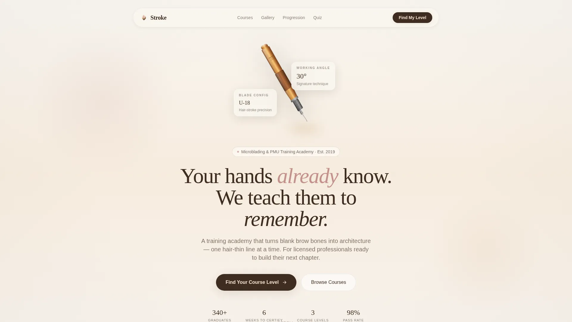
- A 3D rotating microblading tool header with a slow copper-barrel spin, macro blade detail, and a headline reveal at the 30-degree working angle
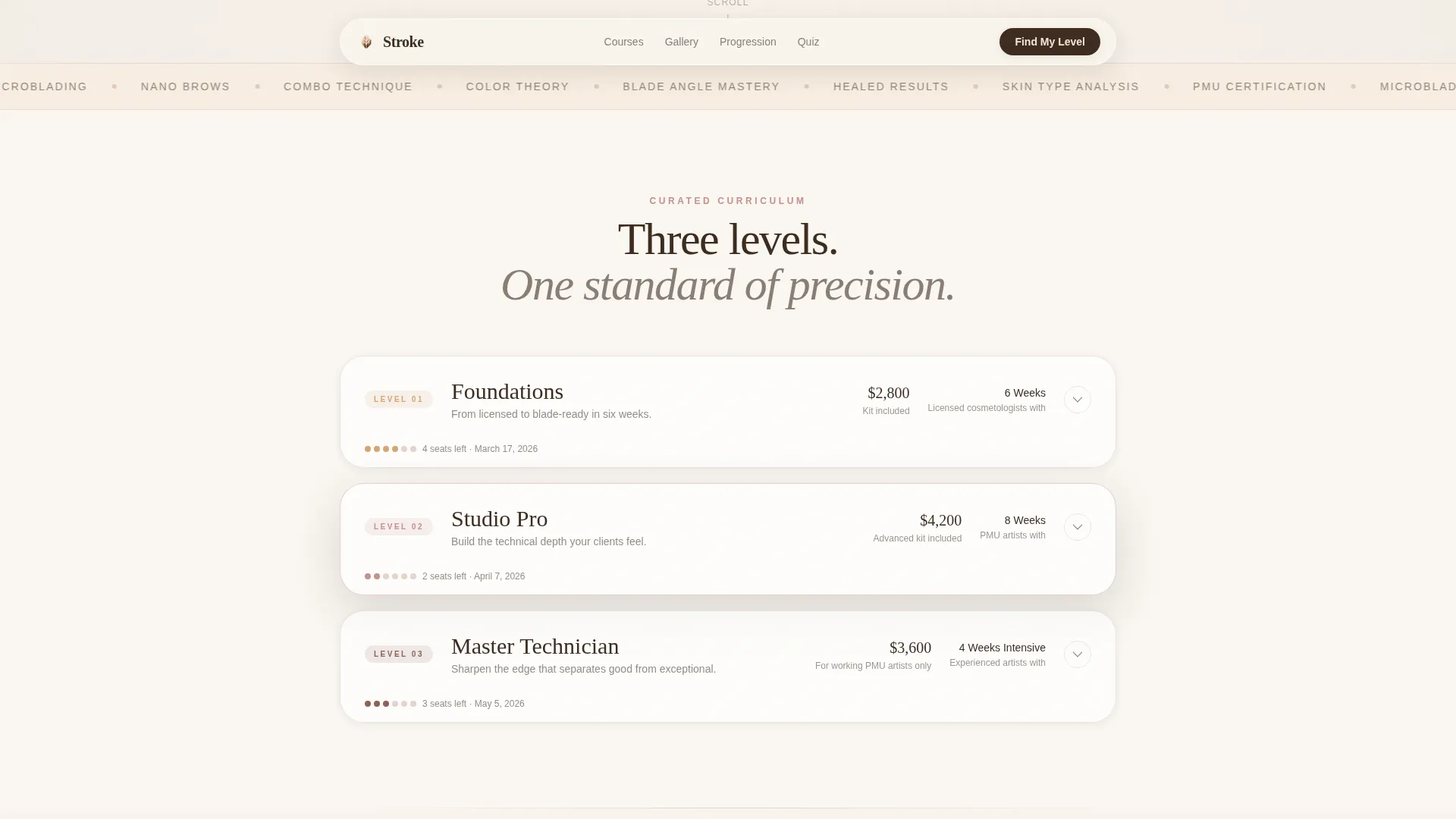
- Three expandable course tier cards covering curriculum details, kit contents, and certification outcomes, plus a filterable healed brow gallery and a week-one versus week-six student progression section
- A five-step quiz that collects license type, experience hours, hand-steadiness rating, technique preference, and start timeline, then returns a named cohort recommendation with remaining seat count
Feature list
3D Product Spin Hero
The header opens with a photorealistic microblading hand tool rotating slowly on a sand-colored background. The camera holds at macro distance, revealing the individual needle configuration in the blade cartridge. As the rotation completes, the tool settles at the 30-degree working angle taught in the academy's signature technique, and the headline fades in beneath it.
Expandable Course Tier Cards
Three course cards, Foundations, Studio, and Master, sit side by side and expand on tap to reveal full curriculum details, included kit contents, and certification outcomes. Each card is a discrete module with breathing room around it, consistent with the Curated Collection scroll experience.
Filterable Healed Brow Gallery
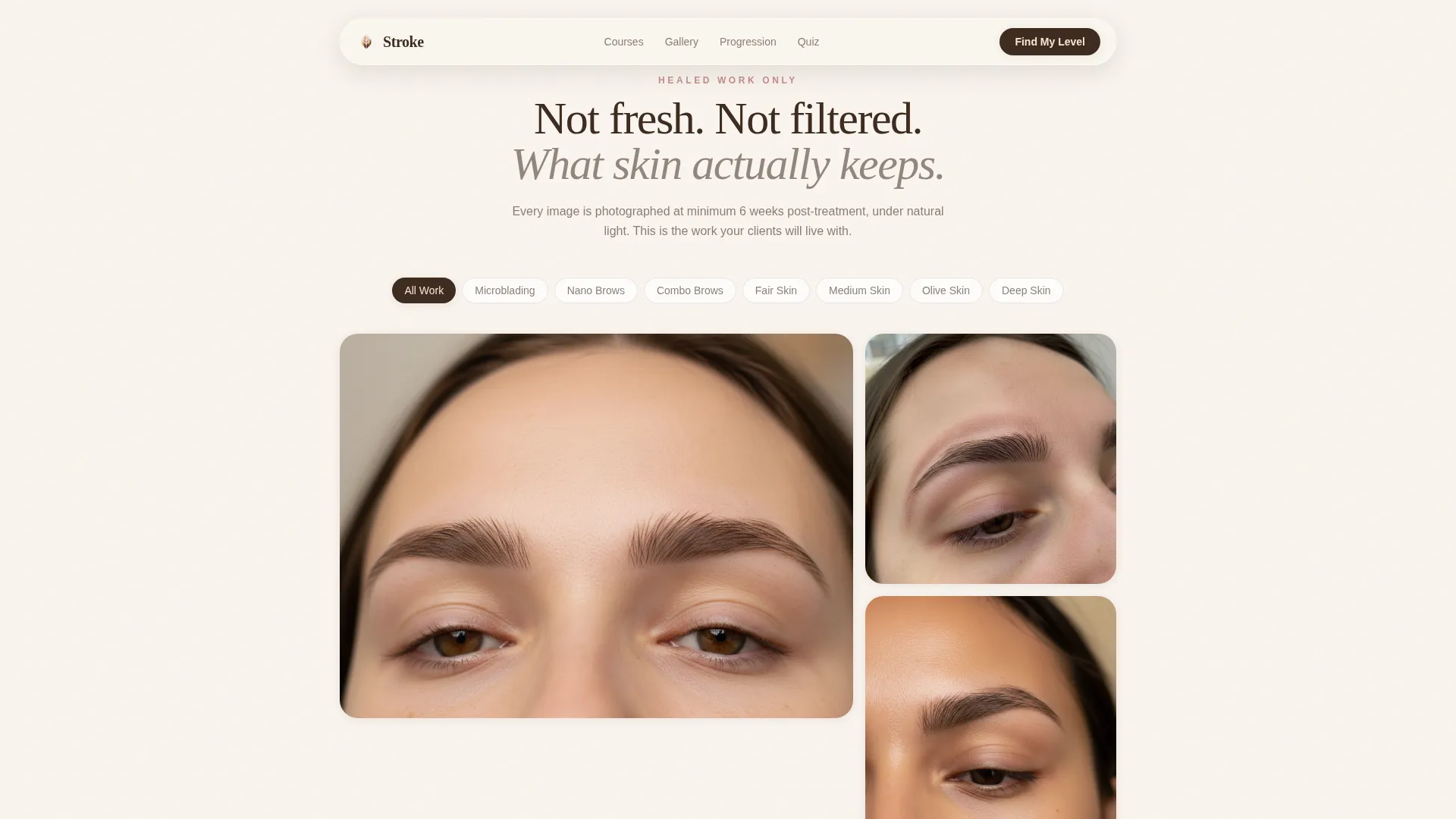
The gallery section displays healed brow work organized by skin type and technique. Filter tabs let visitors sort the work they want to study, showing real healed results rather than freshly done or filtered images.
Student Stroke Progression Display
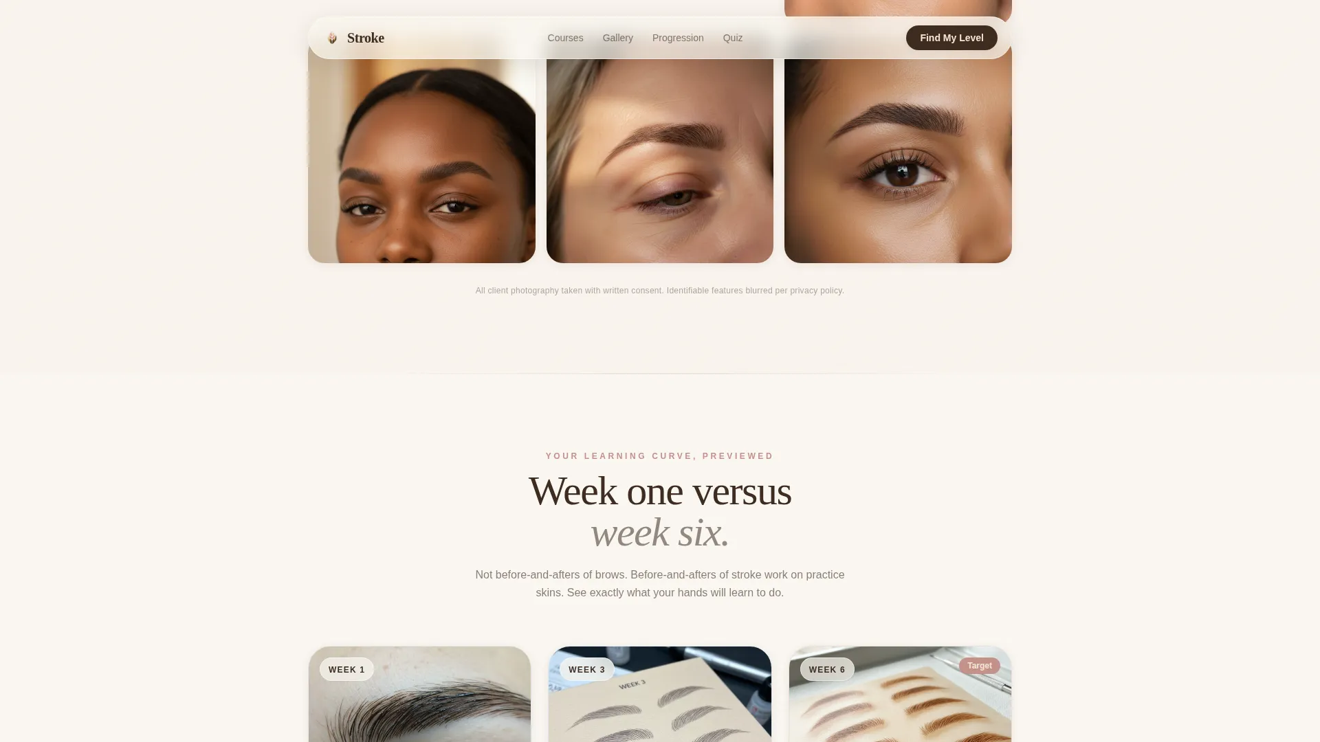
This section shows practice-skin comparisons from week one versus week six of training. Visitors see the actual learning curve previewed in their own context, not a polished graduate portfolio. It is a direct visual answer to the question "what will I be able to do by the end?"
Five-Step Course Recommendation Quiz
The primary call to action launches a five-question diagnostic. It collects current license type, permanent makeup experience hours, dominant hand steadiness via a visual slider, preferred technique interest, and a start-timeline selection. The result is a personalized course recommendation with a named cohort date and a live remaining seat count.
Email Capture Secondary Path
Below the quiz, a secondary conversion path invites visitors to download a Starter Kit Checklist. It captures email address and experience level for follow-up nurturing, giving undecided visitors a low-commitment entry point.
Page sections overview
| Section | Purpose |
|---|---|
| Hero with 3D Spin | Introduce the tool and headline with cinematic depth |
| Course Tier Cards | Present three expandable curriculum tiers |
| Healed Brow Gallery | Show filterable healed work by skin type and technique |
| Student Progression | Compare practice-skin stroke quality week one to week six |
| Quiz Call to Action | Deliver personalized course recommendation via five-question diagnostic |
| Email Capture Path | Offer checklist download for visitors not ready to enroll |
| Footer | Display logo, tagline, and navigation links in Arc Browser Split layout |
Design & branding system
The visual identity follows a Luxe Minimal direction with a Desert Rose color system. The palette is warm and intentional, stripped of anything decorative that does not serve clarity. Typography pairs DM Sans for body copy with Fraunces as the serif display face, giving the page both readability and editorial weight.
- Sand (#F5E6D3) and white carry all backgrounds; deep umber (#3D2B1F) handles body text for strong contrast on light surfaces
- Rose clay (#C4918A) washes across section dividers and hover states; warm highlight gold (#D4A574) is reserved for interactive elements and progress indicators such as quiz steps
- Animation includes a 3D CSS tool spin in the hero, staggered scroll-reveal entries for each section module, and scroll-linked parallax depth on background layers
Mobile & speed optimization
The template is built desktop-first, reflecting how beauty professionals typically research training investments. It is fully mobile-responsive so the experience holds on any screen size. Interactive components, the quiz state machine and gallery filter, run as client-side components while static sections use server-rendered markup.
- The single-column layout stacks cleanly on smaller screens without requiring layout adjustments to the course cards or gallery filter
- Quiz steps, expandable cards, and the email capture form are all touch-friendly and functional on mobile viewports
How this template helps you convert
Stroke is structured around a guided decision path. Every section moves the visitor one step closer to a course enrollment or a list opt-in, without pressure.
- The 3D hero and course tier cards build trust and present the curriculum transparently, so visitors arrive at the quiz already informed about what each level offers.
- The five-step diagnostic removes the friction of choosing a course level by delivering a personalized recommendation with a specific cohort date and seat count, turning browsing intent into a concrete next step.
Other information about this template
Stroke sits at the intersection of beauty education and high-interactivity landing page design. It is suited for permanent makeup training academies, microblading artists launching their first group course, and beauty entrepreneurs building a studio-to-academy pipeline.
- The footer uses a Pattern 7 Arc Browser Split layout with logo and tagline on the left and navigation links on the right
- Graduate testimonials and stroke progression evidence are built-in social proof placements, positioned to support conversion before the quiz call to action
- The template is localized for English, United States dollar pricing, and MM/DD/YYYY date formatting
- Cohort naming and remaining seat count inside the quiz result are included to create urgency without manufactured pressure
- The Starter Kit Checklist secondary path is designed to capture undecided visitors at the experience-level stage, providing useful data for follow-up outreach
Theme
Luxe Minimal
Creative direction
Curated Collection
Color system
Desert Rose
Style
Single Column Flow
Direction
Quiz/Assessment
Page Sections
3D Rotating Tool Hero
Expandable Course Tier Cards
Filterable Healed Brow Gallery
Student Stroke Progression Section
Five-step Diagnostic Quiz
Checklist Email Capture Path
Related questions
Who is this landing page template designed for?
Can I adjust the quiz questions to match my own course tiers?
What makes the gallery section different from a standard photo grid?
Is this template suitable for a solo instructor or only for a full academy?
What is the secondary conversion path for visitors not ready to enroll?