Set Designer Portfolio Reviews Website Template
Concrete is a bold brutalist set designer landing page template built for film and commercial set designers who need to win the room before a word is read. It pairs a self-drawing SVG blueprint hero with scroll-linked overlapping project cards, behind-the-scenes photography, pull-quote testimonials, and a direct "Send Me Your Treatment" contact form, all wrapped in an electric indigo and void-black visual identity.
by Rocket studio
Quick summary
Concrete is a single-page, overlap-layered brutalist website template for professional set designers. It opens with an animated blueprint illustration, builds credibility through cascading award-tagged project cards, and closes with a focused lead-capture form. The design speaks the language of music video directors, commercial producers, and feature film art directors before a single line of copy asks for anything.
Who this template is for
This template is built for working set designers in the film and commercial industry. It targets creative professionals who win projects through visual proof, not lengthy written bios.
- Music video directors and commercial producers scouting a visual collaborator fast
- Feature film art directors who need evidence of scale, craft, and camera-ready architecture
- Freelance set designers ready to replace a generic portfolio website with something that matches the intensity of the work itself
What problem this template solves
Most set designers rely on a portfolio website that looks like every other creative website. The work is extraordinary, but the web design is forgettable. Potential clients browse and move on without making contact.
- The template removes the gap between the quality of the work and the quality of the website design
- It delivers visual credibility in roughly forty seconds of scroll before the contact form ever appears
- It replaces passive browsing with a clear and direct inquiry path, so visitors know exactly what to do next
What you get with this template
You get a complete, single-page brutalist website built around the overlap-layered template style. Every section has a defined job, and every design decision serves lead generation.
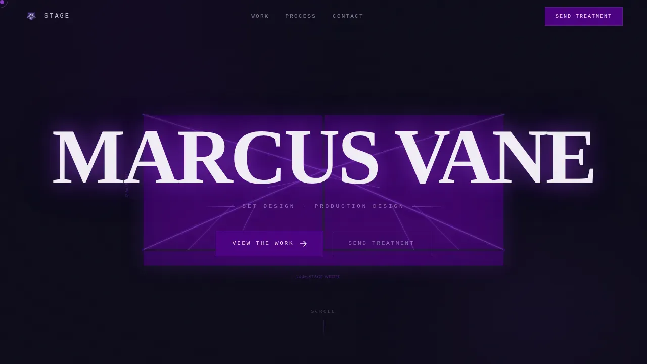
- A self-drawing SVG blueprint hero animation that constructs a stage environment in four seconds, stamping the designer's name in bold brutalist type
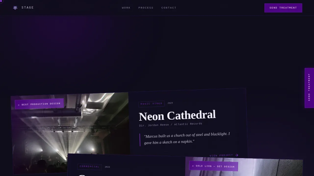
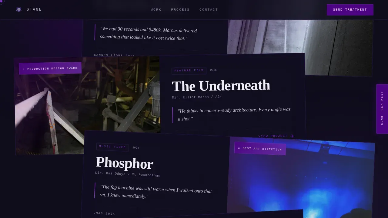
- A cascading stack of tilted, overlapping project cards carrying festival laurels, director pull quotes, and full-bleed behind-the-scenes photography
- A three-field "Send Me Your Treatment" contact form plus a gated reel download, both positioned after the visual proof has done its work
Feature list
This template includes a focused set of features drawn directly from the project brief. Each one serves the core purpose: communicate craft, build trust, and generate qualified inquiries.
Self-Drawing Blueprint Hero Animation
The header opens with hand-drawn set blueprints constructing themselves in real time. SVG path animation sketches architectural lines upward over four seconds. The wireframe then floods with indigo color, the camera perspective shifts to reveal depth, and a single brutalist type stamp drops the designer's name across the frame. It is the most distinctive opening sequence available in this style of portfolio website.
Scroll-Linked Overlapping Project Cards
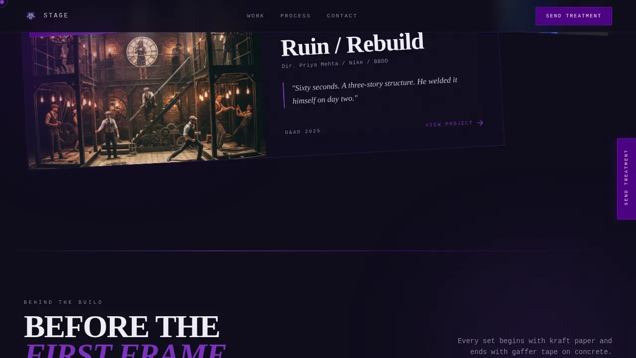
As users scroll, project cards cascade into view in a tilted, lightbox-stacked layout. Each card carries a festival laurel, a director or producer pull quote, and a project description. The scroll escalates from music videos to commercial spots to feature films, building a geological record of creative credibility. Asymmetrical layouts like this force users to engage more actively with the content, breaking traditional web layouts that center everything on a rigid grid.
Full-Bleed Behind-the-Scenes Photography
Between project card stacks, full-bleed behind-the-scenes stills interrupt the scroll rhythm. These raw images show the designer mid-build: hands dusty, scale model in the foreground, finished set enormous behind them. Raw, high-contrast images like these match the monochromatic aesthetic naturally and reinforce the sense of real craft at genuine scale.
Fixed "Send Me Your Treatment" Call to Action
A fixed call-to-action tab sits on the right edge of the page throughout the entire scroll experience. Users never have to hunt for the contact path. At the bottom, the tab resolves into a full brutalist form block with three fields: project type, director or agency name, and a free-text prompt labeled "Describe the world you need built."
Gated Reel Download
A secondary lead-capture path offers a reel download gated behind an email field. This gives visitors who are not yet ready to commit a lower-friction way to engage. It also gives the designer a direct line of follow-up for warm leads.
Electric Indigo Color System and Brutalist Typography
The entire website design runs on a void-black base with electric indigo bleeding through layered panels, UV violet on hover states, and searing white typography. Bold typography functions as a structural element here, not decoration. The type system uses a serif display face for headlines and a monospace face for detail labels, creating a contrast that feels industrial and theatrical at the same time.
Page sections overview
| Section | Purpose |
|---|---|
| SVG Blueprint Hero | Opens with animated stage construction and name stamp |
| Project Card Stack | Cascading tilted cards with laurels and pull quotes |
| Behind-the-Scenes Stills | Full-bleed raw photography between card groups |
| Testimonials Block | Director and producer pull quotes in brutalist layout |
| Contact Form Block | Three-field inquiry form and gated reel download |
| Footer | Horizontal flow footer with minimal navigation links |
Design & branding system
The visual identity of this brutalist website is built on industrial-theatrical tension. It borrows directly from brutalist architecture's philosophy of exposing raw structure rather than hiding it behind decoration. The palette feels like a blacklight hitting poured concrete, heavy bones glowing with something alien underneath.
- Color system: void black (#0D0B1A) as the dominant ground, electric indigo (#4B0082) bleeding through panels, UV violet (#7B2FBE) on hover states and section dividers, and searing white (#F0EDF5) for typography
- Typography system: Fraunces serif display for headlines, JetBrains Mono for monospace detail labels; bold typography is treated as a structural element, not just text
- Layout approach: overlap-layered panels, tilted card stacks, and parallax depth create geometric forms and asymmetrical shapes that push well beyond traditional web layouts
Mobile & speed optimization
The template is designed desktop-first, reflecting the reality that music video directors and commercial producers review portfolios on workstations. A mobile fallback layout is included for visitors who visit on a smaller screen.
- Desktop-first layout with a mobile fallback that preserves the core visual hierarchy
- Server-rendered static components keep the base page fast; client-side rendering is scoped to animation-heavy elements only, supporting faster load times on the static portions
- The minimal graphics approach across non-hero sections contributes to faster load times, a recognized benefit of brutalist web design that avoids heavy decoration
How this template helps you convert
The page earns the click before it asks for it. Brutalism values directness over decorative flair, and this template puts that principle directly to work for lead generation.
- The animated hero creates an immediate, memorable first impression that holds visitors on the page long enough for the project cards to load and begin scrolling
- Forty seconds of layered visual proof, awards, quotes, behind-the-scenes build photography, answers every credibility question before the form appears, so the contact ask lands on primed intent
- Two conversion paths (direct inquiry form and gated reel download) give visitors a choice of commitment level, improving the overall rate of contact from a single page visit
Other information about this template
This template sits within a broader context of brutalist web design that has its own history and philosophy. Understanding that background helps set designers use the template with intention rather than just treating it as a style choice.
- The term "brutalism" originated in architecture and comes from the French term "béton brut," meaning raw concrete. Brutalist architecture peaked in the 1950s and 1960s. Web brutalism emerged later as a reaction to overly polished, corporate website design
- The early days of the web were defined by raw functionality and minimal CSS. Web brutalism reclaims that directness and applies it intentionally, stripping away unnecessary decoration while keeping functionality sharp
- This template embodies that philosophy: it uses a strict hidden grid under an apparently raw surface, so the site feels unstructured but never breaks. Monochromatic schemes, high-contrast accents, and bold geometric forms all reflect brutalist elements applied with purpose
- Brutalist website templates like this one can appeal to younger creative professionals who value authenticity over refinement. They also work well for personal or portfolio websites that need to stand out from conventional designs
- Web brutalism in creative industry examples such as this showcases how brutalist design can achieve a better user experience by prioritizing simplicity and directness over visual complexity
- The article you are reading covers a concrete bold brutalist set designer landing page template with a raw, industrial aesthetic defined by monochrome palettes, large bold typography, and asymmetrical layouts, exactly the characteristics that make this style effective for creative industry portfolios
- Designers and developers who want to explore brutalist aesthetics further will find that this template follows the basics well: high-contrast color, minimal decoration, bold type as structure, and functionality placed above visual refinement
- A demo of the full page is available on the platform so you can review the scrolling experience, hover states, and animation timing before making a decision
Theme
Bold Brutalist
Creative direction
Award & Recognition
Color system
Electric Indigo
Style
Overlap/Layered
Direction
Lead Generation
Page Sections
Self-drawing SVG Blueprint Hero
Scroll-linked Overlapping Project Cards
Full-bleed Behind-the-scenes Photography
Fixed Right-edge Call-to-action Tab
Gated Reel Download Path
Electric Indigo Brutalist Visual System
Related questions
Who is this landing page template designed for?
Can I update the project cards and photography without rebuilding the layout?
What makes this template different from a standard creative portfolio website?
Does the fixed call-to-action tab appear on every screen size?
Is this template suitable for set designers outside the film industry?



