Japanese Architecture Professional Website Template
Atelier is a storybook landing page built for a Japanese architecture studio. It opens with an animated SVG elevation drawing itself line by line, then guides visitors through a gallery-walk layout of full-bleed project rooms, a philosophy manifesto, a client typology section, and a three-field lead form. Every detail reflects minimalist restraint and quiet authority.
by Rocket studio
Quick summary
This is a single-page, storybook-style landing page designed for a minimalist Japanese architecture practice. The page opens with a live-drawn architectural elevation, moves through three full-bleed project rooms, and closes with a contemplative lead form. The design concept, color system, typography, and section pacing are all built to reflect the studio's philosophy: that every space, and every surface, deserves deliberate consideration.
Who this template is for
This template is built for architecture studios that let their work speak quietly. It suits practices rooted in Japan or influenced by Japanese spatial thinking, where restraint and precision define every built outcome. The aesthetic and structure are intentionally designed for a design-led, relationship-first practice.
- Private homeowners seeking a bespoke urban residence, a villa, or a family home where space is treated as a material in itself
- Boutique hoteliers and ryokan operators commissioning interiors where architecture and atmosphere become indistinguishable
- Cultural institutions and gallery clients who need an architect whose concept of beauty is built into the structure, not applied on top
What problem this template solves
Most architecture website templates default to busy portfolio grids, aggressive calls to action, and color palettes that compete with the work. For a minimalist studio, that approach actively undermines credibility. Visitors leave before they understand the practice's depth.
This template solves that mismatch by doing the opposite:
- It creates a paced, gallery-like experience so visitors slow down and read, rather than scan and exit
- It signals editorial intelligence through asymmetrical layouts, wide open negative space, and a restrained Monochrome Steel color system
- It replaces a generic contact form with a three-field sequence that reflects how a thoughtful architect actually selects a client
What you get with this template
You get a complete, ready-to-deploy landing page built around a single, coherent design vision. Every section is intentional. Nothing is included by default; everything is considered by design.
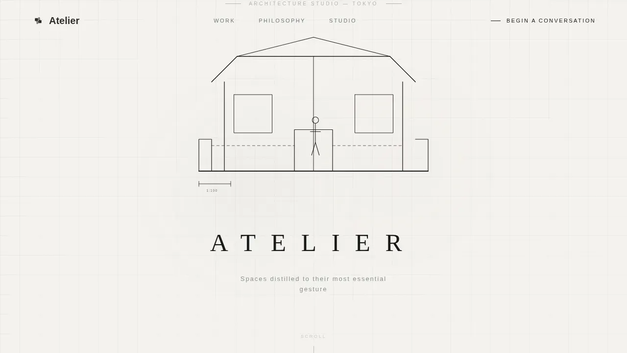
- An animated SVG hero where the architectural elevation draws itself in real time, roofline first, columns next, then walls and a human figure for scale
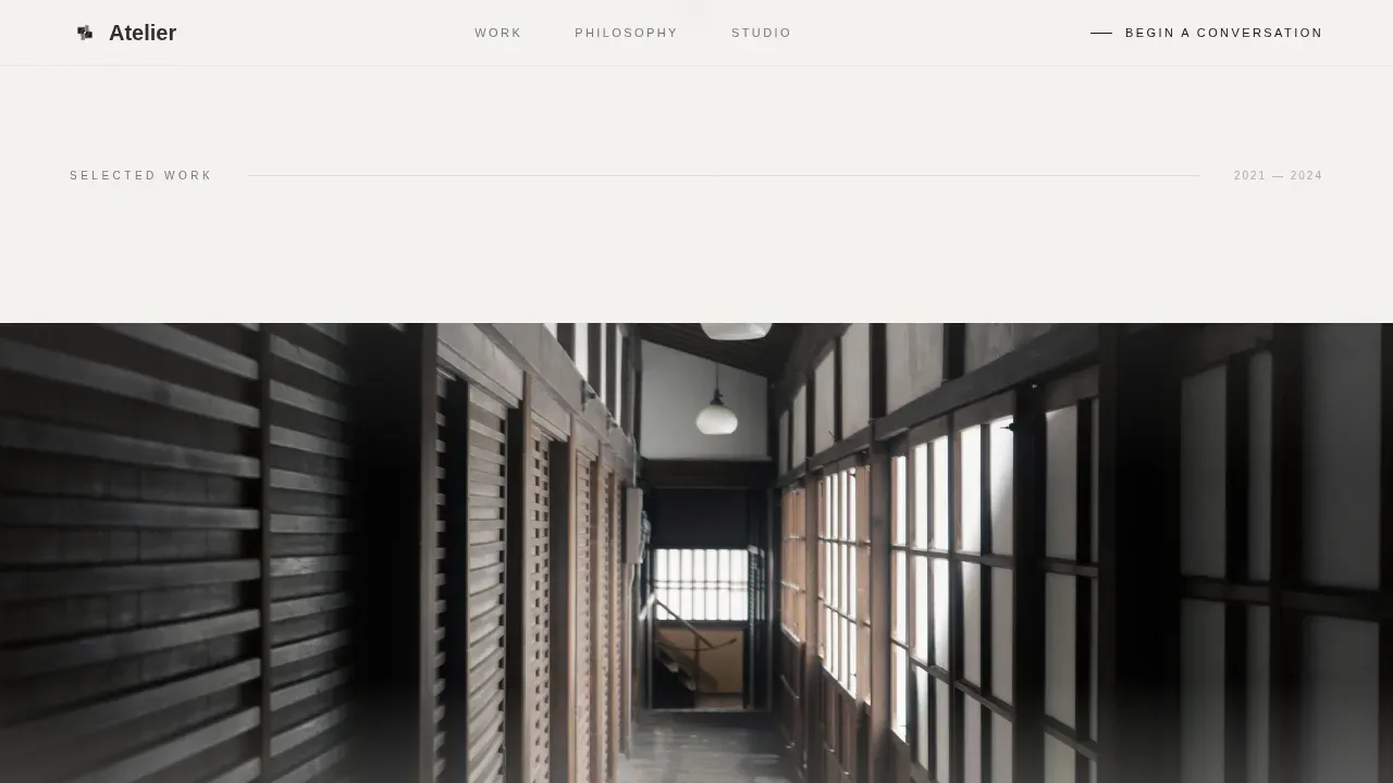
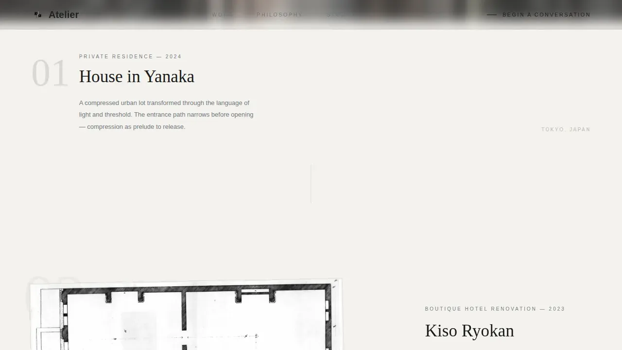
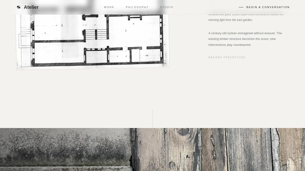
- Three full-bleed project rooms built as a gallery walk, each presenting a different register: interior photograph, hand-drawn plan, and close-up detail shot
- A philosophy section, a "Who We Work With" section defining three client typologies, and a three-field lead form styled as a gallery guestbook
Feature list
This template is built around a small number of highly intentional features. Each one is directly connected to the studio's design philosophy and lead-generation purpose.
Animated SVG Hero Elevation
The hero opens with a single architectural elevation drawing itself line by line over eight seconds. The roofline traces first, then the structural columns descend toward the ground, then the garden walls emerge, and finally a scaled human figure appears at the threshold. The studio name appears last, letterspaced wide and featherweight. This is the main first impression, quiet, precise, and completely unlike a standard hero image.
Gallery Walk Project Rooms
Three full-page sections each present a completed project as a room you have entered rather than a portfolio item you are browsing. One section is a wide interior photograph bleeding edge to edge. The next is a hand-drawn plan floating in open white space with a single caption. The third is a close detail shot, a joint, a shadow, a handrail, so close it becomes abstract. The pacing alternates between density and emptiness, reflecting the rhythm of Japanese architecture itself.
Philosophy Manifesto Section
A split-layout section pairs restrained prose with a floating architectural plan drawing. The copy functions as a poetic mission statement, describing how the studio approaches each site, each structure, and each client relationship. This section is where the studio's design concept is defined in language, not just imagery.
Three-Field Lead Form
The contact form asks only three things in sequence: your name, the nature of your project (new build, renovation, interior, or undecided), and a single open field labeled "Describe the feeling you want your space to hold." There is no budget field and no timeline dropdown. The form itself communicates that this studio selects clients as carefully as clients select them.
Monochrome Steel Color System
The palette uses ink black (#1A1A1A), brushed steel (#71797E), washi white (#F5F3EF), and a single accent of oxidized copper (#6D4C3D) reserved for interactive states and the studio mark. The result is a sleek, tactile visual identity that contrasts warmth and precision without introducing decorative color.
GSAP ScrollTrigger Reveal Animations
Each section reveals through scroll-linked animations. Images transition from grayscale to color on hover. Parallax movement creates depth between foreground and background elements. These interactions are built to feel considered, not performative, they reflect the way light moves through a Japanese house across the course of a day.
Page sections overview
| Section | Purpose |
|---|---|
| Animated hero elevation | Draws the studio identity in real time, line by line |
| Gallery walk rooms | Presents three completed projects as immersive spaces |
| Philosophy manifesto | States the studio's design concept in restrained prose |
| Who we work with | Defines three client typologies with quiet authority |
| Begin a Conversation form | Collects qualified leads through a three-field sequence |
| Ultra-minimal footer | Closes the page with horizontal flow and studio mark |
Design & branding system
The visual identity is built on a Monochrome Steel system that feels like a freshly sharpened drafting pencil resting on tracing paper. Every design decision reflects the wabi-sabi principle that imperfection and restraint are more expressive than decoration. The typography pairs DM Sans for clean, legible body text with Fraunces as an editorial serif for headlines, echoing how a minimalist Japanese house uses contrasts between raw concrete and refined materials to create depth.
- Color palette: washi white (#F5F3EF) background, ink black (#1A1A1A), brushed steel (#71797E), and oxidized copper (#6D4C3D) accent reserved for interactive states
- Typography: DM Sans body text for clarity and openness; Fraunces serif headlines for editorial weight and calm authority
- Structured asymmetrical layouts, wide negative space, and subtle textural contrasts reflect zen restraint throughout
Mobile & speed optimization
The template is designed desktop-first, as architecture clients typically browse on large screens where the full-bleed photography and SVG animation can land with the intended impact. On smaller screens, the layout adapts gracefully without losing its pacing or editorial quality.
- SVG assets are optimized and images are lazy-loaded so the page loads progressively without blocking the visual experience
- CSS custom properties manage the color system and spacing tokens, making it straightforward to adapt the design for different screen widths
- Scroll-linked animations are built with performance in mind, using GSAP ScrollTrigger so reveals feel smooth and connected to the visitor's movement down the page
How this template helps you convert
The landing page is built to generate qualified leads rather than high-volume form submissions. Every design decision, from the paced gallery walk to the three-field form, is set up to attract clients who are the right fit for the studio.
- The animated hero and gallery walk project rooms establish trust and editorial authority before any services or contact information is mentioned, so visitors arrive at the form already engaged and self-selected
- The three-field lead form removes friction while simultaneously signaling the studio's standards, asking for a feeling rather than a budget communicates that this practice is built on concept and craft, not commodity services
- The "Begin a Conversation" call to action, placed after the final project room like a gallery guest book at the exit, catches visitors at the exact moment their interest is highest
Other information about this template
This template is well suited for architecture practices whose work has been published in design journals or whose completed projects are located across Japan and internationally. Studios based in or inspired by Tokyo and Kyoto will find the spatial language and visual references particularly resonant. The gallery walk structure works equally well whether a practice has built a handful of landmark projects or a deeper portfolio of villa and residence commissions.
The template also reflects principles drawn from Japanese minimalist house design: space efficiency in dense urban plots, strategic window placement to protect privacy while drawing in natural light, and the use of local materials that connect each built structure to its environment. These references are woven into the section structure and copy placeholders so the template feels grounded in real architectural thinking, not generic studio aesthetics.
- The project room sections can display interior photography, hand-drawn plans, and detail shots drawn from any location, whether a hillside villa, an urban family home, a seaside residence, or a gallery set within a dense city block
- The philosophy section is designed to hold a short, poetic text block that reflects the studio's own approach to land, structure, and the lived experience of the home
- The footer follows a horizontal flow pattern, ultra-minimal, keeping the studio mark and navigation displayed without visual noise at the close of the page
Theme
Atelier Studio
Creative direction
Gallery Walk
Color system
Monochrome Steel
Style
Storybook/Full-Page
Direction
Lead Generation
Page Sections
Animated SVG Hero Drawing
Gallery Walk Project Rooms
Philosophy Manifesto Layout
Three-field Contemplative Lead Form
Monochrome Steel Visual Identity
GSAP Scroll-linked Reveal Animations
Related questions
Can this template work for a practice outside Japan?
Is the animated SVG hero difficult to customize?
Does the lead form support project type selection?
Who is this landing page template best suited for?
Can I feature more than three projects in the gallery walk?



