Bold Brutalist Creative Agency Landing Page Template
Studio is a full-width immersive landing page template built for full-service creative agencies. It pairs a Bold Brutalist visual theme with a Void and Violet color system to create a pitch-room atmosphere that commands attention. Creator spotlights, full-bleed case study imagery, and a persistent "Start a Project" call-to-action bar turn creative envy into inevitable clicks.
by Rocket studio
Quick summary
Studio is a single-page, full-width immersive landing page template designed for full-service creative agencies. The design language is Bold Brutalist: void black backgrounds, electric violet accents, and oversized lilac-white type. A creator spotlight scroll rhythm and a persistent bottom-bar call to action make the page feel alive and purposeful from the first frame to the final click.
Who this template is for
This template is built for agencies and independent creative studios that lead with cultural impact rather than polished credentials. If your work stops traffic, earns screenshots, and cuts through a feed, this page gives that work the visual weight it deserves.
- Full-service creative agencies offering campaign, identity, and film work
- Independent studios pitching challenger brands, founders, and cultural institutions
- Creative directors who want a portfolio landing page that feels like a pitch room, not a brochure
What problem this template solves
Most agency landing pages look safe. They use the same grid, the same stock photography, and the same neutral palette that says "we are professional" but nothing more. For agencies whose identity is built on confrontational creative work, a forgettable page actively hurts credibility.
- Visitors cannot feel the agency's energy from a conventional template layout
- Case studies buried inside carousels or click-heavy grids lose momentum fast
- Generic calls to action fail to build the creative envy that drives a confident brief submission
What you get with this template
You get a full-width immersive landing page built section by section around the idea that the agency is its people, not its process. Every layout decision supports that story.
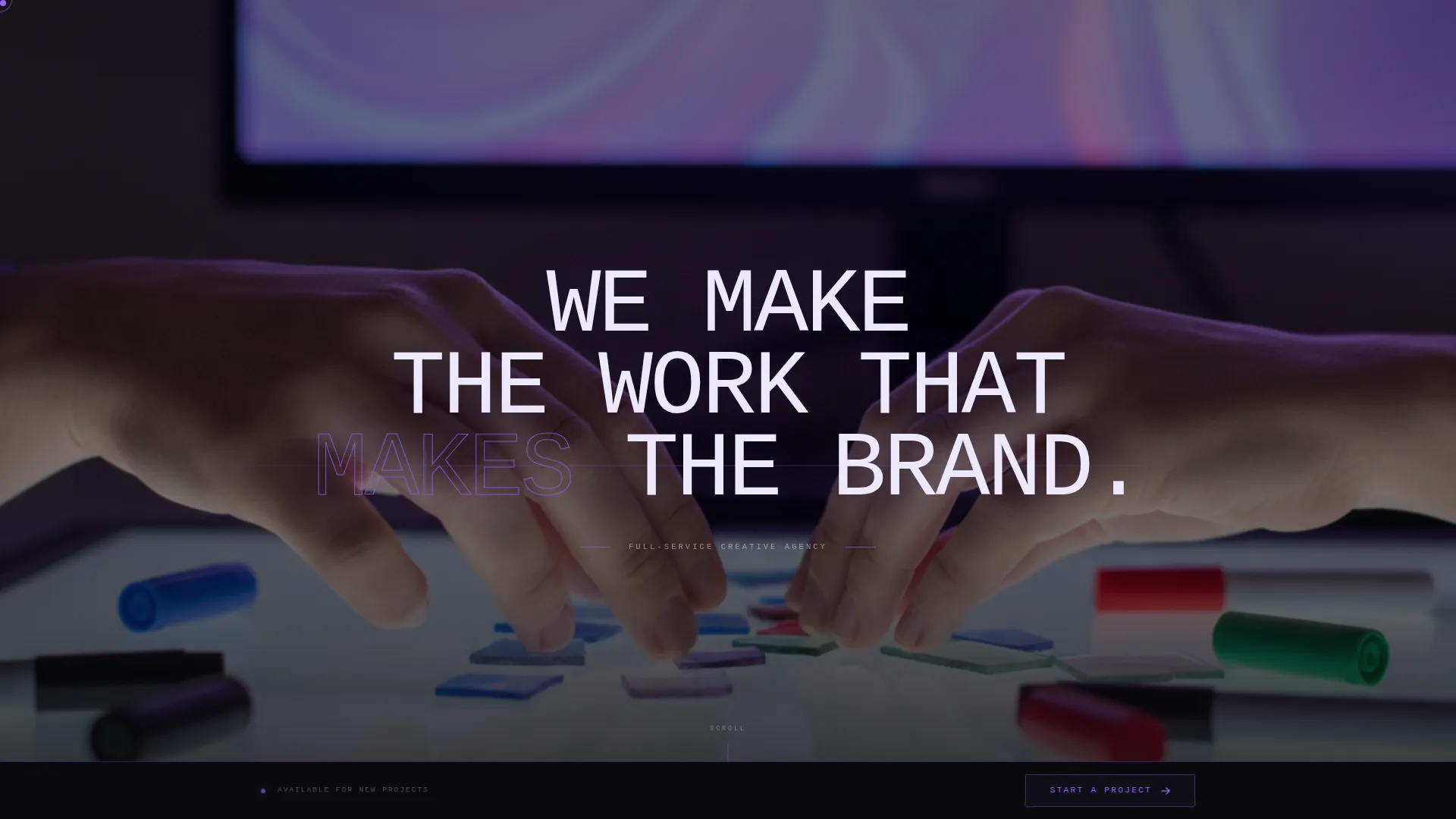
- A full-bleed photo header with a single line of oversized brutalist type stamped across the viewport
- Alternating creator spotlight sections paired with explosive full-width project imagery
- A persistent bottom bar carrying the "Start a Project" call to action in violet on black
Feature list
This template is built around a tight set of intentional design features. Each one supports the core promise: a page so charged with creative conviction that the click to brief feels inevitable.
Full-Bleed Photo Header
The header fills the viewport edge to edge with no padding, no logo, and no navigation. A raw, high-grain studio photograph and a single line of oversized brutalist type give visitors an immediate sense of place. The shot style is deliberately underexposed and unretouched, reinforcing the agency's unpolished, confrontational identity.
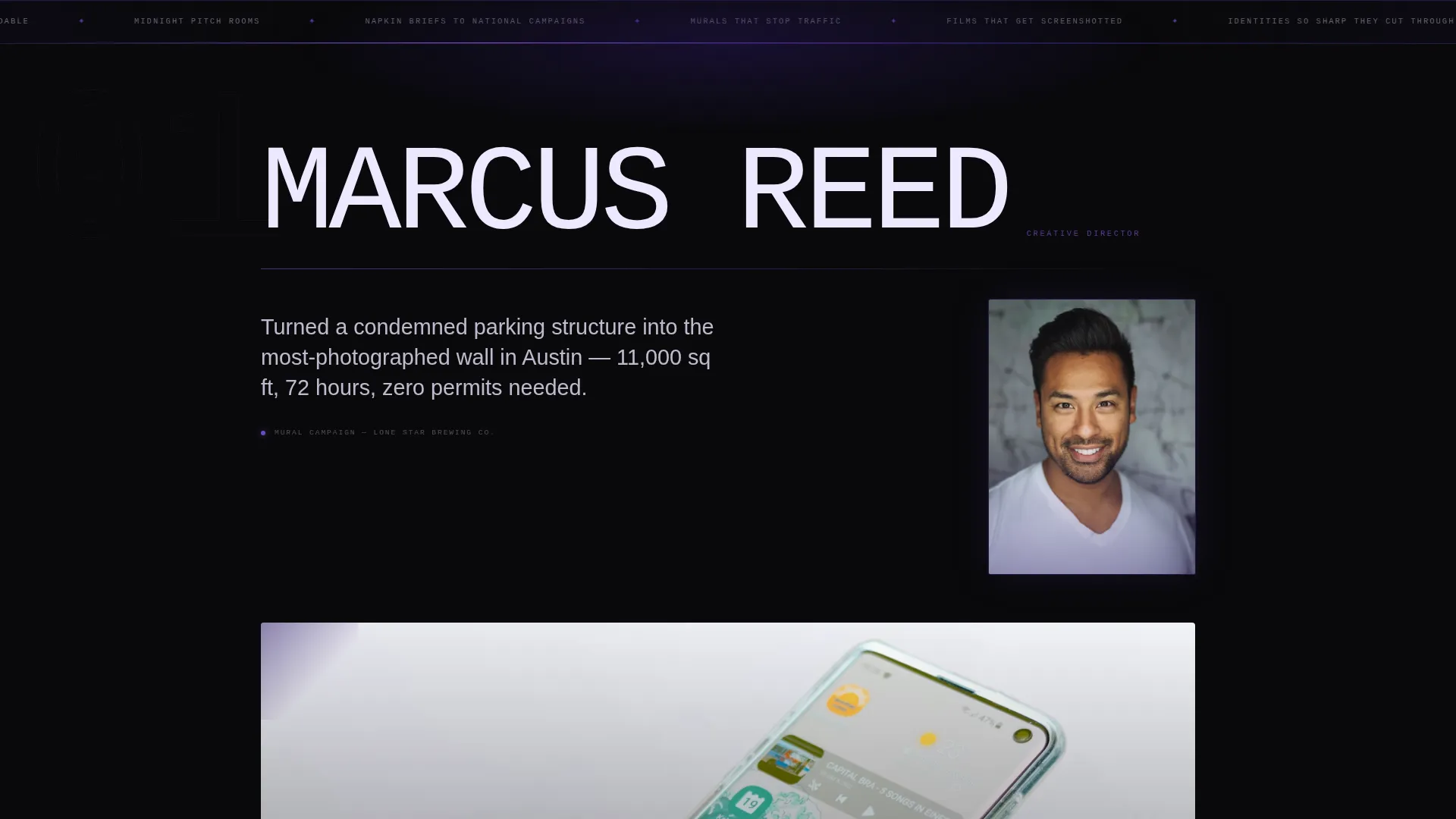
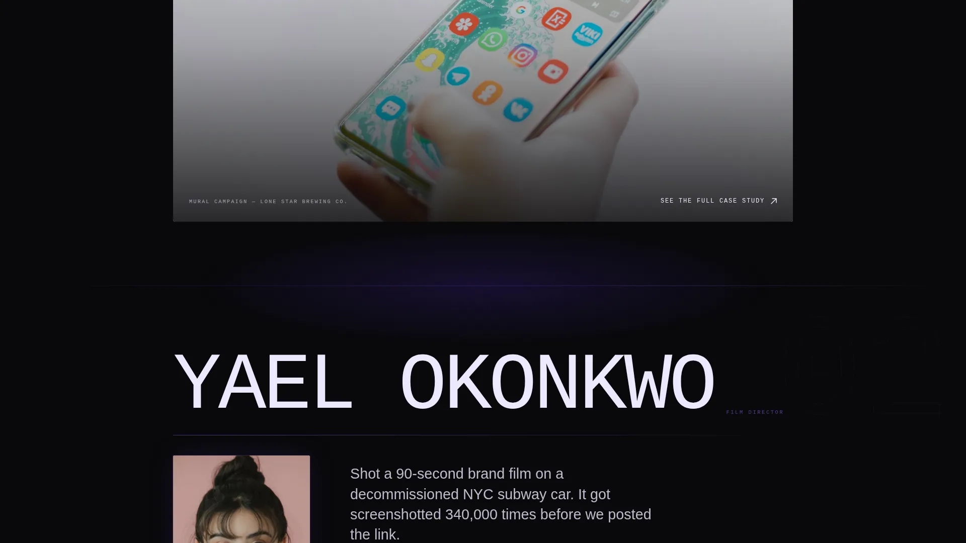
Creator Spotlight Scroll Sections
Each case study opens with a full-bleed portrait of the lead creative, their name set in enormous type, and one sentence describing what they built. This layout frames the agency's output as the product of specific, named people. The result feels like a magazine profile series, not a project archive.
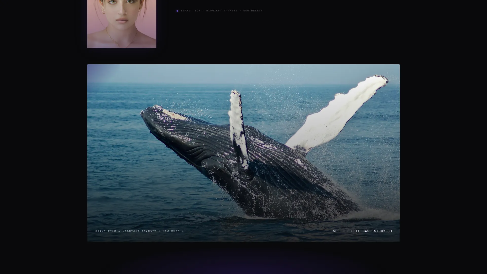
Alternating Full-Width Project Imagery
Between creator portraits, the page drops visitors into explosive project visuals: murals wrapping buildings, subway campaign takeovers, brand identity specimen sheets. The alternating rhythm between intimate portrait moments and large-scale project scale keeps scroll momentum high and attention engaged throughout.
Persistent Bottom-Bar Call to Action
A fixed bottom bar carries the "Start a Project" link in electric violet on void black at every scroll position. There is no contact form on the page. The bar appears only after the visitor has moved through the creative work, so the click arrives with full conviction rather than cold intent.
"See the Full Case Study" Click-Through Links
Every creator spotlight section ends with a curiosity-building link to the full case study. These links do not resolve on the landing page itself. They direct visitors deeper into the agency's work, extending engagement and reinforcing the depth behind each project summary.
Void and Violet Color System
The palette runs on absolute void black as the dominant background color, with deep ultraviolet and electric violet used on gradients, dividers, and interactive states. Lilac white carries all primary type. Violet appears exclusively on hover states and active elements, so every interaction feels intentional and charged.
Page sections overview
| Section | Purpose |
|---|---|
| Full-Bleed Header | Sets the confrontational tone with a raw studio photograph and a single oversized headline |
| Creator Spotlight | Introduces each lead creative with a portrait, name, and one-sentence project description |
| Full-Width Project | Delivers explosive case study visuals at a scale that matches the work's real-world impact |
| Persistent Bottom Bar | Keeps the "Start a Project" call to action visible at every scroll position without interrupting the flow |
| Case Study Links | Ends each spotlight with a click-through that builds curiosity and drives deeper engagement |
Design & branding system
The design system is built around a single principle: confrontation over comfort. Every typographic and color decision is made to feel heavy, intentional, and impossible to skim past.
- Void black (#09090B) dominates every background; deep ultraviolet (#2D1B69) and electric violet (#8B5CF6) appear on gradients and dividers
- Lilac white (#EDE9FE) is used for all primary type; violet is reserved exclusively for hover states and active elements to make interactions feel live
- Type is set in oversized monospaced or grotesque faces, creating the brutalist weight that defines the visual identity
Mobile & speed optimization
The full-width immersive layout is designed to translate the same visual weight across screen sizes. Oversized type, full-bleed imagery, and the fixed bottom bar are all structured to remain functional and legible at mobile viewport widths.
- Full-bleed sections and portrait imagery are laid out to scale cleanly without cropping the creative intent
- The persistent bottom bar is positioned to remain accessible on smaller screens without obscuring scroll content
- Oversized typographic treatments retain their confrontational scale even at reduced viewport sizes
How this template helps you convert
Studio does not rely on a form or a feature list to convert visitors. It builds creative envy through a structured scroll experience, then gives the convinced visitor exactly one clear action to take.
- The creator spotlight structure keeps visitors scrolling by making each section feel like a new reveal, sustaining attention across the full page length before any call to action is presented.
- The persistent bottom bar places the "Start a Project" link at every scroll position so the moment a visitor feels ready, the path to brief submission is already visible and one click away.
Other information about this template
This template is a strong fit for agencies that position themselves against safe, conventional creative work. It is built for situations where the page itself needs to function as a proof of creative conviction.
- The layout is designed as a click-through landing page, meaning no forms or data inputs are included by design
- The "Start a Project" bar links to a dedicated brief intake page, keeping the landing page experience clean and focused
- The Bold Brutalist theme and Void and Violet color system are calibrated for agencies operating in brand identity, campaign production, film, and cultural work
- This template works well for creative agencies, brand studios, and campaign-led production houses looking to replace generic portfolio pages with something that reflects the actual energy of their work
Theme
Bold Brutalist
Creative direction
Creator Spotlight
Color system
Void & Violet
Style
Full-Width Immersive
Direction
Click-Through
Page Sections
Full-bleed Photo Header
Creator Spotlight Scroll Sections
Alternating Full-width Project Imagery
Persistent Bottom-bar Call to Action
Click-through Case Study Links
Void and Violet Color System
Related questions
Is there a contact form included in this template?
What kind of agencies does this template suit best?
Does this template include multiple pages or just one landing page?
How does the violet color work across interactive elements?
Can I adapt the creator spotlight sections to fit my agency's structure?


