Fashion Designer Portfolio Booking Website Template
Atelier is a full-width immersive landing page for fashion designers who want their portfolio to feel like a live runway experience. Built on a Bold Brutalist visual identity, it combines a Before/After Slider header, case study narrative scroll sections, and brutalist conversion elements to turn portfolio visitors into booked creative consultations.
by Rocket studio
Quick summary
Atelier is a single-page fashion designer video portfolio built for maximum impact. It opens with a draggable Before/After Slider that splits raw process footage from finished editorial work. Three narrative case study sections unpack each collection as a story. Every design choice, from the Monochrome Steel palette to oversized stamped typography, earns trust before the booking call-to-action ever appears.
Who this template is for
This template is built for working fashion designers who need to demonstrate craft, not just final imagery. If your clients judge you on process as much as product, Atelier gives them both in a single scroll.
- Fashion designers building a video-led portfolio to attract editorial and commercial clients
- Independent designers pitching creative directors, magazine editors, or brand founders
- Emerging talent who want a portfolio that communicates skill, discipline, and a distinct point of view
What problem this template solves
Most portfolio pages show finished looks and stop there. Creative directors and editors want to understand how a designer thinks and works. A static image grid cannot communicate that. Atelier solves this by structuring the page as a narrative built around fabrication process footage, so visitors feel they watched something being made before they ever read a bio.
- Flat image portfolios fail to communicate the skill and labour behind finished garments
- Visitors leave before reaching a contact form because the page never builds enough trust
- Designers lose high-value clients who cannot assess whether working together is worth the risk
What you get with this template
You get a complete, full-width immersive landing page structured around three narrative collection case studies, a cinematic header interaction, and two distinct conversion paths. Every section is designed to deepen trust progressively before asking for a booking.
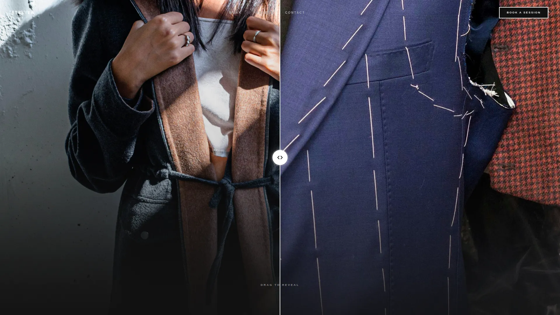
- A draggable Before/After Slider header showing raw process alongside the finished editorial result
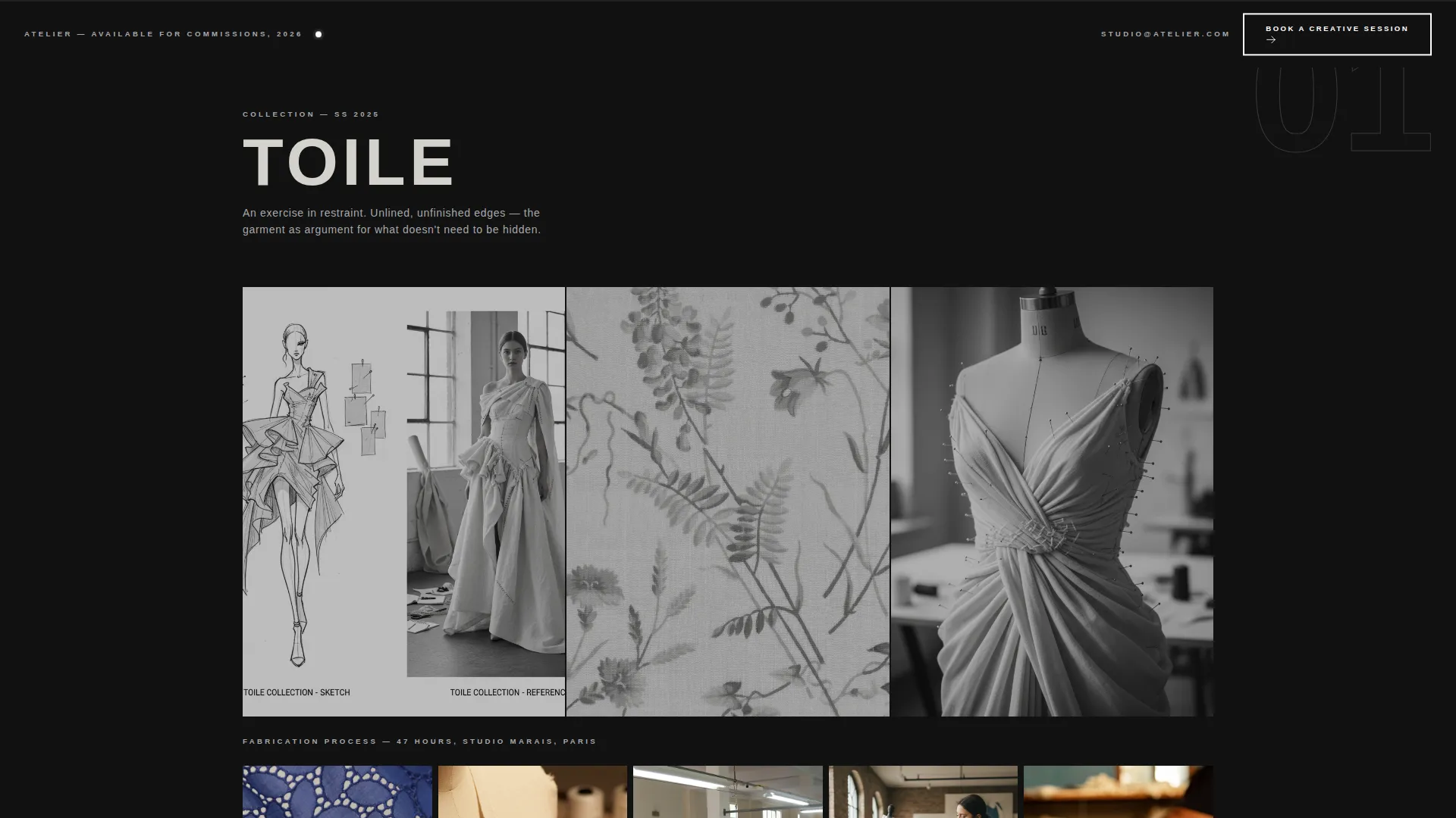
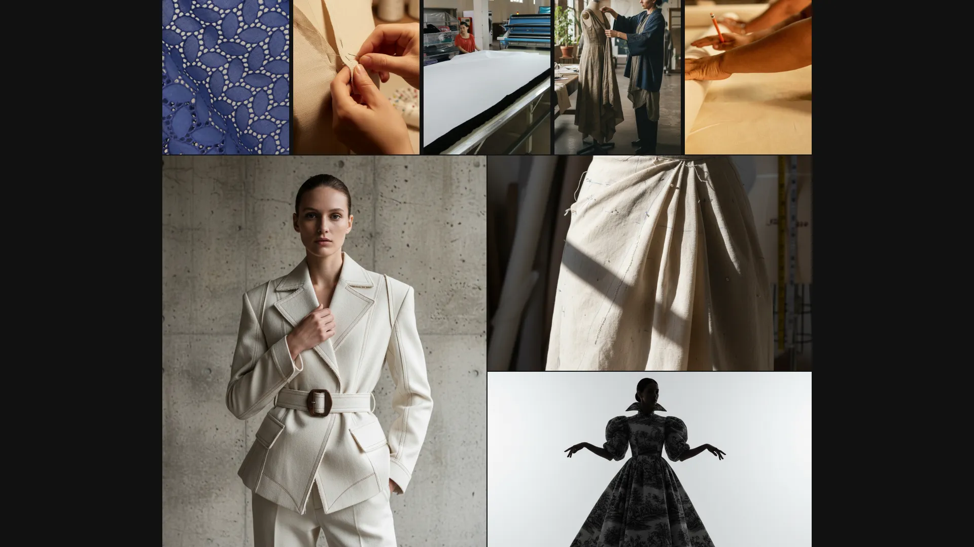
- Three scroll-driven collection case studies that move from sketch and reference imagery through fabrication video to final lookbook imagery
- Two call-to-action paths: a primary brutalist booking button and a secondary email-capture lookbook download
Feature list
This template is built around a set of carefully considered interactive and structural components. Each one serves the core goal of proving process before presenting a conversion ask.
Before/After Viewport Slider
The full-viewport header is split into two states. The left side holds a stilled frame from behind-the-scenes footage: chalk marks, pins, a half-constructed bodice on a dress form. The right side holds the finished editorial shot of the same garment. The visitor drags the divider and watches craft become campaign. The designer's name appears in 180-pixel uppercase type, anchored to the bottom-left, only after the slider is touched.
Case Study Narrative Scroll
Each of the three collection sections is structured as a complete story in three beats: reference image or sketch, close-up fabrication video, and final edge-to-edge lookbook imagery. The intensity of each section builds deliberately. The first collection is intimate and quiet, the second introduces movement, and the third delivers full runway footage with audience reaction.
Philosophy Viewport Breaks
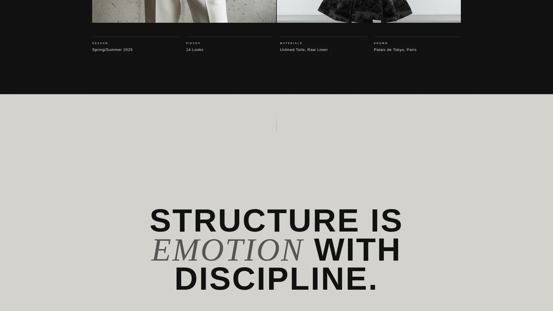
Between each collection case study, a single sentence in enormous type fills the entire viewport. These fragments, such as "Structure is emotion with discipline," act as editorial punctuation. They give the visitor a moment to absorb tone before the next collection begins.
Primary Booking Call-to-Action
The "Book a Creative Session" button appears for the first time immediately after the second case study. It is styled as a brutalist flat button with black fill, white text, and no border radius. It repeats as a persistent bottom bar after the third collection, ensuring it is always within reach without interrupting the narrative scroll.
Secondary Lookbook Email Capture
Visitors who are not ready to book a consultation can download the lookbook instead. A single email field captures the lead with minimal friction. This secondary path keeps a warm audience connected without requiring an immediate commitment.
Monochrome Steel Typography System
All body and display text is set in brutalist sans-serif typefaces. Oversized headings are tracked wide and feel stamped rather than typed. The sizing scale is intentional: display copy reaches 180 pixels at key moments to command attention without decoration.
Page sections overview
| Section | Purpose |
|---|---|
| Before/After Slider | Opens the page with a draggable craft-to-campaign reveal |
| Designer Name Reveal | Displays the designer's name in large tracked type after slider interaction |
| Collection One Case Study | Introduces the first collection through sketch, process video, and lookbook |
| Philosophy Viewport One | Fills the screen with a single design philosophy sentence |
| Collection Two Case Study | Builds energy with fabrication footage and movement |
| Philosophy Viewport Two | Delivers a second editorial punctuation moment |
| Collection Three Case Study | Closes with full runway footage and audience reaction |
| Primary Booking call to action | Presents the "Book a Creative Session" button after collection two |
| Lookbook Email Capture | Offers a secondary download path with a single email field |
| Persistent Booking Bar | Anchors the booking button to the bottom of the page after collection three |
Design & branding system
The visual identity is built on a Monochrome Steel color system. Every surface is intentional: there is no warmth, no decorative relief, and no apology. The palette and typography work together to feel like the inside of a steel-frame fitting room, where the work is the only thing worth looking at.
- Color palette uses forge black (#111111), brushed aluminum (#A8A9AD), poured concrete (#D4D2CC), and arc-weld white (#FFFFFF) reserved strictly for hover states and active typography
- Background sections alternate between forge black and poured concrete in massive full-width slabs, creating rhythm through contrast rather than color
- Interactive elements, including buttons and slider handles, glow arc-weld white on hover to simulate a needle catching studio light
Mobile & speed optimization
The template is structured for full-width immersive display with large video and imagery assets. These components are designed to adapt across viewport sizes so the editorial quality of the content is preserved on smaller screens.
- The Before/After Slider and case study video sections are built for responsive full-width display across desktop, tablet, and mobile viewports
- Typography scaling preserves the visual weight of oversized display text at smaller screen widths, keeping the brutalist tone intact
- Section layout and spacing adjust for mobile scroll behavior so the narrative flow reads correctly without horizontal overflow or broken grids
How this template helps you convert
The page is structured around a deliberate trust-building sequence. By the time a call-to-action appears, the visitor has already watched raw material become a finished collection three times. The conversion architecture is built into the scroll order, not bolted on at the end.
- The Before/After Slider immediately demonstrates the gap between raw process and finished work, establishing credibility before a single word of copy is read.
- Three sequential case studies build cumulative trust by showing the same creative discipline applied across different collections, so the booking ask arrives after the visitor already believes in the work.
- The persistent bottom booking bar ensures the primary call-to-action is always visible after the third collection without interrupting the narrative, removing friction from the decision moment.
Other information about this template
This template sits within the Portfolio and Agency category, specifically designed for the fashion designer video portfolio niche. It is a strong fit for designers who already have video assets from shoots, fittings, and runway shows and need a page structure that gives those assets the editorial treatment they deserve.
- Template style is Full-Width Immersive, making it well suited to video-heavy content where edge-to-edge display matters
- The Bold Brutalist theme and Case Study Narrative creative direction make this template a strong choice for designers whose visual identity leans industrial, architectural, or avant-garde
- The Click-Through landing page direction is optimized toward a single destination: a booking page for creative consultations
- The header concept, Before/After Slider, is a distinctive interaction that immediately differentiates this portfolio from conventional grid-based fashion websites
Theme
Bold Brutalist
Creative direction
Case Study Narrative
Color system
Monochrome Steel
Style
Full-Width Immersive
Direction
Click-Through
Page Sections
Before/after Viewport Slider Header
Three-part Case Study Narrative
Philosophy Viewport Breaks
Brutalist Booking Call-to-action
Secondary Lookbook Email Capture
Monochrome Steel Visual System
Related questions
Who is this template designed for?
Do I need video content to use this template?
What conversion paths does this template include?
Is this a single-page or multi-page template?
Can the template support a designer with fewer than three collections?