Personal CRM & Network Pre-Launch Website Template
Substanceroom is a dark, cinematic waitlist landing page built for a curated professional networking platform. It combines a living photo mosaic header, scroll-driven layered transitions, and a two-step waitlist form designed to hook identity before collecting contact details. The result is an immersive first impression that feels earned, not generic.
by Rocket studio
Quick summary
Substanceroom is a single-page waitlist experience for a curated professional networking platform. The overlap-and-layer layout uses cinematic scroll transitions, a photo mosaic header, and a two-step "Hold My Seat" form to build intrigue and drive sign-ups. Every design decision serves one goal: making the right people feel this room was built for them.
Who this template is for
This template is built for founders and platform builders who want their waitlist page to feel like a destination, not a placeholder. It speaks directly to an audience that is tired of transactional networking and ready for something more considered.
- Mid-career strategists and freelance creative directors who need a page that earns attention before asking for an email
- Startup founders launching a curated community or invite-only professional network
- Builders who want their landing page to signal quality, exclusivity, and real human connection
What problem this template solves
Most waitlist pages feel like a form dressed in startup clothing. They collect emails but give visitors no reason to feel invested. Substanceroom solves the trust and intrigue gap that kills early-stage community sign-ups.
- Generic waitlist pages fail to communicate what makes a network worth joining before asking for contact details
- Professionals with high signal-to-noise standards leave immediately when a page feels mass-produced or algorithmically safe
- Founders lose early momentum because their launch page does not match the quality of the product they are building
What you get with this template
You get a fully designed, overlap-layered landing page with a dark immersive visual identity and a narrative scroll experience that builds from stranger to collaborator to potential co-founder. Every section has a defined role in the conversion sequence.
- A photo grid mosaic header with parallax depth, a two-step waitlist form with a live position counter, and a referral sharing path
- A cinematic scroll sequence where each section slides over the previous one with deliberate tonal transitions
- A complete Ink & Paper color system with four defined values and a fountain pen blue accent reserved exclusively for interactive states and the primary call to action
Feature list
This section covers the core built-in components that define the Substanceroom template experience.
Photo Grid Mosaic Header
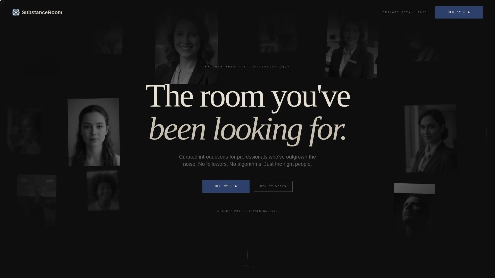
The header is a living wall of varied professional portraits at different scales, rotations, and blur depths. They drift slowly with a parallax effect, and the headline "The room you've been looking for" emerges from the negative space in vellum white. No stock symmetry, no uniform grid.
Cinematic Scroll Sequence
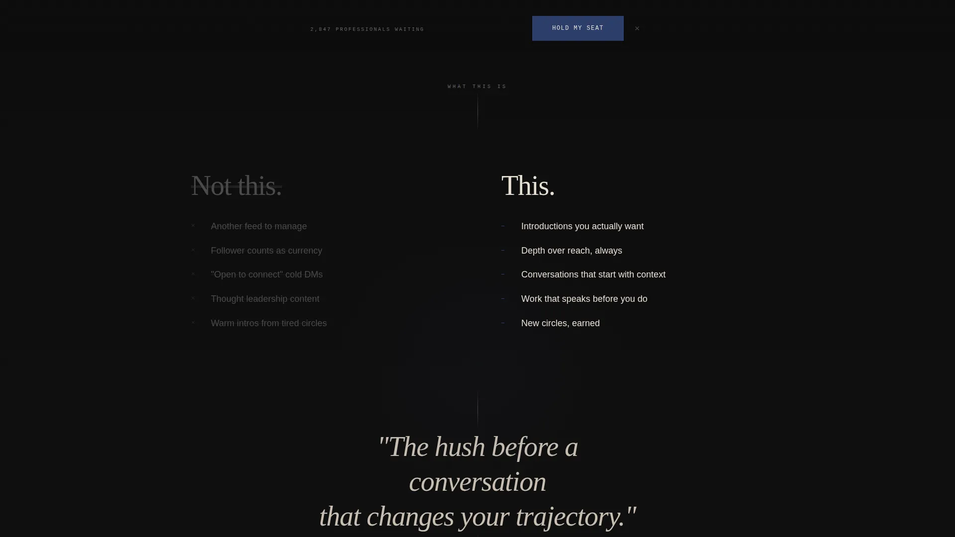
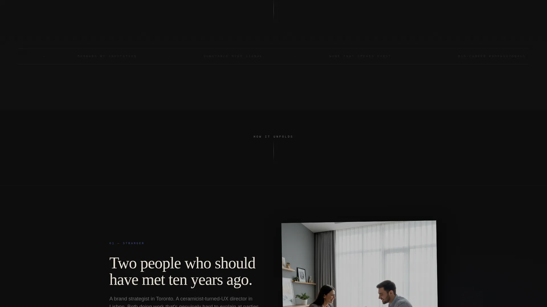
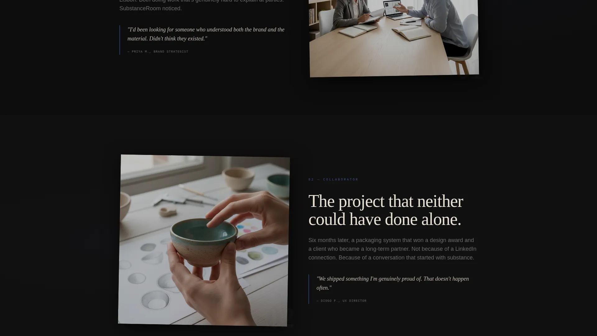
Each content section slides over the previous one with deliberate weight, like turning pages in a printed story. The sequence moves from a single connection line between two portraits, to a typographic conversation excerpt, to a project born from that exchange. Each transition shifts one shade darker or lighter to maintain narrative momentum.
Two-Step Waitlist Form
The primary call to action reads "Hold My Seat" in fountain pen blue and is pinned at the bottom of the viewport. Step one asks for a name and the question "What do you do that's hard to explain at parties?" Step two, triggered after submission, asks for an email framed as "Where should we send your invite?" Identity comes before contact.
Live Waitlist Position Counter
A real-time counter displays the visitor's position on the waitlist after they begin the sign-up flow. This adds social proof and urgency without resorting to countdown timers or pressure tactics that feel manufactured.
Referral Sharing Path
A secondary conversion path lets visitors share a unique link to refer someone they consider brilliant. Successful referrals move the referrer up the waitlist. This builds organic reach while keeping the community feel curated and earned.
Overlap and Layered Section Architecture
The entire page is built using an overlap layout where sections stack and slide rather than stack and stop. This creates a continuous narrative experience and keeps readers scrolling through the story rather than past it.
Page sections overview
| Section | Purpose |
|---|---|
| Photo Mosaic Header | Establishes tone and draws visitors into the world through faces and the headline |
| Connection Line Scene | Compresses the mosaic into a single visual link between two people |
| Conversation Excerpt | Surfaces a typographic close-up of a real-feeling professional exchange |
| Project Origin Story | Shows the outcome of that connection, a shared project taking shape |
| Pinned Waitlist call to action | Anchors "Hold My Seat" persistently and opens the two-step form |
| Waitlist Position Counter | Confirms position and adds social proof after step one submission |
| Referral Share Path | Offers a secondary action to refer a contact and move up the list |
Design & branding system
The visual identity is built around an Ink & Paper color system that feels like a Moleskine notebook opened under a single desk lamp. Every color choice is deliberate, and the palette carries emotional weight before a single word is read.
- Four defined color values: deep manuscript black (#0D0D0D) for backgrounds, aged vellum (#E8E0D5) for cards and profile elements, graphite notation gray (#4A4A4A) for body typography, and fountain pen blue (#2C3E6B) reserved exclusively for interactive states and the waitlist call to action
- Cards and profile elements use a torn-edge vellum treatment with subtle layered shadows, giving physical texture to digital components
- Typography sits in graphite at rest and transitions into fountain pen blue on hover, keeping every interactive moment intentional and consistent with the palette
Mobile & speed optimization
The overlap-and-layer architecture is designed to translate the cinematic desktop experience into a readable, engaging mobile flow. Layered transitions scale gracefully without losing the narrative weight of the scroll sequence.
- The pinned "Hold My Seat" call to action remains accessible at the bottom of the viewport on mobile screens, keeping the primary conversion path always within reach
- The photo mosaic adapts its portrait arrangement and parallax depth for smaller screens so the header retains its living, breathing quality without becoming cluttered
How this template helps you convert
The conversion strategy is built into the page structure itself. Every section earns the next interaction before asking for anything from the visitor.
- The photo mosaic header and cinematic scroll sequence create genuine curiosity and establish the emotional register of the platform before any form appears, so visitors arrive at the call to action already invested.
- The two-step form separates identity from contact, leading with a question that resonates with the exact audience this network is built for, which makes completing step two feel like a natural continuation rather than a cold data exchange.
- The live counter and referral path extend engagement beyond the initial sign-up, turning early members into active advocates and giving them a tangible stake in the community before it launches.
Other information about this template
This template sits within the Personal and Resume category, specifically the Personal CRM and Network subcategory, targeting the professional networking page niche. It is designed as a single overlap-layered landing page, not a multi-page site.
- The Dark Immersive theme and Cinematic Sequence creative direction make this template well suited for curated community platforms, invite-only networks, and professional spaces that want to signal quality from the first scroll
- The template style is Overlap and Layered, meaning sections are designed to visually slide over each other rather than sit in a conventional stacked layout
- The waitlist and coming soon direction means this template is purpose-built for pre-launch phases, where building anticipation and collecting qualified interest matters more than showcasing a finished product
Theme
Dark Immersive
Creative direction
Cinematic Sequence
Color system
Ink & Paper
Style
Overlap/Layered
Direction
Waitlist/Coming Soon
Page Sections
Photo Grid Mosaic Header
Cinematic Scroll Sequence
Two-step Waitlist Form
Live Waitlist Position Counter
Referral Sharing Path
Overlap and Layered Layout
Related questions
Can I change the color palette to match a different brand identity?
Does the two-step form require a specific backend or email tool to function?
Is this template suitable for a community platform that is already live?
How does the referral path work within the template?
What makes this different from a standard waitlist page template?



