Nepal Adventure Tour Landing Page Template
Summit is a dark immersive single-column landing page built for Nepal adventure tour companies. It uses a Sunset Gradient palette, a macro close-up header, and an atmosphere-first scroll flow to pull visitors deep into the Himalayan experience before showing a single price. A filterable trip selector and a guide consultation prompt drive bookings from one seamless page.
by Rocket studio
Quick summary
Summit is a single-column flow landing page designed for Nepal adventure tour operators. It opens with a razor-sharp macro close-up, pulls the visitor through sensory mood sections, and closes with a filterable trip selector and a guide callback prompt. The dark indigo-to-amber Sunset Gradient palette makes every scroll feel like a high-altitude sunrise.
Who this template is for
Summit is built for tour operators and adventure travel brands whose clients want more than a holiday. It suits companies offering guided treks, expedition pushes, and wildlife safaris across Nepal.
- Trekking companies running routes on the Annapurna Circuit, Everest Base Camp, or the Langtang Valley
- Operators offering mixed itineraries that include jungle safaris alongside mountain expeditions
- Adventure travel brands targeting restless professionals in their thirties and forties who want a transformative trip
What problem this template solves
Most travel landing pages lead with prices and itinerary bullet points. That approach sells the logistics, not the experience. Summit flips the order entirely.
- Visitors often need to feel a destination before they commit to booking it
- Generic travel templates cannot convey altitude, atmosphere, or emotional weight
- A flat product grid loses high-intent buyers who are comparing emotional resonance, not just dates and costs
What you get with this template
You get a fully structured single-column landing page that moves a visitor from cold curiosity to genuine intent. Every section is crafted to deepen immersion before revealing any commercial layer.
- A macro close-up header with a viewport-filling image slot, a slow text-reveal headline, and a predawn indigo depth-of-field background treatment
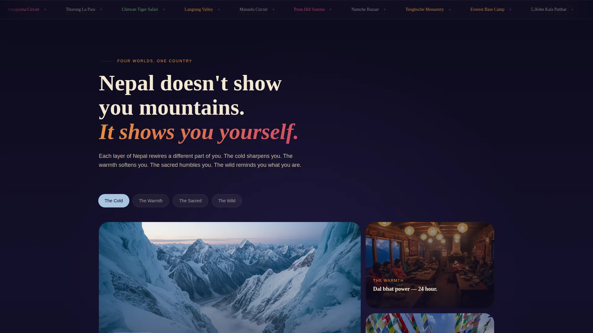
- An atmosphere-first scroll flow with four distinct mood sections covering cold and altitude, teahouse warmth, sacred sites, and wild landscapes
- A filterable trip selector organized by difficulty, duration, and region, plus individual trip cards showing price-from tags and next departure dates
- A secondary conversion module labeled "Talk to a Sherpa" for guide consultation callbacks
Feature list
Summit packs a focused set of purpose-built components. Each one earns its place in the flow.
Macro Close-Up Header
The header fills the entire viewport with a single extreme-detail image slot. A slow letter-by-letter text reveal introduces the headline only after a full scroll beat, giving the atmosphere time to land before the copy appears.
Atmosphere and Mood Scroll Flow
Four sequential mood sections guide the visitor through sensory layers of Nepal. The gradient palette shifts warmer or cooler with each section, and image widths expand as the scroll deepens, creating a pacing rhythm that feels like physical acclimatization.
Filterable Trip Selector
The trip selector lets visitors filter adventures by difficulty level, trip duration, and region. Each trip card displays a price-from tag, the next available departure date, and one atmospheric thumbnail image.
Guide Consultation Module
A secondary call-to-action block invites visitors to request a callback or start a live chat with a Nepal-based guide. The prompt is positioned after the immersive scroll and before the booking confirmation layer.
Sunset Gradient Color System
The palette moves from deep Himalayan night indigo through high-altitude amber and rhododendron blush to glacial cream. Section transitions bleed through gradient warm tones, and hover states pulse with rhododendron pink for active interactive elements.
Single-Column Flow Layout
Every section stacks in a single vertical column with no sidebars or split-panel interruptions. This keeps the visitor's attention locked to one narrative path from the header all the way down to the conversion modules.
Page sections overview
| Section | Purpose |
|---|---|
| Macro Close-Up Header | Opens with an extreme-detail image and slow headline reveal to establish atmosphere before any copy |
| Cold and Altitude | Communicates the physical reality of high-altitude trekking through imagery and sparse, direct language |
| Teahouse Warmth | Shifts the palette warmer to convey rest, community, and the human side of expedition life |
| Sacred Sites | Introduces the cultural and spiritual layer of Nepal through temple imagery and ambient copy |
| Wild Landscapes | Covers the jungle safari and river wilderness dimension of the trip catalog |
| Filterable Trip Selector | Lets visitors filter and browse the full adventure catalog by difficulty, duration, and region |
| Trip Cards Grid | Displays individual adventures with price-from tags, departure dates, and thumbnail images |
| Talk to a Sherpa | Secondary conversion block for guide consultation callbacks or live chat requests |
Design & branding system
The visual identity is built around a Dark Immersive theme anchored in the Sunset Gradient color system. Every color choice reflects a specific moment in the Himalayan sky rather than a generic palette choice.
- Core colors: deep Himalayan night (#0D0B1E) for backgrounds, high-altitude amber (#E8913A) and rhododendron blush (#D4456A) for gradients and accents, and glacial cream (#F4E8D1) for body text and interactive labels
- Section transitions bleed through the gradient warm tones so each scroll feels like a palette shift rather than a hard cut
- Hover states pulse with rhododendron pink to create a live ember quality on buttons and card interactions
Mobile & speed optimization
The single-column flow is inherently responsive. Stacking every section vertically means the layout requires no structural rearrangement on smaller screens.
- The macro close-up header and expanding image widths in the mood sections scale cleanly to mobile viewports without cropping the focal detail
- Trip cards in the filterable selector reflow into a single-column stack on narrow screens, keeping price tags and departure dates clearly visible
- The gradient transitions and hover states are designed with touch interaction in mind, so the palette shifts read naturally on mobile devices
How this template helps you convert
Summit earns the conversion by building emotional commitment before introducing any booking mechanics. By the time a visitor reaches the trip selector, they are choosing rather than browsing.
- The atmosphere scroll flow moves visitors through four sensory layers of Nepal, building desire before any pricing or itinerary detail appears, so intent is already high when the commercial section loads.
- The filterable trip selector reduces decision friction by letting visitors narrow options by difficulty, duration, and region, which means each trip card they see already matches their personal criteria.
- The "Talk to a Sherpa" module gives hesitant visitors a low-commitment next step, converting undecided visitors who are not yet ready to book but are close enough to want a conversation.
Other information about this template
Summit was designed as a Marketplace and Multi-offer landing page, meaning it supports a full catalog of bookable adventures within a single uninterrupted scroll. This approach suits operators who run a broad range of trips under one brand.
- The template style is Single Column Flow, which works across both desktop and mobile without layout restructuring
- The creative direction is Atmosphere and Mood, meaning visual and copy hierarchy prioritize sensory experience over feature lists or specification tables
- The header concept is Macro Close-Up, a deliberate departure from wide-angle panoramas common in travel marketing
- The template sits in the Travel and Hospitality category with a specific focus on Nepal adventure travel and Nepal trekking experiences
- It is well suited to operators offering Nepal trekking packages, guided Everest Base Camp expeditions, Annapurna Circuit routes, and Chitwan jungle safaris
- The Dark Immersive theme and Sunset Gradient palette are intentional differentiators that separate this page visually from the bright, beach-resort aesthetic common in mainstream travel templates


Theme
Dark Immersive
Creative direction
Atmosphere & Mood
Color system
Sunset Gradient
Style
Single Column Flow
Direction
Marketplace/Multi
Page Sections
Macro Close-up Hero Header
Four-stage Atmosphere Scroll
Filterable Trip Selector
Guide Consultation Block
Sunset Gradient Palette
Single-column Flow Structure
Related questions
Can I use this template for a tour operator that offers both trekking and safari trips?
How does the atmosphere scroll flow work in practice?
Can the trip cards show different pricing tiers and departure dates?
What makes the header different from a standard travel hero image?
Is this template suited to operators who only run guided group expeditions?


