Local Brick & Mortar Business Professional Website Template
Sundries is a Neo-Retro bento grid landing page built for variety stores selling small, affordable everyday finds. It combines a playful Citrus Burst color palette with a Before/After Reveal scroll experience, direct-sales checkout flow, and a floating cart icon. Every section is designed to turn casual browsers into impulse buyers, fast.
by Rocket studio
Quick summary
Sundries is a single-page landing page template built for variety and corner-shop retailers. It uses a bento grid layout, a Neo-Retro visual identity, and a scroll-driven Before/After Reveal format to showcase affordable everyday products. The page is wired for direct sales with inline "Add to Bag" buttons, a persistent floating cart, and a guest checkout flow that removes every friction point.
Who this template is for
This template suits any retailer selling a wide mix of low-cost, high-impulse products. It works especially well for shops where discovery and delight are the selling points, not deep product research.
- Small variety store owners and corner shop operators who sell everyday finds priced under fifteen dollars
- Gift shop and impulse-buy retailers who want a page that feels as fun to browse as the store itself
- Pop-up or online-only shop owners who need a direct-sales landing page without building a full multi-page site
What problem this template solves
Most retail templates are built for curated, high-consideration purchases. They use clean white space, long product descriptions, and navigation menus that slow things down. That approach kills impulse sales before they start.
- Visitors who arrived on a whim need visual energy and fast decision-making cues, not a quiet editorial layout
- Sellers with dozens of small, low-priced products need a format that lets many items coexist without feeling cluttered
- Shoppers who buy on Thursday-night impulse abandon carts the moment checkout feels like a chore
What you get with this template
You get a fully designed, single-page landing page ready to adapt for your variety store. Every visual and functional element comes from the source brief and is ready to customize.
- A bento grid layout with Before/After Reveal cells, single-product hero tiles, and an App Store Preview header with a phone mockup and floating product thumbnails
- Direct-sales components including per-cell "Add to Bag" buttons in tangerine, a persistent floating cart icon, and a sticky free-shipping progress banner
- A guest checkout flow featuring Apple Pay, Google Pay, and card fields in that order, with no account creation required
Feature list
This section breaks down the core design and functional features built into the Sundries landing page template.
Bento Grid Layout with Reveal Cells
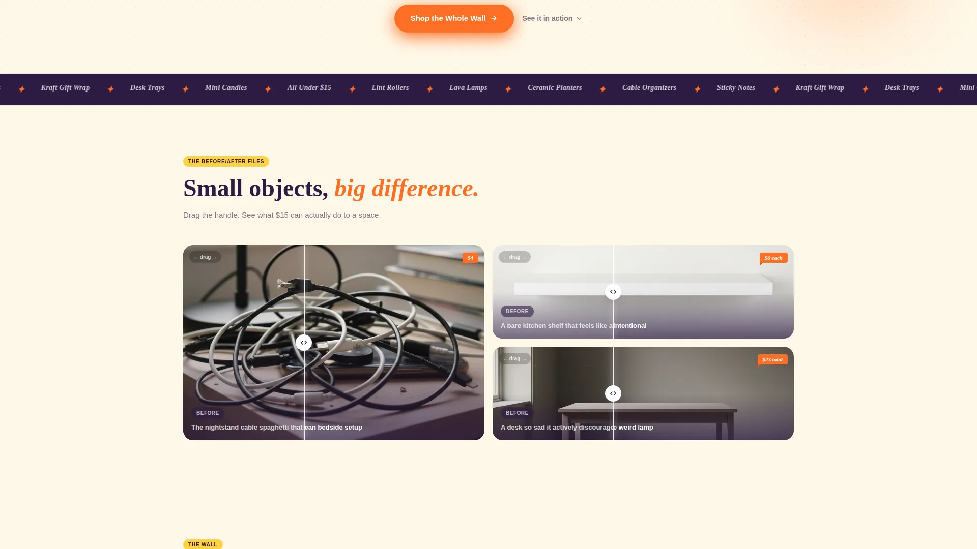
The page uses a bento grid structure where each cell serves a different purpose. Some cells run a Before/After Reveal showing a messy everyday scene transformed by a variety-store find. Visitors drag a diagonal swipe to reveal the change, creating an interactive scroll experience that builds product desire naturally.
App Store Preview Header
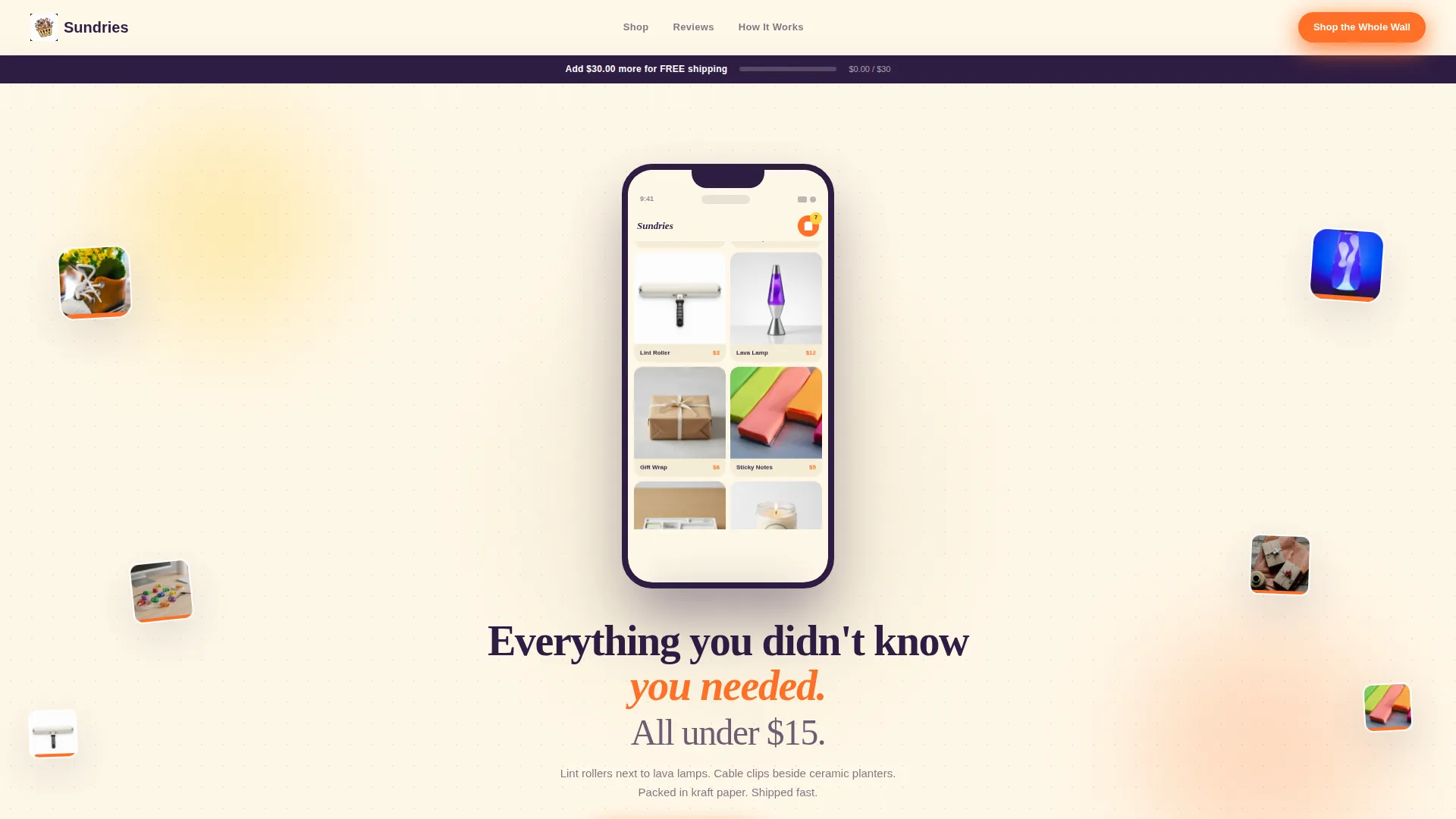
The header centers a giant phone mockup showing the store's mobile browsing experience mid-scroll. Floating product thumbnails drift outward around the mockup. Inside the phone screen, a live-looking product grid appears with tiny price tags and a cart badge reading "7 items." Below the mockup, a bold headline in deep grape on vintage cream reads: "Everything you didn't know you needed. All under $15."
Single-Product Hero Tiles
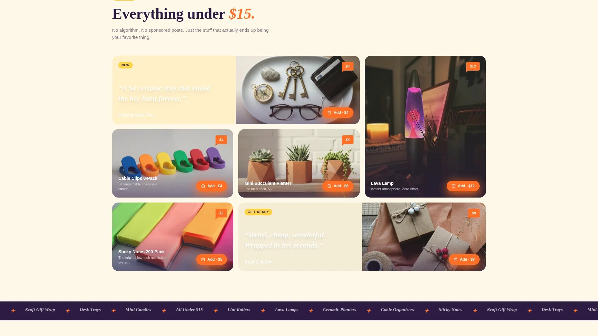
Between reveal cells, the grid breaks rhythm with oversized single-product photography and one-line copy. Lines like "A $4 ceramic tray that ended the key hunt forever" interrupt the scroll pattern and keep visitors reading. These tiles prevent visual monotony and spotlight individual products with personality.
Persistent Floating Cart
Every "Add to Bag" button in the grid triggers a micro-animation that drops the item visually into a floating cart icon pinned to the bottom corner of the page. The cart stays visible as visitors scroll, keeping the purchase intent alive without requiring a page change.
Sticky Free-Shipping Banner
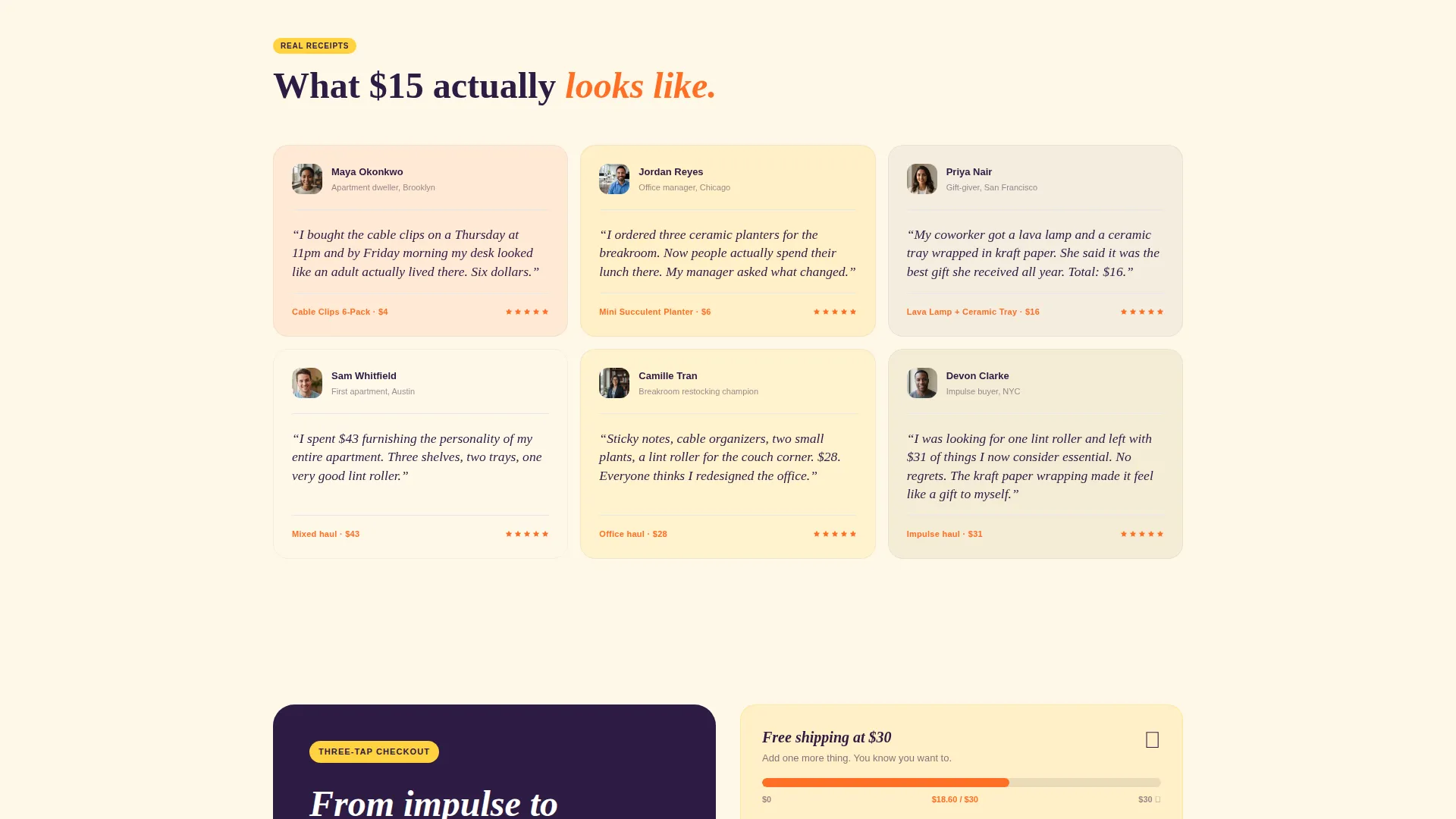
A sticky banner sits across the top of the page and displays a real-time progress bar. It shows visitors exactly how close their cart total is to the free-shipping threshold of thirty dollars. This nudges cart value upward without any aggressive upsell language.
Guest Checkout Flow
The checkout sequence requires no account creation. Apple Pay, Google Pay, and card fields appear in that order, following the most common mobile payment preference pattern. The design reduces the number of taps between impulse and completed purchase to three.
Page sections overview
| Section | Purpose |
|---|---|
| App Store Header | Showcases mobile browsing experience with phone mockup and floating product thumbnails |
| Headline Block | Delivers the core value proposition in grape-on-cream typography |
| Before/After Grid | Reveals everyday problems solved by affordable variety-store products |
| Hero Product Tiles | Highlights individual products with oversized photography and one-line copy |
| Sticky Shipping Banner | Shows real-time cart progress toward the free-shipping threshold |
| Floating Cart Icon | Keeps purchase intent visible and accessible throughout the scroll |
| Guest Checkout Section | Completes purchase with Apple Pay, Google Pay, or card in three taps |
Design & branding system
The Sundries template runs on a Citrus Burst color system built around four values that feel nostalgic, energetic, and slightly electric. The overall aesthetic is Neo-Retro: bold shapes, punchy contrast, and a warmth that recalls Saturday-morning cartoons and fruit-stripe gum packaging.
- Tangerine pop (#FF6F26) drives every price tag, "Add to Bag" button, and active call-to-action element
- Lemon rind (#FFD23F) handles hover states and sale badge highlights, while vintage cream (#FFF8E8) dominates the background like sun-bleached shelf paper
- Deep grape (#2D1B42) anchors all major headlines with heavy typographic weight that keeps the sweetness grounded
Mobile & speed optimization
The template is designed with a mobile-first browsing experience at its center. The header phone mockup is not decorative; it signals to visitors immediately that this page was built for how they actually shop.
- The bento grid scales cleanly across screen sizes, keeping reveal cells, hero tiles, and cart interactions usable on small displays
- The guest checkout sequence with Apple Pay and Google Pay is ordered specifically for mobile thumb reach and one-handed use
- The floating cart icon and sticky shipping banner remain fixed on all viewport sizes so key purchase signals never scroll out of view
How this template helps you convert
The Sundries template treats conversion as a design problem, not an afterthought. Every structural and visual decision in the layout reduces hesitation and shortens the path from scroll to sale.
- The Before/After Reveal format builds a visual argument that small, cheap objects genuinely improve daily life, doing the persuasion work that product descriptions usually struggle to complete
- The micro-animation on "Add to Bag" provides immediate tactile feedback, making the act of adding items feel satisfying rather than uncertain
- The guest checkout flow with no account requirement removes the single biggest drop-off point in impulse retail: the moment a shopper is asked to create a login before they can pay
Other information about this template
The Sundries landing page fits naturally into the broader world of variety retail, impulse gifting, and affordable everyday product shops. A few additional details worth knowing before you get started:
- The template style follows a Masonry and Pinterest-influenced bento grid, meaning cells vary in size and visual weight to keep the layout feeling dynamic and non-repetitive
- The creative direction aligns with an Unboxing Experience tone: the page should feel like opening a bag of interesting things, not browsing a structured product catalog
- The "Shop the Whole Wall" primary call-to-action links to the full product catalog, making this landing page a strong entry point for a broader variety-store inventory
- This template works well for gift shops, dollar-style stores, and local brick-and-mortar retailers who want an online presence that captures the energy of the physical shopping experience
Theme
Neo-Retro
Creative direction
Unboxing Experience
Color system
Citrus Burst
Style
Masonry/Pinterest
Direction
Marketplace/Multi
Page Sections
Bento Grid with Before/after Reveal
App Store Preview Header
Single-product Hero Tiles
Persistent Floating Cart
Sticky Shipping Progress Banner
Three-tap Guest Checkout
Related questions
Can I use this template without a developer?
Does the template support multiple product categories at once?
Is the guest checkout flow built into the template?
Can I change the Citrus Burst color palette to match my brand?
How many products can this landing page showcase?



