Neo-Retro Meal Kit Delivery Landing Page Template
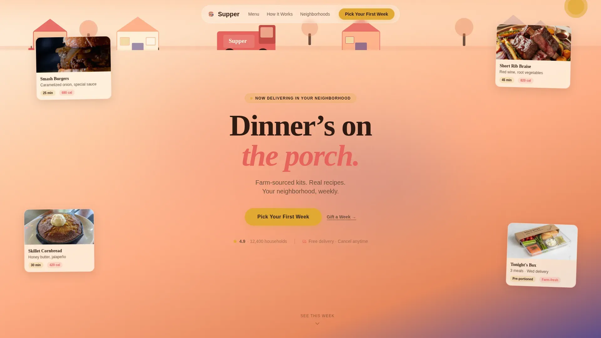
Supper is a Neo-Retro meal kit delivery landing page built around warm food storytelling and a clear scheduling flow. A modular card grid layout guides visitors from a hand-drawn sunset hero through this week's menu, neighborhood kitchen spotlights, and a simple three-step booking modal. The design feels like a 1970s diner menu reimagined for a modern food business.
by Rocket studio
Quick summary
Supper is a single-page, card grid landing page tailored for American meal kit delivery. It blends Neo-Retro design with a Local and Neighborhood creative direction, guiding visitors from a hand-drawn hero illustration through a modular food story that ends with an easy, three-step meal-scheduling flow.
Who this template is for
This landing page is built for food business owners who want to convert hungry visitors into first-week subscribers without writing a single line of code. It suits a range of operators and creators.
- Meal kit founders launching a direct-to-consumer food subscription
- Small food companies targeting suburban or rural households
- Marketers who need a ready, visually rich restaurant-style landing page fast
What problem this template solves
Most food delivery pages bury the meal behind pricing tables and sign-up forms. Visitors lose interest before they feel hungry. This page flips that order.
- It shows the food first, builds neighborhood trust second, and presents the order flow last
- It removes decision fatigue with a focused, three-step scheduling modal instead of a long form
- It gives a restaurant-quality design to businesses that cannot afford a custom build
What you get with this template
You get a production-ready landing page with high-energy, modular blocks that are easy to customize. Every section is built around the food experience, not generic filler.
- A hand-drawn sunset hero illustration with a punchy headline and a primary "Pick Your First Week" call to action
- A three-row card grid covering this week's menu, neighborhood kitchen spotlights, and an illustrated how-it-works sequence
- A three-step scheduling modal letting visitors choose delivery day, household size, and meals before they sign up
Feature list
This landing page ships with a focused set of design and interaction features drawn directly from the brief.
Flip Card Menu Grid
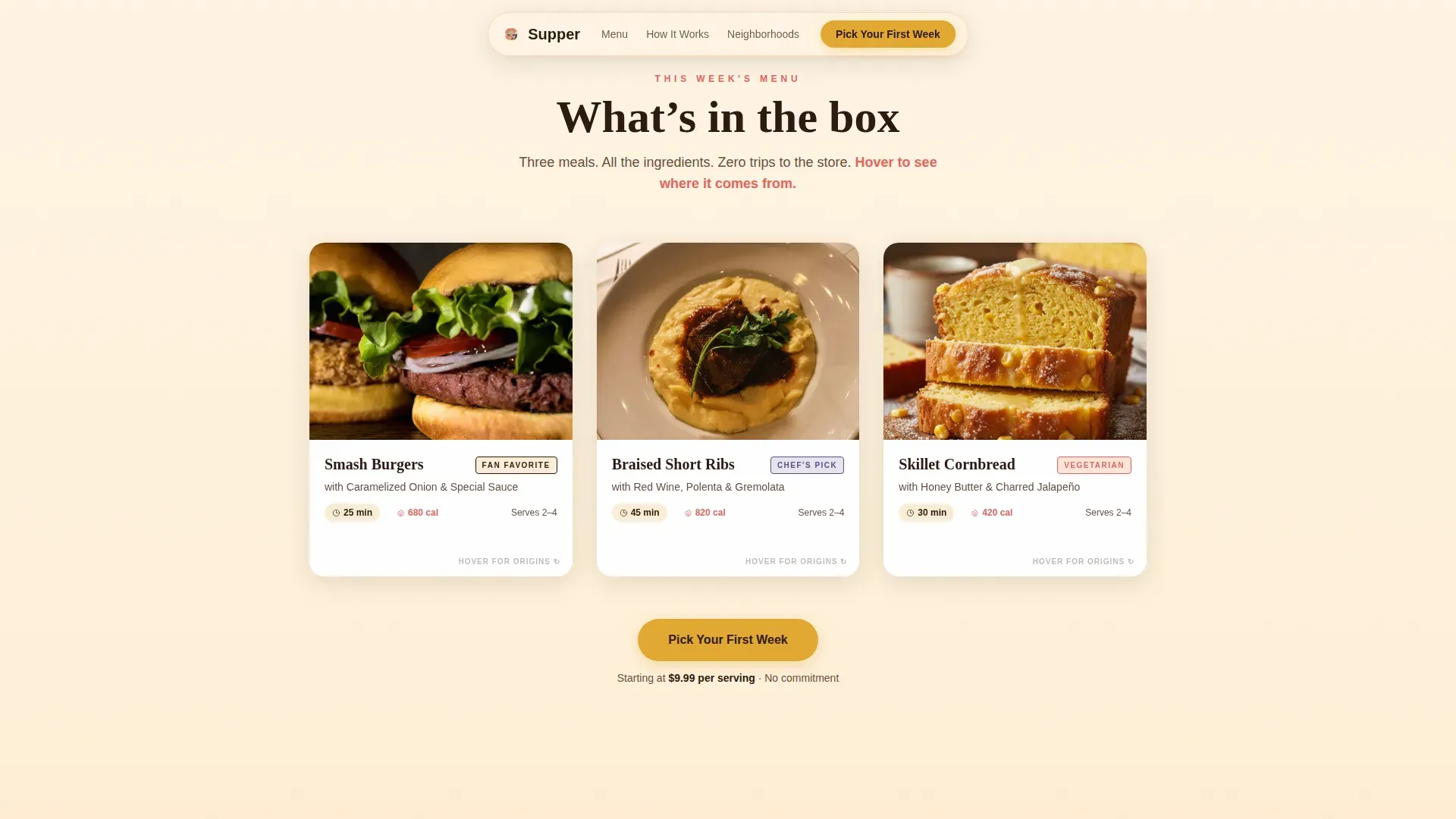
Each meal card in the first grid row shows a food photo on the front. On hover, the card flips to reveal ingredient origins linked to nearby farms and suppliers. This detail builds trust without adding page clutter.
Illustrated How-It-Works Row
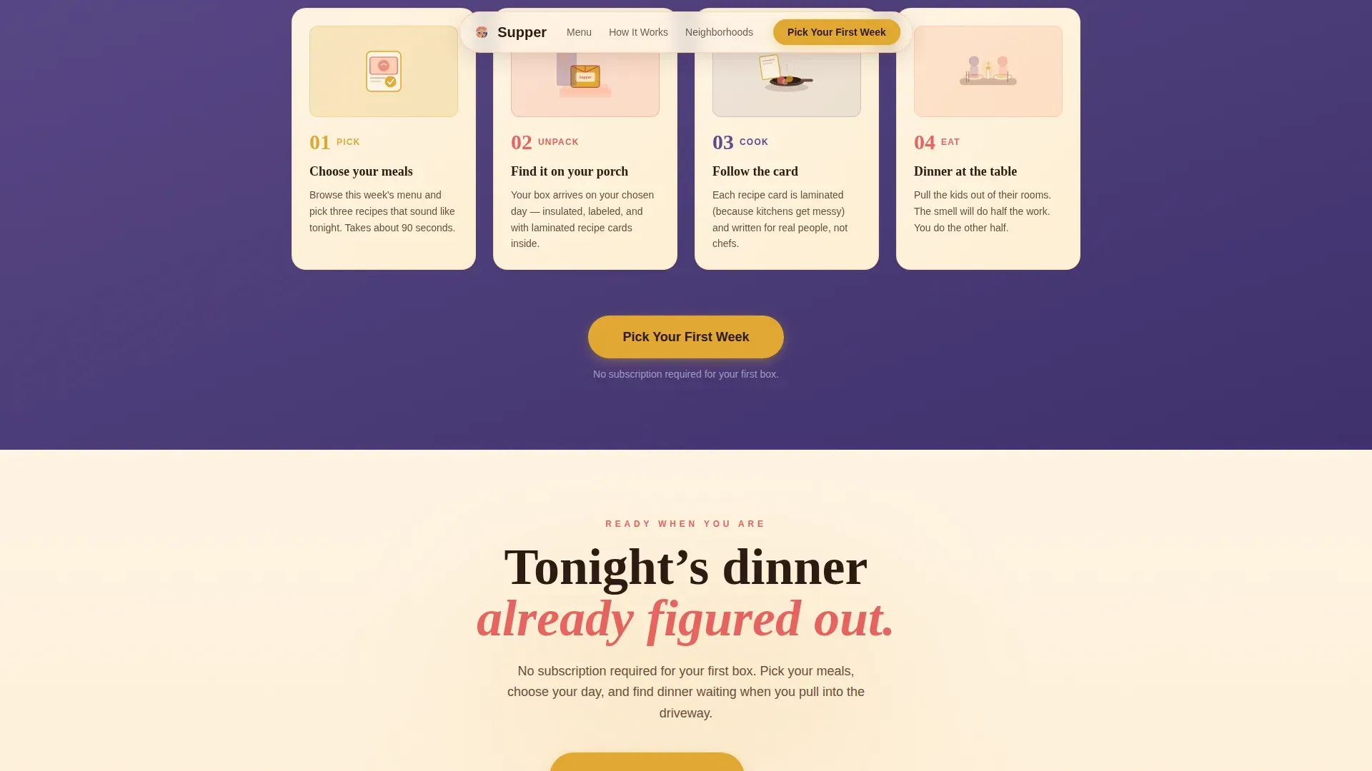
Four hand-drawn scene cards walk visitors through the subscription model: Pick, Unpack, Cook, Eat. The illustration style matches the header panorama, giving the page a cohesive, handcrafted feel from top to bottom.
Three-Step Scheduling Modal
The primary call-to-action opens a booking flow in three steps: select a delivery day, choose household size, then pick three meals from a visual menu with calorie and cook-time badges. A secondary "Gift a Week" text link serves visitors arriving to buy for someone else.
Sticky Mobile Call-to-Action Bar
On mobile, the primary action button stays fixed at the bottom of the screen throughout the scroll. This keeps the conversion path accessible without interrupting the food story above it.
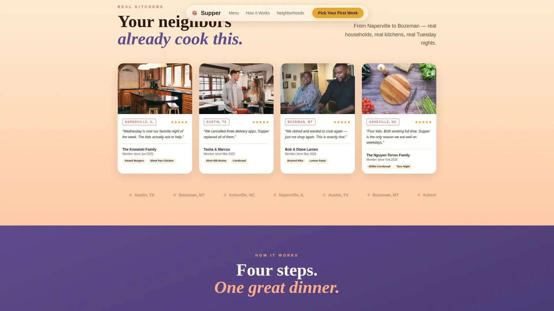
Neighborhood Spotlight Cards
The second card row features real customer kitchen photos styled like postcards, with the customer's city listed underneath. This social proof section connects food with place in a format that feels personal, not promotional.
Page sections overview
| Section | Purpose |
|---|---|
| Hero Illustration | Punchy headline, sunset panorama, primary call to action |
| This Week's Menu | Flip card grid showing meals and farm sourcing |
| Neighborhood Spotlights | Customer kitchen postcards with city stamps |
| How It Works | Illustrated Pick, Unpack, Cook, Eat card row |
| Scheduling Flow Modal | Three-step booking for day, size, and meal selection |
| Footer | Warm, minimal single-row footer with links |
Design & branding system
The design language blends nostalgia from 1960s to 1980s food culture with sharp modern layout. The typography pairs Fraunces, a rounded slab serif display font, with DM Sans for body copy. This mix of retro-inspired serif and clean sans-serif gives the page character while staying easy to read.
- Color palette: buttermilk canvas (#FFF5E4), warm peach (#FFAD85), deep coral (#E8625C), dusk purple (#5C4B8A) for footer and section backgrounds, accent mustard (#E2A832) on buttons and hover states
- Graphic elements carry a handcrafted, small-batch feel using flat illustration with subtle grain texture
- Background tints shift from buttermilk to soft peach as the visitor scrolls, mimicking a sky cooling toward evening
Mobile & speed optimization
The template is built mobile-first. Parents and couples on the go check food options on their phones, so the page prioritizes thumb-friendly layouts and clear visual hierarchy at every screen size.
- Sticky bottom call-to-action bar keeps the scheduling entry point visible on all mobile viewports
- Card grid reflows naturally from three columns on desktop to a single column on small screens
- Scroll-triggered reveals and float animations are scoped to client components, keeping static content light
How this template helps you convert
The page is structured so that by the time a visitor reaches the scheduling flow, they are already engaged with the food and the community around it.
- The hero section leads with appetite: a warm illustration, a clear headline, and an immediate call to action above the fold so visitors can get started without scrolling
- The menu grid and neighborhood spotlights build trust through food photography and real kitchen social proof before any pricing or form appears
- The three-step modal reduces friction at the moment of commitment, allowing visitors to choose meals visually before they finalize their order
Other information about this template
This template is part of a broader family of website templates and restaurant website templates designed for food-focused businesses. It works well for any company that wants to promote a food subscription and showcase its menu with warmth and personality.
- The Supper Neo-Retro Meal Kit Delivery Landing Page Template is listed free to access and customize on the platform
- No-code drag-and-drop building tools mean you can make changes to meals, promotions, and layout blocks without programming knowledge
- The page supports photo galleries in the neighborhood spotlight row and can accommodate social media links in the footer
- Customizable templates like this one allow easy updates to menu items, promotions, and pricing as your food business grows
- Restaurant website designs built on this template find it easy to maintain a consistent brand across landing pages and social media presence
- The reservation systems-style scheduling modal can be adapted for other food service booking contexts beyond meal kit delivery
Theme
Neo-Retro
Creative direction
Local & Neighborhood
Color system
Sunset Gradient
Style
Card Grid (Modular)
Direction
Booking/Scheduling
Page Sections
Flip Card Meal Menu Grid
Three-step Scheduling Modal
Sticky Mobile Action Bar
Neighborhood Spotlight Postcards
Illustrated How-it-works Cards
Sunset Gradient Scroll Experience
Related questions
Can I update the meal cards and menu each week without rebuilding the page?
Does this template work for a restaurant website or only meal kit delivery?
Is the three-step scheduling modal included in the template?
Do I need coding skills to customize this template?



