Supper — Retro Popup Landing Page Template
Supper is a single-column event landing page built for pop-up restaurant experiences. It pairs a neo-retro Sunset Gradient color system with gallery-paced scroll design and a UGC photo wall header to make visitors feel the evening before they commit. A four-field registration form, real-time seat counter, and a sticky "Claim Your Seat" call to action drive reservations with quiet urgency.
by Rocket studio
Quick summary
Supper is a one-page event landing page template designed for ephemeral restaurant experiences. It blends bold neo-retro design with a slow gallery-walk scroll rhythm, pulling food-obsessed visitors into the story of a 72-hour pop-up before presenting the registration form. Every section earns the click before asking for it.
Who this template is for
This template is built for anyone running a pop-up restaurant, supper club, or chef-driven dining event. It suits food entrepreneurs who want a landing page that feels as considered as the meal itself.
- Pop-up restaurant organizers promoting a limited-run dining event
- Guest chefs and culinary collectives who want to showcase their food story and signature dishes
- Food business owners ready to move customers from discovery to reservation in a single scroll
What problem this template solves
Most event pages rush to the registration form. They drop visitors into a wall of text and a booking button before they have any reason to care. That approach fails for experiential dining, where the atmosphere is the product.
- Visitors arrive from Instagram with high curiosity and low patience; the page must grab their attention instantly with strong food photography and an immersive layout
- Standard restaurant website templates do not convey the scarcity, intimacy, or energy of a 72-hour pop-up
- A poorly structured event page forces attendees to scroll and hunt for essential details like date, time, and location, losing them before the form ever appears
What you get with this template
You get a fully customizable, single-column flow landing page built to promote an ephemeral dining event from the first scroll to the final seat claim. Every section has a clear role in the storytelling sequence.
- A UGC photo wall header, a gallery-walk tasting menu section, a looping video block, and a four-field registration form with a live seat counter
- Neo-retro design with a Sunset Gradient color system, Fraunces display serif typography, and DM Sans body text, all ready to customize to match your event's brand
- Scroll-linked animations, a sticky call-to-action button, and mobile-first layout built for food discovery on any device
Feature list
This template is built around five tightly scoped design features. Each one serves the event registration goal without adding noise.
UGC Photo Wall Header
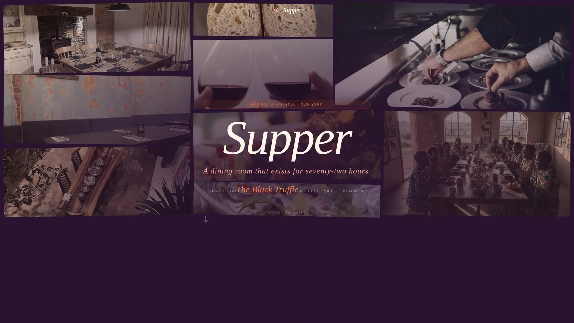
The header opens as an asymmetric mosaic of guest photos, candlelit table shots, and chef moments. Images carry a warm grain overlay and a desaturated film tone. The event name and date rise from the center in Fraunces serif, giving visitors the date, time, and location context above the fold before they read a single description line.
Gallery Walk Tasting Menu
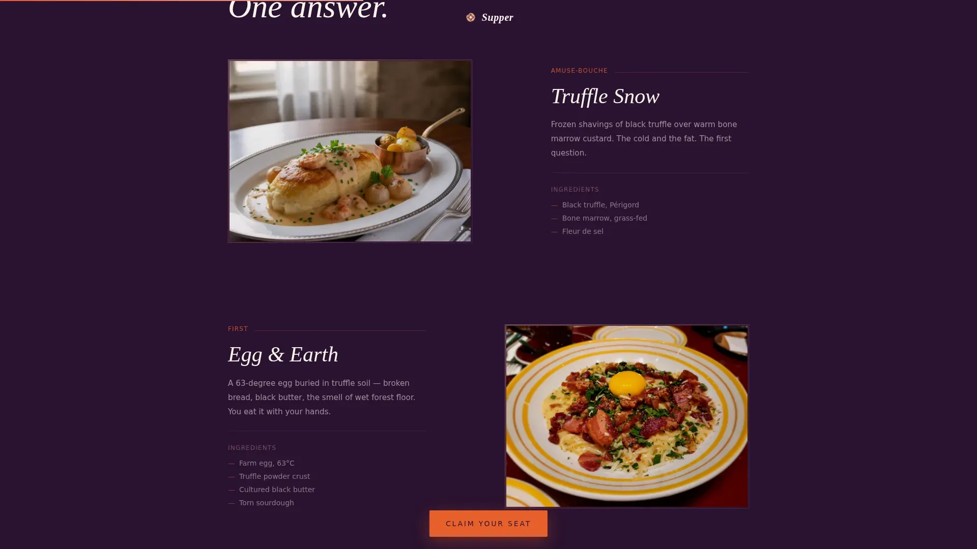
Each dish in the tasting menu occupies its own scroll-stop, presented like a painting on a gallery wall with ingredient notes as placard text beside each food photo. Scroll pacing slows deliberately as white space widens and type gets bolder. This approach lets you showcase signature dishes one at a time, making the menu feel like an unfolding event rather than a printed list.
Looping Video Block with Scarcity Signal
A short, muted looping video of a previous pop-up edition breaks the stillness near the bottom of the page. Handheld footage and ambient texture make the food life and energy feel real. The scarcity signal sits nearby, reinforcing the limited-seats message and building the urgency required to push visitors toward the form.
Four-Field Registration Form
The registration form asks only for name, party size via a one-to-four dropdown, preferred seating time, and any dietary needs. A live seat counter sits above the form, displaying remaining spots in real time. Keeping the form to four fields means the booking path stays frictionless and easy for attendees to complete on a phone.
Sticky Call-to-Action Button
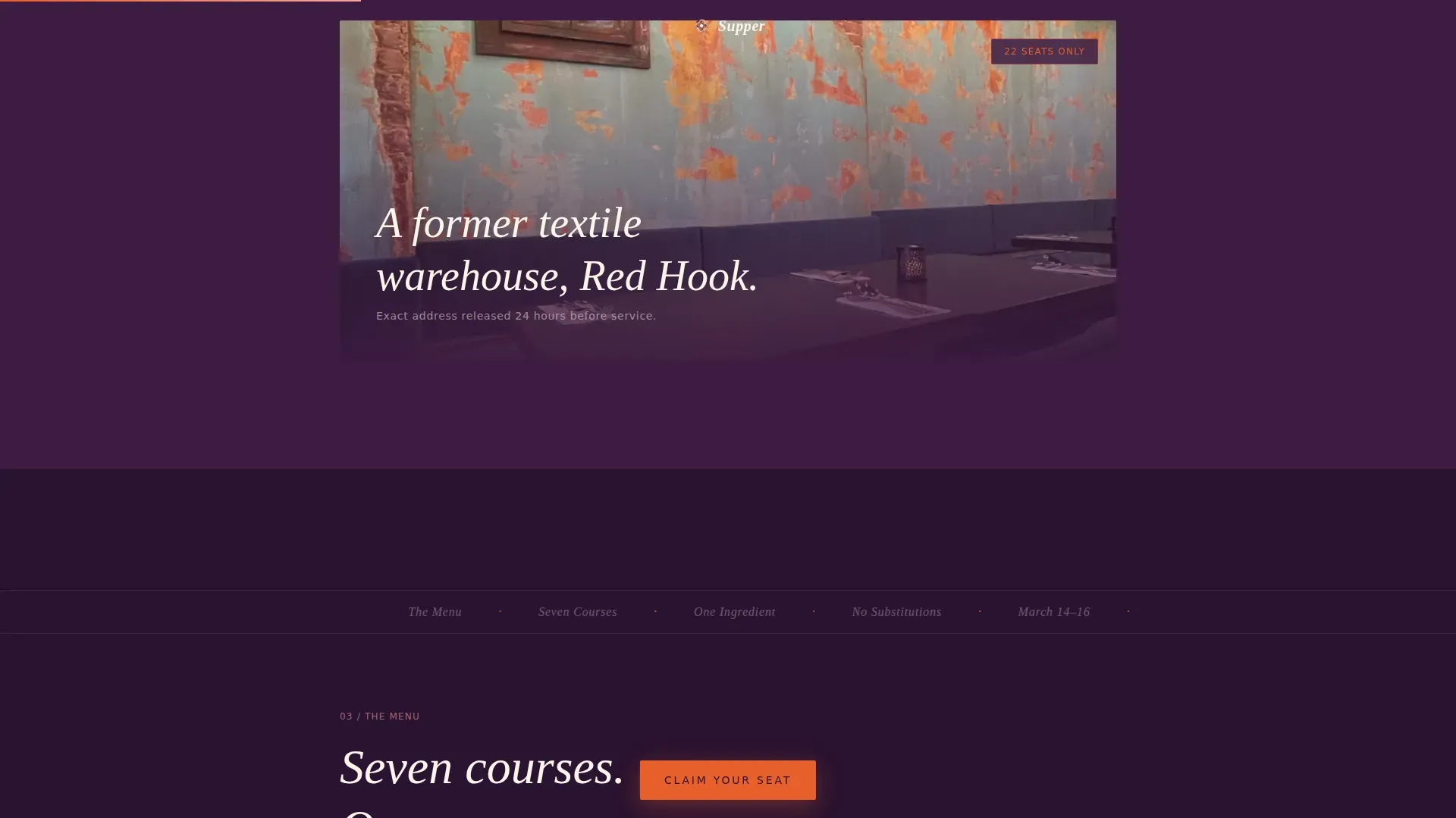
"Claim Your Seat" appears first after the tasting menu reveal in bold tangerine on deep plum. It then persists as a sticky button through the final scroll. The high-contrast design and action-oriented text guide visitors clearly toward registration without interrupting the storytelling rhythm of the page.
Page sections overview
| Section | Purpose |
|---|---|
| UGC Photo Wall Hero | Opens with guest photos and reveals event name, date, and location above the fold |
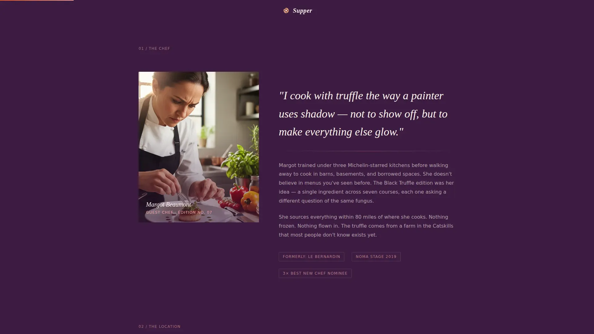
| Chef and Location | Split portrait and philosophy alongside a moody wide-shot of the venue |
| Gallery Walk Menu | One dish per scroll-stop with ingredient placard descriptions |
| Previous Edition Video | Looping muted footage from a past pop-up, paired with a scarcity signal |
| Registration and Seat Counter | Live remaining-seats counter above a four-field form with a primary call to action |
| Minimal Footer | Clean footer with essential links and no visual clutter |
Design & branding system
The design immediately establishes a neo-retro atmosphere through color, typography, and texture. The goal is to build emotional connections before a single word about registration appears.
- Sunset Gradient color system: deep plum (#3D1C42) anchors backgrounds and type; burnt tangerine (#E8602C) hits calls to action and date badges; faded rosé (#F2A7A0) washes dividers and hover states; warm cream (#FFF5EB) provides breathing space between sections
- Typography pairs Fraunces display serif for headlines and event branding with DM Sans for body text and form labels, creating a bold visual hierarchy that is easy to read at any size
- Corkboard-inspired photo layouts, grain overlays, Ken Burns image animation, and scroll-scrub text reveals bring a candlelit warmth that static restaurant website designs rarely achieve
Mobile & speed optimization
Food discovery happens on phones. This template is built mobile-first, because food photography scrolls best on a phone screen and most users will book from their mobile device.
- Single-column flow layout keeps every section readable on small screens without horizontal scrolling or pinching
- Images are lazy-loaded, grain texture is applied via CSS rather than heavy image files, and the looping video autoplays muted to keep the page light on any device
- The sticky call-to-action button stays visible throughout the mobile scroll, so the action is always one tap away
How this template helps you convert
A well-designed event landing page works like a sales machine when the layout stays focused and the food story earns the click. This template is structured so visitors feel the evening before they are asked to commit.
- The gallery-walk pacing and food photography pull visitors into the sensory experience first, so by the time they reach the registration form, skipping it feels like leaving a party early
- The live seat counter and "Limited Seats Available" framing create genuine urgency without resorting to gimmicks, making the choice to register feel natural and time-sensitive
- The frictionless four-field form with a high-contrast submit button removes every barrier between interest and a confirmed reservation, bringing the booking path to its shortest possible length
Other information about this template
This template belongs to the Food and Beverage category, within the Restaurant and Dining subcategory. It sits specifically in the Pop-Up Restaurant niche, making it a focused choice for ephemeral food business experiences rather than a generic restaurant website.
- The supper neo retro pop up dining event landing page template is fully customizable: swap colors, update the tagline, replace photos with your own food photography, and adjust the description text for each dish
- Users can download the template files and choose which sections to keep, reorder, or remove, allowing creative teams of any size to adapt it to fit each new edition of their event
- The layout supports multi-edition use; print new dates, update the seat counter, refresh the UGC photo wall images, and the page is ready for the next pop-up without rebuilding from scratch
- Teams can connect the site to google analytics to track visitor behavior, form submissions, and scroll depth across each event landing page run
- The clean, illustration-free design approach means the food photos and brand colors do the heavy visual lifting, keeping the page free from clutter that competes with the food story
- Thousands of event creators across the food and beverage category explore this style of experiential landing page to promote limited-run dining services; this template gives them a ready-made, structured starting point for sharing their event with the right audience
Theme
Neo-Retro
Creative direction
Gallery Walk
Color system
Sunset Gradient
Style
Single Column Flow
Direction
Event Registration
Page Sections
UGC Photo Wall with Text Reveal
Gallery Walk Tasting Menu
Looping Video with Scarcity Messaging
Four-field Registration Form
Sticky Call-to-action Button
Related questions
Can I use this template for multiple pop-up events?
How many fields does the registration form include?
Can I customize the colors and fonts to match my event brand?
Is this template suitable for a food business that runs regular pop-ups?
Does the template include space for guest testimonials or social proof?



