Precision Logistics Landing Page Template
Supplyflow is a single-page landing page template built for digital supply chain consultancies. It pairs an animated trade-corridor header with a structured before-and-after comparison table, a five-phase methodology timeline, and two B2B conversion paths. The result is a page that communicates deep operational credibility before a prospect ever books a call.
by Rocket studio
Quick summary
Supplyflow is a precision-built landing page template for supply chain consultancies that need to earn trust fast. It opens with a live-rendered network map, moves into a six-row comparison table with real benchmark deltas, and closes with two qualification-driven conversion forms. Every design decision reinforces one message: this firm knows the data.
Who this template is for
This template is built for consultancies operating at the intersection of logistics strategy and data-driven decision-making. If your firm advises VP-level supply chain leaders, procurement directors managing hundreds of origin SKUs, or COOs navigating port congestion and cost overruns, this page is designed to speak their language directly.
- Supply chain consultancies targeting mid-market manufacturers and retail conglomerates
- Logistics advisory firms that lead with benchmarks, methodologies, and measurable outcomes
- Digital transformation practices focused on inventory optimization, forecast accuracy, and supplier risk
What problem this template solves
Most professional services landing pages describe what a firm does without showing what changes. Prospects at the VP and COO level need to see proof of methodology, not a brochure. This template solves the credibility gap by leading with data and making the engagement process fully transparent before any conversation begins.
- Visibility gaps and vague service descriptions that fail to qualify serious B2B buyers
- Generic layouts that cannot carry the weight of complex logistics value propositions
- Conversion flows that rely on a sales call too early, losing prospects who are still in research mode
What you get with this template
You get a complete single-page layout structured around transparent, data-led persuasion. Every section is purpose-built to move a senior operations buyer from skepticism to action, without asking them to trust what they cannot yet see.
- An animated supply chain map header with live trade-corridor nodes and teal-highlighted data callouts
- A six-row before-and-after comparison table with signal teal delta highlights and anonymized client benchmarks
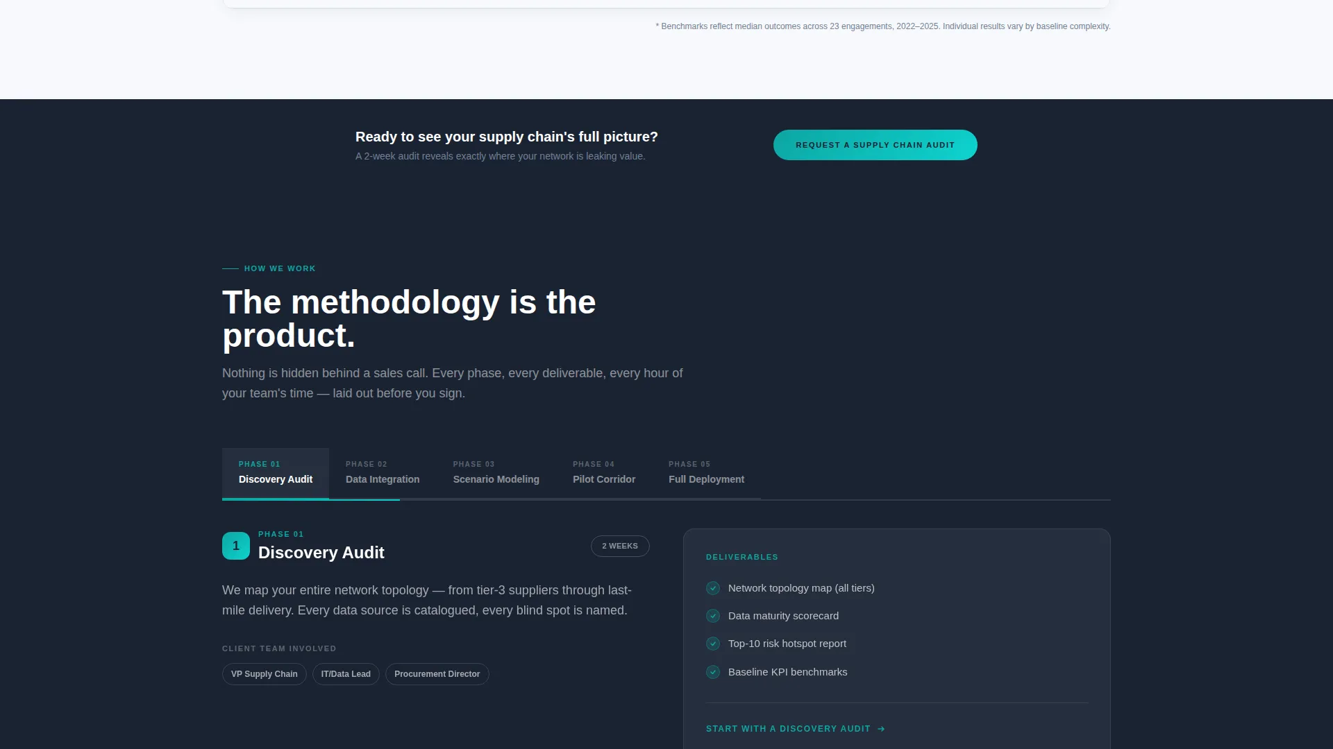
- A five-phase horizontal methodology timeline with expandable phase details covering deliverables, duration, and client team involvement
- A primary audit request form collecting company name, shipment volume, origin country count, and pain-point qualification
- A secondary gated download path for a benchmark report, capturing earlier-stage prospects by email only
Feature list
This section walks through the core built-in components and what each one contributes to the overall page experience.
Animated Trade-Corridor Header
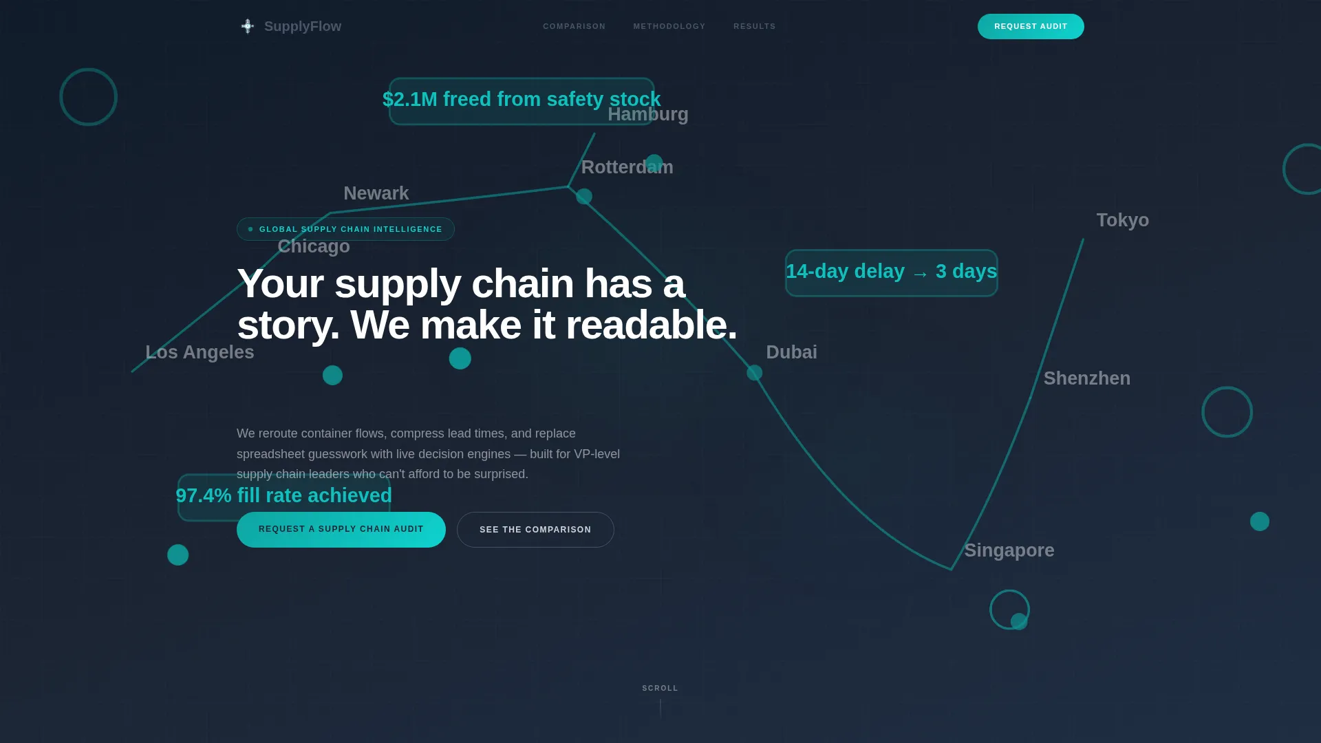
The header renders an interactive supply chain map across the full viewport. Nodes light up along real trade routes, thin teal lines trace container paths, and data callouts fade in at chokepoints showing specific metric improvements. A headline types itself in over the animation, grounding the visual story in a single clear idea.
Before-and-After Comparison Table
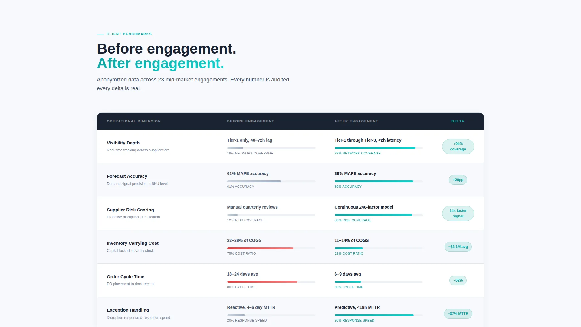
The comparison table contrasts six operational dimensions across two states: before engagement and after engagement. Each row references anonymized client benchmarks. Delta values are highlighted in signal teal, making the performance gap immediately scannable for a data-literate executive audience.
Five-Phase Methodology Timeline
A horizontal timeline walks through Discovery Audit, Data Integration, Scenario Modeling, Pilot Corridor, and Full Deployment. Each phase is expandable on click, revealing deliverables, estimated duration, and which members of the client team are expected to participate. The transparency of this section removes the need for a discovery call to understand scope.
Dual Conversion Path System
The template includes two distinct conversion entry points. The primary path is a pinned audit request form with business-qualifying fields. The secondary path is a gated benchmark report download requiring only a work email, designed to capture prospects who are still evaluating options.
B2B-Qualified Lead Form
The audit request form is designed to pre-qualify leads before they reach the sales team. It collects company name, annual shipment volume range via dropdown, number of origin countries, and a four-option pain-point radio selector covering visibility gaps, forecast inaccuracy, supplier fragility, and cost overruns. Personal email domains are not accepted, reinforcing a business-only audience.
Corporate Precision Design System
The visual identity uses an Arctic White color system with four precisely assigned roles: glacier white for backgrounds, steel-wire gray for body text and table borders, deep operations navy for headers and data-dense regions, and signal teal reserved exclusively for interactive states and key metrics. The palette communicates zero tolerance for ambiguity.
Page sections overview
| Section | Purpose |
|---|---|
| Animated map header | Opens with a live trade-corridor network and a typed headline to establish data credibility immediately |
| Comparison table block | Contrasts before-and-after benchmarks across six operational dimensions with teal-highlighted deltas |
| Pinned audit call to action | Locks the primary conversion form in place after the table so it stays visible as the prospect scrolls |
| Methodology timeline | Reveals the five-phase engagement process with expandable deliverable details per phase |
| Benchmark report download | Offers a gated secondary asset to capture research-stage prospects via email |
| Page bottom call to action | Repeats the audit request form at the end of the scroll flow for final conversion |
Design & branding system
The template follows a Corporate Precision theme built on the Arctic White color system. Every color assignment is intentional and carries a specific functional role on the page, giving the layout a calibrated, instrument-panel quality.
- Glacier white (#F7F9FC) for all background regions, deep operations navy (#1A2332) for headers and data-heavy sections, and steel-wire gray (#4A5568) for body text and table borders
- Signal teal (#0EA5A2) used exclusively for interactive states, progress indicators in the methodology timeline, and benchmark delta values in the comparison table
- No stock photography anywhere on the page; the animated network map and data callouts replace imagery with live operational context
Mobile & speed optimization
The template is structured to deliver a coherent experience across screen sizes. The data-heavy comparison table and methodology timeline are designed to reflow cleanly on smaller viewports without losing their analytical readability.
- The comparison table adapts to narrower screens so row labels and delta values remain legible on mobile devices
- The methodology timeline collapses to a vertical scroll pattern on small screens, keeping phase details accessible without horizontal overflow
- Lightweight animation design for the header map keeps the visual introduction functional across a range of device contexts
How this template helps you convert
The page is engineered around a single conversion strategy: earn trust through transparency before asking for anything. Two conversion paths are built in to capture prospects at different stages of readiness.
- The before-and-after comparison table with teal delta highlights creates an immediate proof moment, giving senior buyers a data-backed reason to stay on the page and consider the primary audit request form.
- The gated benchmark report acts as a low-commitment secondary conversion, collecting work emails from research-stage prospects who are not yet ready for a direct conversation but want verifiable industry data.
Other information about this template
This template is categorized under Professional Services, specifically within the Supply Chain and Procurement subcategory, targeting the Digital Supply Chain Consultant niche. It is suited for firms that position around measurable operational improvement rather than general advisory credentials.
- The Intersection Match Score for this template's category, subcategory, and niche alignment is 13, indicating a strong fit between template structure and audience intent
- The page direction is Partnership and B2B engagement, meaning all structural and copy decisions prioritize senior-level qualification over broad awareness
- The template style is a Comparison Table layout, a format with proven effectiveness for consultancies that need to demonstrate delta value before a sales conversation
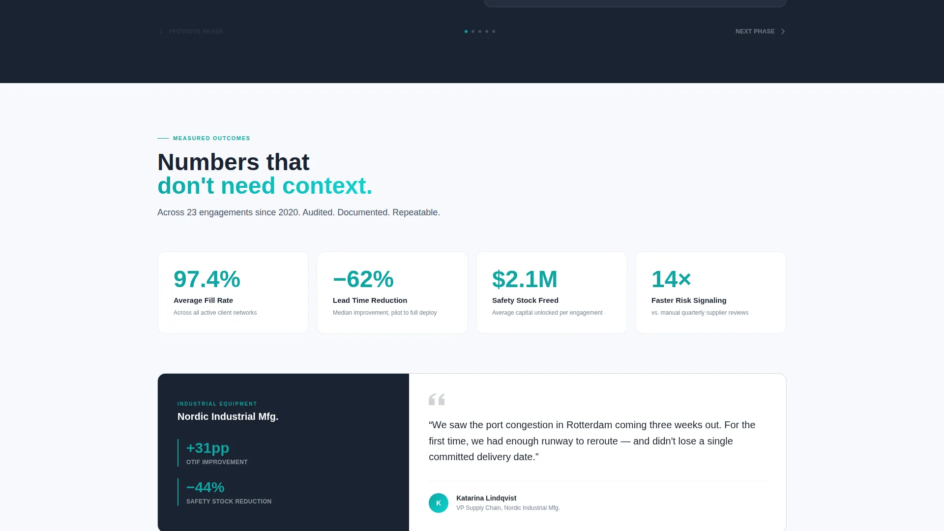
- The Creative Direction is Transparent Process, which means the methodology is surfaced on the page itself rather than reserved for a proposal document
- The Header Concept is Data Storytelling, executed through the animated supply chain map rather than photography or abstract illustration
Theme
Corporate Precision
Creative direction
Transparent Process
Color system
Arctic White
Style
Comparison Table
Direction
Partnership/B2B
Page Sections
Animated Trade-corridor Map Header
Six-row Comparison Table
Five-phase Methodology Timeline
Dual B2B Conversion Paths
Business-qualified Lead Form
Corporate Precision Color System
Related questions
Can I edit the comparison table rows to match my firm's specific metrics?
What makes the header animation different from a standard hero section?
How does the dual conversion path work in practice?
Is the methodology timeline editable for different engagement models?
Who is the ideal user of this template?



