Trusted Mission Consulting Landing Page Template
The Steward template is a single-page nonprofit management consulting landing page built around editorial authority and institutional credibility. It pairs a typographic press-mentions header with zigzag transformation stories, client logo clusters, and a low-friction booking form. Consultants get a professional, field-manual aesthetic that moves executive directors and board leaders toward a diagnostic call.
by Rocket studio
Quick summary
Steward is a nonprofit management consulting landing page template designed for operational consultants who serve executive directors and board leadership in crisis. It opens with a press-mentions bar and a confident serif headline, then scrolls through alternating case-study sections before landing on an embedded scheduling form and a Board Health Checklist lead magnet.
Who this template is for
This template is built for consulting professionals who work inside the nonprofit sector at the operational level. It speaks directly to the reality these consultants navigate every day: compliance gaps, lapsed grants, and leadership transitions with no succession plan in sight.
- Independent consultants and boutique agencies who support mid-size nonprofit organizations with budgets between $500K and $2M
- Consulting firms that want a professional website presence reflecting field-manual authority rather than corporate polish
- Practitioners who serve founding executive directors, board chairs inheriting troubled organizations, and interim program leadership
What problem this template solves
Most generic consulting landing pages feel built for corporate strategy firms, not for the people who actually sit across the table from a nonprofit executive director at hour seventy of a compliance audit. The template closes that gap.
- Consultants lose credibility when their website pages do not reflect the specific, high-stakes environment their clients face
- Generic layouts force nonprofit consultants to adapt materials built for commercial business, diluting the trust signals their audience needs
- Without a structured booking flow, qualified visitors leave without taking action, reducing conversion rates and wasting hard-earned referral traffic
What you get with this template
You get a fully structured nonprofit landing page with every section already planned and sequenced for maximum persuasion. No blank-canvas decisions and no wasted hours arranging components from scratch.
- A press-mentions marquee bar, three zigzag transformation sections, a scheduling form with organization-size intake fields, and a lead-magnet capture block
- An editorial Ink and Paper visual system using archival black, warm parchment, marginalia gray, and editorial red as a deliberate accent
- A Fraunces serif headline stack paired with DM Sans body text, tuned for boardroom-ready readability and professional authority
Feature list
This template is built around a defined set of capabilities drawn directly from the brief. Every feature below serves a specific conversion or credibility function on the page.
Press Mentions Authority Bar
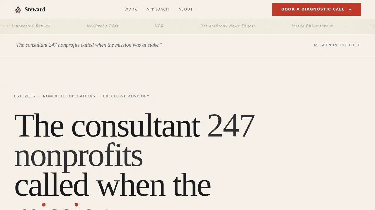
The header opens with a horizontal marquee scroll of publication logos rendered in monochrome against the parchment background. This gives visitors an immediate, wordless first impression of institutional credibility before they read a single line of body copy. The bar sets the standard for the proof accumulation that follows on every scroll.
Zigzag Alternating Case Study Layout
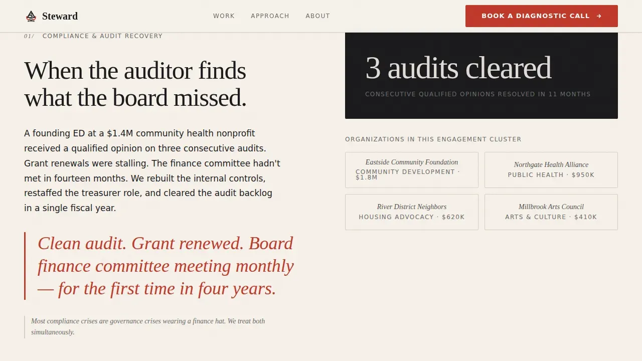
Three alternating sections each pair a client logo cluster with a specific transformation story. One example: board giving increased by 340% in 18 months beside community foundation logos. The layout alternates sides on each scroll, keeping visitors engaged and building confidence through accumulated evidence rather than louder claims.
Embedded Diagnostic Booking Form
The scheduling section includes an embedded calendar-style form that captures organization name, annual budget range, and a single free-text field asking what is keeping the prospect up at night. This low-friction approach promises a consultation rather than a sales pitch, which is exactly the tone needed to convert visitors who are already in a leadership crisis.
Board Health Checklist Lead Magnet
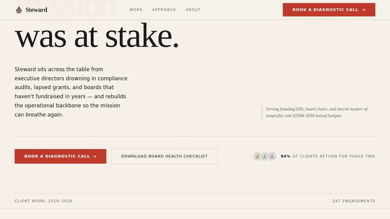
A secondary conversion path offers a downloadable Board Health Checklist in exchange for an email address. This resource-download strategy demonstrates expertise without requiring an initial financial commitment, giving prospects who are not yet ready to book a tangible reason to stay connected and a clear example of the consultant's thinking.
Editorial Red Call-to-Action System
The primary call-to-action button, labeled "Book a Diagnostic Call," appears first beneath the header logos and resurfaces at each zigzag section transition. It is rendered exclusively in editorial red (#C0392B), making every instance visually distinct against the parchment background and commanding immediate attention from visitors scanning the page.
Typographic Headline Architecture
The page uses no hero images or stock photography. Instead, a large Fraunces serif headline carries the full persuasive weight of the above-the-fold section. This minimalist design approach prioritizes typographic authority, which aligns with how the target audience reads: quickly scanning for signal, not imagery.
Page sections overview
| Section | Purpose |
|---|---|
| Press Mentions Bar | Establishes institutional credibility through publication logos on load |
| Typographic Hero Headline | Delivers the core value proposition with serif authority |
| Primary call to action Block | Prompts immediate booking action below the header logos |
| Zigzag Section One | Pairs compliance audit story with community foundation logo cluster |
| Zigzag Section Two | Shows board fundraising transformation beside health nonprofit logos |
| Zigzag Section Three | Addresses succession and interim leadership with capacity-building logos |
| Diagnostic Booking Form | Captures organization context and schedules a consultation call |
| Lead Magnet Block | Offers Board Health Checklist download in exchange for email |
| Footer Row | Closes with a single linear row of contact and navigation elements |
Design & branding system
The visual identity follows an Educational Guide theme using the Ink and Paper color system. Every design decision is made to feel like a well-printed policy brief on heavy cotton stock, not a scrolling social feed.
- Color palette: warm parchment (#F5F0E8) dominates backgrounds, archival black (#1B1B1E) carries all body text, marginalia gray (#6B6B6B) supports secondary labels, and editorial red (#C0392B) appears only on calls to action and pull quotes
- Typography: Fraunces serif for all headlines and editorial pull quotes, DM Sans for body copy, creating a modern aesthetic that feels authoritative without being cold
- Visual strategy: no hero photography, no stock imagery of diverse hands or generic office scenes; logo walls and typographic hierarchy do all the persuasive work, keeping the brand signal clean and consistent
Mobile & speed optimization
The template is built desktop-first, reflecting the reality that the primary audience, executive directors and board chairs, typically make decisions from a laptop or desktop in a boardroom setting. Full mobile responsiveness is still built in.
- Responsive layout ensures the zigzag sections, marquee bar, and booking form all reflow cleanly across mobile devices without losing hierarchy or legibility
- Static server-rendered sections handle all non-interactive content, while the booking form and lead-magnet capture fields use client-side rendering to keep the page feeling fast
- Loading speed is a direct factor in bounce rate, so the template keeps asset weight low by relying on typography and logo SVGs rather than large image files
How this template helps you convert
Nonprofit consultants need landing pages that do more than look professional. This template is structured so that every scroll deepens trust and every section transition offers a clear next action.
- The press-mentions bar and typographic headline establish a strong first impression and build trust before visitors read a single service description, reducing early bounce rate and keeping attention on the page
- The zigzag case study sections showcase specific metrics and success stories rather than vague praise, which supports data driven decisions among skeptical executive-director prospects who have seen too many overpromised consulting engagements
- The dual conversion path, a direct booking form plus a lead-magnet checklist download, means the page can convert visitors at two different readiness levels, improving overall conversion rates without adding friction to either path
Other information about this template
This template is especially well suited for consultants who want to promote their services through a focused single-page experience rather than a multi-section website. It reflects best practices for nonprofit landing page design: clean layout, clear hierarchy, and trust signals placed at every critical role in the scroll journey.
- The steward trusted nonprofit management consulting landing page template is available as a ready-to-use starting point, allowing consultants to save significant time and money compared to building a bespoke site from scratch
- A landing page builder with no-code editing tools can be used to customize the template without requiring coding skills, making it practical for small agencies and solo consultants who need to move quickly
- The template supports transparent reporting of transformation metrics through its zigzag case study layout, giving organizations a structured way to showcase measurable improvement and long term growth
- Nonprofit landing pages built on this template can connect with email marketing and social media campaigns to promote community programs and charity initiatives, extending the reach of each diagnostic call offer
- The donation page pattern is not the primary focus here, but the same trust architecture that powers high-performing donation page designs, visible credibility, clear calls to action, and low-friction forms, is embedded throughout this template's structure
- Consultants can use the page to display detailed information about their services and showcase the foundation of their methodology without overwhelming visitors, keeping the environment focused and the decision making path clear
- Search engines index the clean semantic structure of the page, which supports visibility for consultants investing in organic growth alongside their referral and press-driven traffic

Theme
Educational Guide
Creative direction
Logo Wall Authority
Color system
Ink & Paper
Style
Zigzag/Alternating
Direction
Booking/Scheduling
Page Sections
Press Mentions Authority Bar
Zigzag Case Study Sections
Diagnostic Booking Form
Board Health Checklist Lead Magnet
Editorial Red Call to Action System
Typographic Headline Architecture
Related questions
Can I customize the colors and typography to match my consulting firm's brand?
Does the template include the scheduling form, or do I need to connect my own tool?
Is this template useful for consultants who serve larger nonprofits above $2M in annual budget?
How does the Board Health Checklist lead magnet section work?
Can a nonprofit organization use this template for its own donor-facing website?



