Bold Asian-Owned App Upgrade Landing Page Template
Surge is a bold, layered landing page template built for an Asian-owned dev shop targeting free-tier users ready to upgrade. It blends Neo-Retro energy with a Dopamine Pop color system, interactive scroll moments, and a frictionless one-click upgrade flow. Every section earns the next scroll with playful animations, a usage-comparison widget, and a sticky Pro upgrade call to action.
by Rocket studio
Quick summary
Surge is a single-page upgrade landing page for a scrappy, Asian-owned consumer app studio. The template layers bold Neo-Retro visuals over a practical upsell flow. Free-tier users land, see their own usage stats reflected back at them, and get gently confronted with why going Pro makes sense. The design rewards every scroll with something unexpected.
Who this template is for
This template is built for founders and creators who already have an audience on a free tier and need a compelling page to convert them into paying users. It fits teams with a strong visual identity who want personality, not polish-for-polish's-sake.
- College students and first-gen founders managing multiple side projects on a free plan
- Young creatives who have hit usage limits and need a clear, low-friction path to upgrade
- Small dev shops or indie app studios looking for a punchy, opinionated landing page
What problem this template solves
Getting free-tier users to upgrade is hard. Generic pricing pages feel cold. A wall of features means nothing if the visitor can't see how those features apply to their own situation. Surge fixes this by making the upgrade decision feel personal and obvious.
- Free users often don't realize how close they are to needing Pro until they see their own data
- Standard pricing pages fail to create emotional pull or a sense of reward for upgrading
- Most upgrade flows have too many steps, killing momentum right when interest peaks
What you get with this template
Surge delivers a complete, one-page upgrade experience with a strong visual identity baked in from the first pixel. Every section is designed to move the visitor forward without letting energy drop.
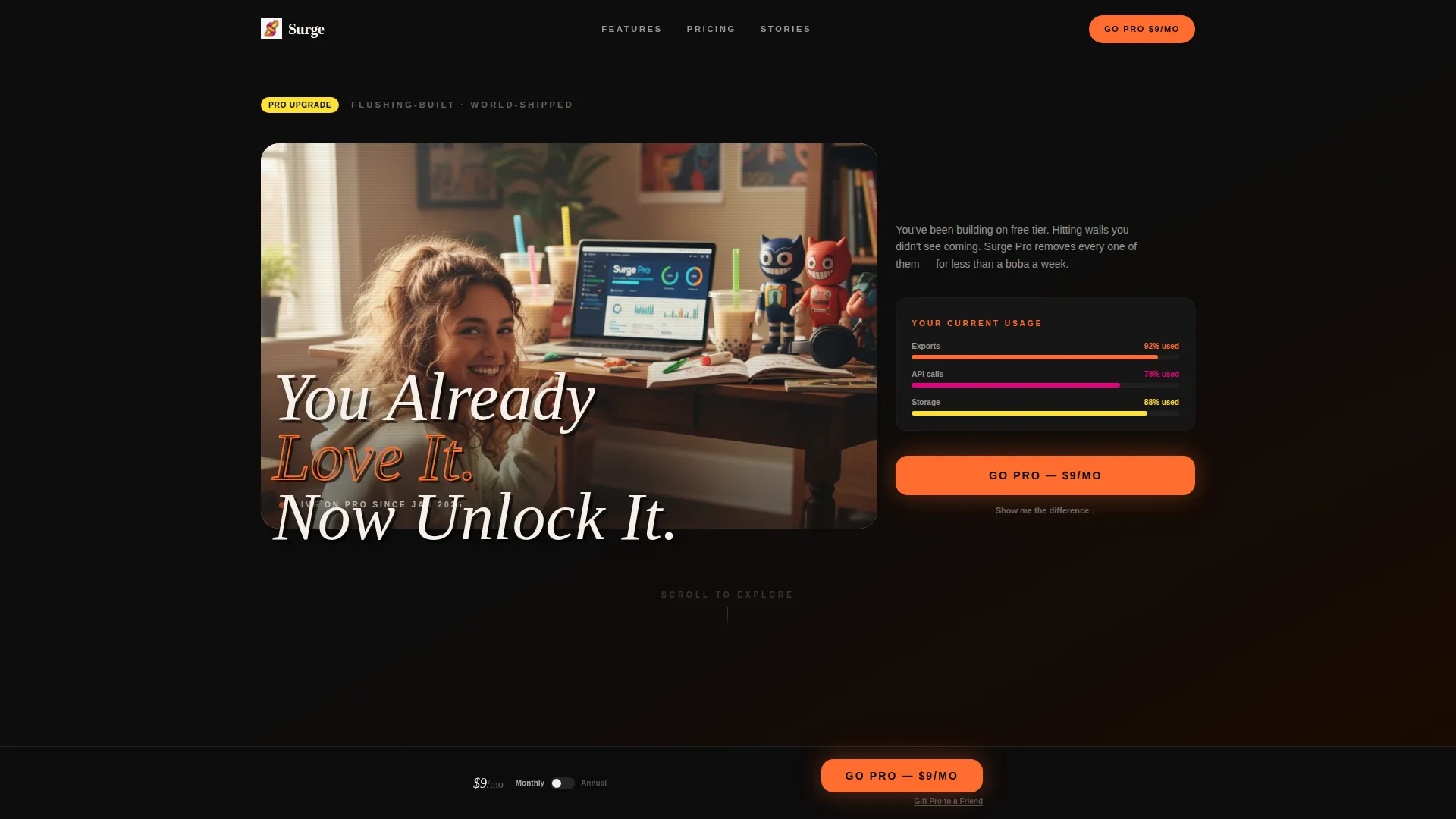
- A lifestyle hero section with an overlapping tilted headline and shallow-depth-of-field photography direction
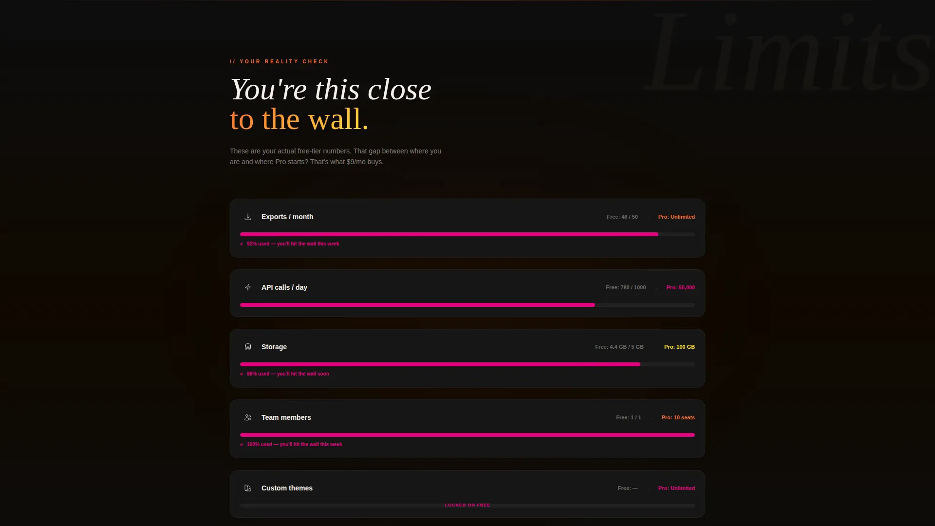
- A live usage-comparison widget section, stacked peeling card animations, and a sticky floating upgrade bar
- A confetti confirmation modal, a pixel-cat easter egg, and a monthly/annual pricing toggle
Feature list
A brief note: every feature below comes directly from the template's design and interaction brief. Nothing is assumed or added beyond what the page delivers.
Overlapping Hero with Tilted Headline
The header uses a lifestyle photograph shot slightly from above, featuring a young woman on a cluttered desk with the app dashboard glowing on screen. A chunky retro-pixel headline overlaps the image at a slight tilt, styled to look as if it was printed on acetate and physically placed on top of the photo.
Live Usage Comparison Widget
The first scroll section slides in a side-by-side comparison of the visitor's actual free-tier usage stats against Pro plan limits. The widget is personalized, confrontational in a playful way, and designed to make the upgrade decision feel self-evident rather than sales-driven.
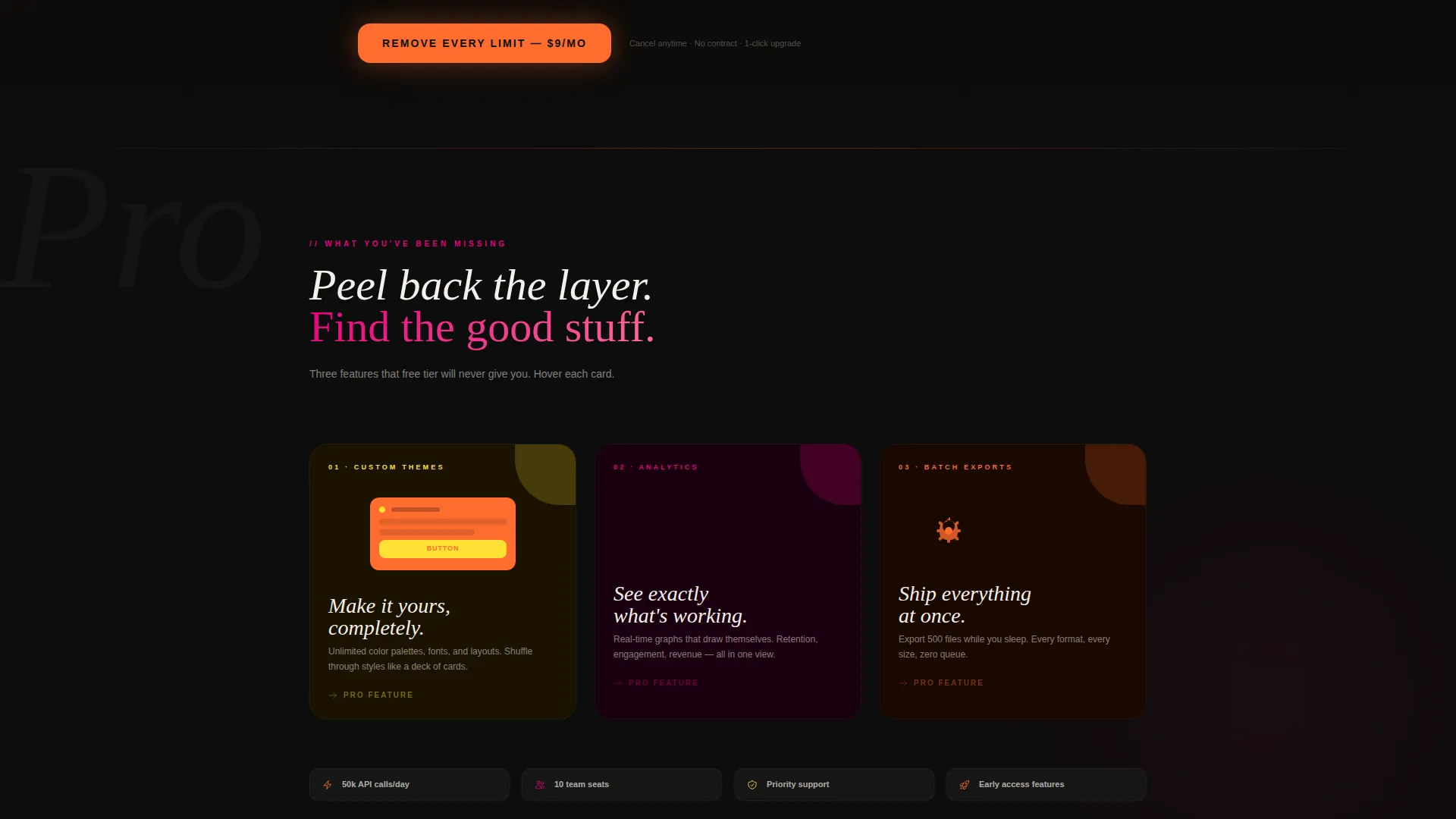
Stacked Peeling Card Animations
Pro features are revealed through stacked cards that physically peel away like Post-it notes as the user scrolls. Each card exposes a feature with a looping micro-animation: batch exports whirring, analytics graphs drawing themselves, and custom themes shuffling like a deck of cards.
Pixel Cat Easter Egg
A hidden pixel cat dashes across the screen when the user scrolls fast enough. This small moment of surprise reinforces the brand's playful personality and rewards curious, engaged visitors without interrupting the conversion flow.
Sticky Floating Upgrade Bar
A floating bottom bar appears after the usage-comparison section and stays pinned as the visitor continues scrolling. The primary call to action reads "Go Pro for $9/mo" with a secondary text link below it reading "Gift Pro to a Friend," opening a viral gifting path.
Monthly and Annual Pricing Toggle
A pricing toggle lets visitors flip between monthly and annual billing. The annual option pulses once in magenta to draw the eye without being aggressive. One click authenticates via the visitor's existing account, and a confetti confirmation modal closes the loop.
Page sections overview
| Section | Purpose |
|---|---|
| Hero lifestyle header | Establishes brand energy and frames the upgrade narrative |
| Usage comparison widget | Personalizes the case for upgrading with real free-tier data |
| Peeling Pro feature cards | Reveals Pro features through scroll-driven card animations |
| Pricing toggle section | Presents monthly and annual options with a magenta pulse accent |
| Sticky upgrade bar | Keeps the primary call to action visible throughout the scroll |
| Confetti confirmation modal | Closes the dopamine loop after a successful upgrade action |
Design & branding system
The visual identity runs on a Dopamine Pop color system anchored in four colors. Every shade has a role, and none of them fight for attention without purpose. The result feels like a well-curated arcade cabinet: loud in the right places, disciplined everywhere else.
- Electric tangerine (#FF6D2E) and arcade-cabinet magenta (#E4007C) trade off as section accent colors across the page
- Synthetic banana (#FFE135) handles micro-interaction highlights and hover states, while deep CRT black (#0D0D0D) anchors the background
- Body text sits in warm off-white (#F5F0EB) to soften contrast without losing energy, and headlines use a chunky retro-pixel typeface
Mobile & speed optimization
The page is built with a single-page, section-led layout that keeps the interaction hierarchy clear on smaller screens. Scroll-driven animations and the sticky upgrade bar are designed to work naturally in a mobile browsing context.
- The floating upgrade bar and pricing toggle are sized for thumb reach on phone screens
- Stacked card animations and the usage widget maintain their interaction logic on touch-based scroll gestures
- The one-click account authentication flow removes form friction, which matters most on mobile
How this template helps you convert
Surge is engineered around a single conversion goal: turn a free-tier user into a Pro subscriber in as few steps as possible. Every design and interaction decision serves that goal.
- The usage-comparison widget makes the upgrade decision feel personal before any pricing information appears, reducing resistance and increasing relevance.
- The sticky floating bar keeps "Go Pro for $9/mo" visible at all times after the comparison section, so the call to action is always one tap away.
- The one-click account authentication and confetti modal compress the post-decision experience into a rewarding, near-instant confirmation.
Other information about this template
Surge is a Neo-Retro themed landing page template designed for an Asian-owned tech business context. It fits naturally within the Asian-Owned Business category and can serve as a reference point for founders who want to express cultural identity through bold, opinionated design rather than defaulting to generic SaaS aesthetics.
- The template style follows a Gallery and Detail approach, meaning feature moments get generous visual space to breathe before the next section begins
- The creative direction is rooted in a Comparison Journey, where the visitor's own situation is the opening argument rather than a list of abstract benefits
- The header concept uses a Full-Bleed Photo format, giving the lifestyle image room to set tone before any product detail appears
Theme
Neo-Retro
Creative direction
Comparison Journey
Color system
Obsidian & Gold
Style
Gallery + Detail
Direction
Marketplace/Multi
Page Sections
Overlapping Hero with Tilted Headline
Live Usage Comparison Widget
Stacked Peeling Card Animations
Sticky Floating Upgrade Bar
Monthly and Annual Pricing Toggle
Confetti Modal and Pixel Cat Easter Egg
Related questions
Who is this landing page template designed for?
Can I customize the colors and typography?
Does the usage comparison widget require a live data connection?
Is this template suitable for a physical product store or retail page?
What makes the 'Gift Pro to a Friend' link different from the main call to action?



