Premium Whole Grain Supplement Landing Page Template
The Nourish Whole Grain Ferment Supplement landing page template is a single-page, masonry-style layout designed for macrobiotic supplement brands. Built around a Neo-Retro Parchment and Rust visual identity, it blends before/after ingredient storytelling, a full-screen video hero, and trust-building micro-proof elements to guide visitors toward a product collection click-through.
by Rocket studio
Quick summary
The Nourish landing page template is purpose-built for whole-food supplement brands that lead with craft and ingredient honesty. It uses a masonry grid layout, cinematic video, and a before/after reveal mechanic to nourish visitor trust before any purchase decision. Every section is designed to move health-conscious customers from curiosity to confident click-through.
Who this template is for
This template is a strong fit for founders and brand owners operating in the macrobiotic food and wellness space. It suits anyone who wants to build credibility through ingredient storytelling rather than generic supplement claims. Whether you are sharing a diet plan built around fermented whole grains or inviting a nutritionist community to learn more, this layout gives you the structure to do it well.
- Macrobiotic supplement brand owners launching a direct-to-consumer landing page
- Wellness practitioners and nutritionist professionals restocking or recommending health supplements
- Health-focused creators building a diet and nutrition brand with a strong visual identity
What problem this template solves
Most supplement pages look the same. Neon colors, synthetic photography, ingredient panels full of filler names, and no real sense of where the food came from. Customers who care about gut health, whole-food nutrition, and diet quality are not convinced by that approach. They want to understand what goes into each capsule and why it matters.
- Visitors leave synthetic-looking supplement pages quickly because nothing earns their trust
- Supplement brands struggle to display the story behind fermented food ingredients in a visual, compelling way
- A poorly structured landing page fails to guide visitors toward a purchase with confidence
What you get with this template
You get a fully structured, single-page landing layout that is ready to adapt to your macrobiotic supplement brand. The template includes every section needed to build credibility and drive click-through to your product store without relying on a cart or form on the page itself.
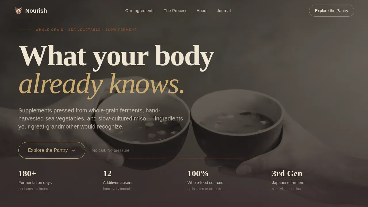
- A full-screen video hero with a slab serif headline and scroll-triggered stat bar
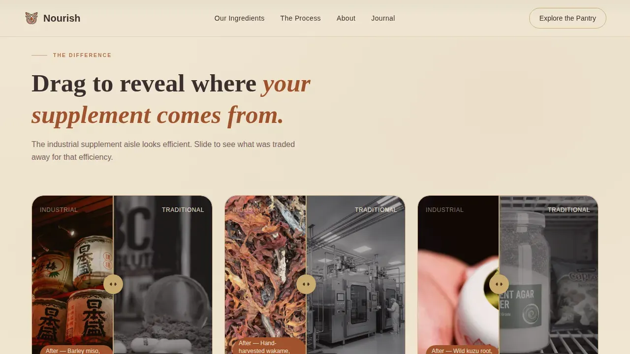
- A masonry before/after ingredient reveal grid with flip and slide card animations
- A founder quote strip, a "What's NOT inside" transparency panel, and fermentation-day counters per ingredient card
Feature list
This template is designed with a specific set of interactive and visual features drawn directly from the Nourish brief. Each one serves a clear role in building the trust and discovery flow that supplement customers need before buying.
Full-Screen Video Hero Section
The header opens with slow, meditative 16mm-style footage of the fermentation and harvesting process. The footage is desaturated to match the parchment color tone and plays at reduced speed. A heavy slab serif headline fades in over the steam, setting the food philosophy before a single word of body copy appears.
Masonry Before/After Reveal Grid
The core layout is a Pinterest-style masonry grid where each card flips or slides to contrast the industrial supplement world with the macrobiotic source. Visitors learn about fermented food ingredients through texture and contrast rather than marketing language. As the scroll deepens, the reveals shift from ingredients to people, showing lifestyle transformation through calm, analog visuals.
Fermentation-Day Ingredient Counters
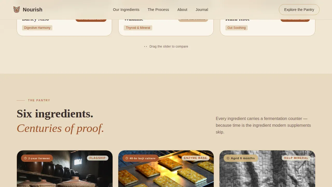
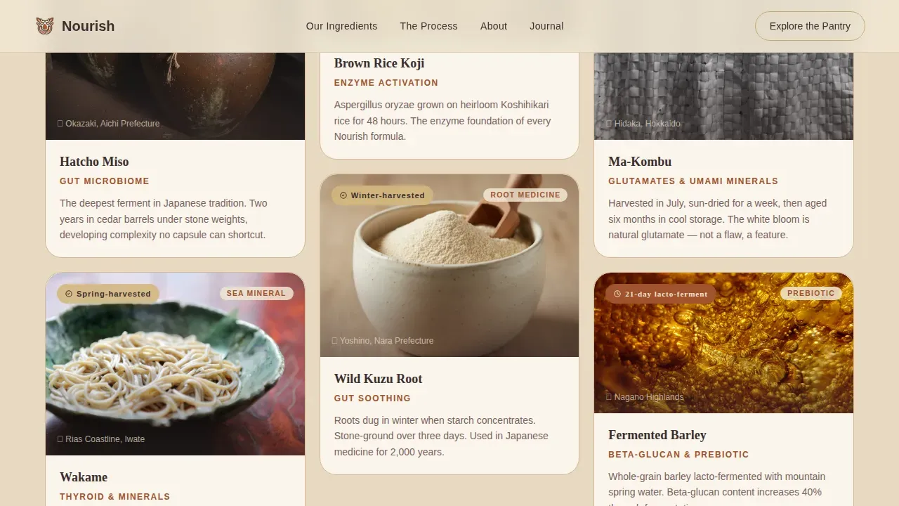
Each ingredient card in the masonry grid displays a fermentation-day counter, a specific number that communicates how long each whole grain, sea vegetable, or miso extract was cultured. This detail is one of the most effective trust-building tools on the page. It turns an abstract health claim into a concrete, verifiable fact that supplements brands rarely share.
Founder Transparency Strip
A single-sentence quote pulled from a handwritten founder note sits alongside the "What's NOT inside" panel. This strip lists twelve common additives absent from every formula, giving visitors clear, honest nutrition content. Ingredient transparency like this helps customers feel confident before they shop the collection.
Sticky Call-to-Action Bar
The primary call to action, "Explore the Pantry," appears first beneath the hero video and then returns as a sticky bottom bar after the third masonry row. This approach keeps the action visible without interrupting the storytelling session. Visitors are never more than one click away from the product collection.
Neo-Retro Typography and Color System
Fraunces slab serif handles headlines throughout. DM Sans carries body text at the sesame tone. Gold activates only on hover states and call-to-action borders, rewarding visitor attention with warmth. This typographic and color system is designed so the page pages feel handmade and analog while remaining fully functional and readable on screen.
Page sections overview
| Section | Purpose |
|---|---|
| Full-screen video hero | Opens with cinematic footage and the primary brand headline |
| Before/after masonry | Contrasts industrial supplements with whole-food macrobiotic sources |
| Fermentation ingredient cards | Displays ingredient cards with fermentation-day counters in a masonry grid |
| Founder quote strip | Shares a handwritten founder note alongside the "What's NOT inside" panel |
| People transformation masonry | Shows lifestyle before/after imagery for skin, sleep, and energy |
| Sticky call-to-action bar | Keeps the "Explore the Pantry" click-through action visible during scroll |
| Footer | Horizontal pattern footer with brand links and navigation |
Design & branding system
The visual identity follows a Neo-Retro theme that feels like a 1970s whole-foods co-op poster printed on washi paper. Every color choice, typeface, and animation is designed to make the brand feel warm, deliberate, and analog in a category full of neon wellness pages. White space is used intentionally across the layout to let ingredients breathe and keep the reading experience calm.
- Parchment (#F0E6D3) base backgrounds, Rust (#A0522D) for headlines and dividers, Sesame (#3B2F2F) for body nutrition content, and Gold (#C9A96E) reserved for hover states and call-to-action borders
- Fraunces heavy slab serif for all headlines, DM Sans for body text, maintaining a letterpressed analog food aesthetic
- High-animation interactions including clip-in reveals, scroll-linked parallax, card flip transitions, and a marquee band
Mobile & speed optimization
The template is designed desktop-first, given the visual richness of the masonry layout and video header. However, the structure also adapts for responsive mobile display so that users on smartphones can still move through the page and reach the product collection click-through without friction. A seamless user experience across devices is part of the layout's core delivery.
- CSS-first animations used throughout to keep interactions performant without heavy script dependencies
- Intersection Observer patterns power the scroll-linked card reveals and masonry transitions
- Responsive breakpoints ensure the masonry grid and before/after cards reflow cleanly on smaller screens
How this template helps you convert
A high-converting nutritional product landing page focuses on one goal: turning visitors into customers. This template is designed around that principle. It builds trust through texture, specificity, and honest food storytelling rather than loud claims. Visitors are guided step by step, with every section earning the next scroll and the final click to the product store.
- The hero video and headline earn attention in the first session seconds, making visitors want to learn more before they consider leaving the page
- The masonry before/after grid and fermentation counters build trust through ingredient-level specificity, replacing vague wellness claims with visible craft and diet transparency
- The sticky call-to-action bar and transparency strip give visitors the confidence to shop the collection without hesitation, reducing the friction that usually stops purchases before checkout
Other information about this template
This template sits in the Food and Beverage category, specifically the Macrobiotic Food and Dining subcategory, and is designed for a direct-to-consumer supplement brand niche. It covers a full range of trust-building content needs within one single landing page, making it a practical choice for supplement brand owners who want to nourish visitor confidence before sending them to a product store.
The template is built to support diet plan communication, gut health education, and the kind of ingredient-level nutrition storytelling that a nutritionist or wellness brand needs to earn buying decisions. Customers who are building a supplement business around protein-rich ferments, vitamins sourced from sea vegetables, and probiotic-forward food formulas will find the layout well-matched to their mission. It also works for vegan supplement lines where food provenance and diet integrity matter most to the audience.
Sharing the science of gut health, including how fermented whole grains improve nutrient absorption, how vitamins and minerals increase through fermentation, and how a diverse microbiome supports long-term wellness, is exactly the kind of content this template is designed to display. Educational sections can follow the layout structure to help visitors understand the body and gut connection that makes fermented food supplements worth buying.
- Supports a click-through landing page direction with no cart or form on the page itself
- Product collection store link is the single conversion destination, keeping the focus clear
- Pricing information and discount offers can be surfaced on the product pages that visitors reach after clicking through
- Google-indexed meta content and open graph fields are supported through standard page settings
- The template is built for English-language, United States market contexts (USD pricing)
- Welcomed feedback from nutritionist professionals and wellness practitioners can be incorporated as additional social proof quotes
- The community of autoimmune-focused, yoga-aligned, and health-conscious fifty-something customers is directly addressed by the tone, design, and content structure
Theme
Neo-Retro
Creative direction
Before/After Reveal
Color system
Parchment & Rust
Style
Masonry/Pinterest
Direction
Click-Through
Page Sections
Full-screen Video Hero with Slab Serif Headline
Masonry Before/after Ingredient Reveal Grid
Fermentation-day Counters on Ingredient Cards
Founder Quote and Transparency Strip
Sticky Click-through Call-to-action Bar
Neo-retro Animation and Interaction System
Related questions
Does this template include a shopping cart or checkout?
Can I apply my own supplement brand colors and fonts?
Is the before/after card flip interaction included in the template?
Is this template suitable for a vegan supplement brand?
How does the fermentation-day counter work on ingredient cards?



