Nonprofit Sustainability Consultant Landing Page
Sustain is a comparison-table landing page built for nonprofit sustainability consultants. It guides executive directors, development staff, and board treasurers through a self-diagnostic scroll experience, contrasting fragile funding models with resilient ones. A dual conversion path captures both audit-ready leaders and earlier-stage visitors, using calm authority and purposeful whitespace to move every reader toward action.
by Rocket studio
Quick summary
Sustain is a single-page template for a nonprofit sustainability consultancy. It uses FAQ-driven scroll sections, side-by-side comparison tables, and a clean Arctic White palette to help nonprofit leaders self-diagnose their funding vulnerability and take a clear next step toward diversified, resilient revenue.
Who this template is for
This template is built for nonprofit sustainability consultants who work directly with mission-driven organizations facing funding instability. It speaks to the people making urgent financial decisions inside those organizations.
- Executive directors managing a fiscal year where one or two grants cover the majority of operating revenue
- Development directors tasked with diversifying funding with no clear roadmap or strategy
- Board treasurers who have watched peer organizations close after losing a primary funder
What problem this template solves
Most nonprofit leaders already know they are too dependent on a single funder. What they lack is a clear, credible resource that names their situation honestly and shows them a practical path forward. This template solves the trust and clarity gap between awareness and action.
- Fragile revenue structures are hard to visualize without a direct comparison to a healthier model
- Visitors arrive anxious and skeptical, so the page must feel calm and authoritative before any ask is made
- A single conversion path misses leads who are worried but not yet ready to book a call
What you get with this template
The template delivers a fully structured single-page layout built around diagnostic comparison tables and two distinct conversion paths. Every section is designed to move the reader from recognition to action at their own pace.
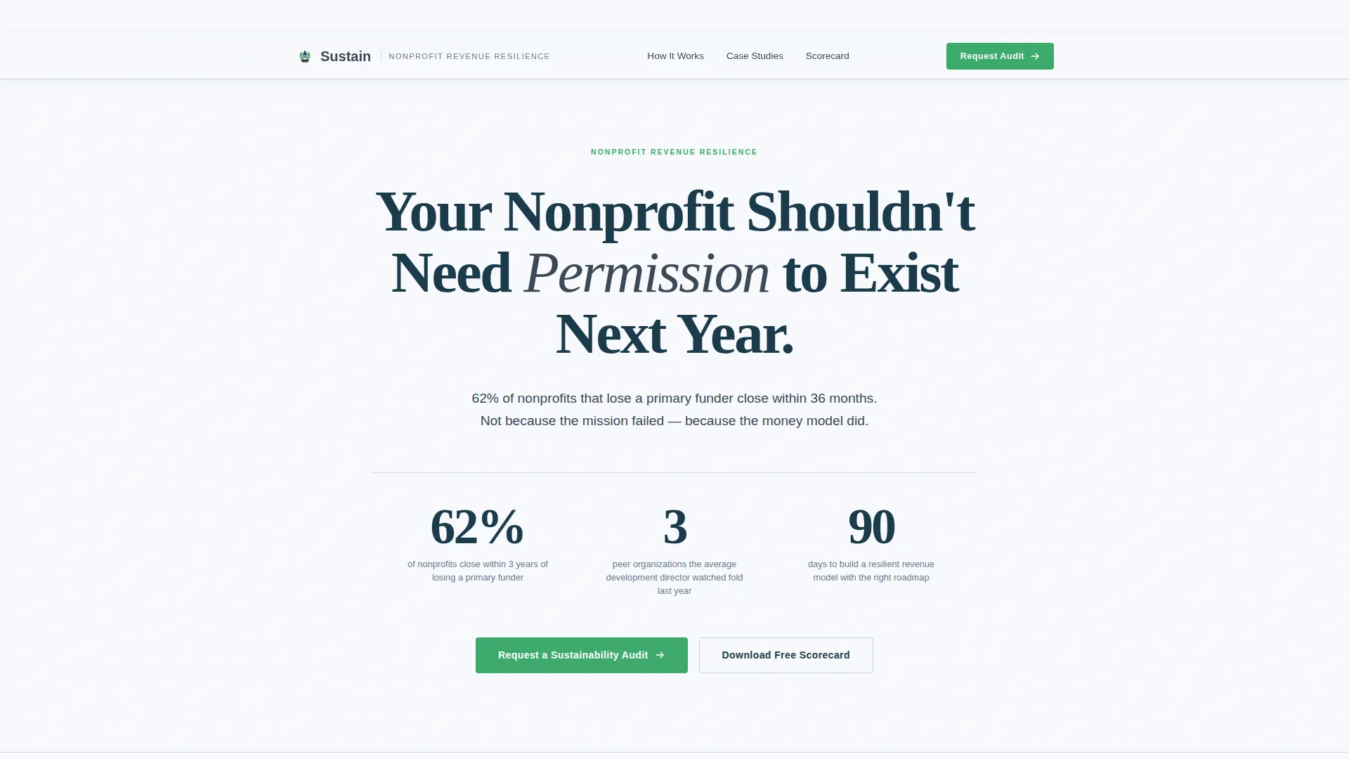
- A centered giant headline section with a high-impact statistic that anchors the page's urgency
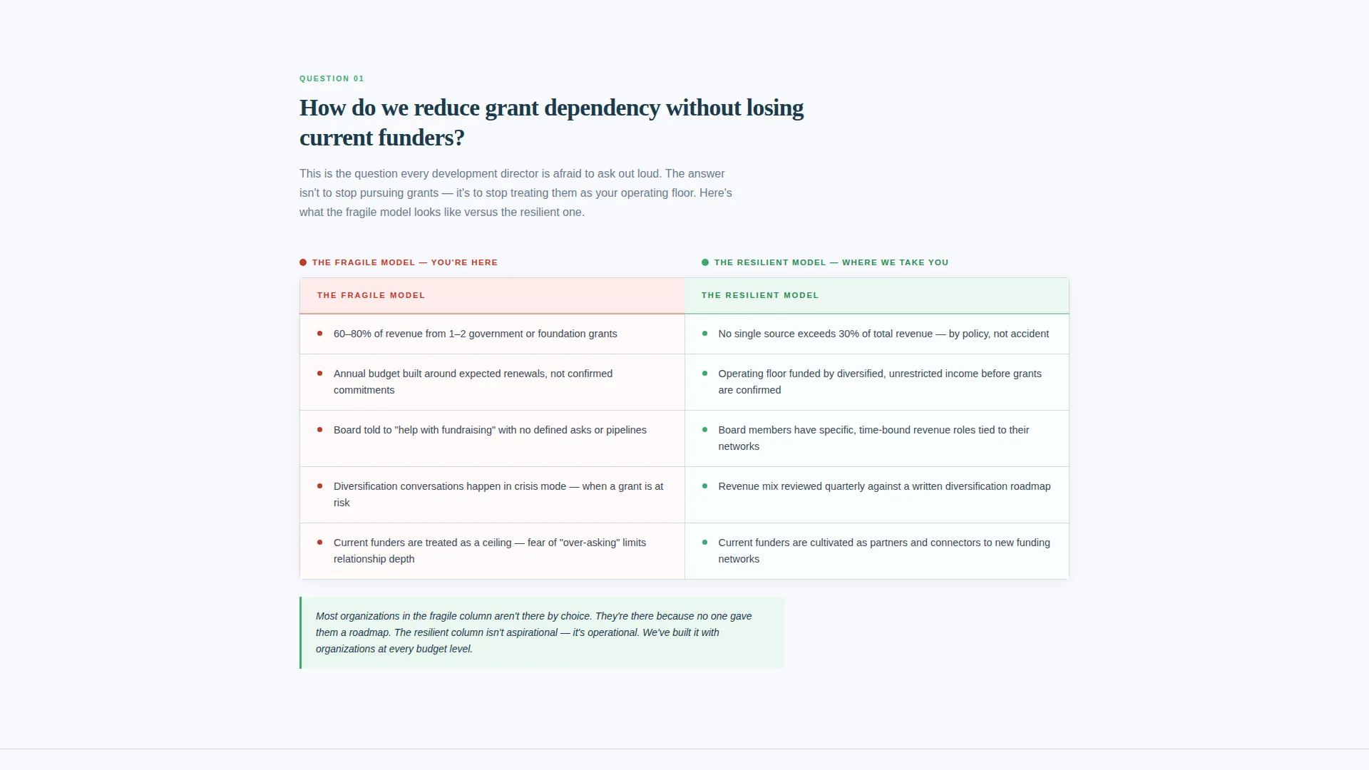
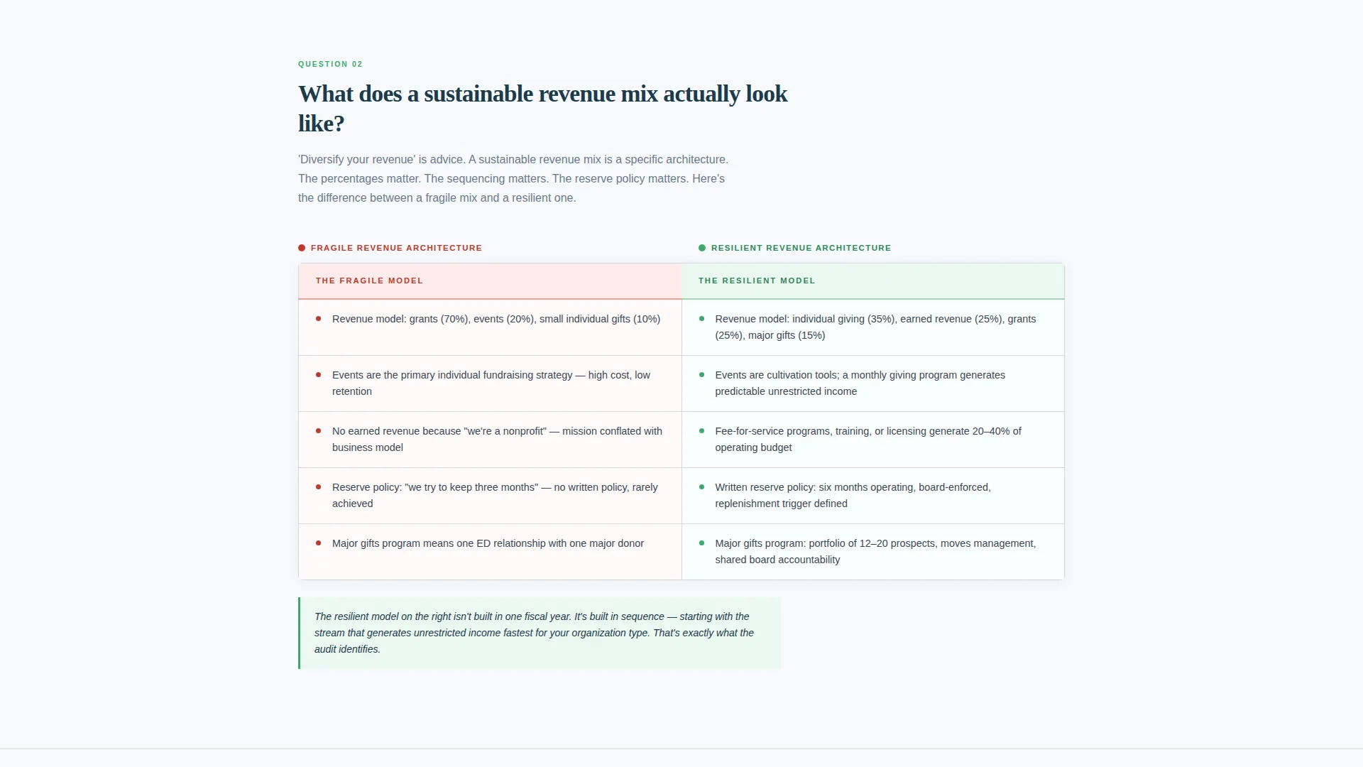
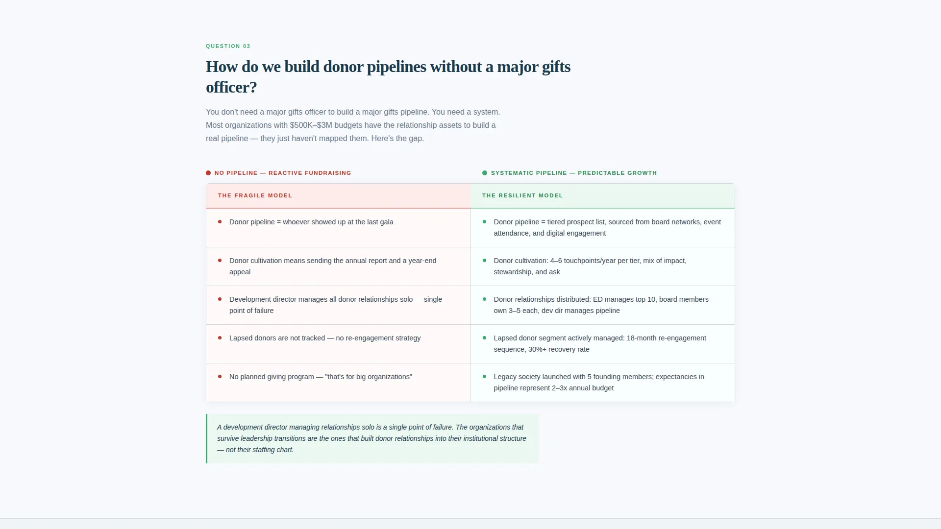
- Multiple FAQ-driven scroll sections, each paired with a left-versus-right comparison table showing fragile versus resilient funding models
- A primary audit request form and a secondary gated scorecard download for capturing leads at different readiness levels
Feature list
The Sustain template includes several purpose-built components that make the page work as both a diagnostic tool and a lead generation engine.
Giant Centered Headline Section
The header opens with large black text on Arctic White, no competing visuals. A single statistic in slate graphite sits beneath the headline, delivering immediate emotional impact before the reader scrolls.
FAQ-Driven Scroll Sections
Each scroll section frames a real question nonprofit leaders search for at night. The question acts as a heading, and the answer unfolds through structured copy and a comparison table beneath it.
Diagnostic Comparison Tables
Each table places the fragile funding model in the left column and the resilient model in the right. Visitors recognize their own organization in the left column, which creates natural motivation to keep reading and reach out.
Primary Audit Request Form
After the third comparison table, a form captures audit-ready leads. It collects organization name, annual operating budget range, number of current funding sources, and an open text field for the visitor's biggest sustainability concern.
Gated Scorecard Download
A secondary conversion path offers a downloadable Nonprofit Revenue Diversification Scorecard. It is gated behind email address and role title, capturing leads who are worried but not yet ready to request a full audit.
Signal Green call to action System
Call-to-action buttons and positive-outcome indicators use signal green throughout. The color distinguishes action moments from informational content and reinforces forward momentum visually.
Page sections overview
| Section | Purpose |
|---|---|
| Centered Headline Block | Opens with urgency and frames the nonprofit funding crisis |
| Impact Statistic Line | Anchors the stakes with a single gut-punch data point |
| FAQ Section One | Addresses grant dependency and how to reduce it without losing funders |
| Comparison Table One | Shows fragile versus resilient funding side by side |
| FAQ Section Two | Explains what a sustainable revenue mix actually looks like |
| Comparison Table Two | Contrasts reactive budgeting with reserve-policy thinking |
| FAQ Section Three | Tackles systemic donor pipelines versus founder-dependent relationships |
| Comparison Table Three | Visualizes people-dependent models against systemic alternatives |
| Audit Request Form | Captures primary leads ready for a sustainability conversation |
| Scorecard Download Gate | Converts earlier-stage visitors with a practical takeaway resource |
Design & branding system
The visual identity follows an Educational Guide theme grounded in an Arctic White color system. The palette is deliberately institutional, designed to feel credible inside a board meeting while remaining warm enough to avoid the coldness of a government form.
- Glacier white (#F7F9FC) dominates the background; slate graphite (#3B4856) handles body text and table borders; deep fjord blue (#1B3A4B) anchors headers and data emphasis
- Signal green (#3DAA6D) is reserved for call-to-action buttons and positive-outcome indicators in the comparison tables
- Whitespace is treated as a core design element, with no images or animations competing for attention in the header section
Mobile & speed optimization
The single-column flow structure ensures the comparison tables and FAQ sections reformat cleanly across screen sizes. Nonprofit leaders often review resources on mobile devices between meetings, so the layout prioritizes readable type and tappable form fields.
- Comparison tables are structured to stack or scroll horizontally on smaller screens without losing the left-versus-right diagnostic logic
- Form fields for the audit request and scorecard gate use dropdown inputs and an open text area, keeping the mobile input experience straightforward
How this template helps you convert
The page is engineered around a self-diagnostic journey. By the time a visitor reaches the primary call to action, they have already identified themselves in the fragile model column and absorbed three sequential answers to questions they were already asking.
- The comparison table structure acts as a mirror, letting visitors self-qualify before any sales language appears, which lowers resistance and raises form completion intent
- The dual conversion path means visitors who are not ready for an audit still enter the lead funnel through the gated scorecard download, captured by email and role for follow-up
Other information about this template
This template is part of the Professional Services category under the Nonprofit Consulting subcategory. It is designed for consultancies whose value proposition centers on long-term organizational resilience rather than short-term grant writing.
- The page structure suits a consultancy positioning itself as a strategic partner rather than a transactional service provider
- The FAQ-and-table format mirrors the kind of structured, evidence-based communication that resonates with nonprofit boards and finance committees
- The scorecard download component supports a longer nurture cycle, making it suitable for consultancies with a considered sales process
- The template is built as a single-page layout and is not configured as a multi-page website structure
Theme
Editorial Magazine
Creative direction
Team & People
Color system
Monochrome Steel
Style
Single Column Flow
Direction
Lead Generation
Page Sections
Diagnostic Comparison Tables
Faq-driven Scroll Layout
Giant Centered Headline Block
Dual Conversion Path Design
Signal Green Call to Action System
Structured Lead Capture Forms
Related questions
Can I edit the comparison table content to match my consultancy's framework?
Does the template include both conversion paths out of the box?
Is this template suitable for a solo consultant or only for a larger firm?
Can I add more comparison tables or FAQ sections beyond what is included?
What role does the statistic in the header play?



