Insurance Services Landing Page Template
Suture is a hub-and-spoke landing page built for board-certified hand surgery practices that handle their own insurance navigation. It leads with credential badges and a coverage verification modal, then walks visitors through prior authorization, CPT code transparency, appeals timelines, and an interactive plan finder, converting anxious patients into booked consultations.
by Rocket studio
Quick summary
Suture is a single-page, anchor-nav template designed for hand surgery practices that want to turn insurance confusion into patient confidence. It opens with a badge constellation of certifications and accepted plans, then guides visitors through four expert-voiced spokes covering prior authorization, billing transparency, appeals, and plan coverage, before asking for a single piece of contact information.
Who this template is for
This template is built for hand surgery practices that manage complex insurance cases in-house. It works best when the practice is ready to speak directly to patients who arrive with real billing anxiety, not just general health questions.
- Board-certified hand surgeons running specialty practices that accept multiple commercial and government insurance plans
- Practice managers and billing coordinators who want to present CPT code transparency and prior authorization workflows online
- Medical marketing teams building a lead generation page that converts insurance-anxious patients before the first phone call
What problem this template solves
Patients facing hand surgery often delay booking because they cannot get a straight answer about coverage. They worry about denied claims, surprise bills, and whether workers' compensation or Medicare will approve a complex procedure. This template addresses that friction head-on.
- Visitors leave other practice pages without knowing whether their plan is accepted or what a procedure will cost
- Prior authorization requirements for hand surgeries are poorly explained online, causing patients to abandon their search
- Families navigating Medicare appeals or workers' compensation claims need a credible, structured resource before they will trust a practice enough to call
What you get with this template
You get a fully structured, five-section landing page that proves clinical and billing expertise before asking for contact information. Every section is purpose-built to move a visitor one step closer to picking up the phone.
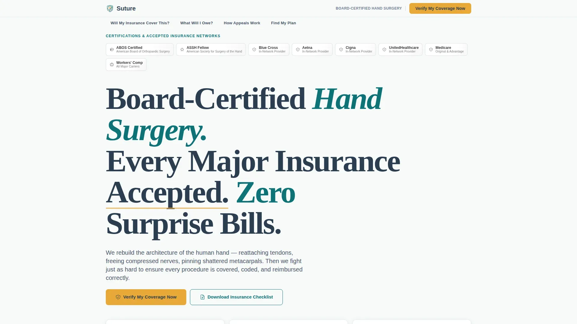
- A hero section with a badge constellation of board certifications, fellowship seals, and insurance network logos, plus an amber "Verify My Coverage Now" call-to-action that opens a coverage modal
- Four anchor-nav spokes covering prior authorization, CPT code transparency, appeals timelines, and a filterable insurance plan grid
- Two conversion paths: a primary coverage verification modal and a secondary gated PDF checklist for visitors who need more time before calling
Feature list
A paragraph overview of the feature set: each component below is drawn directly from the template brief and reflects what is built into the page layout and interaction design.
Anchor Navigation Hub
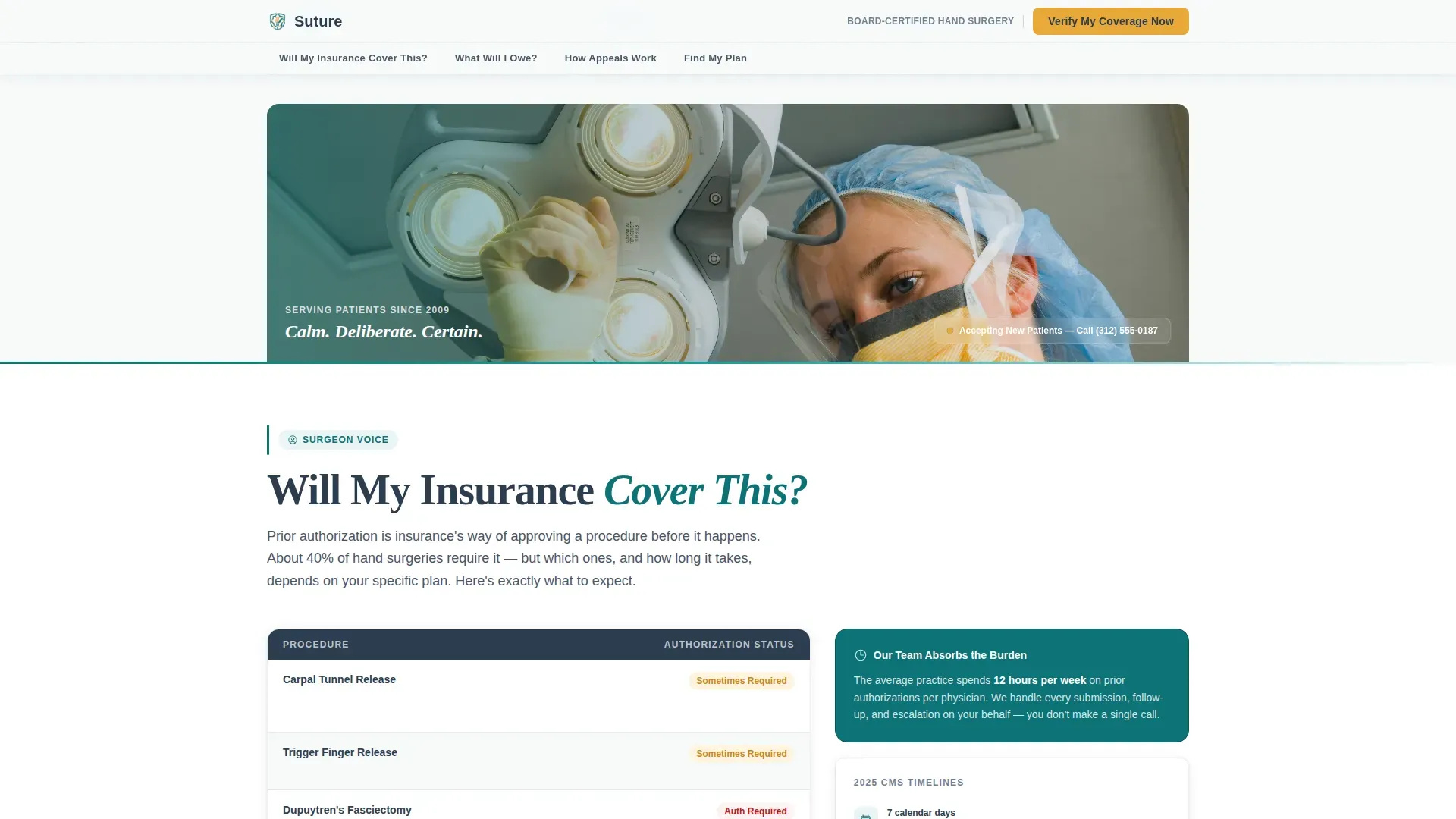
A fixed hub navigation bar sits at the top of the page throughout the scroll. Each spoke label is written in plain patient language: "Will My Insurance Cover This?", "What Will I Owe?", "How Appeals Work", and "Find My Plan." The nav highlights the active spoke in amber as the visitor scrolls.
Coverage Verification Modal
The primary call-to-action opens a modal form that collects insurance carrier, plan type (HMO, PPO, Medicare, or Workers' Compensation), the patient's hand condition or planned procedure, and a phone number for callback. This modal appears first in the hero and repeats as a sticky bottom bar on mobile.
CPT Code Transparency Section
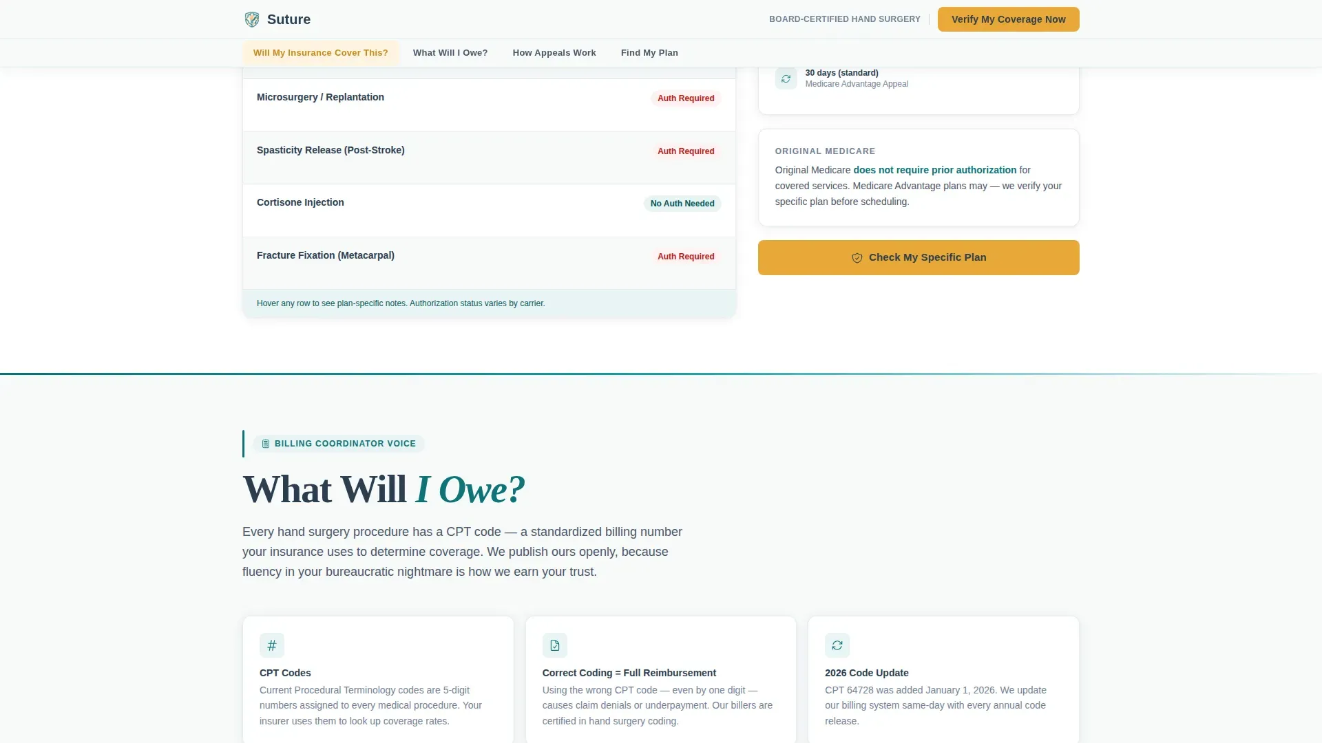
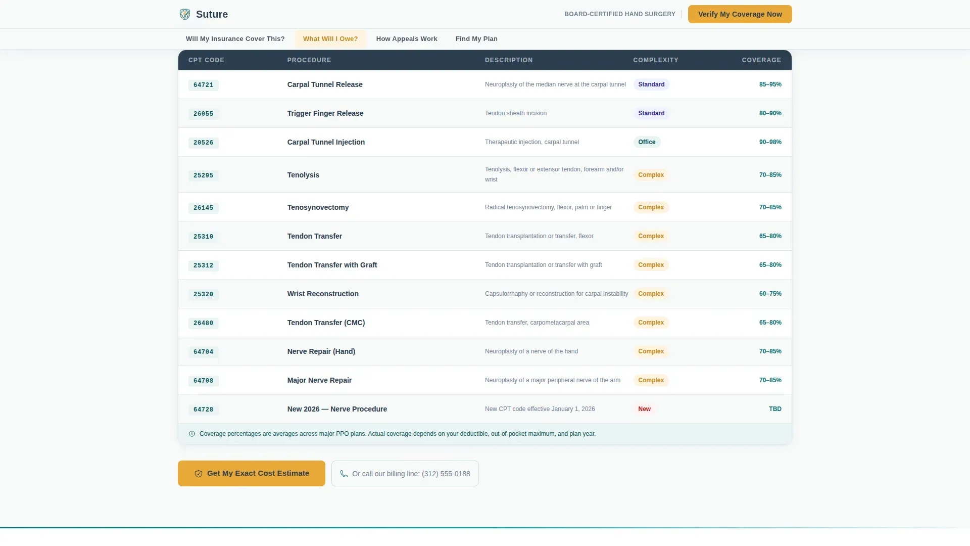
The billing coordinator spoke displays actual Current Procedural Terminology (CPT) codes for common hand surgeries, including carpal tunnel release, Dupuytren's fasciectomy, and tendon repair. Showing real codes before asking for information proves billing fluency and reduces patient hesitation.
Prior Authorization Spoke
The surgeon-voiced section explains clearly which hand procedures require prior authorization and which do not. This directly answers the question most patients search for first, positioning the practice as a knowledgeable guide rather than a gatekeeper.
Filterable Insurance Plan Grid
The "Find My Plan" spoke presents every accepted insurance plan in a searchable, filterable grid. Visitors can locate their carrier quickly without needing to call the front desk for basic eligibility information.
Gated PDF Checklist
A secondary conversion path offers a downloadable insurance preparation checklist in exchange for an email address. This captures visitors who are not ready to call but want to arrive at their consultation fully prepared.
Page sections overview
| Section | Purpose |
|---|---|
| Hero Badge Constellation | Display certifications, network logos, and primary coverage call to action |
| Prior Authorization Spoke | Surgeon explains which procedures need pre-approval |
| CPT Code Transparency | Billing coordinator lists real procedure codes and cost context |
| Appeals Timeline Spoke | Patient advocate narrates a denial-to-approval journey |
| Insurance Plan Finder | Filterable grid of every accepted insurance plan |
| Footer Row | Single-row linear footer with practice contact and legal links |
Design & branding system
The visual identity follows a Corporate Precision theme. Every design decision reinforces surgical calm and clinical authority, making the page feel like a credentialed operating environment rather than a generic medical website.
- Color system uses surgical teal (#0D7377) as the dominant accent for section dividers and icon sets, sterile field white (#F7FAFA) for section backgrounds, charcoal instrument gray (#2C3E50) for body text and navigation, and warm amber (#E8A838) used sparingly and exclusively for calls-to-action, badge highlights, and active navigation states
- Typography pairs DM Sans for navigation and interface elements with Fraunces serif headlines, combining the readability of a modern sans-serif with the authority of a classical editorial typeface
- Badge elements in the hero are rendered in monochrome with a subtle teal foil effect, creating a credential wall composition that reads with the same weight as a surgeon's office diploma display
Mobile & speed optimization
The template is built mobile-first, reflecting the reality that most patients research hand surgery options from a phone while sitting in a waiting room or urgent care facility. Every interactive element is sized and sequenced for thumb navigation.
- The sticky bottom bar on mobile surfaces the "Verify My Coverage Now" call-to-action persistently, so the primary conversion path is never more than one tap away regardless of scroll position
- Scroll-linked spoke activation uses IntersectionObserver reveals to animate sections into view as the visitor reaches them, keeping the page feeling responsive without overwhelming the layout
- Static sections use server-side rendering for fast initial load, while the coverage modal, plan filter, and anchor navigation are handled client-side for interactive responsiveness
How this template helps you convert
This template is structured around a single behavioral insight: patients will not share their contact information until they believe the practice understands their specific insurance situation. Every section is ordered to build that belief progressively.
- The hero section leads with third-party credibility through board certification badges and insurance network logos, establishing authority before the visitor reads a single sentence of body copy
- The four expert-voiced spokes escalate trust in sequence, moving the visitor from "these people are qualified" to "these people will handle everything" to "I literally just need to call," at which point the amber call-to-action becomes the natural next step
- The dual conversion paths capture visitors at different stages of readiness, with the modal for high-intent visitors and the gated PDF checklist for those still in the research phase
Other information about this template
This template is categorized under Health & Medical, specifically the Hand Surgeon Website subcategory, and is designed for the Hand Surgeon Insurance and Billing Page niche. It is built for the United States market with USD pricing references, English-language copy, and date formatting in the MM/DD/YYYY convention.
- The template style is Hub and Spoke with Anchor Navigation, using a Lead Generation landing-page direction and an Expert Panel creative direction that assigns a distinct specialist voice to each spoke section
- Header concept follows the Award Badges pattern, arranging certifications and plan logos in a horizontal constellation with teal foil rendering and amber active states
- Animation is set to medium intensity, with badge shimmer in the hero, scroll-linked spoke activation, and IntersectionObserver reveals throughout the page body
- Interactivity is high, covering the anchor navigation bar, the coverage verification modal, the insurance plan filter, and the gated PDF download gate
Theme
Corporate Precision
Creative direction
Expert Panel
Color system
Teal Catalyst
Style
Hub & Spoke (Anchor Nav)
Direction
Lead Generation
Page Sections
Anchor Navigation Hub
Coverage Verification Modal
CPT Code Transparency Section
Prior Authorization Spoke
Filterable Insurance Plan Grid
Gated PDF Checklist Download
Related questions
What kind of practice is this landing page designed for?
Can I customize the coverage verification modal for my accepted plans?
Does the template display real CPT codes, and can I update them?
How does the gated PDF checklist conversion path work?
Is this template relevant for patients dealing with Workers' Compensation or Medicare appeals?



