Healthcare Branding Agency Bento Grid Landing Page
Suture is a bento grid landing page built for healthcare branding agencies. It uses a monochrome steel palette, oversized centered typography, and a case study narrative layout to build trust before asking for anything. A fixed waitlist form captures work email and organization type, supported by a live slot counter that signals real demand without pressure.
by Rocket studio
Quick summary
Suture is a precision-crafted bento grid landing page for a healthcare branding agency. The design centers on a single oversized headline, a cold monochrome palette, and a grid of case study cells that tell client stories without spelling them out. The page converts through earned trust, showing the work before making any pitch.
Who this template is for
This template is built for healthcare branding professionals who work at the highest level of the field. If your clients are health system CMOs, concierge practice founders, or medtech startups, this page was designed around your exact positioning.
- Healthcare branding agencies serving regional health systems and hospital networks
- Boutique practices and medtech brand consultancies launching a waitlist or intake process
- Agency founders who want to lead with work quality rather than service descriptions
What problem this template solves
Most agency landing pages look indistinguishable. They list services, show headshots, and end with a contact form. In healthcare branding, that approach signals exactly the kind of generic thinking your clients are trying to escape.
- Visitors leave before understanding what makes your agency different
- Generic layouts fail to communicate the precision and credibility that healthcare buyers demand
- A pitch-first structure creates friction with sophisticated CMO-level decision makers
What you get with this template
You get a fully structured bento grid landing page that replaces the standard agency pitch with a diagnostic visual experience. Every cell has a purpose, and the layout guides visitors from evidence to pattern to decision.
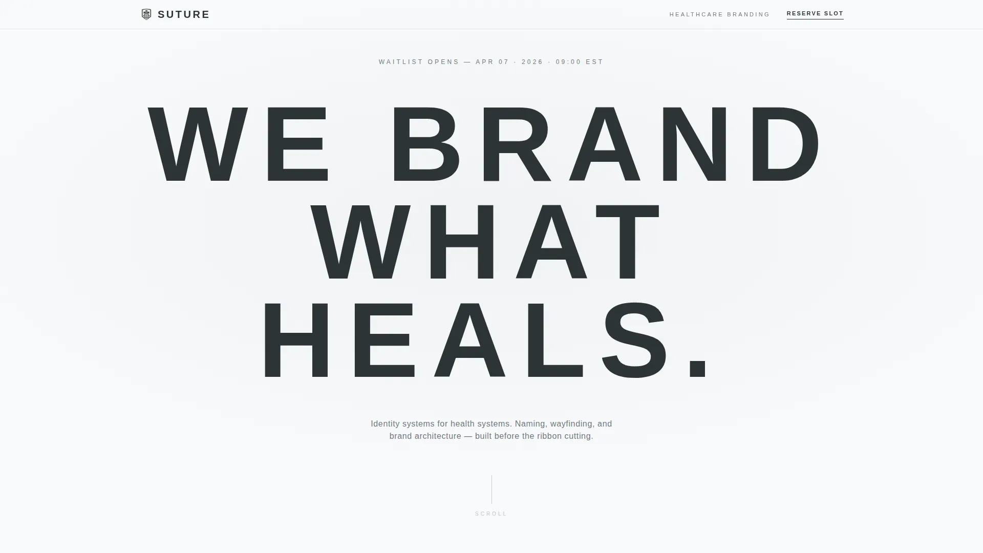
- An oversized centered headline section with a steel-gray dateline styled as a medical chart timestamp
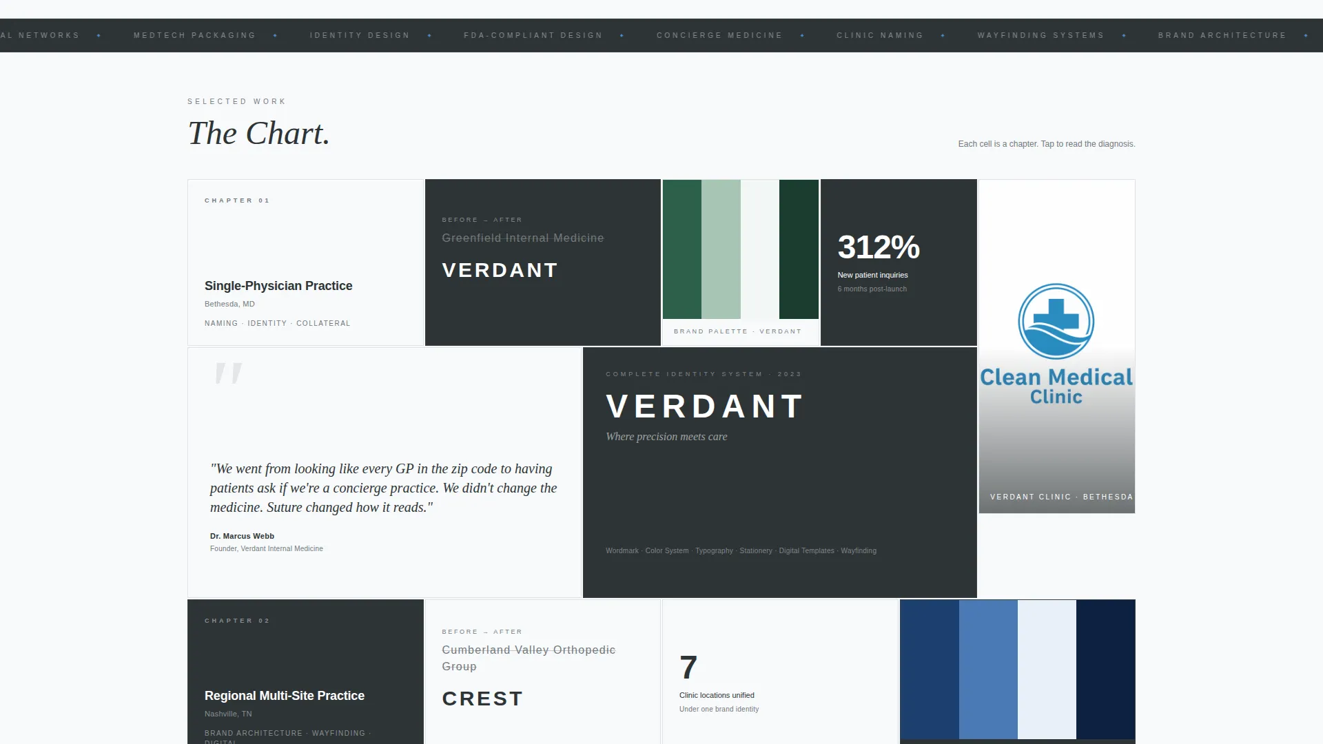
- A multi-cluster bento grid of case study cells that escalate in scale across the page
- A fixed bottom-right waitlist form with a live intake slot counter and two-field capture
Feature list
This template delivers a focused set of layout and interaction features grounded in the source brief.
Oversized Centered Headline Block
The header presents a single line of tracked-out grotesque typography at 12vw on a clean white field. No image, no animation, and no ornamentation compete with it. The negative space itself becomes the design statement, drawing the visitor's eye immediately to the brand message.
Case Study Bento Grid
Each bento cell functions as one chapter of a past engagement. A before-logo cell, a color swatch cell, a CEO quote cell, and a finished identity reveal cell work together without narrating themselves. Visitors read the grid the way a clinician reads a chart, assembling the story from evidence rather than being told what to think.
Escalating Grid Clusters
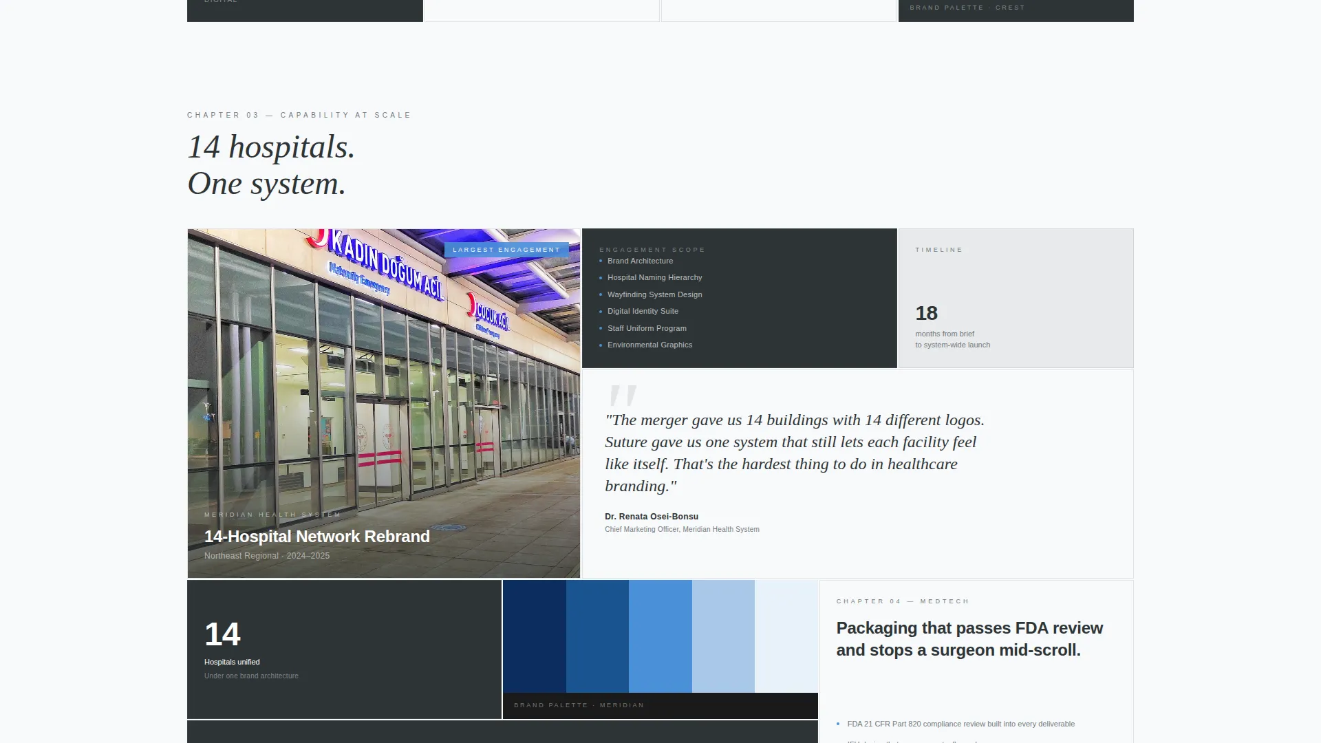
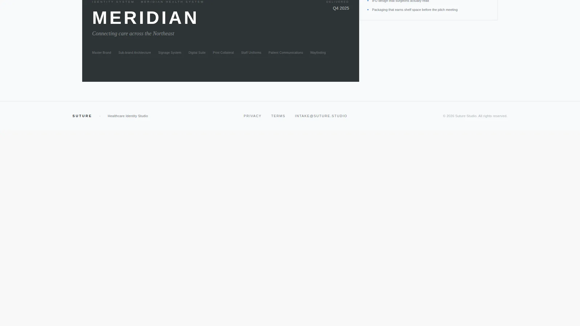
Grid clusters grow in complexity as the visitor scrolls. Cases begin with a single-physician practice and build to a 14-hospital network rebrand. The escalation proves capability through visual evidence rather than written claims.
Full-Screen Case Study Overlay
Tapping any case study cell expands it into a full-screen overlay. This gives interested visitors deeper context before they reach the waitlist form. Trust is built inside the page, not offloaded to a separate portfolio link.
Fixed Waitlist Form Cell
A bento cell anchored to the bottom-right corner stays visible throughout the scroll experience. The form captures only work email and organization type, chosen from health system, practice, medtech, or other. Two fields, nothing more.
Live Intake Slot Counter
A live counter displayed above the waitlist form shows remaining intake slots for the current quarter. The counter creates genuine scarcity based on a real capacity signal rather than fabricated urgency copy.
Page sections overview
| Section | Purpose |
|---|---|
| Headline Header Block | Anchors brand voice with oversized centered typography and chart-style dateline |
| Opening Case Cell | Introduces the first client story fragment to orient the visitor |
| Brand Swatch Cell | Displays an identity color without context, prompting curiosity |
| CEO Quote Cell | Adds social proof from a hospital executive without a full case study |
| Identity Reveal Cell | Shows the finished brand system as the narrative payoff |
| Escalating Grid Clusters | Progresses case complexity from solo practice to hospital network |
| Case Study Overlay | Expands any cell into full-screen detail on tap or click |
| Fixed Waitlist Form | Captures work email and organization type in a persistent bottom-right cell |
| Slot Counter Display | Shows live remaining intake slots above the waitlist form |
Design & branding system
The visual identity follows a Lens and Frame theme with a Monochrome Steel color system. Everything is deliberate and cold by design, so the work inside the cells becomes the only warmth on the page.
- Color palette: surgical steel (#71797E), operating-room white (#F8F9FA), charcoal scrub (#2D3436), and cautery blue (#4A90D9) used exclusively for interactive and hover states
- Typography: grotesque face set at 12vw for the headline, tracked wide with generous letter spacing; steel gray text on light backgrounds and pure white text on dark bento cells
- Backgrounds alternate between operating-room white and charcoal scrub across bento cells, creating sharp contrast without decorative elements
Mobile & speed optimization
The bento grid layout is structured to reflow cleanly at smaller viewport sizes. Fixed elements and overlay interactions are designed to remain accessible on touch devices as described in the brief.
- Bento cells resize and restack for mobile viewports without losing the cell-by-cell narrative structure
- The fixed waitlist form cell remains anchored and visible during scroll on both desktop and mobile
- Full-screen case study overlays function on tap for mobile visitors, preserving the trust-building path on smaller screens
How this template helps you convert
This template earns the conversion by building trust through the layout itself rather than through copywriting promises.
- The escalating case study grid demonstrates real capability before any call to action appears, so visitors arrive at the form already convinced rather than skeptical.
- The full-screen overlay path lets curious visitors go deeper without leaving the page, reducing the drop-off that happens when people click away to a separate portfolio.
- The two-field waitlist form with a live slot counter lowers commitment friction while creating honest urgency, making it easier for a senior buyer to act without feeling pressured.
Other information about this template
This template is category-matched to portfolio and agency use cases with a specific focus on healthcare marketing and healthcare branding agency positioning. It is part of a curated set of bento grid landing page designs built around distinct intersection contexts.
- Template style: Bento Grid; theme: Lens and Frame; creative direction: Case Study Narrative
- Landing page direction: Waitlist and Coming Soon, suited for agencies opening a new intake cycle or launching a rebrand offer
- Intersection match score of 13 reflects a tightly aligned combination of niche, style, and conversion goal
- The dateline in the header is formatted as a medical chart timestamp, reinforcing the clinical precision of the brand identity without using medical imagery
Theme
Lens & Frame
Creative direction
Case Study Narrative
Color system
Monochrome Steel
Style
Bento Grid
Direction
Waitlist/Coming Soon
Page Sections
Oversized Centered Headline Block
Case Study Bento Grid
Escalating Grid Clusters
Full-screen Case Study Overlay
Fixed Waitlist Form with Slot Counter
Related questions
Can I change the headline text and dateline to match my agency?
How does the live intake slot counter work?
Can I add more case study cells or change the grid order?
Is the waitlist form connected to any email platform?
Who is this template best suited for?



