Oral Surgeon Patient Education Landing Page Template
Suture is a single-column oral surgeon landing page template designed to calm anxious patients before their consultation. It walks visitors through common conditions and treatments using illustrated cards, numbered step-by-step guides, a recovery timeline, and a consultation checklist. The Alpine Fresh visual system and warm editorial layout make clinical information feel approachable, not alarming.
by Rocket studio
Quick summary
Suture is a patient education landing page built for oral surgeons. It organizes complex procedures into clear, illustrated walkthroughs that reduce pre-visit anxiety. With a warm mountain-clinic visual identity and a step-by-step content flow, the template moves visitors from frightened late-night searching to calm, confident consultation booking.
Who this template is for
This template is designed for oral surgeons and specialty dental practices that treat patients facing unfamiliar, often frightening procedures. It works especially well for practices that want to educate patients before the first appointment rather than after.
- Adult patients between roughly 25 and 70 facing procedures like implants, jaw surgery, or bone grafts
- Parents researching corrective jaw procedures for teenagers
- Oral surgery practices that want to reduce patient anxiety and increase consultation bookings
What problem this template solves
Patients searching for oral surgery information late at night encounter clinical jargon, graphic images, and scattered information. That experience increases fear and delays booking. This template replaces that experience with a calm, organized resource that answers every frightening question before the consultation call to action appears.
- No clear place to find condition-specific treatment steps in plain language
- Patients arrive at consultations underprepared, anxious, and hard to reassure
- Practices lose potential bookings because patients never feel confident enough to schedule
What you get with this template
You get a fully structured single-column landing page with five distinct content sections, each serving a specific step in the patient education journey. The layout moves from visual discovery through detailed clinical walkthroughs to a confident booking prompt.
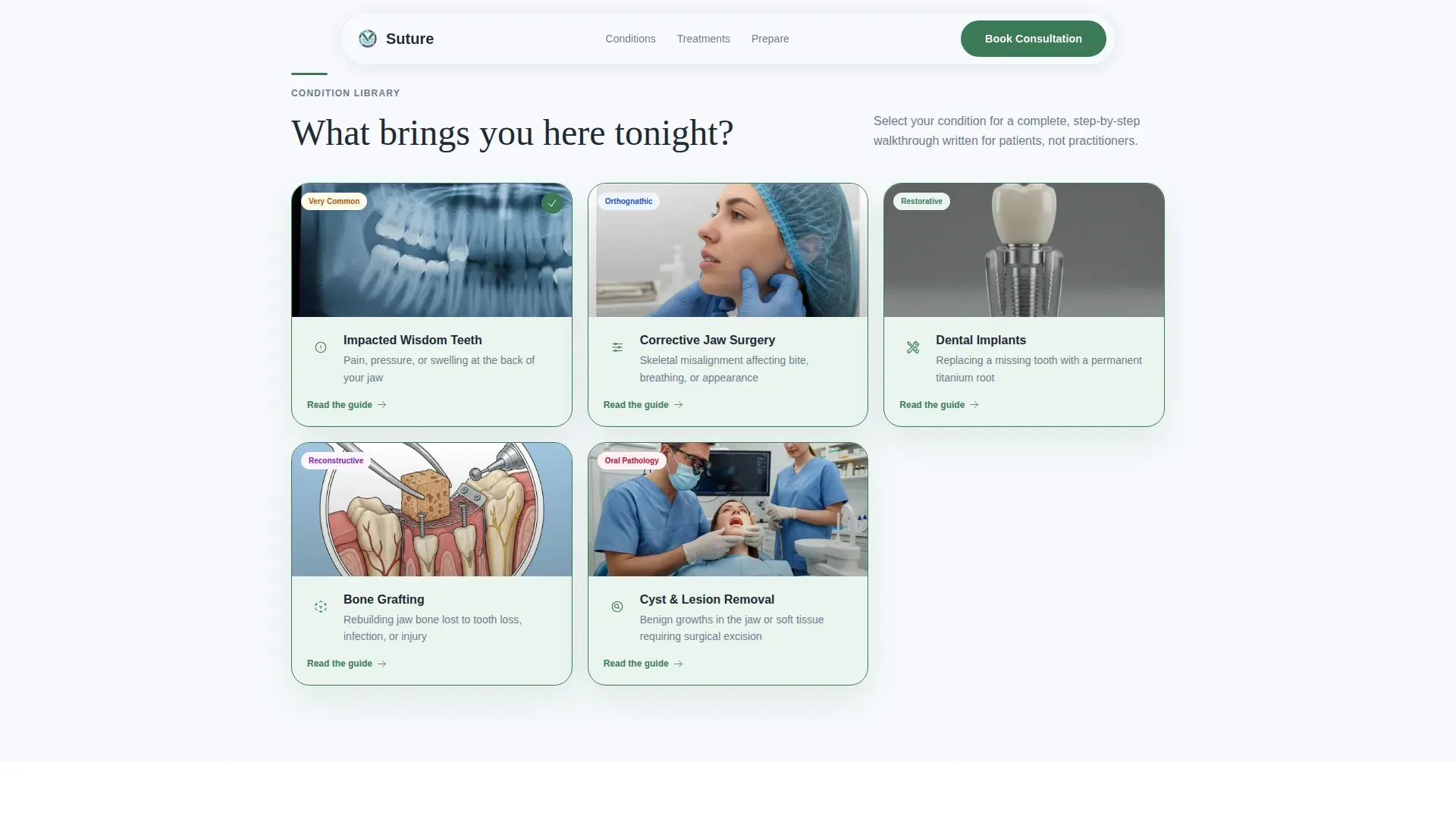
- A hero section with a half-page photo and text composition, a condition index with five illustrated cards, a numbered walkthrough section, a recovery timeline, and a consultation checklist with email capture
- Scroll-reveal animations, parallax hero behavior, progress bar animation, and card hover states built into the layout
- Interactive condition card tab switching, checkable checklist items, and a PDF guide email capture form
Feature list
This template bundles several purpose-built components that work together to guide patients from curiosity to confidence.
Illustrated Condition Card Index
Five visual cards represent distinct oral surgery conditions: impacted teeth, jaw misalignment, dental implants, bone grafting, and cyst removal. Each card uses a clean illustrated style rather than clinical photography, keeping the experience informative without being alarming.
Numbered Step-by-Step Condition Walkthrough
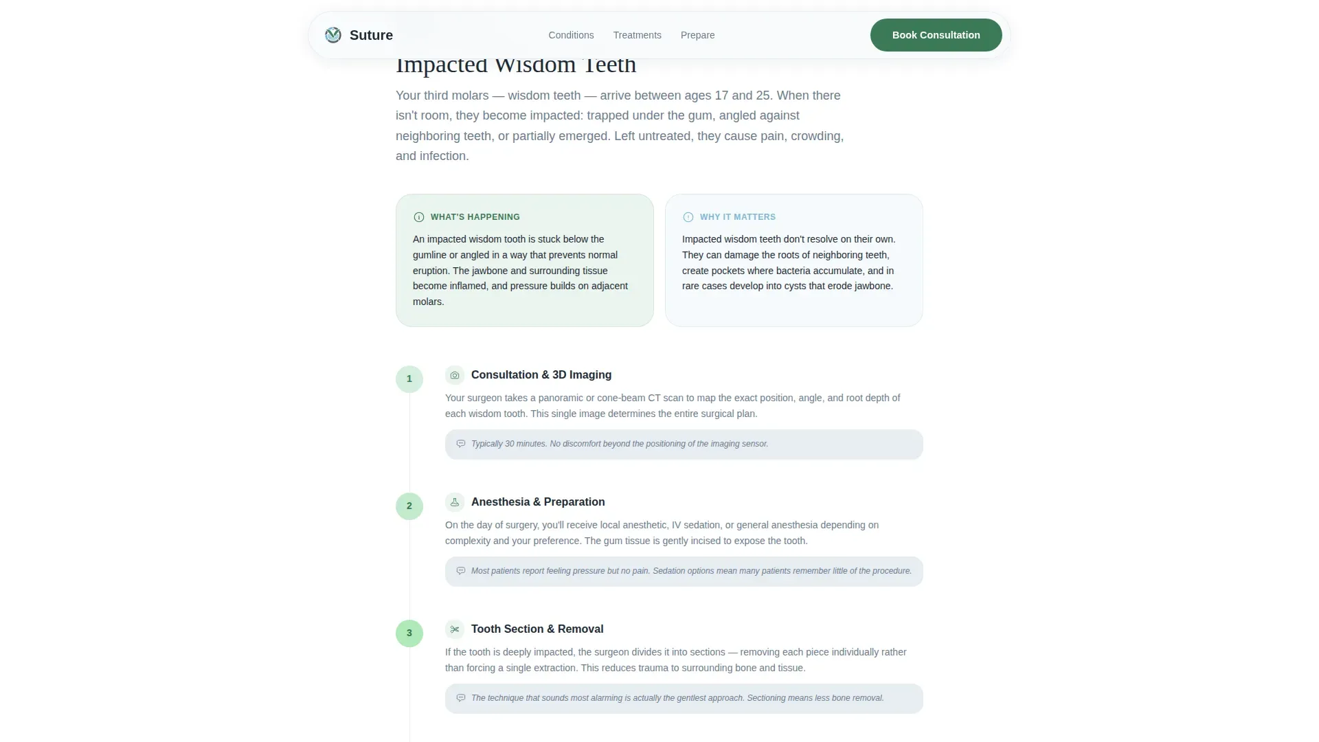
Each condition card opens into a vertically flowing guide. Steps are numbered clearly, paired with soft anatomical illustrations, and written in plain language. The walkthrough covers what is happening, why it matters, and what the surgeon does at each stage.
Animated Recovery Timeline
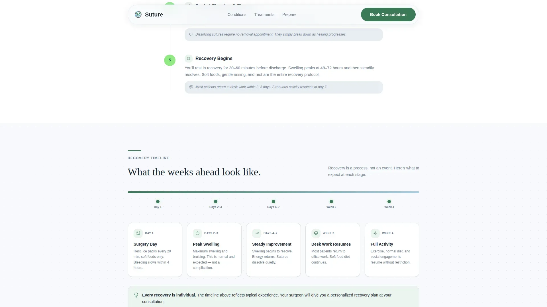
A horizontal progress bar maps recovery milestones from the day of the procedure through final follow-up. The bar animates on scroll, giving patients a visual sense of duration and making recovery feel manageable rather than vague.
Consultation Checklist with PDF Capture
Each condition guide closes with a list of questions to bring to the consultation. Visitors can download the checklist as a PDF by entering a first name and email address. This gives late-night researchers something tangible to hold onto before they are ready to book.
Click-Through Consultation call to action
A primary call to action reading "Schedule Your Consultation" appears at the base of every condition guide. A secondary soft-touch prompt for the PDF download appears mid-guide. Both calls to action are placed after the patient's questions have already been answered.
Half-Page Cinematic Hero
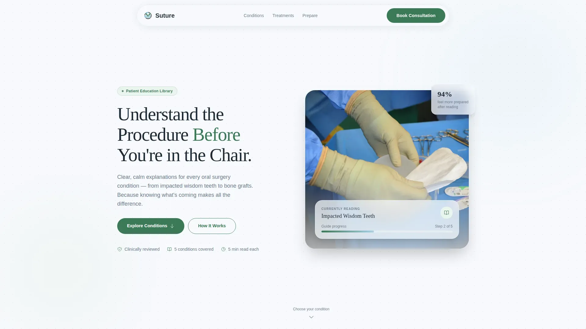
The hero section pairs a warm, naturally lit photograph of a surgeon's gloved hands at rest with a serif headline and a brief reassuring line. The composition sets a calm, confident tone from the first scroll.
Page sections overview
| Section | Purpose |
|---|---|
| Hero Composition | Establishes calm authority with a cinematic photo and reassuring headline |
| Condition Card Index | Lets visitors self-select their specific condition from five illustrated options |
| Step-by-Step Walkthrough | Guides visitors through each procedure stage with numbered steps and illustrations |
| Recovery Timeline Bar | Visualizes post-procedure milestones using an animated horizontal progress bar |
| Consultation Checklist | Delivers a printable question list and captures email for PDF guide delivery |
| Footer Row | Provides practice links and contact details in a clean single-row layout |
Design & branding system
The visual identity follows a Healing Space theme, styled around the idea of a bright mountain clinic where everything is clean but never cold. Typography pairs Fraunces, a warm serif display face, with DM Sans for body text, keeping the page readable and authoritative without feeling clinical.
- Color palette: snowfield white (#F7F9FC) for the background, soft evergreen (#3B7A57) for section headers and icons, granite calm (#6B7B8D) for body text, and glacial blue (#A8D0E6) for hover states and progress indicators
- The evergreen accent deepens subtly as the visitor scrolls from diagnosis content toward recovery content, reinforcing a sense of progress
- Scroll-reveal transitions, a parallax hero, and smooth card hover states give the page a composed, editorial feel without visual overload
Mobile & speed optimization
The template is built mobile-first, reflecting the reality that most anxious patients find oral surgery information on a phone at night. Every section is structured to read clearly on a small screen without requiring horizontal scrolling or zooming.
- Interactive components such as the condition card switcher use client-side rendering, while static content sections use server components to keep load behavior efficient
- The single-column flow means content stacks naturally on mobile without layout restructuring
- Progress bar animation and scroll reveals are designed to perform smoothly on mobile viewports
How this template helps you convert
The template earns its call-to-action placement by building patient confidence throughout the scroll journey. By the time the booking button appears, the visitor has already had every major question answered.
- The condition index lets visitors immediately find their specific situation, making the page feel personal and relevant from the first interaction.
- The step-by-step walkthrough and recovery timeline reduce the fear of the unknown, replacing anxiety with a clear mental map of the procedure.
- The PDF email capture mid-guide provides a low-commitment conversion point before the full consultation booking ask, giving hesitant visitors a comfortable first step.
Other information about this template
This template is part of a broader set of healthcare and patient education layouts built for specialty medical practices. It is suited to oral surgeons who want a polished, trust-building online presence without building a multi-page site from scratch.
- The Alpine Fresh color system and Healing Space theme are part of a coordinated design language used across related health and medical templates
- The template style is Single Column Flow, making it straightforward to customize section by section without disrupting the overall layout
- The footer follows a linear single-row pattern, keeping the bottom of the page tidy and functional
- The template supports English (United States) copy and uses no currency formatting, keeping it neutral across practice locations
Theme
Healing Space
Creative direction
Step-by-Step Guide
Color system
Alpine Fresh
Style
Single Column Flow
Direction
Click-Through
Page Sections
Illustrated Condition Card Index
Numbered Step-by-step Walkthrough
Animated Recovery Timeline
Consultation Checklist with PDF Capture
Half-page Cinematic Hero
Click-through Consultation Ctas
Related questions
Can I customize the five condition cards to match the procedures my practice offers?
Does the PDF download form connect to an email marketing tool?
Is this template suitable for a general dentist or only an oral surgeon?
How does the condition card tab switching work?
Can I add more than five conditions to the card index?



