Pest Control Franchise Upsell Landing Page Template
Swarm is a premium pest control landing page template built for franchise upsell campaigns. It guides existing quarterly-plan subscribers through a seasonal threat timeline, showing coverage gaps and a clear upgrade path. The card-grid layout, aubergine-to-amber gradient palette, and pinned "Upgrade My Shield" call-to-action create an exclusive, conversion-focused experience without a single stock bug photo.
by Rocket studio
Quick summary
Swarm is a single-page upsell template designed for an established pest control franchise. It targets existing subscribers who already trust the brand and need one compelling reason to upgrade. A scroll-driven seasonal threat timeline, modular card grid, and pre-filled confirmation panel make the path from curiosity to conversion feel effortless and premium.
Who this template is for
This template is built for pest control franchise operators who already have a subscriber base on quarterly service plans. It speaks directly to customers who have had a technician visit and are open to a higher tier of protection.
- Franchise marketing teams running seasonal upsell campaigns
- Regional operators promoting bundled service upgrades to active plan holders
- Brand managers who want a polished, on-brand page without a generic pest-photo aesthetic
What problem this template solves
Most upsell pages for home services feel like form letters. They list features, show a price, and hope for the best. Swarm solves a more specific problem: it makes the coverage gap feel real before asking for a commitment.
- Subscribers do not always know what their current plan leaves unprotected
- Generic service pages fail to create seasonal urgency or emotional relevance
- A cluttered or low-trust page pushes warm leads away instead of converting them
What you get with this template
You get a fully structured landing page with a clear visual hierarchy, a defined upgrade flow, and seasonal content modules ready to customize. Every section has a stated purpose and a deliberate position in the scroll journey.
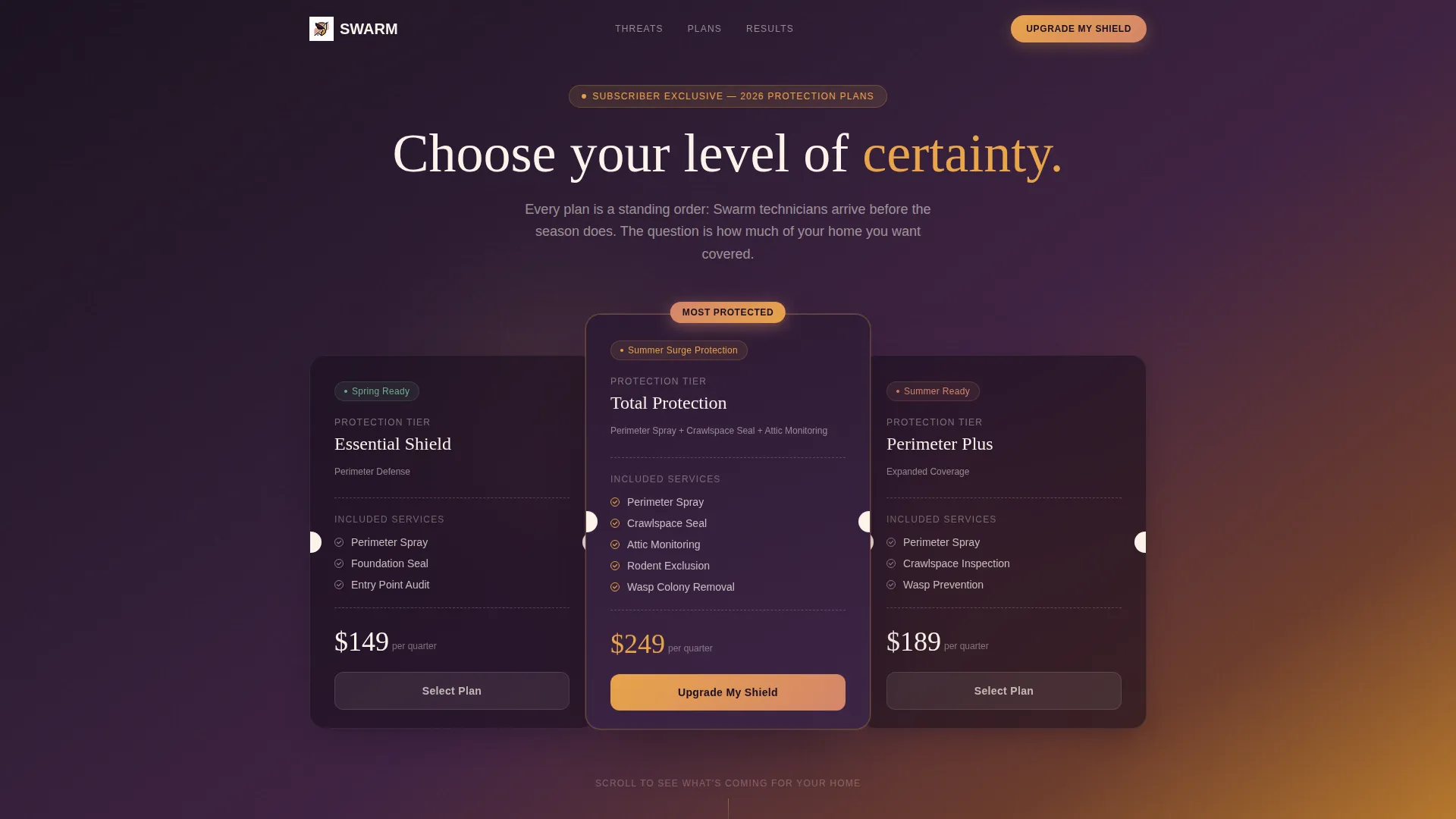
- An oversized header card presenting three service tiers like boarding passes, with the target upsell tier pulled forward using a subtle shadow and a "Most Protected" badge
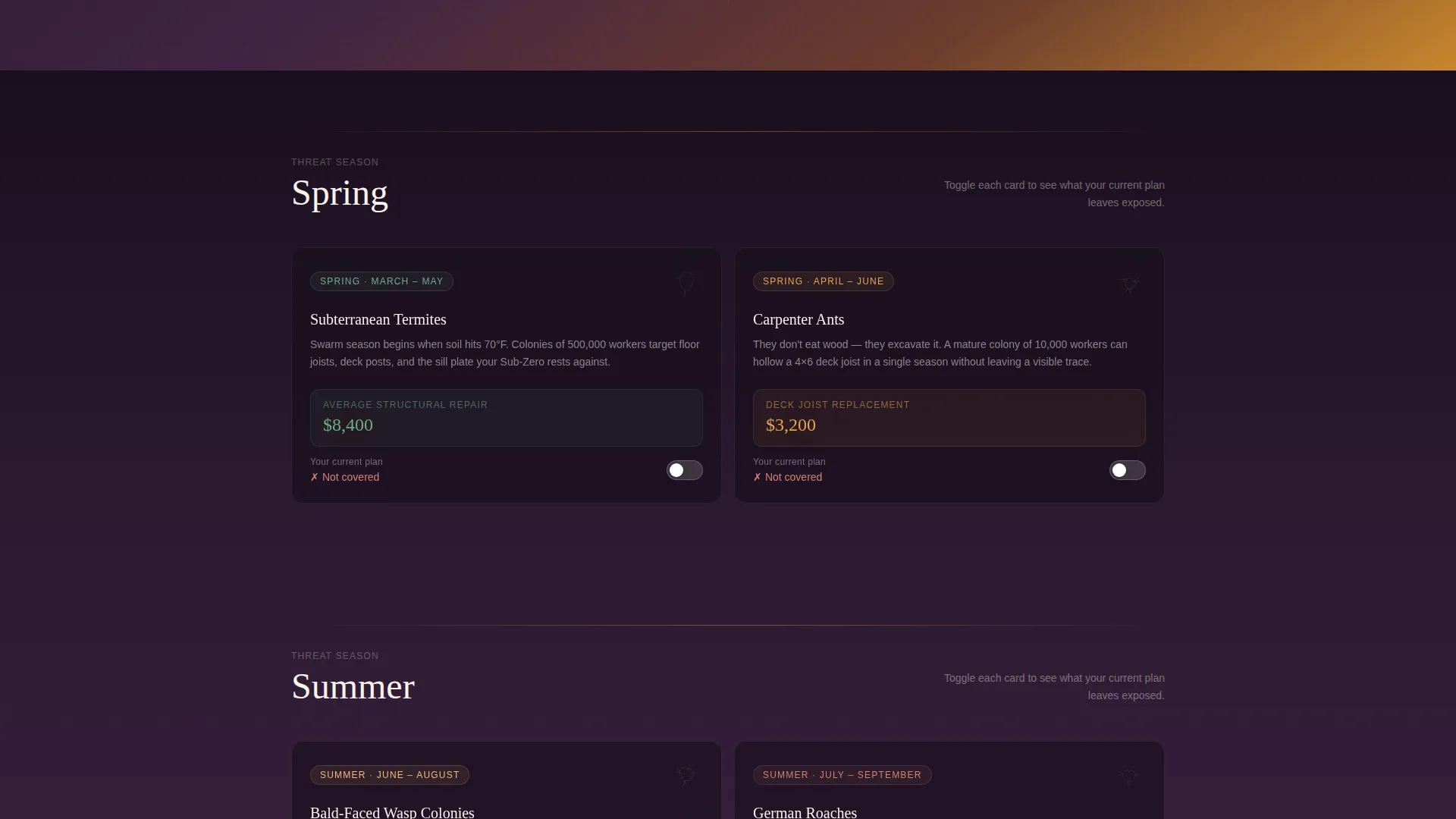
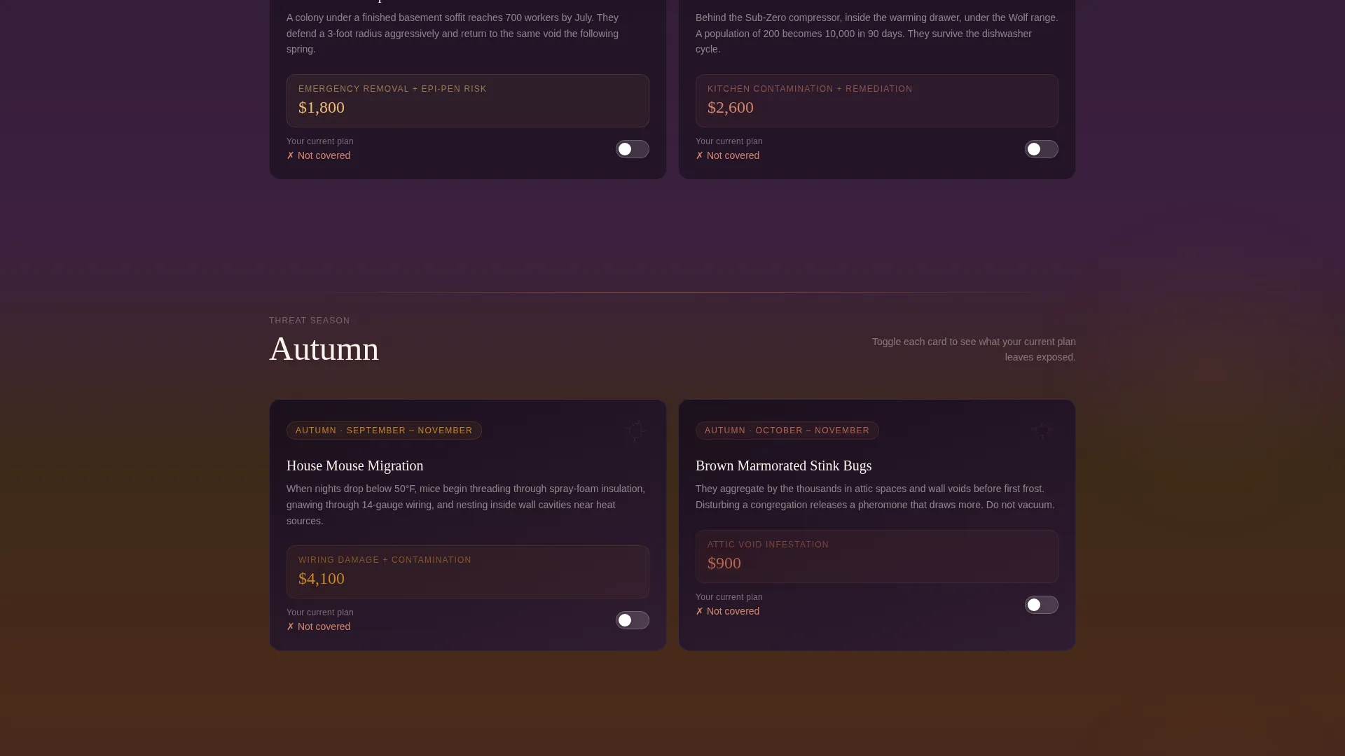
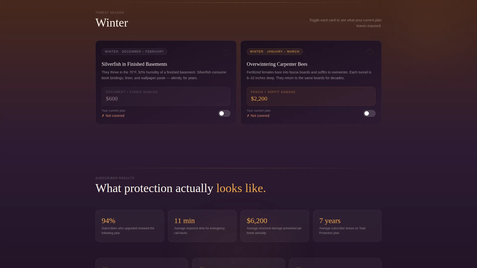
- Four seasonal card modules covering spring termites, summer wasps, autumn rodents, and winter silverfish, each with a plan-coverage toggle
- A pinned floating bottom bar with the primary call-to-action and a secondary soft-capture path for zip-code-based threat reports
Feature list
This template delivers a focused set of design and layout features grounded in the brief.
Seasonal Threat Timeline Cards
Each of the four seasonal modules presents a pest silhouette in minimal line art, a damage cost figure in bold amber type, and a side-by-side toggle showing current plan coverage versus what the upgrade adds. The rhythm tightens as the visitor scrolls into autumn and winter, reinforcing urgency visually.
Three-Tier Bundle Header
The header presents a single oversized card floating on an aubergine-to-amber gradient. Three service tiers are stacked visually like boarding passes. The middle card is the target upsell, pulled forward with a shadow and labeled with a rose-clay "Most Protected" badge and a "Summer Surge Protection" seasonal tag.
Pinned Upgrade Call-to-Action Bar
A floating bottom bar carries the primary call-to-action labeled "Upgrade My Shield." It transitions from transparent to a deep aubergine background as the visitor scrolls past the second seasonal section, creating a moment of emphasis without interrupting the reading flow.
Single-Step Confirmation Panel
Clicking the primary call-to-action opens a compact confirmation panel. It is pre-filled with the subscriber's current plan tier and address, displays only the price difference per quarter, and lists the three added services in plain language. There is no multi-step form to abandon.
Soft-Capture Secondary Path
A secondary link labeled "See What's Crawling This Month" connects to a zip-code-specific seasonal threat report. This path is designed to capture engagement from visitors who check the report but do not convert on the first visit, keeping them in the funnel.
Luxe Minimal Visual System
Typography is set in clean serif and stays sharp in parchment or deep black throughout the page. Gradient washes move from aubergine to amber behind card clusters without overlapping text. No stock photos of insects or technicians appear anywhere on the page.
Page sections overview
| Section | Purpose |
|---|---|
| Hero Bundle Card | Presents three service tiers with upsell tier highlighted |
| Spring Threat Module | Introduces termite swarm season with coverage toggle |
| Summer Threat Module | Covers wasp colony risk with damage cost and toggle |
| Autumn Threat Module | Highlights rodent migration with tightening card rhythm |
| Winter Threat Module | Closes the threat arc with silverfish and uncovered gaps |
| Floating Upgrade Bar | Pins the primary call-to-action as scroll depth increases |
| Confirmation Panel | Confirms upgrade with pre-filled plan details and price delta |
| Threat Report Link | Soft-capture path to zip-code seasonal report |
Design & branding system
The visual identity follows a Luxe Minimal theme built around a Sunset Gradient color system. The palette is warm, dark, and deliberate, evoking a desert sky cooling after sunset rather than the clinical greens or cautionary reds typical of pest control marketing.
- Deep aubergine (#2D1B33) anchors headers, card backgrounds, and the activated floating bar; warm amber (#E8A44A) highlights damage costs, key figures, and gradient transitions; soft rose-clay (#D4856B) appears on hover states, progress indicators, and the "Most Protected" badge; clean parchment (#FAF3EB) fills open space and keeps typography legible
- Gradient washes flow from aubergine to amber behind card clusters and never overlap body text
- Typography is set in a clean serif face, with all heading and body copy staying in parchment or deep black for maximum contrast
Mobile & speed optimization
The card-grid layout is modular by design, which means individual cards reflow cleanly across screen sizes without losing their visual hierarchy. The pinned bottom bar and confirmation panel are built to work on touch screens as comfortably as on desktop.
- Card modules stack vertically on smaller screens while preserving the seasonal scroll sequence and toggle interactions
- The floating upgrade bar remains accessible at the bottom of the viewport regardless of scroll position on mobile
- The single-step confirmation panel keeps the upgrade flow compact, reducing the number of taps required to complete an action
How this template helps you convert
Swarm is structured around a single conversion goal, and every layout decision reinforces it. The page does not try to educate a cold audience. It moves a warm, trusting subscriber from awareness of a coverage gap to a confirmed upgrade.
- The seasonal timeline creates a felt sense of risk before the call-to-action appears, so the upgrade feels like a solution rather than a sales pitch.
- The pinned floating bar keeps the primary action visible throughout the scroll without interrupting the content experience, and the single-step confirmation panel removes friction at the final moment of decision.
Other information about this template
This template is designed to work as a standalone campaign page within a broader franchise digital presence. It does not require a redesign of existing brand assets.
- The template is category-matched to franchise business use cases within retail and service industries
- The card-grid modular structure makes it straightforward to swap seasonal content or update plan details for new campaign cycles
- The secondary soft-capture path provides a lower-commitment entry point for subscribers who are not ready to upgrade on their first visit
- The page aesthetic is intentionally free of stock imagery, which makes it easier to maintain visual consistency across franchise locations without sourcing location-specific photos
- This template is well-suited for franchises looking to differentiate their digital marketing from category-standard service page designs
Theme
Neo-Retro
Creative direction
Comparison Journey
Color system
Ink & Paper
Style
Overlap/Layered
Direction
Click-Through
Page Sections
Seasonal Threat Timeline Card Grid
Three-tier Bundle Header Card
Pinned Floating Upgrade Bar
Single-step Confirmation Panel
Soft-capture Secondary Path
Luxe Minimal Typographic Design
Related questions
Is this template suitable for a single franchise location or a whole network?
Can I update the seasonal content each quarter?
Does the template include the confirmation panel pre-fill logic?
What if I do not offer all four seasonal service tiers?
Is the floating bottom bar always visible on mobile?



