Home Décor & Lifestyle Comparison Website Template
Swatch is a scroll-reveal landing page built for a boutique bespoke paint studio. It guides visitors through a progressive comparison journey, revealing the difference between mass-market pigments and hand-tinted bespoke color. Every section builds toward a clear upgrade decision, with a Luxe Minimal design rooted in lavender, plum, and champagne gold.
by Rocket studio
Quick summary
Swatch is a single-page, scroll-reveal landing page designed for a bespoke paint studio. It walks visitors through a visual comparison journey, from standard big-box color to hand-tinted artisan pigment. The layout is built to upsell existing clients toward a premium tinting service, using layered evidence and frictionless progressive forms.
Who this template is for
This template is designed for boutique paint studios and artisan color brands that serve discerning clients. It works best when your offer is premium, your audience already understands quality, and your goal is to convert existing customers into higher-value purchases.
- Interior designers and color consultants presenting premium paint options to clients
- Boutique hoteliers and property stylists sourcing bespoke wall finishes
- Homeowners and independent decorators who treat color as a considered investment
What problem this template solves
Most paint brand pages fail to communicate why bespoke color is worth the investment. Visitors leave without understanding the difference in pigment depth, undertone quality, or longevity. Swatch solves this by making the distinction visible and undeniable through every scroll section.
- Visitors who arrive unconvinced leave without upgrading their existing paint order
- Standard product pages cannot show the sensory and visual gap between mass-market and artisan pigment
- Long forms and unclear paths cause hesitation before the first commitment step
What you get with this template
You get a fully structured, scroll-reveal landing page with a clear narrative arc from curiosity to conversion. Every section is purposefully ordered to accumulate evidence and guide the visitor toward the upgrade call to action.
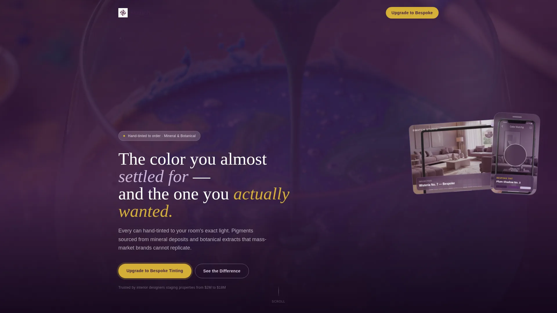
- A device mockup header featuring a floating tablet and phone showing a color-matching app view
- A progressive comparison journey covering pigment density, primer quality, and five-year longevity swatches
- A two-path conversion structure with a primary upgrade call to action and a secondary physical swatch box offer
- A progressive form that opens with a single familiar field before expanding to room-specific detail
Feature list
This template delivers six purpose-built components that work together to move a skeptical visitor toward a confident purchase.
Scroll Reveal Progression
Each section animates into view as the visitor scrolls. The reveal pacing mirrors the gradual, deliberate feeling of watching wet paint settle on a surface.
Device Mockup Header
The header features a floating tablet and phone angled over a photograph of hand-poured pigment mid-bloom. The screens show the same living room rendered across three lavender-family palettes, giving the visitor an immediate visual anchor.
Side-by-Side Comparison Sections
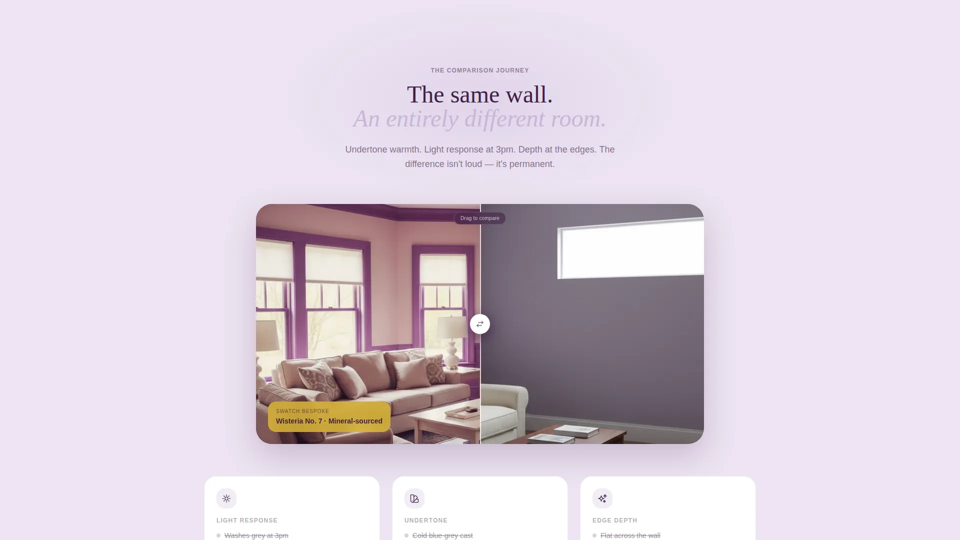
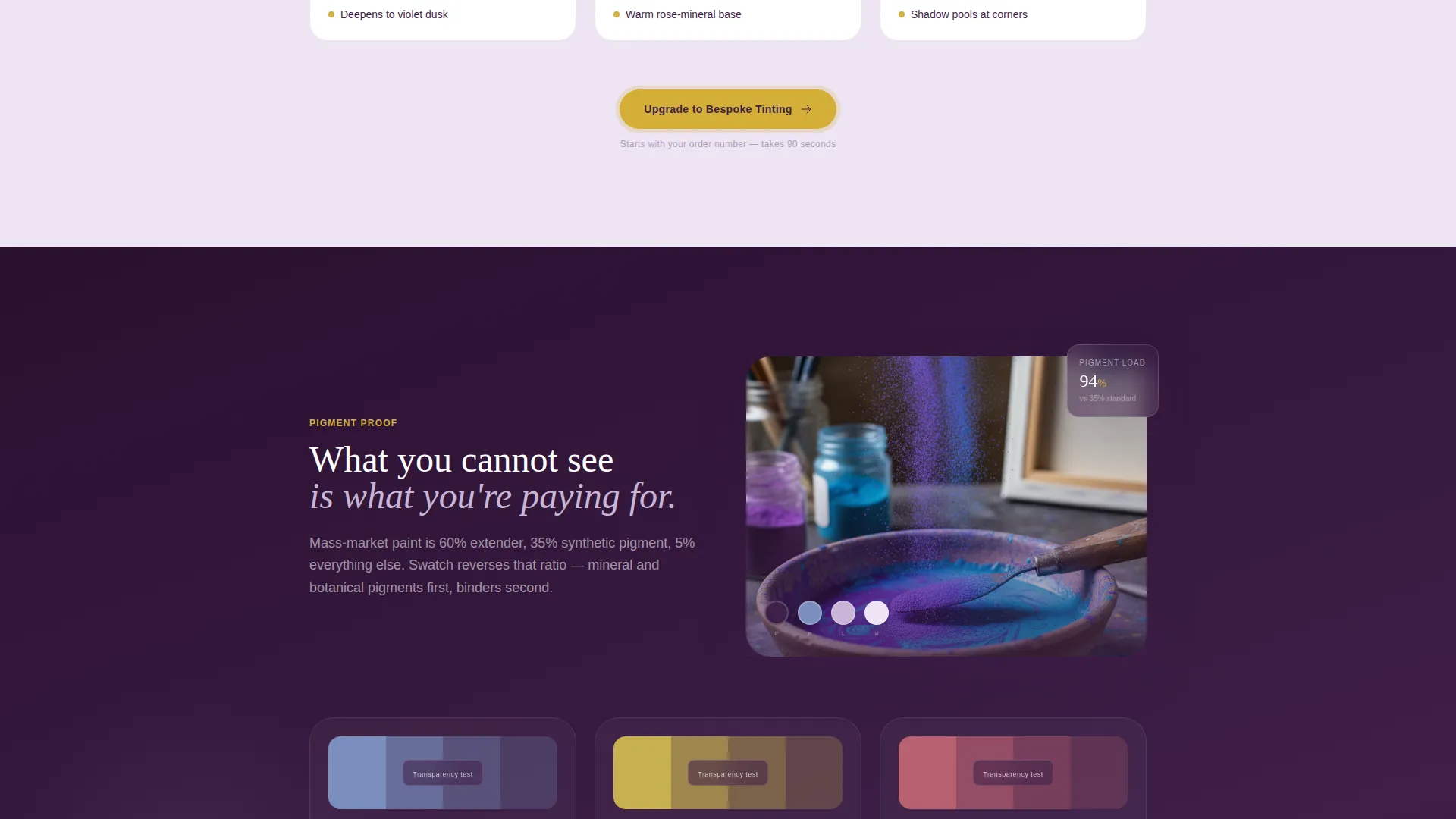
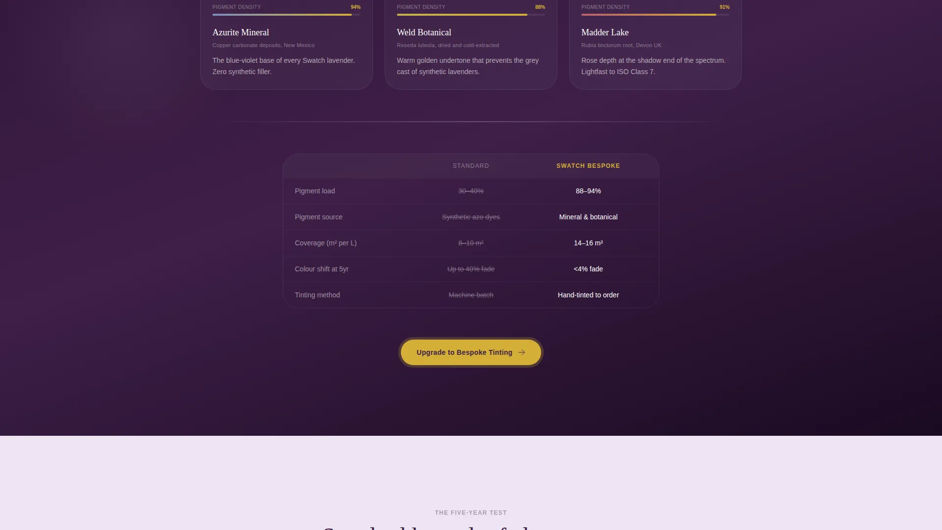
Paired imagery shows a standard big-box lavender finish against the studio's bespoke tint. Subsequent sections escalate the comparison with primer quality, pigment transparency tests, and sun-exposure longevity swatches photographed after five years.
Progressive Upsell Call to Action
A primary "Upgrade to Bespoke Tinting" button is placed after every comparison reveal. This repetition keeps the conversion path visible without feeling aggressive, meeting the visitor exactly when their confidence peaks.
Pigment Archive Add-On Path
A secondary call to action offers "Add the Pigment Archive," directing visitors toward a curated box of physical swatches mailed to their door. This softens the commitment for undecided buyers while still capturing intent.
Frictionless Progressive Form
The form opens with only two fields: order number and preferred color family. Once the visitor commits, it expands to capture room dimensions and light-direction details. This staged approach reduces drop-off at the most sensitive friction point.
Page sections overview
| Section | Purpose |
|---|---|
| Hero Header | Float device mockups above poured pigment photo with headline fade-in |
| First Comparison | Side-by-side room reveal comparing standard versus bespoke lavender tint |
| Primer Quality | Contrast section highlighting primer depth and coverage difference |
| Pigment Density Test | Transparency test imagery showing pigment concentration difference |
| Longevity Swatches | Five-year sun-exposure comparison showing color integrity over time |
| Upgrade Call to Action | Primary call to action button placed after each comparison evidence section |
| Pigment Archive Offer | Secondary add-on path for mailed physical swatch collection |
| Progressive Form | Staged input form beginning with order number and color family |
Design & branding system
The visual identity follows a Luxe Minimal theme using a four-tone lavender palette that reads like soft violet light pooling through a Georgian townhouse at dusk. Every color choice is deliberate and restrained.
- Backgrounds stay in pale wisteria mist (#EDE4F3), keeping the canvas quiet and focused
- Body text lives in deep plum shadow (#3E1F47), giving contrast without harshness
- Hushed lilac (#C8B6D8) handles supporting accents and secondary surfaces
- Warm champagne (#D4AF37) is reserved exclusively for calls to action and interactive highlights
Mobile & speed optimization
The template is structured for responsive display across screen sizes, ensuring the comparison journey reads as intended on both desktop and handheld devices. The layered scroll reveal and device mockup header are designed to scale without losing visual clarity.
- Device mockup angles and image compositions are sized to remain legible on smaller screens
- The progressive form collapses cleanly to a single-column layout on mobile, keeping the low-friction entry point intact
How this template helps you convert
Swatch is built around a single strategic idea: the visitor should accumulate evidence until the upgrade feels inevitable. Every design and copy decision supports that arc.
- The comparison journey stacks visual proof section by section, making the quality gap tangible before asking for any action.
- The repeated primary call to action after each reveal catches the visitor at their highest confidence point, reducing the time between conviction and click.
- The two-path structure lets hesitant visitors choose a lower-commitment entry (the physical swatch archive) while keeping the upgrade path always visible.
Other information about this template
This template sits within the Retail and E-Commerce category, specifically under Home Décor and Lifestyle. It is matched to an upsell and upgrade landing page direction, meaning it is purpose-built for visitors who already have a baseline purchase or consultation and need a clear reason to move up.
- The template style blends gallery presentation with detail-focused reveal sections, letting imagery carry the persuasion load
- The header concept draws from an app store preview approach, using device mockups to visualize a digital color-matching tool within the physical product story
- The creative direction prioritizes a considered, high-value atmosphere over urgency or flash-deal pressure
- The color system uses a lavender and wisteria palette rather than a high-contrast or warm-toned scheme, aligning the aesthetic with the boutique positioning
- This template is well suited for paint studios, bespoke finishing services, and color consultation brands operating in the premium residential and hospitality market
Theme
Neo-Retro
Creative direction
Flash Deal
Color system
Sunset Gradient
Style
Gallery + Detail
Direction
Upsell/Upgrade
Page Sections
Scroll Reveal Section Animation
Device Mockup Header
Progressive Comparison Journey
Repeated Upgrade Call to Action
Pigment Archive Secondary Path
Frictionless Progressive Form
Related questions
Can I use this template if I only sell paint online without a physical studio?
Does the progressive form require a specific platform to work?
Can I replace the lavender color palette with my own brand colors?
How many conversion paths does this template include?
Is this template suitable for a paint brand that also offers color consultation services?



