Sweep - Editorial Pestcontrol Landing Page Template
Sweep is an editorial-style landing page template built for a Los Angeles pest control company. It pairs a giant centered headline, crew portrait profiles, and a calm Cloud Canvas color system to earn trust before asking for a click. The page routes visitors to a scheduling page through a frictionless click-through flow with zero on-page forms.
by Rocket studio
Quick summary
Sweep is a single-page editorial landing page for a Los Angeles pest control crew. The design leads with a massive serif headline, scrolls through environmental team portraits paired with pull-quotes, and closes with a clean click-through to a scheduling page. Every layout decision serves one goal: make the visitor feel like they already know and trust the people walking into their home.
Who this template is for
This template is built for local pest control operators who want to stand out from generic service-directory listings. It works best when the business can supply real crew photography and a confident brand voice.
- Property managers handling tenant complaints across multi-unit buildings in Los Angeles
- Homeowners who have spotted signs of infestation and want to book a trusted local crew fast
- Restaurant owners facing health inspection pressure who need a professional, credible first impression online
What problem this template solves
Most pest control pages look identical: stock photos of insects, a phone number in red, and a wall of bullet points about chemicals. That sameness breeds distrust. Visitors bounce before they ever read the service list.
- The template replaces generic layouts with an editorial magazine format that projects calm authority
- It answers the unspoken homeowner question of who exactly is walking into my house by putting real crew profiles front and center
- It eliminates form friction entirely by routing all conversion intent to a dedicated scheduling page through a single clear call to action
What you get with this template
You get a fully structured single-page layout designed around editorial storytelling and a precise visual system. Every section has a defined role, and every design choice reinforces the quiet confidence the brief calls for.
- A giant centered headline block, a scrolling team profile section, a service breakdown segment, and three placed call-to-action moments
- A Cloud Canvas color palette with eucalyptus green accents, wide-tracked serif typography, and generous whitespace built into every section
- A click-through conversion flow that sends visitors directly to a scheduling page with no on-page form to fill out
Feature list
This template is built around a focused set of design features that work together as a single editorial system.
Giant Centered Headline Block
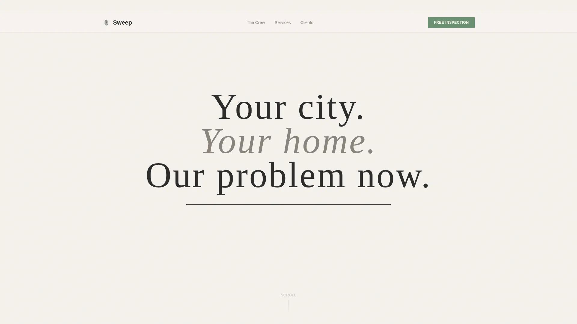
A full-width serif headline set in wide tracking against soft warm white carries the entire opening statement. No hero image competes with it. A thin charcoal rule beneath it is the only supporting element. The stop-scroll effect comes from typographic confidence alone.
Editorial Team Portrait Section
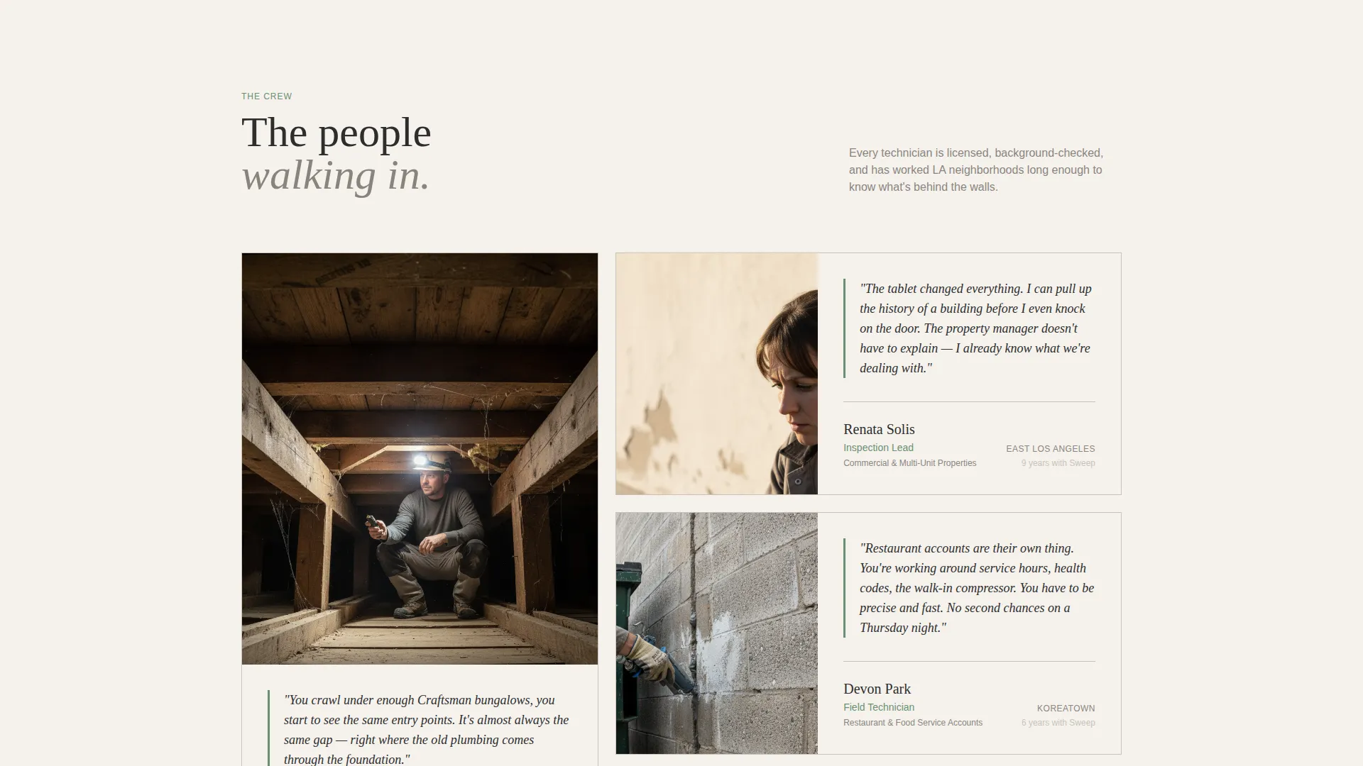
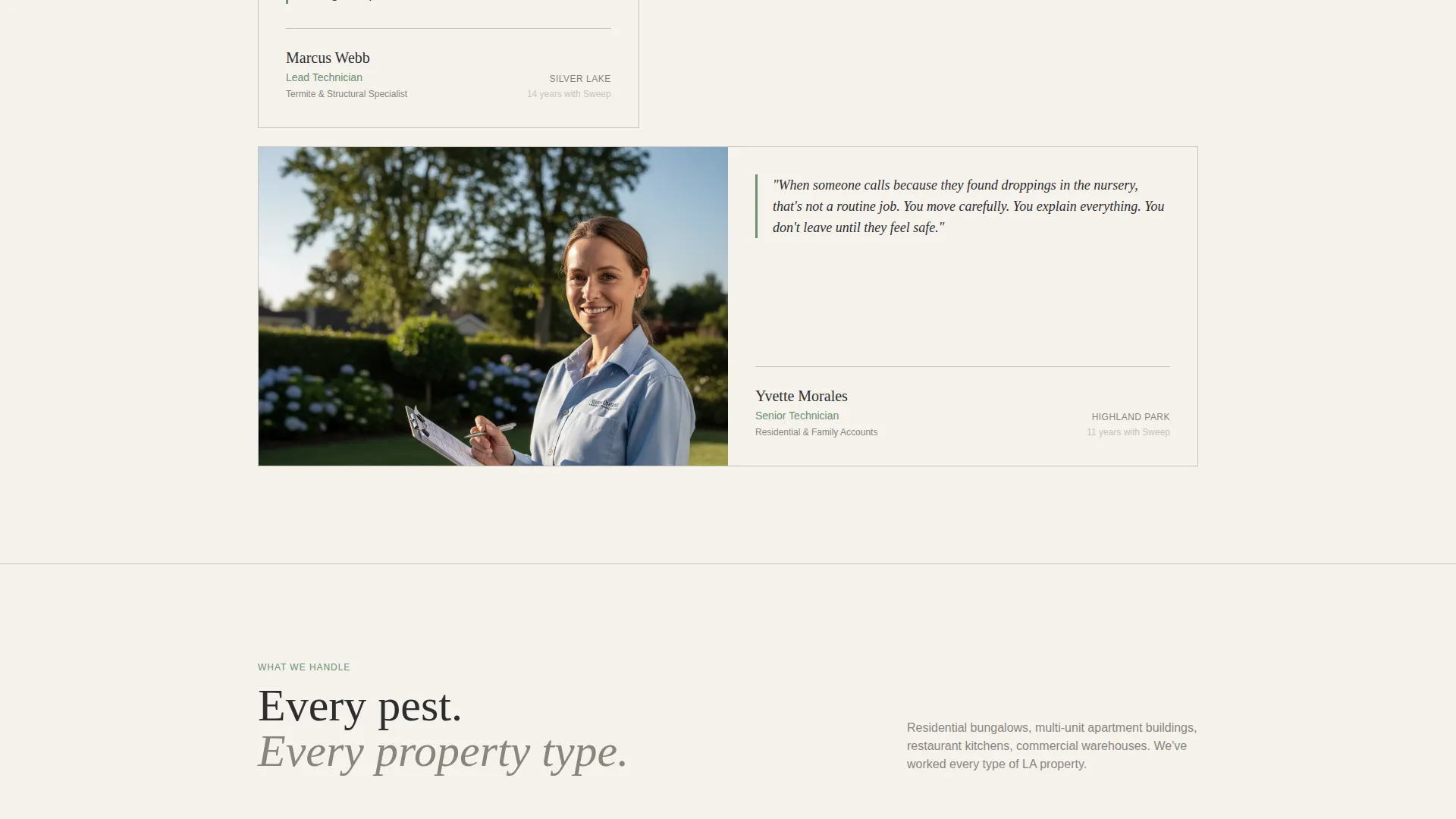
Each crew member gets an environmental photograph paired with a short pull-quote in their own words. The scroll reads like a magazine profile series. Visitors meet the technicians before they ever click the call-to-action button.
Three-Stage Call-to-Action Placement
The primary call to action, "Get Your Free Inspection," appears three times: as understated eucalyptus-green text beneath the headline, as a full-width button after the team profiles, and again after the service breakdown. Each placement matches the visitor's momentum at that point in the scroll.
Service Breakdown Segment
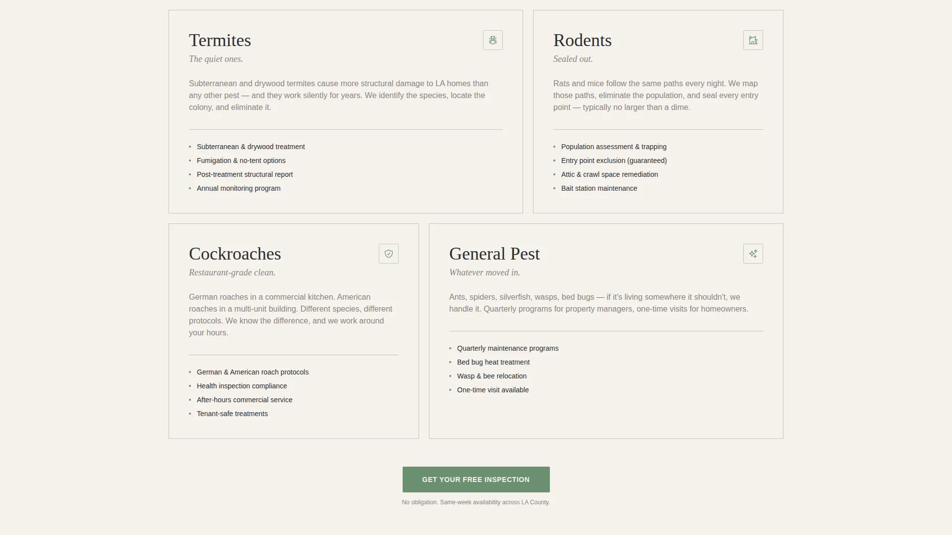
A concise section outlines the pest types the crew handles, including termites, roaches, and rodents. It fits the editorial tone without turning into a feature checklist. The section reinforces expertise without breaking the magazine-style reading flow.
Cloud Canvas Color System
The palette uses soft warm white, matte charcoal, pale fog gray, and a single eucalyptus green accent. Green appears only on links, buttons, and pull-quote borders. The restraint keeps the page feeling like a Sunday print magazine rather than a promotional flyer.
Click-Through Conversion Flow
There is no form on this landing page. Every call-to-action element routes to a separate scheduling page. This keeps friction at zero and preserves the editorial tone from the first headline to the final button click.
Page sections overview
| Section | Purpose |
|---|---|
| Giant headline block | Opens with bold serif type and a thin charcoal rule to establish authority immediately |
| Eucalyptus call to action link | Places a low-friction first call to action directly beneath the headline |
| Team portrait profiles | Introduces each crew member with an editorial photo and a personal pull-quote |
| Full-width call to action button | Captures scheduling intent after visitors have met the team |
| Service breakdown segment | Summarizes pest types handled in a concise, editorial-toned format |
| Final call to action button | Re-presents the scheduling call to action for visitors who scrolled the full page |
Design & branding system
The visual identity follows an Editorial Magazine theme built on the Cloud Canvas color system. Every color, type choice, and spacing decision references a specific Sunday print magazine feeling: airy, unhurried, and quietly authoritative.
- Colors: soft warm white (#F5F2ED) as the base, matte charcoal (#2D2D2D) for all body text and rules, pale fog gray (#D6D1CA) for dividers and supporting surfaces, and eucalyptus green (#6B8F71) reserved strictly for links, buttons, and pull-quote borders
- Typography: large serif type tracked wide for headlines; supporting body copy kept clean and readable at comfortable reading sizes with generous line spacing
- Whitespace and layout: wide margins and breathing room between sections let each photograph and headline stand on its own without visual crowding
Mobile & speed optimization
The editorial layout is designed to translate cleanly from a wide desktop reading experience to a narrow mobile screen. Section stacking and type scaling are part of the template structure.
- The giant headline and portrait section reflow to single-column layouts on smaller screens without losing the editorial character
- The three call-to-action placements remain clearly visible and tappable at mobile viewport widths
- The absence of an on-page form removes a common source of mobile friction entirely
How this template helps you convert
The conversion strategy here is trust-first. The page earns confidence through editorial presentation before it ever asks for a commitment.
- The team portrait section answers the homeowner's core anxiety about who is entering their property, removing the biggest barrier to booking a residential pest control service
- The three-stage call-to-action placement meets visitors at different points of readiness, so a visitor who is ready to book after the headline and a visitor who needed to read the full team profiles both find the button exactly when they want it
- The click-through flow to a separate scheduling page keeps the landing page completely free of form fields, so the editorial tone is never interrupted by a data-entry interruption
Other information about this template
This template was designed specifically for the Los Angeles local services market, where pest control operators compete heavily on trust and neighborhood credibility rather than price alone.
- The editorial magazine format is a deliberate contrast to standard pest control website templates, which typically rely on urgent red palettes and stock insect photography
- The Team and People creative direction is a recognized pattern for local service businesses where the crew's identity is a core part of the brand promise
- The template style suits operators in dense urban markets like Los Angeles where property types range from Craftsman bungalows to multi-unit apartment buildings and commercial restaurant spaces
- The Click-Through landing page direction makes this template compatible with paid search and social campaigns where a dedicated scheduling page handles the conversion mechanics
Theme
Editorial Magazine
Creative direction
Team & People
Color system
Cloud Canvas
Style
Editorial/Magazine
Direction
Click-Through
Page Sections
Giant Centered Headline Block
Editorial Team Portrait Section
Three-stage Call-to-action Placement
Click-through Conversion Flow
Cloud Canvas Color System
Service Breakdown Segment
Related questions
Does this landing page include a contact form?
Can I use this template if I only have a small crew?
What kind of photography does this template require?
Is this template only suitable for pest control businesses in Los Angeles?
Can I adapt the color palette to match my existing brand?



