Millennial Credit Card Comparison Landing Page Template
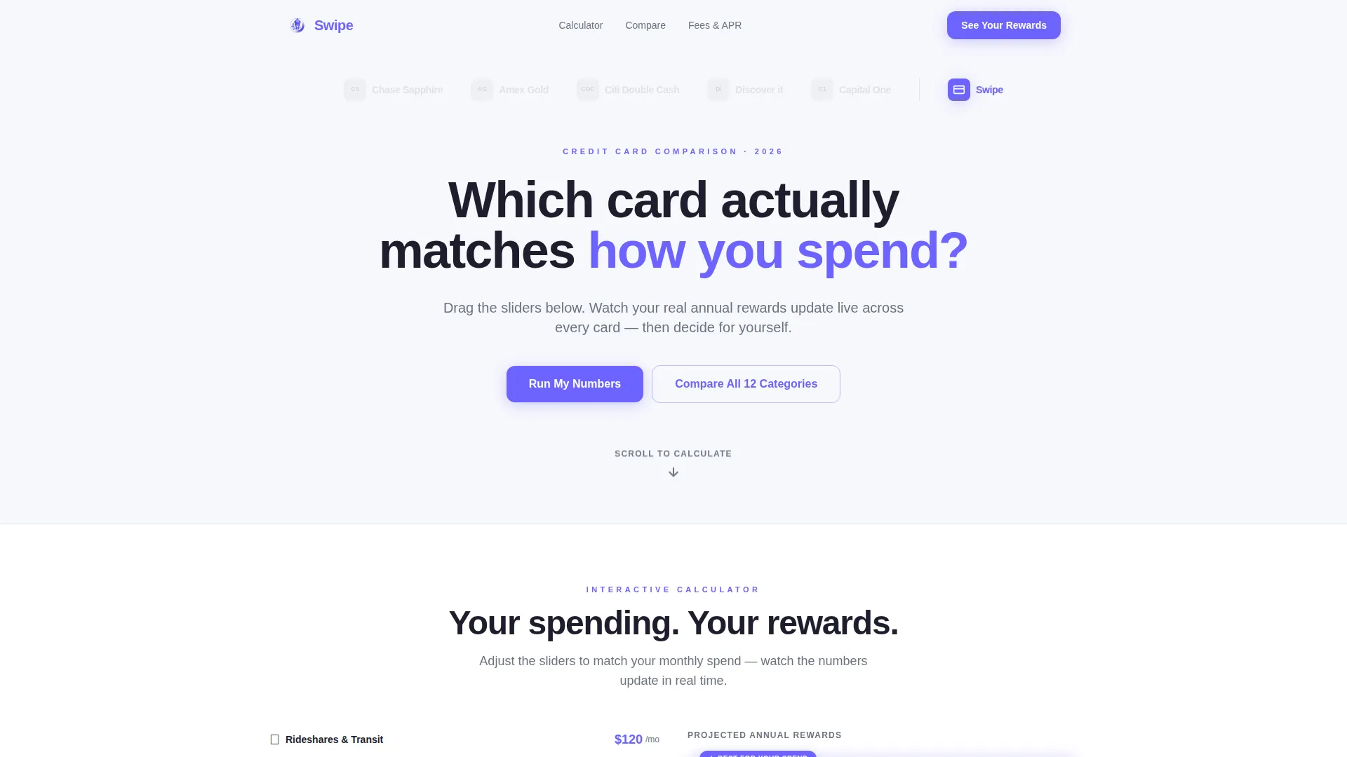
Swipe is a comparison table landing page template built for millennial credit card products. It leads with an interactive spend calculator, a competitor logo bar, and a highlighted comparison table that auto-selects the winning column. The design uses a clean Cloud Canvas palette with electric periwinkle accents, and the page flows from visual proof to an email-gated personalized rewards report.
by Rocket studio
Quick summary
Swipe is a single-page, calculator-first landing page template for a millennial credit card product. Visitors drag sliders across five spending categories and watch real-time reward projections update across three card columns. The page moves from competitor context to live data to a gated call to action, turning a complex financial decision into a clear, personal answer.
Who this template is for
This template is designed for fintech teams and direct-to-consumer financial brands targeting millennial spenders. It works especially well when your product's reward structure outperforms competitors in everyday spend categories like rideshares, streaming, and subscriptions.
- Product managers or marketers launching a millennial-focused credit card
- Fintech startups that need a data-driven, comparison-led landing page
- Growth teams running paid campaigns where a calculator can pre-qualify interest
What problem this template solves
Most credit card landing pages bury the value proposition in fine print. Millennial audiences, in particular, want proof before they commit. They need to see their own numbers, not a generic promise.
- Competitor tables look identical until you interact with them; this template makes the winner obvious at a glance
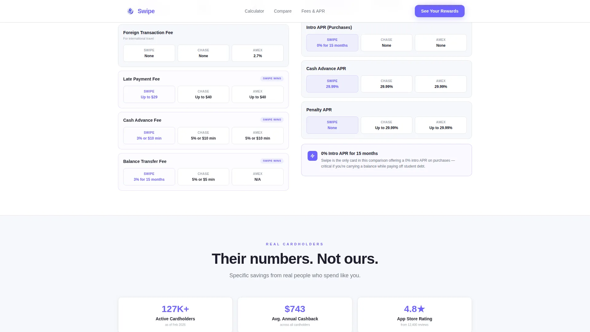
- Fine print on fees and annual percentage rates (APR) gets ignored; this template reveals those rows through animated scroll triggers
- Generic hero sections fail to hold attention; this template skips lifestyle imagery and opens with a direct question and live tool
What you get with this template
You get a fully structured, single-page layout built around an interactive rewards calculator and an expandable comparison table. Every section is sequenced to build trust before asking for an email address.
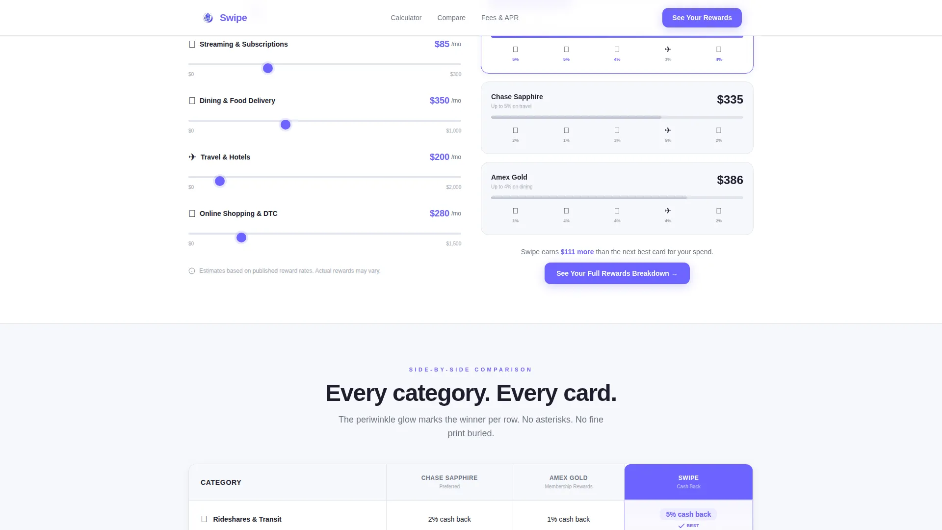
- A five-category spend calculator with real-time reward projections across three card columns
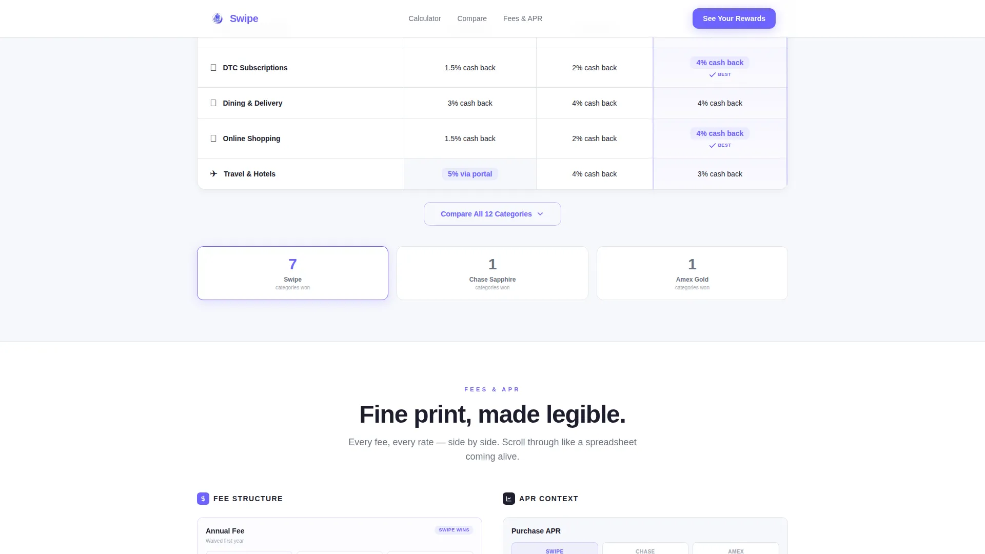
- An auto-highlighted comparison table with an expandable "Compare All 12 Categories" option
- An email gate section tied to an income range selector for a personalized PDF rewards report
Feature list
This template ships with six purpose-built components. Each one carries a specific job in the conversion sequence.
Interactive Spend Calculator
Visitors use sliders to set monthly spend across five categories: dining, subscriptions, travel, groceries, and online shopping. All three card columns update their projected annual reward totals instantly as sliders move.
Auto-Highlighted Comparison Table
The comparison table marks the winning card column per category with an electric periwinkle glow. A secondary button expands the table from a default view to all twelve categories without any email gate, giving browsers a reason to stay longer.
Competitor Logo Bar Header
The header shows competitor card logos rendered in greyscale next to the Swipe product logo in full color. A single sharp typographic question sits below, followed by a pulsing scroll arrow. There is no hero image and no photography.
Animated Fee and APR Rows
Fee breakdowns, APR context, and foreign transaction details reveal themselves row by row as the visitor scrolls down. Fine print becomes scannable, digestible data rather than a wall of legal text.
Email-Gated Rewards Report
A primary call-to-action button labeled "See Your Full Rewards Breakdown" triggers a short form. Visitors enter an email address and select a monthly income range to receive a personalized PDF report.
Dollar-Amount Social Proof
Named testimonials with job titles and specific dollar figures are embedded in the page. Real numbers from real user types, such as product managers and freelance designers, anchor the calculator results in lived experience.
Page sections overview
| Section | Purpose |
|---|---|
| Competitor Logo Bar | Frame context against known cards |
| Typographic Hero Question | Open with a direct spending question |
| Interactive Spend Calculator | Show personal reward projections live |
| Auto-Highlighted Comparison Table | Reveal the winning card per category |
| Expandable Category View | Let browsers explore all twelve rows |
| Fee and APR Breakdown | Turn fine print into scannable data |
| Social Proof Block | Anchor numbers with named testimonials |
| Email Gate Call to Action | Capture email with income range selector |
| Linear Footer Strip | Close with a minimal single-row footer |
Design & branding system
The visual identity follows a Startup Velocity theme expressed through the Cloud Canvas color system. The palette is deliberately restrained: one background tone, one text tone, and one action color. Every interactive element earns its visibility.
- Background uses soft cumulus white (#F7F8FC); table rows and dividers use mist gray (#E2E5ED); all body and heading text uses deep graphite (#1E1E2E)
- Electric periwinkle (#6C63FF) appears exclusively on calls to action, toggle states, and the selected comparison column highlight
- Typography is set in Plus Jakarta Sans throughout, keeping the layout clean, modern, and legible at all sizes
Mobile & speed optimization
The template is built mobile-first, reflecting the phone-native habits of its target audience. Interactive components are structured as client-side elements while static sections are handled server-side to keep initial load light.
- Slider interactions, row reveal animations, counter updates, and column highlight transitions are scoped to client components only
- Static sections, including the header, footer, and non-interactive copy blocks, are rendered server-side for faster first paint
- Touch targets on the calculator sliders and call-to-action buttons are sized for comfortable one-handed mobile use
How this template helps you convert
The page is sequenced so that visitors convince themselves before they reach the email field. The calculator does the persuasion work; the form simply collects the result.
- The spend calculator personalizes the value proposition immediately. Visitors see their own projected annual rewards before reading a single line of marketing copy.
- The ungated table expansion builds trust by letting skeptical visitors explore all twelve comparison categories freely, deepening session time before the email ask.
- The email gate arrives only after the calculator has already shown the visitor a specific dollar advantage, making the "See Your Full Rewards Breakdown" offer feel like a natural next step.
Other information about this template
This template is localized for the United States market. All currency values display in USD, dates follow the MM/DD/YYYY format, and all copy is written in American English. The page targets millennial spenders in the 25 to 35 age range, including gig-economy workers with variable 1099 income and couples pooling travel rewards points.
- The animation level is set to high, covering slider interactions, scroll-triggered row reveals, counter animations, and column highlight transitions
- The footer follows Pattern 1, a linear single-row layout, keeping the close of the page minimal and uncluttered
- This template is well suited for paid social traffic from platforms frequented by millennial audiences, where a tool-first landing page typically holds attention longer than a static offer page
Theme
Startup Velocity
Creative direction
Calculator/Tool First
Color system
Cloud Canvas
Style
Comparison Table
Direction
Content/Resource
Page Sections
Interactive Spend Calculator with Live Projections
Auto-highlighted Comparison Table
Competitor Logo Bar Header
Animated Fee and APR Row Reveals
Email-gated Personalized Rewards Report
Named Dollar-amount Testimonials
Related questions
Do I need coding skills to customize the calculator categories?
Can I remove the email gate and keep the calculator fully open?
Is the full comparison table visible without clicking anything?
Does the personalized PDF report generate automatically on form submission?
Is this template suitable for mobile users?



